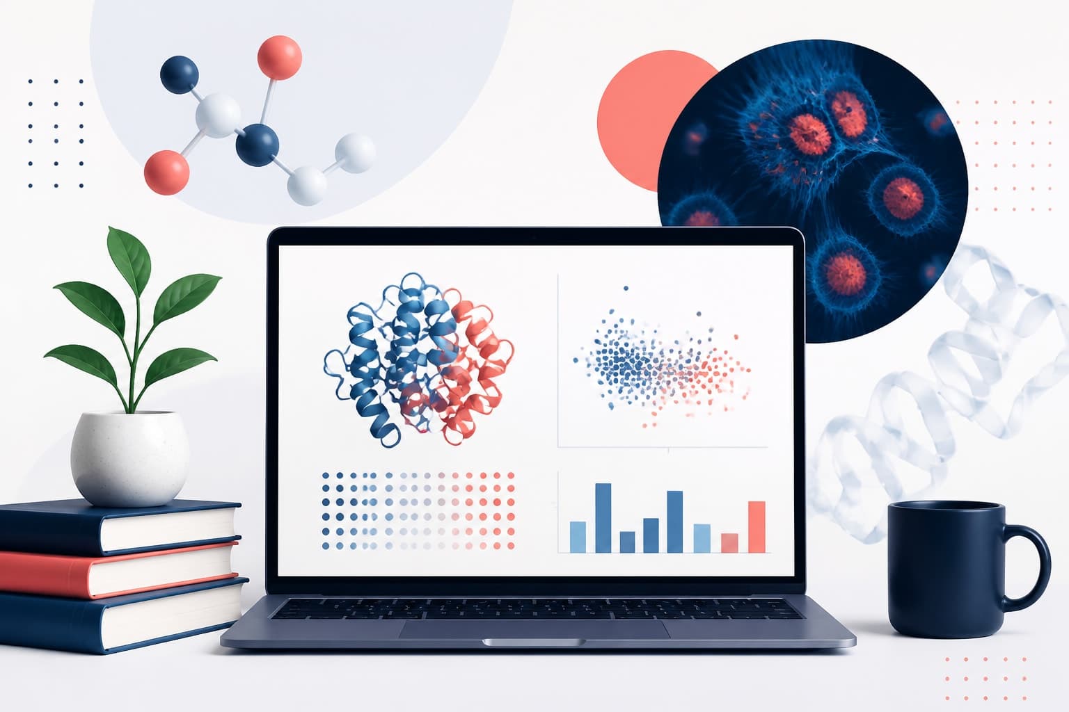
free publication figure tools for Making Research Figures on a Budget
In This Article
Why free publication figure tools matter when money is tight
If you are writing a paper, poster, thesis, grant figure, or conference abstract, free publication figure tools can save real money. They can also save you from sending blurry charts, mismatched icons, or oversized PDFs to a journal portal five minutes before the deadline.
The catch is that no free tool does everything perfectly. Charting tools are not always good at layout. Vector editors can be powerful but slow to learn. Image cleanup tools can improve microscopy panels, yet they can also get you into trouble if edits are not transparent.
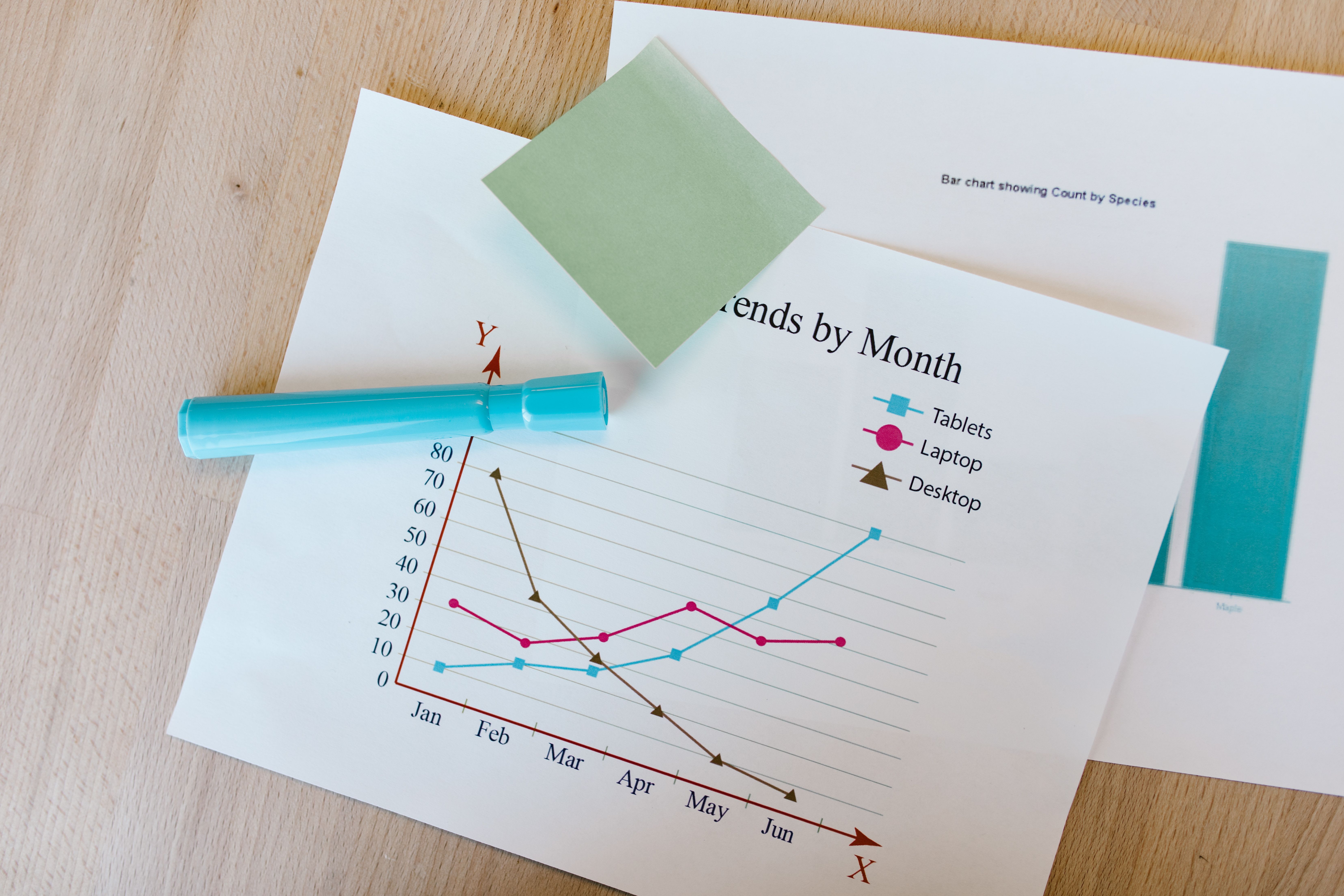
This guide compares practical free options by job: charts, vector editing, icons, image cleanup, and final exports. We are focusing on researchers and students who need reliable results without paying for a large design stack. For a faster AI-assisted workflow, you can also create with Graffiy when you want scientific figure design help in one place.
How we compare free publication figure tools
Good publication figures are not just pretty. They are accurate, readable, reproducible, and accepted by the journal or conference system. That means a tool has to support more than a quick screenshot.
For this comparison, we look at five criteria. First, can the tool create clean output at print quality? Second, does it support vector formats such as SVG, PDF, or EPS? Third, can you keep edits traceable and avoid accidental data distortion? Fourth, is the learning curve reasonable for a busy lab schedule? Finally, does the free version have limits that will hurt you later?
Before choosing any tool, check your journal instructions. Many publishers specify minimum resolution, color mode, font rules, and acceptable image handling. Nature Portfolio, for example, publishes detailed image integrity guidance that is useful even if you submit elsewhere.
The best free publication figure tools are usually used as a workflow, not a single app. You might plot data in R, refine labels in Inkscape, clean panel images in Fiji, and export the final figure as PDF. That sounds messy, but it is often more controllable than forcing one tool to do every task poorly.
Quick comparison table
| Task | Strong free options | Best for | Main limitation |
|---|---|---|---|
| Charts and plots | R with ggplot2, Python with Matplotlib or Seaborn, RAWGraphs, Google Sheets, Datawrapper | Data-driven charts, reproducible graphs, quick exploratory plots | Some require coding, others limit export control |
| Vector editing | Inkscape, LibreOffice Draw, Figma free tier | Combining panels, aligning labels, editing SVG figures | Advanced print workflows can take practice |
| Icons and diagrams | Bioicons, Servier Medical Art, Phosphor Icons, Wikimedia Commons | Biology diagrams, medical visuals, simple interface icons | Licenses vary, so attribution rules matter |
| Image cleanup | Fiji, ImageJ, GIMP, Photopea | Microscopy panels, gel images, brightness adjustment, cropping | Improper edits can violate journal policies |
| Final exports | Inkscape, Scribus, LibreOffice, Ghostscript, PDF tools | PDF, SVG, TIFF, and figure assembly checks | Font embedding and raster settings need attention |
Charts: choose reproducibility before decoration
For charts, the strongest free publication figure tools are usually code-based. R with ggplot2 and Python with Matplotlib, Seaborn, or Plotly give you repeatable figures. If your dataset changes, you rerun the script rather than manually moving points and labels.
R is especially strong for statistical plots, faceting, and consistent themes across a paper. ggplot2 can export PDF, SVG, PNG, and TIFF through common R devices. The main downside is the learning curve. If you only need one bar chart today, R may feel heavy. If you need ten related plots over six months, it pays off.
Python is a good fit if your analysis already lives in notebooks. Matplotlib offers deep control, while Seaborn makes statistical plots easier to style. Plotly is helpful for exploration, though interactive defaults may need simplification before print export.
For no-code charting, RAWGraphs is a strong option. It is open source, browser-based, and useful for alluvial diagrams, bump charts, circle packing, and other layouts that spreadsheets rarely handle well. It exports SVG, which you can refine in Inkscape.
Google Sheets and LibreOffice Calc are fine for fast, simple charts. They are not our first choice for final publication art because label spacing, font control, and export quality can be awkward. Still, for basic scatterplots or teaching materials, they are convenient.
Datawrapper is polished and friendly, especially for maps and web-style charts. Its free tier can be useful for public communication, but journal figures often need more control than the interface provides. Use it when speed and clarity matter more than journal-specific export precision.
Vector editing: where figures become publishable
Vector editing is the step many researchers skip, then regret. A plot exported from R or Python may be accurate, but it still needs panel letters, consistent font sizes, aligned axes, labels, and sometimes schematic elements. This is where free publication figure tools like Inkscape matter.
Inkscape is the best free alternative to paid vector design software for most academic figure work. It opens and edits SVG, exports PDF, handles layers, supports precise alignment, and gives you control over line weights and text. It is not perfect. Large files can slow down, and PDF import is sometimes fussy. Even so, it is the tool we would recommend first for serious budget figure assembly.
LibreOffice Draw is less elegant, but surprisingly useful for simple layouts. It works well when you need to combine a few panels, add arrows, and export a PDF. It is not ideal for complex SVG editing, but it is available on many university computers and has a gentler learning curve.
Figma has a generous free tier and a friendly interface. It is excellent for layout, alignment, and collaborative review. However, Figma is cloud-first, so sensitive unpublished data may be a concern. It also behaves more like a screen design tool than a scientific print production tool. Use it carefully for journal figures, especially when exporting PDFs.
A practical rule: keep charts editable as vectors for as long as possible. Do not export a plot as a low-resolution PNG, paste it into a slide, and then screenshot the slide. That path creates fuzzy text and painful revisions. SVG or PDF should be your default whenever the figure is line art.
Icons and scientific illustrations: free does not mean license-free
Icons can make a figure easier to understand, especially when explaining workflows, study designs, pathways, or experimental setups. The problem is that icons often come with licenses, attribution requirements, or usage restrictions. Budget-friendly does not mean you can copy anything from the internet.
Bioicons is one of the most useful free resources for life science diagrams. It collects biology-focused icons from multiple contributors and makes licensing information visible. You still need to check each item, but the collection is far better suited to research figures than generic icon sites.
Servier Medical Art is another useful source for medical and biological illustrations. It is popular for pathway diagrams, anatomy visuals, and educational graphics. Again, read the license and include attribution when required by the terms.
For general-purpose shapes, Phosphor Icons, Tabler Icons, and Wikimedia Commons can help. These are better for interface symbols, arrows, people, devices, and simple objects. For manuscripts, choose icons with similar stroke widths and visual style. Mixing a cartoon microscope, a flat DNA icon, and a 3D syringe in one figure usually looks careless.
If you use free publication figure tools for icons, build a small lab-approved library. Store the SVG files, license notes, source URLs, and attribution text in one folder. This is boring work, but it prevents frantic license hunting during submission.
Image cleanup: improve clarity without changing the science
Image cleanup is a sensitive part of figure preparation. You can crop, rotate, adjust brightness, and improve contrast in many cases. But you must not hide, erase, exaggerate, or selectively alter data. Journals and reviewers are increasingly good at spotting suspicious image handling.
Fiji, a distribution of ImageJ, is the strongest free choice for scientific images. It is widely used for microscopy, gels, and quantitative image analysis. It supports measurements, channels, overlays, scale bars, batch processing, and plugins. Because it is common in research, methods sections can also describe Fiji workflows more easily than obscure apps.
ImageJ alone is lighter, while Fiji includes more tools out of the box. If you are working with microscopy, start with Fiji. Keep original files untouched, save processed copies separately, and document adjustments. When possible, apply changes uniformly across the whole image and across comparable images.
GIMP is useful for general raster editing. It can crop, mask, adjust levels, and prepare panels. It is powerful, but it is not a scientific image analysis tool. Use it for presentation cleanup, not for quantitative measurement unless your workflow is validated.
Photopea is a browser-based editor that resembles Photoshop. It can open PSD files and handle quick edits when you are away from your usual computer. Be cautious with sensitive unpublished images, because browser-based workflows may not fit your lab or institution data policies.
The safest workflow is simple. Preserve originals, process in Fiji when the image is scientific data, assemble in a vector editor, and export according to journal rules. Avoid cosmetic edits that you would be embarrassed to explain to a reviewer.
Final exports: the last step can break a good figure
Many figure problems appear at export, not during design. Fonts change, thin lines disappear, transparent objects render strangely, and files become too large for submission portals. Good free publication figure tools should help you check output before you upload.
For vector-heavy figures, Inkscape can export PDF, SVG, EPS in some workflows, and high-resolution PNG. When exporting PDF, check whether text remains editable or is converted to paths. Converting text to paths avoids font substitution, but it makes later editing harder. Embedding fonts is often better when allowed.
For raster-heavy figures, journal instructions usually ask for TIFF or high-resolution PNG at 300, 600, or 1200 dpi, depending on the figure type. Photos and microscopy images often need 300 dpi. Line art may need 1000 dpi or more. Mixed figures need careful handling because text and images have different needs.
Scribus is worth considering for final layout and PDF production. It is free desktop publishing software, and it gives more print-focused controls than a slide deck. The interface feels old-fashioned, but it is useful for posters, graphical abstracts, and multi-panel layouts.
LibreOffice can export PDFs and may be enough for simple figures or teaching handouts. However, slide software tends to encourage manual placement and inconsistent scaling. If you must use it, set the page size correctly, use vector imports where possible, and test the PDF on another computer.
Before submission, zoom into the final PDF at 400 percent. Check every label, symbol, scale bar, axis, legend, and panel letter. Then print a draft if the figure will appear in print or as a poster. Tiny problems become obvious on paper.
Best free tool stacks by situation
There is no universal winner. The best choice depends on your data, your time, and your tolerance for technical setup. Here are practical stacks that work well for common academic situations.
Best stack for a thesis or manuscript with many charts
Use R or Python for plots, Inkscape for layout, Bioicons for consistent SVG symbols, Fiji for scientific images, and PDF export from Inkscape or Scribus. This stack has a learning curve, but it is reproducible and flexible. It is the strongest choice for long projects with repeated revisions.
Best stack for students who need a figure this week
Use Google Sheets or RAWGraphs for charts, Inkscape or LibreOffice Draw for assembly, and Bioicons for scientific symbols. This is less reproducible than a coding workflow, but it is realistic. If you are new to figure design, this stack gets you acceptable results without weeks of training.
Best stack for microscopy or image-heavy work
Use Fiji for image processing and measurements, then assemble panels in Inkscape. Add labels, arrows, and scale bars with care. Keep a processing log, because image-heavy figures attract close review.
Best stack for posters and teaching visuals
Use Figma, Inkscape, or Scribus for layout, with charts from R, Python, or RAWGraphs. Posters need visual hierarchy more than dense detail. Use fewer colors, larger labels, and generous spacing.
Our practical verdict
If you are choosing only one free tool to learn for publication figures, choose Inkscape. It is the central workshop where charts, icons, images, and labels become a coherent figure. It will not replace statistical plotting or scientific image analysis, but it solves the layout problem that ruins many otherwise good figures.
If you are choosing one charting path, choose R or Python if your project will last more than a week. Reproducibility matters. Manual chart editing feels faster until your supervisor asks for the same plot with a new subgroup, changed colors, and revised labels.
If you handle scientific images, learn Fiji before you learn a general photo editor. It keeps you closer to accepted research practice and helps you separate data processing from visual polish.
The best free publication figure tools are not the fanciest tools. They are the ones that protect accuracy, reduce rework, and export clean files. Use free software confidently, but build a repeatable workflow. Your future self, your coauthors, and your journal production editor will thank you.
Frequently Asked Questions
What are the best free publication figure tools for a student manuscript?
A strong free stack is R or Python for charts, Inkscape for vector editing, Bioicons for scientific icons, Fiji for scientific image processing, and Inkscape or Scribus for final PDF export. If you need a lower learning curve, RAWGraphs plus Inkscape is a practical starting point.
Can I use free tools for journal-quality figures?
Yes, free tools can produce journal-quality figures if you export at the right resolution and keep vector elements editable. The weak point is usually workflow, not price. Check journal instructions early so you do not rebuild the figure at submission time.
Are free icon libraries safe for publication figures?
They can be safe, but you must check the license for each icon or illustration. Some resources require attribution, restrict commercial use, or use different licenses within the same collection. Save source links and license notes with your figure files.
Written by
Shobajo AbdulAzeez
Tags
Share this article