Scientific Poster Design: The Complete Guide for Conferences in 2026
In This Article
Why scientific poster design matters more in 2026
Scientific poster design is not decoration. It is how you help a tired conference attendee understand your research in under two minutes. Poster halls are crowded, sessions move quickly, and many posters are photographed for later review.
Your poster has three jobs. It must attract the right people, explain the core finding quickly, and support a deeper conversation when someone stops. If it fails at the first job, the other two rarely happen.
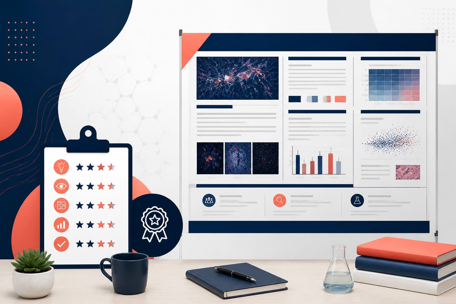
[IMAGE: scientific poster design example showing a clean conference poster with a strong title, clear columns, large figures, and short text blocks]
You do not need to be a professional designer to make a strong research poster. You need a clear message, a reliable grid, readable type, disciplined color, and the courage to cut clutter.
Start with the message, not the template
Before you open design software, write one sentence that captures the poster. This is not your paper title. It is the answer to this question: what should a visitor remember after one minute?
A weak message is: “We studied immune responses in treated mice.” A stronger message is: “Treatment X reduced inflammatory signaling by 42 percent in a mouse model of acute lung injury.” The second version has a subject, an action, and a result.
That message should guide every design choice. If a figure does not support it, cut the figure. If a method detail is only useful to a specialist, reduce it. Scientific poster design rewards focus more than volume.
A conference poster is not a paper on a wall. It is a visual argument. Your abstract can live in the program. Your poster should show the problem, the approach, the main evidence, and the takeaway.
Scientific poster design layout principles that work
The most reliable poster layouts use an obvious reading path. In many English-speaking conferences, that means top to bottom and left to right. Do not make people guess where to begin. A confused viewer usually walks away.
Use a grid with two, three, or four columns. Three columns work well for many research posters because they balance content and space. A typical structure is: background and question, methods and study design, main results, then conclusion and implications.
Place your title at the top, large enough to read from several meters away. Under it, include authors, affiliations, and contact details. Keep logos modest. A poster covered in institutional marks can feel more like a sponsorship banner than science.
The center of the poster should carry the most important evidence. For many projects, that means one main figure, model, chart, image panel, or workflow. Give it more space than feels comfortable. If everything is the same size, nothing is important.
White space is not wasted space. It lets viewers understand groups of information. Use generous margins around sections, figures, and headings. If the poster feels packed, remove content before you shrink the font.
| Poster area | Purpose | Design note |
|---|---|---|
| Top band | Title, authors, affiliations | Make the title readable from across the aisle |
| Left column | Problem, question, brief methods | Use short text and clear headings |
| Center area | Main results | Prioritize figures over paragraphs |
| Right column | Conclusion, implications, next steps | End with a strong takeaway |
| Bottom corner | QR code, contact, funding | Keep it useful but visually quiet |
Bad layout usually has one of three problems. It reads like a manuscript, it has no visual priority, or it forces the viewer to jump around. A good layout feels almost obvious. That is the point.
Typography: make reading feel effortless
Typography can quietly make or break a poster. Choose clarity over personality. Most conference halls have uneven lighting, people read while standing, and many visitors see your poster at an angle.
Use one clean sans serif typeface for most of the poster. Good choices include Arial, Helvetica, Source Sans, Inter, Roboto, or similar fonts. If your institution requires a specific typeface, use it consistently and avoid mixing too many styles.
As a starting point, use a title around 85 to 110 points for large posters. Section headings often work around 44 to 60 points. Body text should usually stay above 28 points. Captions can be smaller, but do not punish readers with tiny labels.
Line spacing matters. Tight lines make text look dense, even when the font size is acceptable. Aim for comfortable spacing and keep paragraphs short. In scientific poster design, three crisp bullets often beat one long paragraph.
[IMAGE: typography comparison for a conference poster showing readable heading sizes beside cramped small text and crowded captions]
Avoid all caps for long headings. All caps reduce word shape recognition and can feel like shouting. Use bold for hierarchy, not decoration. Italics are fine for species names or emphasis, but large blocks of italic text are harder to read.
Also check every axis label, legend, and annotation inside figures. Many posters use readable body text but unreadable charts. If a figure was built for a journal page, it often needs to be rebuilt for a poster.
Color choices that support the science
Color should organize information, not compete with it. A strong poster usually uses a limited palette: one primary color, one accent color, neutral text, and a light background. This gives you contrast without visual noise.
Dark text on a white or very light background is still the safest choice for most posters. Light text on a dark background can look striking, but it is harder to print consistently and can reduce legibility in dim halls.
Use color consistently. If blue represents control samples in one chart, do not use blue for treatment samples elsewhere. Consistency reduces cognitive load and makes your poster feel more trustworthy.
Accessibility is not optional. Many attendees have some form of color vision deficiency. Do not communicate important differences using color alone. Add labels, patterns, direct annotations, or distinct marker shapes. The W3C offers practical guidance in its contrast minimum recommendations, which are useful for screen and print design.
Be careful with red and green pairings, rainbow gradients, and saturated backgrounds. They can hide patterns in data and create problems for readers. When in doubt, choose calmer colors and make your labels clearer.
A good color example: a white poster with charcoal text, blue section headings, and orange highlights only for key results. A bad color example: black background, neon green text, red arrows everywhere, and six unrelated chart palettes.
Figures, charts, and visual evidence
Your results section should be the visual heart of the poster. Most visitors will look at figures before reading text. That means your figures need to carry the story without requiring a long verbal explanation.
Choose fewer, stronger visuals. Three excellent figures are better than eight small panels. Each figure should answer a specific question. Put that question in the figure title or nearby heading.
Use direct labels whenever possible. A line chart with labels beside the lines is faster to read than a chart that forces the viewer to bounce between lines and a legend. The same applies to microscopy images, maps, and pathway diagrams.
Write captions that interpret, not merely describe. “Gene expression results” is weak. “Treatment X increased protective gene expression after 24 hours” is useful. Captions should help the viewer understand why the figure matters.
[IMAGE: good and bad chart examples for a research poster, with the good version using direct labels, high contrast, and a clear takeaway]
Keep chart styling restrained. Remove heavy borders, extra gridlines, 3D effects, and decorative shadows. These details rarely help. They usually make data harder to read.
If your research is image-heavy, standardize image sizes, scale bars, labels, and brightness adjustments. If your work is computational, simplify pipelines and models so a non-specialist can follow the logic. Your poster should welcome experts and informed outsiders.
Good and bad poster design examples
Consider two realistic conference posters. The weak poster has a long technical title, four dense columns, small body text, and every section from the manuscript. The results are squeezed into the lower half. The conclusion repeats numbers already shown in the charts.
The stronger version starts with a clear title: “Early microbial shifts predict treatment response in ulcerative colitis.” It uses three columns. The left column explains the research question and cohort. The center features two large plots with direct labels. The right column states three conclusions and shows a simple clinical implication.
The weak poster asks the viewer to work hard. The strong poster does the sorting for them. It says, “Here is the question, here is the evidence, here is why it matters.” That is the heart of scientific poster design.
Here is another example. A bad methods section lists every reagent concentration and instrument setting. A good methods section shows a simple workflow: sample collection, sequencing, analysis, validation. The detailed protocol can be linked by QR code for people who need it.
Good poster design is not about hiding complexity. It is about sequencing complexity. Start broad, then offer depth for the people who ask for it.
Common mistakes researchers should avoid
The most common mistake is trying to include too much. Researchers are trained to be careful, so cutting content can feel risky. But a poster that includes everything usually communicates very little.
Another mistake is treating the title like a paper title. Long titles with nested clauses are hard to scan. Use plain language where possible. If a technical term is necessary, keep the surrounding words simple.
Many posters also bury the conclusion. Do not make visitors hunt for your main finding. Put a short conclusion near the top or in a prominent right-side panel. Repeat the core takeaway in the final section.
Small QR codes are another problem. If you include one, test it from a normal standing distance. Place it near contact information and explain what it opens, such as preprint, dataset, protocol, or lab page.
Do not rely on screenshots of tables. They print poorly and often become unreadable. Rebuild tables with fewer columns, larger text, and only the values that support your point.
Finally, proof the poster at actual size. A PDF that looks fine on your laptop can fail on paper. Print a small tiled section at full scale, especially one with body text, axis labels, and captions. This simple check catches many painful errors.
A practical workflow for your 2026 conference poster
Start earlier than feels necessary. Good posters improve through editing, not panic. First, define your message and select your three to five strongest visual elements. Then build a rough layout before polishing colors or fonts.
Next, write section headings as claims, not labels. “Drug response differs by baseline inflammation” is stronger than “Results 2.” Claim-based headings help scanning visitors understand your argument quickly.
After that, refine figures. Increase label sizes, simplify legends, and remove visual clutter. Then edit text until each section earns its place. If a sentence does not help a visitor understand the poster, cut it or move it to a QR-linked supplement.
When you are ready to design faster, you can create with Graffiy to turn research ideas, workflows, and visual concepts into polished scientific graphics. We built Graffiy for researchers who need accurate, publication-aware visuals without fighting generic design tools for hours.
[IMAGE: researcher preparing a conference poster in an AI scientific design platform with organized figures, color palette, and poster layout controls]
Before sending the final file, review it in three passes. First, check the science. Second, check readability from a distance. Third, check production details: dimensions, image resolution, font embedding, institutional logos, funding statements, and permissions.
Conference poster checklist before you print
Use this checklist as a final review. It is intentionally strict because poster halls are unforgiving.
- Message: Can a visitor understand the main finding in one minute?
- Title: Is it specific, readable, and shorter than a manuscript title?
- Layout: Does the reading path feel obvious?
- Hierarchy: Are the most important figures the largest elements?
- Typography: Is body text large enough to read while standing?
- Color: Is contrast strong, consistent, and accessible?
- Figures: Are labels, legends, scale bars, and captions readable?
- Text: Have you removed anything that belongs in the paper instead?
- QR code: Does it work, and does the poster explain where it leads?
- Final proof: Has someone outside your project understood the poster without your explanation?
The last item is the most revealing. Ask a colleague from a neighboring field to read the poster for 60 seconds. Then ask what they remember. If their answer matches your intended message, your design is working.
Final thoughts on better research posters
Strong scientific poster design respects both the science and the viewer. It does not oversimplify your work. It removes obstacles so the right people can understand your evidence and ask better questions.
For 2026 conferences, the best posters will be clear, visual, accessible, and easy to discuss. They will use fewer words, stronger figures, and more intentional hierarchy. They will feel designed, but not decorative.
Your poster is often the first conversation someone has with your research. Give it the same care you give the experiment, analysis, and abstract. Clear design will not rescue weak science, but it will help strong science travel farther.
Frequently Asked Questions
What is the most important rule in scientific poster design?
The most important rule is to make the main message obvious quickly. A conference attendee should understand your research question, key result, and takeaway without reading every word. Design choices like hierarchy, large figures, and short headings should all support that goal.
How much text should a conference research poster include?
Use less text than you think you need. Most posters work best with short paragraphs, concise bullets, and captions that explain the meaning of figures. If detailed methods or extra results are important, link them through a QR code instead of crowding the poster.
What makes a poster look unprofessional at a conference?
Common problems include tiny fonts, crowded columns, inconsistent colors, low-resolution images, and figures copied directly from a paper. A poster also feels unprofessional when the conclusion is hidden or the reading order is unclear. Simple structure and careful editing usually fix these issues.
Written by
Shobajo AbdulAzeez
Tags
Share this article