
Tools & Resources
Mind the Graph Review: Is It Worth It for Researchers?
This Mind the Graph review breaks down everything researchers need to know, from icon quality and workflow to pricing and whether a smarter alternative exists.
This Mind the Graph review breaks down everything researchers need to know, from icon quality and workflow to pricing and whether a smarter alternative exists.

scientific figure typography is one of the quiet reasons a figure feels clear, credible, and ready for review. This guide helps you choose fonts, sizes, and hierarchy that support the science instead of distracting from it.
Annotated charts research helps your audience notice the finding, not just the figure. This guide shows how to use callouts and labels to make results clearer.
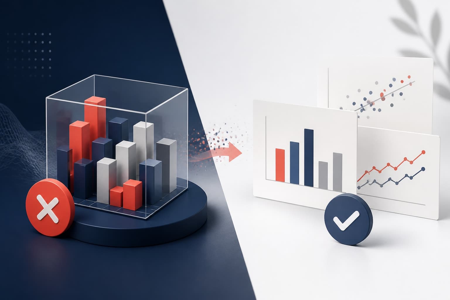
A 3D chart research figure can make a slide look polished, but it usually makes the data harder to read. Here is why flat, precise visuals win in research presentations.

Color alone accessibility figures fail when meaning disappears for readers who cannot distinguish hues. This guide shows researchers and educators how to pair color with shape, pattern, and text cues.
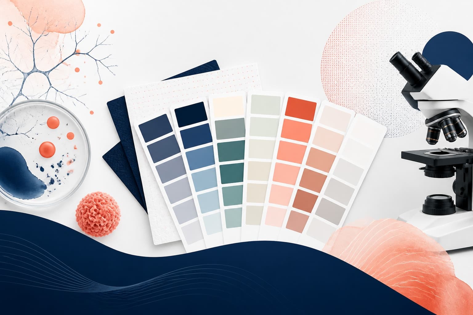
These journal friendly color palettes help research figures stay readable in PDFs, print, projectors, accessibility reviews, and online article pages.
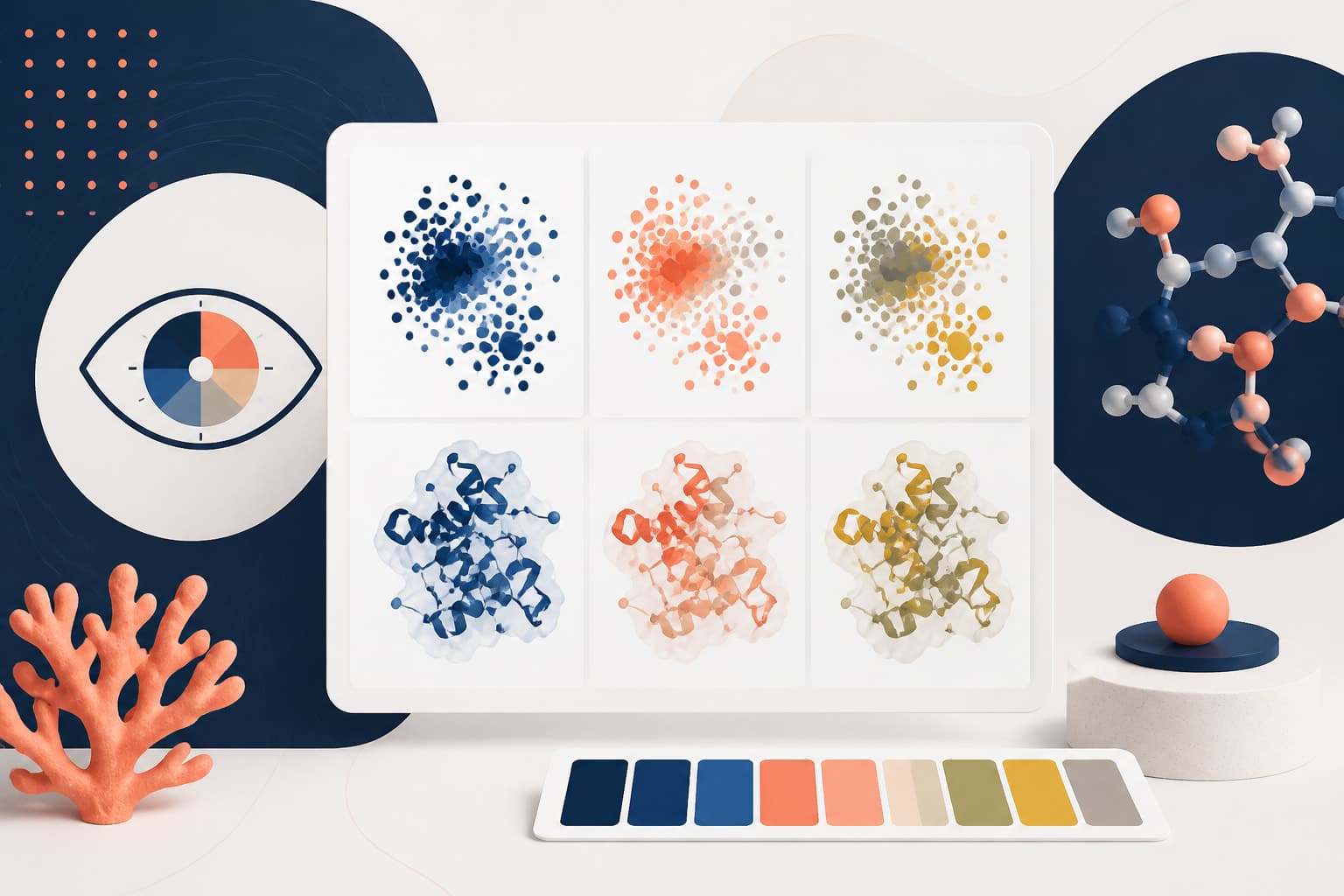
This practical guide shows researchers and teaching staff how to build colorblind safe scientific figures. Learn which color combinations to avoid and how to add cues that do not rely on color alone.
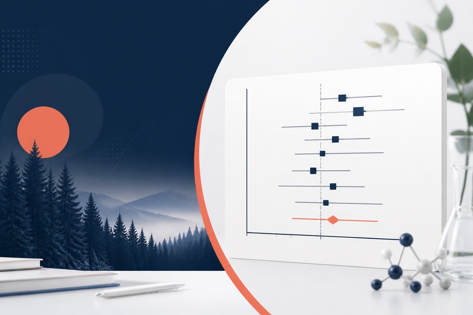
This guide explains forest plot design for medical research papers so readers can scan effect sizes, intervals, and comparisons with less effort.

Good single cell figure design helps readers understand complex omics data quickly, without flattening the biology. This guide shows how to simplify dense visuals while keeping the evidence intact.
This data visualization checklist helps researchers review figures before manuscript submission. Use it to catch unclear charts, weak labels, scale issues, color problems, and accessibility gaps.
These data visualization mistakes research authors make can weaken clear findings and slow down review. Use this practical list to fix scales, legends, labels, and figure choices before submission.

Bioicons provides the most comprehensive free biology icon library for researchers and science illustrators. Discover how to enhance your scientific communications with professional-quality biological symbols.
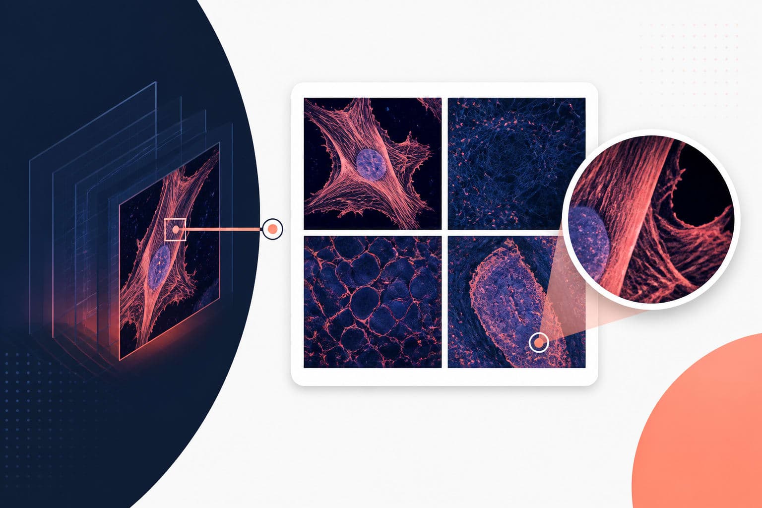
Maintaining multi panel figure resolution is crucial for publication success. This complete guide shows you how to build clean panels and export them correctly.
scientific figure white space is not empty decoration. Used well, it makes data easier to read while keeping figure files controlled and submission ready.
Creating accessible scientific figures ensures your research reaches all audiences, including those with visual impairments or color vision differences.
Master the art of writing clear, informative chart figure caption text that helps readers understand your data visualizations instantly.

Master the art of creating an effective poster results section that showcases your findings with clear visuals and minimal text.
Good poster figure design helps busy conference viewers understand your data before they read the fine print. This guide shows you how to build figures that explain themselves.

Creating an effective graphical abstract color palette requires balancing visual impact with scientific clarity and accessibility.

AI research figures can help you turn complex data into clear visuals without learning design software. This tutorial shows a practical workflow from raw data to publication-ready output.

These conference poster tips help you diagnose why people walk past your poster and show you how to make your research easier to notice, read, and remember.

Effective data visualization for researchers transforms complex datasets into compelling narratives that drive discovery and understanding.

While Canva for scientists offers accessible design tools, it has significant limitations for research visuals that dedicated scientific platforms handle better.
This scientific poster design guide helps researchers build clearer, more persuasive conference posters for 2026. Learn layout, typography, color, and the mistakes that quietly weaken good science.
A hands-on comparison of the six leading AI design tools for researchers and scientists in 2026 — covering pricing, features, icon libraries, and export quality