Annotated charts research: How to Annotate Charts So They Tell a Better Story
In This Article
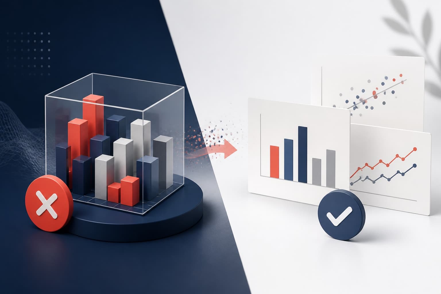
Annotated charts research is not about decorating a figure. It is about guiding attention toward the result that matters most. When you present a key finding, your audience should not have to hunt for the story inside axes, legends, and dense data marks. A good annotation points to the evidence, names the pattern, and explains why the viewer should care.
Researchers often spend weeks refining analysis, then give the chart only a few minutes of design attention. That gap shows. A chart can be statistically correct and still fail because the takeaway is buried. Labels, callouts, arrows, and short notes help you turn a chart into a clearer argument.
Why annotated charts research improves scientific storytelling
In research presentations, people rarely read charts from left to right like a report. They scan. They look for the title, the biggest shape, the brightest color, and any text that seems important. If the chart has no guidance, every viewer builds a different interpretation. That is risky when you are presenting a nuanced result.
Annotated charts research reduces that risk by pairing visual evidence with a concise explanation. Instead of saying, “Here is the trend,” you show the trend and label the moment where it changes. Instead of relying on a legend, you place labels next to the relevant series. Instead of describing a surprising result verbally only, you write it directly beside the data.
This approach is especially useful when you present to mixed audiences. A specialist may understand the metric immediately. A collaborator from another discipline may need context. A funder, reviewer, or student may need even more support. Annotation lets you provide that support without simplifying the science beyond recognition.
The goal is not to explain everything. The goal is to explain the right thing at the right moment. A strong annotated chart tells the viewer where to look first, what pattern to notice, and how that pattern connects to the claim you are making.
Start with the result, not the decoration
Before you add labels, ask one plain question: what should the viewer remember after seeing this chart? If you cannot answer in one sentence, the chart is not ready for annotation. Annotation works best when the message is already defined.
A useful result statement might be, “Treatment response increased after week four,” or “The effect is concentrated in participants over 60.” It may also be more cautious, such as, “The difference is visible but confidence intervals overlap.” Good chart notes can communicate uncertainty without weakening the finding.
Once you have the result statement, decide which part of the chart proves it. That evidence might be a peak, a drop, a crossing line, a cluster, an outlier, or a gap between groups. Your first annotation should point to that evidence. Do not begin with a note about methods, sample size, or data cleaning unless those details are essential to interpretation.
This is where many research charts become cluttered. Authors try to annotate every interesting detail because they know the data deeply. The audience does not need your full internal map. They need a guided path through the figure.
Practical rule: If an annotation does not support the main result, explain uncertainty, or prevent a likely misunderstanding, remove it.
Use callouts to emphasize the result
A callout is a short note attached to a specific part of the visualization. It may include an arrow, bracket, highlight, or small label box. In annotated charts research, callouts are most useful when a viewer could miss the important pattern without help.
Keep callout text short. Aim for one idea, not a paragraph. “Largest increase occurs after intervention” is better than “This section shows that the intervention may have influenced the outcome by creating a larger increase in the post-intervention period.” The second version belongs in your talk or caption, not inside the chart.
Place the callout close to the evidence. Distance creates friction. If the note is far from the data point, the viewer has to connect the message and the mark mentally. A thin leader line or arrow can help, but do not make the viewer follow a maze.
Use callouts sparingly. One strong callout can define the story. Five callouts can make a chart feel like a crowded poster. If you need many notes, consider splitting the chart into a sequence, such as baseline, intervention, and follow-up.

Write labels that replace unnecessary legends
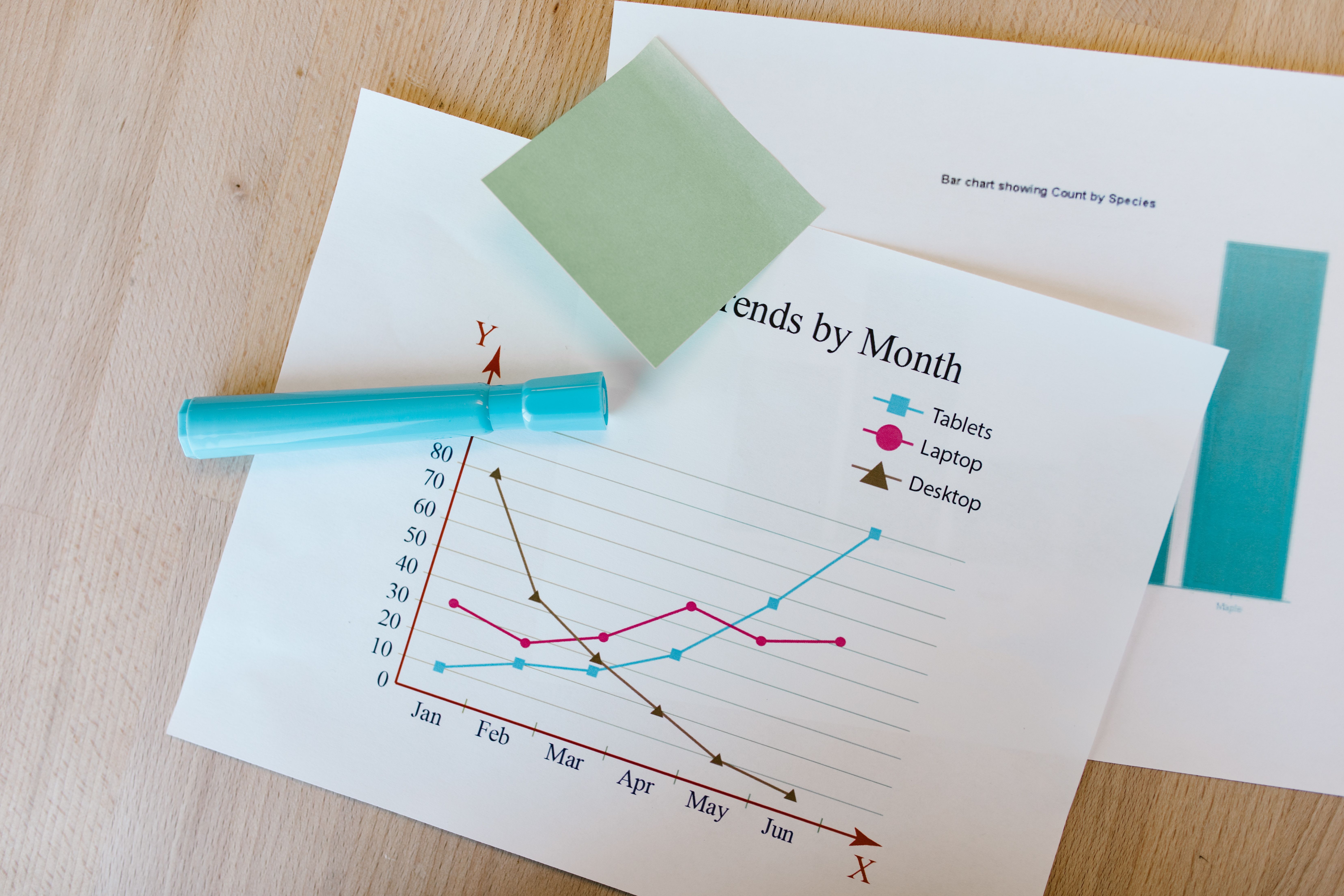
Legends are common, but they are often inefficient. A legend forces the viewer to look back and forth between color keys and data marks. Direct labels reduce that effort. Place the group name beside the line, bar, or cluster whenever space allows.
Direct labels are especially helpful in multi-line charts. If you have three treatment arms, label each line near its endpoint. If the line names are long, use short versions in the chart and define them in the caption or surrounding text. The viewer should not have to memorize color mappings while also interpreting results.
Labels should be specific, but not overloaded. A label such as “High dose” is usually enough beside a line. A label such as “High dose, n = 42, adjusted model, p = 0.03” may be too much if placed directly on the chart. Put secondary details in a footnote, caption, or table if they distract from the visual comparison.
For bar charts, place values only when the exact number matters. If the chart is meant to show a ranking or relative difference, too many numbers can create noise. If the exact estimate is central to your argument, label the most important bars and leave the rest unnumbered.
Build a visual hierarchy before adding more text
Annotation is not only text. Color, weight, size, and position all guide attention. If everything is equally bold, the viewer cannot tell what matters. Before adding another callout, adjust the visual hierarchy.
Start by muting context. Background gridlines, reference categories, and less important series can be light gray. Then emphasize the result with a stronger color or line weight. This creates a clear foreground and background. The annotation can then explain the highlighted pattern rather than compete with it.
Color should have a job. Do not use bright colors for every category. Use one accent color for the key finding and quieter colors for comparison data. If color carries meaning, keep it consistent across slides, posters, and figures.
Accessibility matters here. Many readers have color vision differences, and some figures will be printed in grayscale. The W3C guidance on contrast is a useful reference for making visual elements easier to distinguish. You can review the W3C non-text contrast guidance when choosing colors for data marks and annotation elements.
Hierarchy also applies to typography. Use one clear typeface. Make the chart title, direct labels, and annotation notes distinct in size or weight. Avoid tiny labels that look fine on your monitor but disappear on a projector or printed handout.
Choose the right annotation type for the message
Different findings need different annotation tools. A label names something. A callout explains something. A bracket compares something. A shaded region groups something. A reference line defines a threshold. Matching the tool to the message keeps the chart clean.
| Annotation type | Best use | Example |
|---|---|---|
| Direct label | Identify a series or category | Label each treatment group at the line endpoint |
| Callout | Explain a notable pattern | “Response accelerates after week four” |
| Reference line | Show a benchmark or threshold | Clinical cutoff, policy target, detection limit |
| Shaded band | Mark a time period or range | Intervention window or confidence interval |
| Bracket | Emphasize a comparison | Difference between two groups at final follow-up |
Use reference lines carefully. A benchmark can make a result instantly meaningful, but too many reference lines create visual noise. Label the line directly, such as “Clinical threshold,” rather than making the viewer decode it from a legend.
Shaded regions are useful for time-based research. They can mark a treatment period, a policy change, a lab condition, or an event window. Keep the shading light, so it supports the data rather than covering it.
Brackets work well for categorical comparisons, but they can become messy if every pair gets a bracket. If you are tempted to add six significance brackets, pause. You may need a different chart, a compact letter display, or a table of statistical tests.
How to avoid clutter in annotated charts research
Clutter is the main enemy of annotated charts research. The solution is not always less information. It is better organization. A chart can contain a lot of information and still feel clear if each element has a purpose.
First, remove repeated information. If the chart title says “Mean response by treatment group,” your y-axis does not need to repeat the full phrase. If direct labels identify the lines, remove the legend. If a callout names the threshold, do not also add a separate key for it.
Second, reduce precision where precision is not useful. A label reading “42.137%” looks scientific, but it may distract from the pattern. “42%” or “about 42%” may be more readable, depending on the context. Use exact values when decisions depend on them.
Third, separate main annotations from supporting notes. The primary callout belongs near the data. Method details, exclusions, and definitions usually belong in a caption or slide note. This keeps the viewer focused on the story while preserving transparency.
Finally, test the chart at presentation size. A figure that works in a journal PDF may fail on a conference slide. Stand back from your screen. If you cannot identify the key result in three seconds, the annotation needs work.

Make annotations honest about uncertainty
Clear storytelling does not mean overstating the result. In fact, annotation can make uncertainty easier to understand. You can label confidence intervals, mark overlapping ranges, or add a note that explains a limitation.
For example, a callout might say, “Trend increases, but interval remains wide.” That sentence is more useful than hiding uncertainty or adding a vague asterisk. It tells the audience how to interpret the result responsibly.
When using significance markers, define them. Asterisks are familiar to many researchers, but not to every audience. If you use them, include a simple note such as “* p
Be cautious with arrows. An arrow can imply causality or direction of effect. If your study design does not support causal language, use neutral phrasing. “Observed increase after policy change” is safer than “Policy change caused increase” unless your analysis justifies that claim.
Good annotated charts research respects both clarity and caution. The viewer should leave with a sharper understanding, not an inflated conclusion.
Design workflow for research presentations
A repeatable workflow helps you annotate faster and more consistently. Start with the raw chart, then write the result statement. Next, highlight the evidence in the visual layer. After that, add the smallest amount of text needed to explain it.
- Define the claim: Write the takeaway in one sentence.
- Find the proof: Identify the mark, region, or comparison that supports the claim.
- Mute context: De-emphasize secondary data without deleting necessary information.
- Add direct labels: Replace legends where practical.
- Add one main callout: Explain the result with concise wording.
- Check uncertainty: Show intervals, thresholds, or limitations when needed.
- Test the chart: View it at slide, poster, or manuscript size.
This workflow also works well when you create with Graffiy. You can move from a clean figure to a presentation-ready visual by adding labels, callouts, and emphasis without rebuilding the chart from scratch. That matters when you have many figures and a deadline that refuses to move.
For teams, create simple annotation rules. Decide how you label treatment groups, how you show uncertainty, which colors indicate emphasis, and where notes should sit. Consistency makes a research deck feel more trustworthy.
Common annotation mistakes to fix before presenting
The first mistake is writing labels that describe the chart instead of the insight. “Sales over time” or “Expression by group” tells the viewer what they already see. A stronger title or callout says what changed, where, and why it matters.
The second mistake is overusing arrows. Arrows are powerful because they command attention. If every element has an arrow, none of them feel important. Use arrows for the primary finding, not for every data point you want to mention.
The third mistake is placing labels on top of data. Text that covers data creates suspicion, even when the choice is accidental. Move labels into empty space, use leader lines, or adjust the chart layout to create room.
The fourth mistake is using decorative callout boxes. Heavy borders, shadows, and bright fills can pull attention away from the data. A subtle label with a clear pointer usually works better. Let the evidence stay in charge.
The fifth mistake is ignoring the spoken presentation. If you will explain a point verbally, the chart annotation can be shorter. If the chart must stand alone in a poster or paper, the annotation may need more context. Match the detail level to the setting.
A practical checklist for annotated charts research
Before you publish, present, or share the figure, run through this checklist. It is quick, but it catches most problems.
- Does the title state the main finding or frame the comparison?
- Is the most important result visually emphasized?
- Does at least one annotation explain why the highlighted result matters?
- Are direct labels used where they reduce legend switching?
- Is uncertainty shown or acknowledged where relevant?
- Are colors readable for people with color vision differences?
- Can the chart be understood at final presentation size?
- Have you removed labels that repeat obvious information?
- Does every callout support the research claim?
One more check is worth adding: ask someone outside the project to read the chart for ten seconds. Then ask what they think the main point is. If their answer matches your intended finding, your annotation is working. If not, revise the hierarchy and wording before you add more text.
Turn the chart into a guided argument
Annotated charts research works because it respects how people actually read visuals. Viewers need structure. They need cues. They need help separating the result from the background. That is not a weakness in your audience. It is a design reality.
When you use callouts and labels well, your chart becomes more than a container for data. It becomes a guided argument. The evidence remains visible, but the message is easier to grasp. That balance is exactly what research communication needs.
Start small. Choose one important chart from your next presentation. Replace the legend with direct labels. Add one callout that names the result. Mute anything that competes with the finding. Then test whether the story becomes clearer.
The best annotations feel almost invisible because they remove effort. Your audience spends less time decoding the figure and more time thinking about the finding. That is the real value of annotated charts research: it helps good evidence land with clarity, precision, and confidence.
Frequently Asked Questions
What is annotated charts research?
Annotated charts research refers to the use of labels, callouts, reference lines, and notes to make research findings easier to understand. The goal is to point viewers toward the key evidence while preserving accuracy and uncertainty.
How many annotations should I add to one research chart?
Most charts need one primary callout and a few direct labels at most. If you need more than three explanatory notes, consider splitting the visual into multiple charts or a step-by-step sequence.
Should annotations include statistical significance?
They can, but significance markers should be explained clearly. Whenever possible, pair p values or asterisks with effect sizes, confidence intervals, or plain-language notes about what the result means.
Written by
Shobajo AbdulAzeez
Tags
Share this article