How to Create a Graphical Abstract That Journals Actually Accept
In This Article
Your groundbreaking research deserves a graphical abstract that stops editors in their tracks. Yet countless submissions get rejected not for their scientific merit, but because their visual summaries fail to meet basic journal requirements. The difference between acceptance and rejection often comes down to understanding what journals actually want from your graphical abstract.
We've seen brilliant researchers struggle with this visual communication challenge. Their manuscripts contain world-changing discoveries, but their graphical abstracts look like afterthoughts slapped together in the final hours before submission. This guide will change that pattern for you.
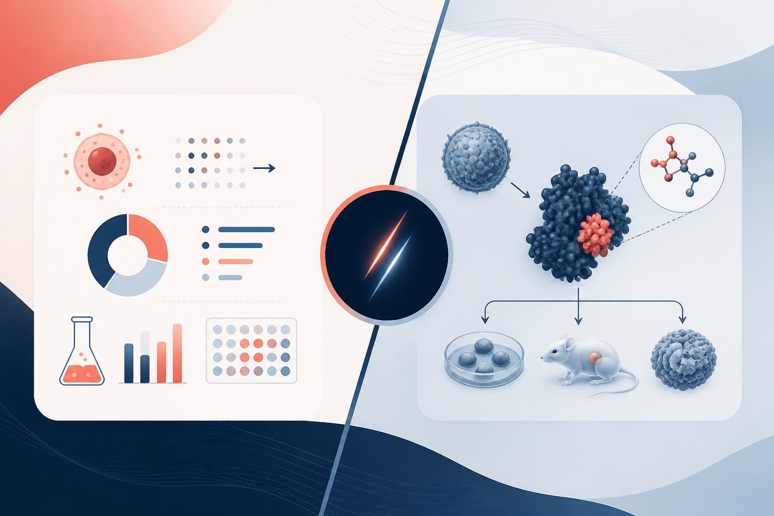
[IMAGE: Split screen showing a poorly designed graphical abstract with cluttered elements on the left versus a clean, professional graphical abstract meeting journal standards on the right]
Understanding What Makes a Graphical Abstract Journal-Ready
Journals don't just want pretty pictures. They need graphical abstracts that serve specific editorial and reader needs. Your visual summary must communicate your research's core message within seconds while adhering to strict technical specifications.
Most journals require graphical abstracts to tell a complete story without requiring readers to dive into the full paper. Think of it as a standalone piece of scientific communication, not just an illustration. The best graphical abstracts answer three fundamental questions: What problem did you investigate? How did you approach it? What did you discover?
Size specifications vary dramatically between publishers. Elsevier typically requires 531 x 1328 pixels, while Nature journals prefer different dimensions entirely. These aren't suggestions—they're hard requirements that determine whether your submission moves forward or gets bounced back for revision.
Color choices matter more than you might expect. Many journals still print in black and white, so your graphical abstract must remain clear and informative without color. This constraint forces you to rely on shape, size, and contrast rather than color coding alone.
Essential Components Every Graphical Abstract Needs
Successful graphical abstracts follow predictable patterns. They typically flow from left to right, mirroring how readers process information in Western publications. Your visual narrative should guide readers naturally from problem identification through methodology to conclusions.
Start with a clear representation of your research question or the biological/chemical/physical system you're studying. This opening element anchors readers and provides context for everything that follows. Avoid abstract concepts here—stick to concrete, recognizable elements that immediately communicate your field of study.
Your methodology section should be the meat of your graphical abstract. Show your experimental approach, computational methods, or analytical techniques using simplified but accurate representations. Readers should understand your basic approach without needing extensive technical background.
The results and conclusions section typically appears on the right side of your graphical abstract. This is where you showcase your key findings using charts, molecular structures, or conceptual diagrams. Keep the focus narrow—highlight only your most significant discovery, not every finding from your study.
[IMAGE: A well-structured graphical abstract showing the left-to-right flow from research question through methodology to key results, with clear visual hierarchy and professional typography]
Common Graphical Abstract Mistakes That Guarantee Rejection
We've reviewed thousands of graphical abstracts, and the same mistakes appear repeatedly. The most common error is cramming too much information into the available space. Researchers often try to summarize their entire paper visually, creating cluttered, unreadable messes that communicate nothing effectively.
Poor typography kills more graphical abstracts than any other single factor. Using multiple font families, inconsistent sizing, or fonts that become illegible when scaled down for print publication will get your submission rejected. Stick to clean, professional typefaces like Arial or Helvetica, and ensure all text remains readable at small sizes.
Another frequent mistake involves using low-resolution images or graphics that pixelate when published. Journals require high-resolution files that maintain clarity across different viewing contexts, from online browsing to print publication. Your beautiful molecular model becomes worthless if it appears as a blurry mess in the final publication.
Color dependency represents a subtle but serious problem. Many researchers create graphical abstracts that lose all meaning when printed in grayscale. Test your design by converting it to black and white—if critical information disappears, you need to redesign using shapes, patterns, or contrast instead of color alone.
Inconsistent visual styling within a single graphical abstract screams amateur to journal editors. Mixing different illustration styles, color palettes, or design approaches creates visual chaos that undermines your scientific credibility.
Step-by-Step Process for Creating Professional Graphical Abstracts
Begin by identifying the single most important message from your research. Not the three most important points, not a comprehensive summary—just one core insight that deserves highlighting. Write this message in one sentence, then use that sentence to guide every design decision that follows.
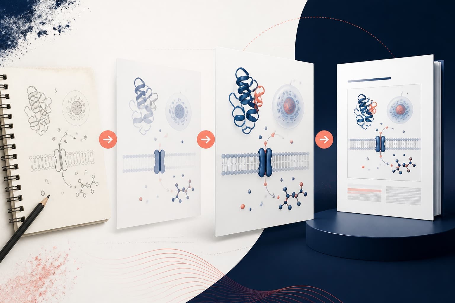
Sketch your initial concept on paper before touching any digital tools. This low-tech approach forces you to focus on essential elements without getting distracted by software capabilities. Your paper sketch should establish the basic flow and key components of your final design.
Choose your color palette carefully, limiting yourself to three or four colors maximum. Ensure these colors work well together and remain distinguishable when converted to grayscale. Professional color palette generators can help you select combinations that meet accessibility standards while looking polished.
Create your graphical abstract at the exact dimensions required by your target journal. Working at the correct size from the beginning prevents scaling issues that can destroy your careful typography and spacing decisions. Always work at high resolution—300 DPI minimum for print-quality output.
Typography deserves special attention during the creation process. Use font sizes large enough to remain readable when your graphical abstract is reduced for publication. Generally, nothing smaller than 10-point text should appear in your final design, and key labels should be considerably larger.
Test your design ruthlessly before submission. View it at different sizes, convert it to grayscale, and ask colleagues from outside your specific research area whether they can understand your main message. If smart people struggle to grasp your point within 30 seconds, your design needs work.
[IMAGE: A computer screen showing the step-by-step process of creating a graphical abstract, with sketch pad, color palette, and design software visible]
How AI Tools Transform Graphical Abstract Creation
Artificial intelligence has revolutionized how researchers approach visual communication. Modern AI tools can generate professional-quality graphics, suggest optimal layouts, and even help refine your core message for maximum impact. These technologies don't replace human creativity—they amplify it.
AI-powered design platforms understand journal requirements and can automatically format your graphical abstract to meet specific publisher specifications. This automation eliminates the tedious process of manually adjusting dimensions, resolution, and color profiles for different submission targets.
Natural language processing helps AI tools interpret your research abstract and suggest visual metaphors or representation strategies. While you maintain creative control, these suggestions often spark ideas that wouldn't occur through traditional brainstorming alone.
Smart typography features in AI design tools automatically adjust font sizes, spacing, and hierarchy to maintain readability across different viewing contexts. These systems understand the relationship between text size, viewing distance, and comprehension better than most human designers.
When you create with Graffiy, you're accessing AI capabilities specifically trained on scientific communication challenges. The platform understands the unique requirements of academic publishing while offering the design flexibility needed for cutting-edge research visualization.
According to research from the Nature Communications study on scientific visualization, papers with high-quality graphical abstracts receive significantly more citations and online attention than those with poor or missing visual summaries.
Journal-Specific Requirements You Must Know
Every major publisher has distinct graphical abstract requirements that can make or break your submission. Elsevier journals typically require horizontal layouts with specific pixel dimensions, while Springer Nature publications often prefer vertical orientations with different aspect ratios.
ACS publications have particularly strict guidelines about chemical structure representation and require specific file formats for submission. Their review process includes technical evaluation of your graphical abstract's compliance with publication standards, not just its scientific accuracy.
IEEE journals focus heavily on technical diagram clarity and often require graphical abstracts that can function as standalone technical illustrations. Their standards emphasize precision and reproducibility over aesthetic appeal, though both remain important.
Royal Society of Chemistry publications require graphical abstracts that highlight synthetic pathways or mechanistic insights prominently. Their editorial team specifically looks for visual elements that enhance understanding of chemical processes and molecular interactions.
Open access journals often have more flexible requirements but still maintain quality standards for visual elements. PLOS ONE, for example, encourages creative approaches while requiring adherence to basic readability and resolution standards.
Advanced Design Principles for Maximum Impact
Visual hierarchy determines whether readers can quickly extract meaning from your graphical abstract. Use size, contrast, and positioning to guide attention to your most important elements first. The human eye naturally follows predictable patterns—leverage these tendencies rather than fighting them.
White space isn't empty space—it's a powerful design tool that prevents visual overload and improves comprehension. Many researchers fear leaving areas unfilled, but strategic white space makes your key elements more prominent and your overall message clearer.
Consistency in visual style signals professionalism and attention to detail. Use the same line weights, corner radii, and spacing throughout your design. Small inconsistencies accumulate to create an overall impression of carelessness that undermines your scientific credibility.
Symbol choice requires careful consideration of your international audience. Avoid culturally specific icons or metaphors that might confuse readers from different backgrounds. Stick to universally understood scientific symbols and clear, literal representations.
Scale relationships within your graphical abstract should reflect the relative importance of different concepts or findings. Make your key discovery visually prominent while supporting elements remain clearly subordinate in the visual hierarchy.
[IMAGE: Before and after comparison showing a graphical abstract improved using advanced design principles, highlighting better visual hierarchy, white space usage, and consistent styling]
Quality Control and Final Submission Tips
Professional quality control prevents embarrassing rejections and ensures your graphical abstract enhances rather than detracts from your manuscript. Create a standardized checklist that covers technical specifications, visual quality, and content accuracy for every submission.
Test file compatibility across different viewing platforms before submission. What looks perfect on your high-resolution monitor might appear completely different on a tablet, smartphone, or when printed on standard office equipment. Cross-platform testing reveals problems you can fix before editors discover them.
Spell-checking becomes crucial when text elements are embedded in graphics rather than editable document text. A single typo in your graphical abstract is more visible and damaging than typos buried in paragraph text. Proofread every text element multiple times.
Version control matters when collaborating with coauthors or design professionals. Maintain clear naming conventions and track changes systematically to avoid submitting outdated versions that lack important corrections or improvements.
Final file preparation requires attention to technical details that many researchers overlook. Embed fonts, convert text to outlines when necessary, and verify that your submitted file contains all required elements at the specified resolution and color profile.
The submission process itself varies between journals, with some requiring separate graphical abstract uploads while others expect integration with manuscript files. Read submission guidelines carefully and follow the specified process exactly—editorial systems are often inflexible about format variations.
Remember that graphical abstracts serve multiple purposes beyond initial manuscript review. They appear in journal table of contents, social media promotions, and conference presentations. Design with these varied contexts in mind, ensuring your visual summary works effectively across different viewing situations and audience expertise levels.
Frequently Asked Questions
What file format should I use for my graphical abstract submission?
Most journals accept TIFF, PNG, or high-resolution JPEG files for graphical abstracts. Always check your target journal's specific requirements, as some publishers have strict preferences. Ensure your file is at least 300 DPI resolution and saved in RGB or CMYK color mode as specified.
How long should it take a reader to understand my graphical abstract?
An effective graphical abstract should communicate its main message within 15-30 seconds of viewing. If readers need longer than that to grasp your key finding, your design is too complex or unclear. Test your graphical abstract with colleagues outside your research area to verify comprehension speed.
Can I reuse the same graphical abstract for multiple journal submissions?
While the content can remain similar, you'll need to adjust dimensions, resolution, and sometimes layout to meet different journal requirements. Each publisher has specific technical specifications that must be followed exactly. It's worth creating journal-specific versions rather than trying to use one design everywhere.
Written by
Shobajo AbdulAzeez
Tags
Share this article