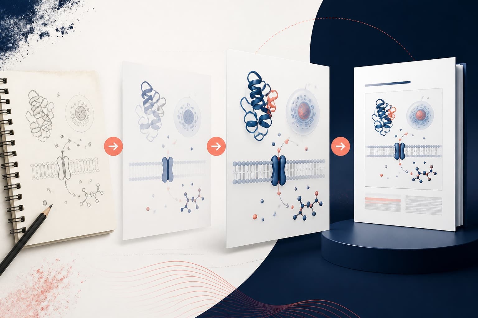
Infographic Style vs Diagram Style for Graphical Abstracts: Which Graphical Abstract Style Fits Your Research?
In This Article
Your research deserves clear, compelling visual communication. But when it comes to choosing the right graphical abstract style, you face a critical decision that will shape how your work reaches different audiences. Should you go with an infographic approach that emphasizes visual storytelling, or stick with a diagram style that prioritizes scientific precision?
The graphical abstract style you choose affects everything from journal acceptance to social media engagement. We see researchers struggling with this choice every day, often defaulting to whatever seems easier rather than considering their specific communication goals. This comparison will help you understand the trade-offs between infographic and diagram styles across three key contexts: academic journals, social media platforms, and public outreach efforts.

Understanding Infographic vs Diagram Graphical Abstract Styles
Infographic-style graphical abstracts prioritize visual hierarchy, color coding, and narrative flow. They often include icons, illustrations, and design elements that guide readers through a story. Think bold headers, numbered steps, and visual metaphors that make complex concepts immediately accessible.
Diagram-style abstracts focus on technical accuracy and scientific convention. They emphasize flowcharts, process diagrams, molecular structures, and data visualizations. The aesthetic is cleaner, more technical, and relies heavily on standard scientific symbols and notation.
Neither approach is inherently superior. The best choice depends entirely on your audience, platform, and communication objectives. However, many researchers miss opportunities by not considering these contextual factors when selecting their visual approach.
Journal Requirements and Editorial Preferences
Academic journals have become increasingly specific about graphical abstract requirements, and understanding these preferences is crucial for publication success. High-impact journals like Nature and Science tend to favor diagram-style abstracts that demonstrate scientific rigor and technical precision.
Cell Press journals explicitly encourage infographic approaches, stating in their author guidelines that graphical abstracts should tell a visual story. They want to see creative use of color, typography, and illustration to make research accessible to broader scientific audiences.
Medical journals often prefer hybrid approaches that combine diagnostic accuracy with visual appeal. They want clear anatomical representations but also appreciate design elements that help non-specialist readers understand clinical implications.

Engineering and chemistry journals typically lean toward diagram styles because their audiences expect technical schematics, molecular structures, and process flows. Adding too many infographic elements can actually reduce credibility in these fields.
The submission process also matters. Some journals provide specific templates or style guides, while others offer complete creative freedom. Always check the journal's requirements before you start designing, as reformatting a completed graphical abstract can be time-consuming and expensive.
Social Media Impact and Engagement Patterns
Social media platforms reward infographic-style graphical abstracts with significantly higher engagement rates. Twitter users are more likely to retweet visually appealing graphics that tell clear stories, even if they sacrifice some technical detail.
Instagram and LinkedIn favor graphical abstracts that work well in square or vertical formats. Infographic styles adapt better to these constraints because they can incorporate text overlays, step-by-step processes, and visual hierarchies that remain legible at small sizes.
However, diagram-style abstracts can perform well on platforms where your audience consists primarily of specialists in your field. Research communities on platforms like ResearchGate often prefer technical accuracy over visual polish.
The key is understanding platform-specific behavior patterns. Facebook users tend to engage more with graphics that include human elements or real-world applications. Twitter users appreciate concise visual summaries that can be understood in seconds. LinkedIn audiences respond well to graphics that clearly demonstrate practical or commercial implications.

Consider creating multiple versions of your graphical abstract for different platforms. You can maintain scientific accuracy while adapting visual elements to match platform preferences and audience expectations.
Public Outreach and Science Communication Goals
Public outreach demands infographic-style approaches almost exclusively. General audiences lack the specialized knowledge to interpret technical diagrams, molecular structures, or complex process flows. They need visual metaphors, familiar imagery, and clear narrative progression.
Science museums, educational websites, and public engagement initiatives consistently choose infographic styles because they bridge the gap between specialist knowledge and public understanding. The goal is not just to inform but to inspire curiosity and build scientific literacy.
Grant applications increasingly require public engagement components, and funding agencies want to see how you plan to communicate your research to taxpayer audiences. Infographic-style visuals demonstrate your commitment to broader impact and science communication.
However, oversimplification remains a constant risk. You need to maintain scientific accuracy while making concepts accessible. This requires careful balance between visual appeal and intellectual honesty about complex topics.
The most successful outreach graphics often use layered approaches, where initial visual appeal draws viewers in, but additional detail is available for those who want deeper understanding. Interactive elements, when possible, allow audiences to control their level of engagement with technical content.
Technical Execution and Design Considerations
Infographic-style abstracts require stronger design skills and more time investment. You need to consider typography, color psychology, visual hierarchy, and illustration techniques. Many researchers find this challenging because their training focused on content rather than visual design.
Diagram-style abstracts rely more on scientific accuracy and clear labeling. The design requirements are typically more straightforward, following established conventions for flowcharts, molecular diagrams, or process schematics.
Software choice affects your options significantly. Tools like Adobe Illustrator offer maximum flexibility for infographic creation but have steep learning curves. Specialized scientific software excels at diagram creation but may limit your infographic capabilities.

Budget considerations matter too. Professional infographic design often requires purchasing stock illustrations, premium fonts, or hiring design consultants. Diagram-style approaches can often be completed using institutional software licenses and standard scientific symbols.
Time investment varies considerably. Simple diagrams might take a few hours to complete, while comprehensive infographic-style abstracts can require days of design work. Factor this into your project timelines, especially when working toward publication deadlines.
You can create with Graffiy to streamline both approaches, using AI-powered tools that understand scientific content requirements while offering flexible design options for different contexts and audiences.
Making Your Style Decision: A Strategic Framework
Start by clearly defining your primary communication goal. Are you trying to get published in a specific journal, build social media engagement, or communicate with public audiences? Your answer should drive your style choice, not personal preferences or design trends.
Consider your audience's expertise level and expectations. Specialists in your field might prefer technical diagrams that demonstrate methodological rigor. General audiences definitely need infographic approaches that prioritize clarity and visual appeal over technical precision.
Evaluate your available resources honestly. Creating compelling infographic-style abstracts requires design skills, appropriate software, and significant time investment. If you lack these resources, a well-executed diagram might serve you better than a poorly executed infographic.
Think about longevity and reuse potential. Will you need to adapt your graphical abstract for multiple purposes over time? Infographic styles often translate better across different contexts, while technical diagrams may require complete redesign for different audiences.
Consider collaboration opportunities. Many institutions now offer design support services, and partnerships with graphic design students or science communication specialists can help you achieve infographic quality without developing those skills yourself.
Hybrid Approaches and Future Trends
The most successful researchers increasingly use hybrid approaches that combine the best elements of both styles. These graphics maintain scientific accuracy while incorporating visual storytelling techniques that broaden their appeal.
Interactive graphical abstracts represent an emerging trend, particularly for online publications. These allow viewers to toggle between simplified infographic views and detailed technical diagrams, serving multiple audience needs simultaneously.
Video abstracts are becoming more common, and they typically favor infographic-style approaches because motion graphics require clear visual hierarchies and narrative progression. Static diagrams rarely translate effectively to video formats.
Artificial intelligence tools are making high-quality design more accessible to researchers. These platforms can help bridge the skill gap that previously made infographic creation challenging for scientists without formal design training.
The trend toward open science and public engagement will likely favor infographic approaches in the coming years. Funding agencies and institutions increasingly expect researchers to communicate effectively with general audiences, not just academic peers.
Practical Implementation Tips
Start your design process by sketching rough concepts for both approaches. This helps you understand which style better serves your specific content and communication goals. Don't commit to a particular style until you've explored both options.
Create a content inventory before you begin designing. List your key messages, supporting evidence, and visual elements. This helps you determine whether your content naturally fits an infographic narrative structure or works better as a technical diagram.
Test your designs with representative audience members. Show infographic versions to non-specialists and diagram versions to field experts. Their feedback will help you understand whether your chosen approach effectively serves your intended audience.
Consider creating modular designs that can be adapted for different contexts. A core technical diagram might serve as the foundation for a more elaborate infographic, or an infographic might be simplified into a clean diagram for different publication requirements.
Keep accessibility in mind regardless of your chosen style. Use sufficient color contrast, include alt text for screen readers, and ensure your graphics remain legible when scaled down for different viewing contexts.
The most important factor in graphical abstract success is not the style you choose, but how well that style serves your specific communication goals and audience needs. Both infographic and diagram approaches can be highly effective when executed thoughtfully and strategically.
Frequently Asked Questions
Which graphical abstract style works better for high-impact journals?
It depends entirely on the journal's preferences and field conventions. Nature and Science tend to favor diagram-style abstracts that emphasize technical precision, while Cell Press explicitly encourages infographic approaches. Always check the specific journal's author guidelines before choosing your style.
How do I decide between infographic and diagram graphical abstract style for my research?
Consider your primary audience and communication goals first. If you're targeting specialists in your field, diagrams often work better. For broader audiences or public engagement, infographic styles are typically more effective. Also factor in your available design resources and timeline constraints.
Can I use the same graphical abstract for journals and social media?
While possible, it's often more effective to adapt your design for different platforms. Social media tends to favor infographic-style approaches with strong visual hierarchy, while some journals prefer technical diagrams. Consider creating variations optimized for each context rather than using a one-size-fits-all approach.
Written by
Shobajo AbdulAzeez
Tags
Share this article