
Tools & Resources
Canva vs Figma for labs: Template Speed or Systems Thinking?
Canva vs Figma for labs is not a simple popularity contest. The better choice depends on whether your team needs fast templates or a shared design system.
Canva vs Figma for labs is not a simple popularity contest. The better choice depends on whether your team needs fast templates or a shared design system.
BioRender Graffiy Inkscape is not a simple winner-takes-all comparison. The right workflow depends on how your lab balances speed, scientific assets, editing freedom, collaboration, and budget.
Annotated charts research helps your audience notice the finding, not just the figure. This guide shows how to use callouts and labels to make results clearer.
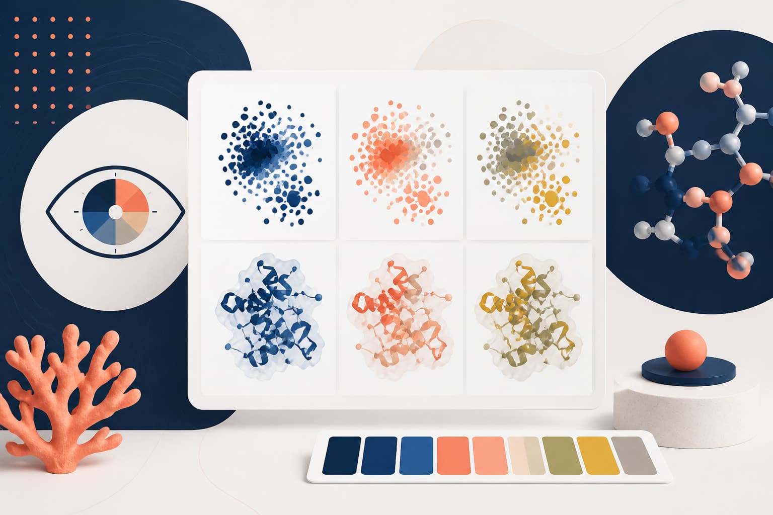
This practical guide shows researchers and teaching staff how to build colorblind safe scientific figures. Learn which color combinations to avoid and how to add cues that do not rely on color alone.

Good single cell figure design helps readers understand complex omics data quickly, without flattening the biology. This guide shows how to simplify dense visuals while keeping the evidence intact.

open science graphics are most useful when other researchers can copy, adapt, translate, and credit them without guessing. This guide shows how to create visual assets others can legally build on.
CC0 vs CC BY scientific images is a practical choice about how open your lab assets should be, and how much credit you want attached to reuse. This guide compares both licenses for figures, diagrams, icons, graphical abstracts, and educational visuals.

Health Icons transform complex medical concepts into clear visual communication, helping researchers and educators present scientific information more effectively.

A reusable lab figure asset library helps your team stop rebuilding the same icons, colors, and layouts from scratch. This guide shows PIs and lab managers how to standardize assets without slowing scientists down.

Free medical icons can make scientific figures and teaching slides clearer without slowing down your workflow. This guide compares practical sources for researchers and educators.
Creating accessible scientific figures ensures your research reaches all audiences, including those with visual impairments or color vision differences.
Master the art of writing clear, informative chart figure caption text that helps readers understand your data visualizations instantly.
Learn how to write effective multi panel figure caption descriptions using our structured template for clearer scientific communication.
These figure caption examples give you practical patterns for main results, methods diagrams, supplemental figures, and multi-panel layouts. Use them to make your manuscript figures easier to understand and review.
Understanding the difference between figure caption vs figure legend helps researchers communicate more precisely in academic publications.

An AI scientific poster can save hours when you use it to draft structure, language, and visuals. This tutorial shows how to move faster without outsourcing your scientific judgment.
Good poster figure design helps busy conference viewers understand your data before they read the fine print. This guide shows you how to build figures that explain themselves.
Strong conference poster sections help busy viewers understand your work in seconds. This guide shows you how to rewrite the intro, methods, results, and conclusions for quick scanning.
Choosing the right graphical abstract style between infographic and diagram approaches can make or break your research communication across different platforms.
This graphical abstract Inkscape tutorial shows researchers how to build a clean vector workflow, import icons, edit elements, and export publication-ready files.

An AI graphical abstract can speed up ideation and layout, but it should not replace scientific judgment. This guide shows you how to use AI responsibly from first prompt to final submission.

These graphical abstract examples show how clarity, flow, and visual hierarchy can turn dense research into a fast, memorable visual story.

AI research figures can help you turn complex data into clear visuals without learning design software. This tutorial shows a practical workflow from raw data to publication-ready output.

Learn how to write compelling figure captions that enhance your research manuscript and meet journal standards.