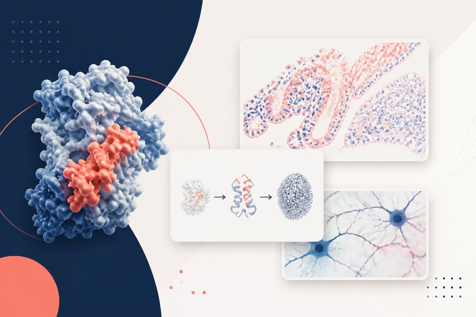
Figure Caption Examples for Results, Methods, and Supplemental Figures
In This Article
Clear figure caption examples can save you from one of the most common manuscript problems: figures that look polished but still need a translator. A good caption tells readers what they are seeing, how the data were generated, what comparison matters, and which details they need before checking the methods. It does not repeat the whole Results section. It does not hide essential information in tiny axis labels. It helps reviewers understand your evidence with less friction.
This guide is for researchers writing manuscripts, especially if you are assembling main results, methods diagrams, supplementary panels, or multi-panel figures. We will use reusable patterns, then adapt them with realistic examples. If you are also building the figure itself, you can create with Graffiy and draft the caption while the visual logic is still fresh.
Why strong captions matter in research manuscripts
Readers rarely move through a paper in a straight line. Many scan the abstract, inspect the figures, then decide whether the full argument is worth their time. Reviewers do the same, although they may not admit it. Your caption is therefore not a decoration. It is a compact guide to your evidence.
A strong caption does four things. First, it identifies the figure's main message without overstating the result. Second, it explains the visual components, including colors, symbols, panels, and abbreviations. Third, it gives enough methodological context to interpret the data. Fourth, it states statistical details where they are needed, including sample size, test, correction, and error representation.
Journal rules vary, so always check the target journal. The PLOS figure guidelines, for example, emphasize clear figure preparation and accessible presentation. The same mindset applies to captions. If the reader cannot understand the figure without hunting through the paper, the caption needs work.
One practical test helps: cover the Results text and read only the figure plus caption. Can a scientist in your field identify the experiment, the comparison, the measurement, and the main takeaway? If not, revise before submission.
Figure caption examples and the core caption pattern
The best figure caption examples follow a pattern, even when they look different across disciplines. You can think of the caption as a small stack of information, ordered from broad to specific. Start with the finding or figure purpose. Then describe the setup, define visual encodings, report sample size and statistics, and finish with notes that prevent confusion.
Use this general pattern for most manuscript figures:
- Short title sentence: State the main result or purpose of the figure.
- Context sentence: Say what was measured, modeled, imaged, or compared.
- Panel guide: Explain panels in order, especially for multi-panel figures.
- Visual key: Define colors, symbols, arrows, scale bars, and abbreviations.
- Quantitative details: Give n values, error bars, statistical tests, thresholds, and corrections.
- Clarifying note: Add exclusions, normalization rules, representative image details, or data availability notes if needed.
Here is a compact pattern you can adapt: Figure X. [Main finding]. [Measurement or experimental context]. [Panel descriptions]. [Visual encodings and abbreviations]. [Data are mean plus or minus SEM, n equals X, test name, adjusted P values if applicable].
That structure keeps you from writing captions that are either too thin or too bloated. It also reduces ambiguity around common reviewer questions, such as whether images are representative, whether n means cells or animals, and whether error bars show SD or SEM.
Main results captions: patterns and examples
Main results figures need captions that connect the visual evidence to the central claim. Be direct, but do not turn the caption into an argument your data cannot support. A useful title sentence names the outcome, not the method alone. Compare RNA sequencing results with Treatment A reduces inflammatory gene expression after 24 hours. The second version gives readers a reason to keep reading.
Pattern for a primary results figure:
Figure X. [Condition or intervention] changes [measured outcome]. [Samples, organisms, cells, participants, or datasets] were [treated, measured, sequenced, imaged, or modeled] under [conditions]. [Panel A] shows [overview or representative data]. [Panel B to D] quantify [specific outcomes]. Points represent [biological replicates, participants, or independent experiments]. Error bars indicate [SD, SEM, CI]. Statistical analysis used [test], with [correction if any].
Example for a biology manuscript:
Figure 2. Inhibition of kinase K reduces cytokine release in stimulated macrophages. Primary mouse macrophages were treated with vehicle or 2 micromolar inhibitor K for 1 hour before LPS stimulation. A, representative immunofluorescence images show nuclear NF-kappaB localization at 30 minutes. B, quantification of nuclear to cytoplasmic NF-kappaB intensity. C, ELISA measurements of IL-6 and TNF-alpha after 6 hours. Points represent independent animals, n equals 6 per group. Bars show mean plus or minus SEM. P values were calculated with two-sided Welch t tests.
Example for a clinical results figure:
Figure 3. Early mobility intervention is associated with shorter postoperative length of stay. Length of stay was compared between patients receiving standard care and patients enrolled in the mobility protocol. A, cohort flow diagram after exclusions. B, unadjusted length of stay by group. C, adjusted effect estimates from multivariable linear regression. Boxes show median and interquartile range, whiskers show 1.5 times the interquartile range, and points show individual patients. Models adjusted for age, baseline mobility score, procedure type, and comorbidity index.
Notice that both captions define what the points mean and where the sample size comes from. That matters. A plot with hundreds of cells may still represent three independent animals. If the caption hides that structure, reviewers will ask.
Methods diagram captions: make the workflow reproducible
Methods diagrams are not just visual summaries. They are maps of what happened, in what order, and with which inputs. The caption should explain the workflow enough for readers to connect the diagram with the Methods section. It should not carry every reagent concentration or software parameter, but it should define the steps and the meaning of arrows, boxes, and decision points.
Pattern for a methods diagram:
Figure X. Overview of the [experimental, computational, or analytical] workflow. [Input material or dataset] was processed through [major stages]. Boxes indicate [steps, datasets, or modules], arrows indicate [sequence, transfer, or dependency], and diamonds indicate [quality control or decision criteria]. Numbers indicate [sample counts, time points, or filtering results]. Full parameter details are provided in Methods.
Example for a computational workflow:
Figure 1. Overview of the single-cell RNA sequencing analysis workflow. Peripheral blood mononuclear cells were isolated from 18 participants and processed for droplet-based single-cell RNA sequencing. Raw reads were aligned to the GRCh38 reference genome, filtered for low-quality cells, normalized, clustered, and annotated using marker genes. Boxes represent analysis stages, arrows show data flow, and diamonds indicate quality control filters. Cell counts shown below each stage indicate the number retained after filtering.
Example for a laboratory protocol schematic:
Figure 1. Experimental design for testing temperature-dependent enzyme activity. Purified enzyme was incubated with substrate at five temperatures before fluorescence measurement at 10-minute intervals. The schematic shows sample preparation, incubation, plate reading, and normalization to the 25 degrees Celsius control. Colored wells indicate temperature groups. Each temperature condition included four technical replicates per independent enzyme preparation.
For methods diagrams, avoid captions that say only Study workflow. That tells readers almost nothing. Mention the input, the major process, and the output. If your figure includes filtering, randomization, blinding, or exclusions, the caption should identify where those actions occur.
Multi-panel figure captions: keep readers oriented
Multi-panel figures often carry the main weight of a manuscript. They can also become confusing fast. The caption needs a clean panel-by-panel path. A good multi-panel caption should make the figure feel intentional, not like six smaller figures squeezed together.
The title sentence should describe the shared claim across panels. Then define each panel in sequence. Use panel letters consistently. If panels share samples, conditions, or statistical tests, say that once. If they differ, state the difference clearly.
Pattern for a multi-panel figure:
Figure X. [Shared conclusion across panels]. A, [what panel A shows and why it matters]. B, [what panel B quantifies]. C, [what panel C compares]. D, [validation, secondary analysis, or mechanistic test]. [Shared sample size and visual definitions]. [Statistics and error bars].

Example for a multi-panel mechanistic figure:
Figure 4. Loss of protein P disrupts mitochondrial organization and reduces cellular respiration. A, representative confocal images of mitochondria in control and protein P knockdown cells. B, quantification of mitochondrial branch length from three independent experiments. C, oxygen consumption rate measured during sequential addition of oligomycin, FCCP, and rotenone plus antimycin A. D, maximal respiration calculated from the assay in C. Scale bar, 10 micrometers. Each point represents an independent culture. Bars show mean plus or minus SD. P values were calculated by one-way ANOVA with Tukey correction.
Example for a multi-panel materials science figure:
Figure 5. Annealing temperature alters film morphology and improves charge transport. A, scanning electron microscopy images of films annealed at 80, 120, and 160 degrees Celsius. B, grain size distribution measured from 12 images per condition. C, current density-voltage curves for representative devices. D, extracted mobility values from 15 devices per condition. Scale bars, 500 nanometers. Boxes show median and interquartile range. Statistical comparisons used Kruskal-Wallis tests followed by Dunn correction.
Be careful with the word representative. If you use it, say what it represents. For example, representative of three independent experiments with similar staining patterns is stronger than representative image. It also sounds more transparent.
Supplementary figure captions: give enough context without repeating the paper
Supplementary figures are often where important controls, robustness checks, additional panels, and extended methods live. Treat them with respect. A weak supplementary caption can make valid supporting data feel like an afterthought.
Supplementary captions should be more self-contained than many authors expect. Readers may open a supplemental PDF separately from the main article. They need enough context to understand the purpose of each panel, especially for controls and additional cohorts.
Pattern for supplemental figures:
Supplementary Figure X. [Control, validation, additional analysis, or extended result]. [Brief context linking the figure to the main analysis]. [Panel descriptions]. [Sample size, normalization, statistical method, and definitions]. [If applicable, state how the result supports or differs from the main figure].
Example for a supplemental control:
Supplementary Figure 2. Knockdown efficiency and cell viability controls for protein P experiments. A, immunoblot showing protein P abundance in cells transfected with control or protein P siRNA. B, densitometric quantification normalized to beta-actin. C, cell viability measured 48 hours after transfection. Data are from three independent experiments. Bars show mean plus or minus SD. P values were calculated with two-sided Welch t tests.
Example for supplemental robustness analysis:
Supplementary Figure 4. Sensitivity analyses using alternative normalization methods. Gene expression changes from the primary dataset were recalculated using upper-quartile normalization and trimmed mean of M values normalization. A, correlation between log2 fold changes from the primary and alternative pipelines. B, overlap of genes passing the adjusted P value threshold of 0.05. C, pathway enrichment results for genes significant in both pipelines.
Do not write supplemental captions as if nobody will read them. Reviewers often inspect them closely because controls live there. If a supplementary panel answers a possible criticism, the caption should make that answer easy to find.
Caption details reviewers look for
Many caption problems are not about style. They are about missing information. Reviewers ask for the same details because they affect interpretation. The table below summarizes common caption elements and when to include them.
| Caption element | When to include it | Example wording |
|---|---|---|
| Sample size | Whenever data are quantified | n equals 8 mice per group, unless otherwise indicated. |
| Replicate type | When technical and biological replicates differ | Points represent independent donors, not technical wells. |
| Error bars | For bar, line, and point summary plots | Error bars indicate 95 percent confidence intervals. |
| Statistical test | When significance markers or P values appear | P values were calculated using two-sided Mann-Whitney tests. |
| Scale bars | For microscopy, histology, maps, and spatial images | Scale bar, 20 micrometers. |
| Abbreviations | When labels are not universally obvious | ECM, extracellular matrix. ROI, region of interest. |
As a rule, define error bars every time. Do not assume readers know whether they show SD, SEM, or confidence intervals. Also define n precisely. In animal studies, n may mean animals. In cell imaging, n may mean fields, cells, cultures, or donors. Those are not interchangeable.
Significance symbols also need decoding. If your plot uses asterisks, the caption should state the thresholds. For example: *P less than 0.05, **P less than 0.01, adjusted for multiple comparisons. Better yet, include exact P values where the journal allows them.
Common caption mistakes and how to fix them
The first common mistake is writing a caption that only names the figure type. Boxplots of biomarker concentration is not enough. Fix it by adding the comparison and sample context: Biomarker concentration is higher in patients with severe disease than in patients with mild disease.
The second mistake is overloading the caption with interpretation. Captions should guide readers, not replace the Results section. Avoid long causal claims unless the figure directly tests causality. A caption can say is associated with, correlates with, or is reduced after treatment when those phrases match the design.
The third mistake is hiding methods that affect interpretation. Normalization, exclusion thresholds, model adjustment, and image selection criteria often belong in captions. You do not need every procedural detail, but you should include the ones that change how the reader interprets the visual.
The fourth mistake is inconsistent panel language. If panel A is a schematic, panel B is a representative image, and panel C is quantification, say so. Readers should not have to infer which panel supports which part of the claim.
Finally, avoid undefined abbreviations. A crowded figure already asks a lot from the reader. Do not make them search the manuscript for labels like TIL, DMS, MFI, UMAP, or ROI. Define them in the caption when they first appear.
A final checklist before submission
Before you submit, read each caption as a standalone object. Ask whether it identifies the finding, the system, the measurement, the visual encodings, the sample size, and the statistics. If any answer is no, revise.
Then check consistency across the manuscript. Use the same terms for groups, treatments, time points, and abbreviations. If the Results section says vehicle, the caption should not suddenly say control compound unless you define the relationship. Consistency reduces reviewer friction.
Also check that captions and figures agree. Mismatched colors, missing panel letters, incorrect scale bars, and outdated sample sizes are surprisingly common in late drafts. They are also easy to prevent with one slow pass through the final figures.
The strongest figure caption examples are not flashy. They are precise, complete, and easy to scan. They respect the reader's time. More importantly, they help your evidence stand on its own, which is exactly what a manuscript figure should do.
Frequently Asked Questions
What should every scientific figure caption include?
Every scientific figure caption should include the figure purpose or main result, enough context to understand the experiment or analysis, definitions for visual elements, sample size, and statistical details when relevant. For images, include scale bars and explain whether images are representative. For graphs, define error bars and what each point represents.
Can I reuse these figure caption examples in my manuscript?
Yes, you can use these figure caption examples as patterns, but adapt them to your study design and journal requirements. Replace generic wording with your actual sample type, measurement, group names, replicate structure, and statistical tests. The goal is not to copy a caption, but to preserve the logic that makes it clear.
How long should a figure caption be for a research paper?
A figure caption should be as long as needed to make the figure understandable without repeating the Results section. Simple single-panel figures may need 50 to 100 words, while complex multi-panel figures may need 150 to 300 words. If the caption becomes much longer, consider whether some details belong in the Methods or supplementary information.
Written by
Shobajo AbdulAzeez
Tags
Share this article