10 graphical abstract examples that get the message across fast
In This Article
When you study graphical abstract examples, the goal is not to copy a style. The goal is to understand how strong scientific visuals make one message clear quickly. A good graphical abstract tells the reader where to look first, what happens next, and why the finding matters. It removes decoration that does not help the science.
This list breaks down 10 graphical abstract examples by clarity, flow, and visual hierarchy. The patterns apply to papers, posters, grant summaries, conference slides, lab websites, and educational material.

What the best graphical abstract examples have in common
The best graphical abstract examples share three traits. First, they focus on one message, not every result. Second, they use a reading path that feels natural, usually left to right or top to bottom. Third, they make the main finding visually dominant through size, contrast, placement, or color.
A graphical abstract is not a compressed poster. It is closer to a visual sentence. You need a subject, an action, and a result. If your design includes every assay, cohort, statistical detail, and caveat, the reader will slow down. That is not a reader problem. That is a design problem.
Journal guidance can help set expectations. Elsevier describes graphical abstracts as visual summaries that help readers quickly understand a manuscript's main findings. Their graphical abstract guidance is a useful reference when preparing a submission.
10 graphical abstract examples to inspire your next paper
1. The mechanism pathway example
A mechanism pathway graphical abstract works when your paper explains how a biological, chemical, or physical process happens. The strongest version shows a starting molecule, cell, tissue, material, or condition on the left, then a small number of arrows leading to the outcome on the right. It does not try to become a full pathway map.
Clarity comes from choosing the mechanism your paper proves best. Flow comes from consistent arrows and spacing. Hierarchy comes from making the key intervention, protein, reaction, or regulatory step more visible than the supporting pieces. If everything is the same size, the reader cannot tell what is new.
2. The before and after intervention example
This is one of the most useful graphical abstract examples for translational research, clinical studies, materials science, and environmental work. The layout is simple: condition before intervention, intervention in the center, and changed outcome on the right. Readers understand the structure quickly because it mirrors a familiar story.
To make it strong, show only the most meaningful contrast. If your claim is reduced inflammation, do not crowd the design with every biomarker. Use color with discipline. Red can suggest stress or disease, while blue or green can suggest recovery, but the meaning should be obvious from labels and context.
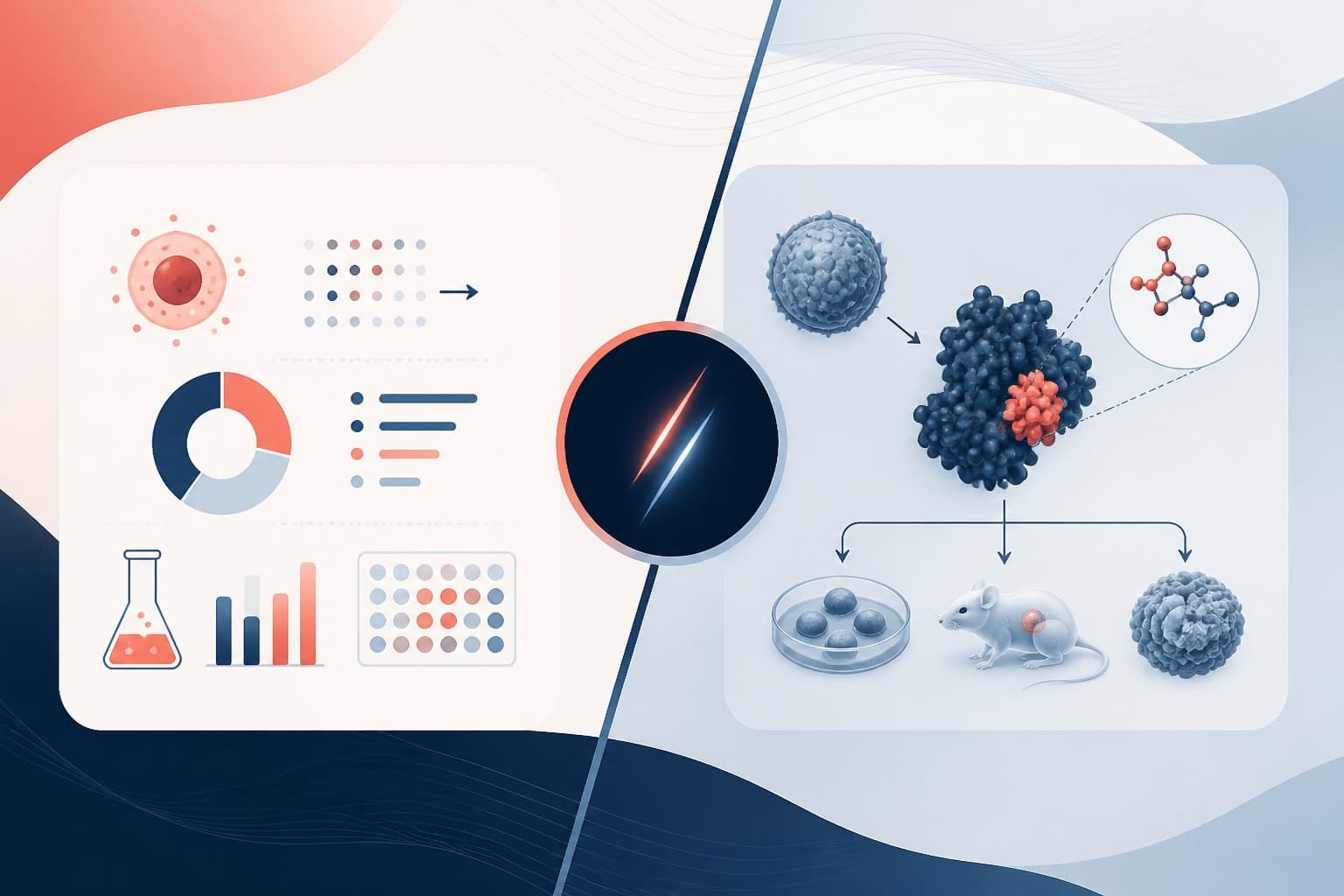
3. The comparison panel example
A comparison panel is ideal when your study tests two models, materials, treatments, or conditions. The most readable version uses two parallel columns. Each column has matching visual components, so readers compare without hunting. Symmetry is useful here because it lowers mental effort.
The main design risk is overcrowding. Researchers often add too many subpanels because the study produced many results. Instead, pick the decisive comparison. Use matched icons, aligned labels, and one highlighted difference. A comparison abstract should feel like a visual verdict, not a figure dump.

4. The workflow pipeline example
Workflow graphical abstract examples are common in bioinformatics, diagnostics, imaging, AI methods, and experimental protocols. They work when the novelty is the process itself. Clean layouts use numbered steps, short labels, and repeated visual containers. Each step should feel connected but not cramped.
A good workflow abstract answers three questions fast: what goes in, what happens, and what comes out. For example, patient samples might enter the pipeline, pass through sequencing and analysis, then produce a predictive signature. Make the output stronger than the intermediate steps, because the endpoint is what readers should remember.
5. The central discovery example
Some papers have one result that deserves the center. This format places the main discovery as the largest visual element, then arranges a few supporting inputs around it. It can work well for a new nanoparticle, receptor, biomarker, model organism, device, or imaging technique.
The central discovery format depends on restraint. Do not surround the main element with a ring of tiny details. Use three or four callouts at most. The hierarchy should say, “This is the discovery, and these are the reasons to trust it.” That structure helps readers retain the claim.
6. The problem to solution example
This example is useful when your paper solves a known limitation. The left side shows the problem, such as low sensitivity, poor stability, limited delivery, weak signal, or high toxicity. The middle introduces your method. The right side shows the improved outcome.
Strong problem to solution designs are emotionally clear without becoming dramatic. The problem side can look fragmented, faded, or noisy. The solution side can look organized and high contrast. That visual contrast helps the reader feel the advance before reading every label. Still, avoid cartoon exaggeration that overstates the evidence.
7. The scale transition example
Many studies connect events across scales, from molecule to cell, cell to tissue, or organism to ecosystem. A scale transition abstract makes that movement explicit. It might start with a molecular interaction, zoom out to cellular behavior, then show the system level consequence.
The key is to use scale as the organizing principle. Do not mix levels randomly. A clean zoom sequence, nested circles, or stacked panels can help readers follow the logic. Hierarchy should emphasize the final biological, clinical, or environmental meaning, not only the smallest mechanistic detail.
8. The method validation example
Method validation graphical abstract examples are common when the paper presents a new assay, sensor, computational model, or imaging approach. The story is not only that the method exists. The story is that it performs better, faster, cheaper, or more accurately under defined conditions.
The most effective structure shows the method, the validation test, and the performance result. Use a simple chart shape, checkmark, or output panel to communicate validation. Avoid packing the abstract with full numerical datasets. If one number is central, make it prominent and give it enough context.
9. The cause and consequence example
This format works when your research explains how one event triggers downstream effects. It is common in immunology, neuroscience, toxicology, climate science, and cell biology. The design usually begins with a stimulus, shows a cascade, then ends with a measurable consequence.
Good cause and consequence visuals need careful arrow discipline. Every arrow should mean something specific. If arrows indicate activation, inhibition, transport, and correlation all at once, the reader will not know what to believe. Use different arrow styles only when needed, and make their meaning clear.
10. The clinical translation example
Clinical translation graphical abstract examples show how a discovery could move from bench to patient care. A common structure is discovery, validation, clinical application. This format is useful for biomarkers, therapeutic targets, diagnostics, and treatment strategies.
The strongest clinical translation visuals are honest about stage. If your work is preclinical, do not imply an approved treatment. Show animal models, cell systems, or early patient cohorts clearly. Visual trust matters. A polished abstract should make your work easier to understand, not make the claim larger than the evidence.
How to judge clarity, flow, and visual hierarchy
When researchers ask whether a graphical abstract is good, we look at three things before style. Can a reader describe the message after five seconds? Does the eye move in the right order? Is the most important element clearly dominant? If the answer is no, prettier icons will not fix it.
Use this quick assessment before submission.
| Design test | What to check | What to fix |
|---|---|---|
| Clarity | Can one sentence explain the visual? | Remove secondary findings and shorten labels. |
| Flow | Does the eye know where to go next? | Add spacing, step numbers, or directional structure. |
| Hierarchy | Does the main finding stand out first? | Increase size, contrast, position, or visual weight. |
| Consistency | Do similar elements look similar? | Standardize icon style, line weight, and label format. |
One useful test is to show your abstract to someone outside your project. Give them five seconds, then ask what they remember. If they recall the method but not the finding, your hierarchy may be upside down. If they recall a decorative detail but not the result, your decoration is competing with your science.
Common mistakes these examples help you avoid
The first mistake is trying to include the whole manuscript. Your graphical abstract should not replace the paper. It should invite the right reader into the paper. Choose the most important claim, then design around that claim.
The second mistake is using arrows as decoration. Arrows should communicate sequence, cause, movement, or transformation. If an arrow does not clarify the relationship between two elements, remove it. Empty arrows create false confidence and visual clutter.
The third mistake is equal weighting. Researchers often make every object similar in size because every detail feels important. Readers do not experience it that way. They need visual order. Large, central, high contrast elements feel important. Small, pale, peripheral elements feel secondary. Use that psychology deliberately.
The fourth mistake is label overload. Labels should be short enough to scan. Use noun phrases and active terms. Instead of “Evaluation of the effect of compound X on inflammatory signaling,” try “Compound X reduces inflammation.” The second version is easier to read and remember.
Design patterns worth borrowing from strong graphical abstract examples
Across strong graphical abstract examples, several patterns repeat. A three part structure is common because it matches how research stories are told: input, process, output. Another pattern is the visual contrast between control and treatment. A third is the central hero element, where the main discovery anchors the layout.
You can also borrow hierarchy tricks. Put the main result near the center or right side, because many readers interpret that position as the conclusion. Use one accent color for the main finding, not five accent colors for everything. Keep supporting icons smaller and quieter. Alignment matters more than most people think.
Typography should be simple. Use a clean typeface, consistent label sizes, and enough spacing around text. If labels touch icons or arrows, the design feels rushed. If your graphical abstract will appear small on a journal page, test it at thumbnail size. A beautiful full screen design can fail when reduced.
Color should carry meaning, not just mood. If red means disease in one panel, do not use red for treatment success elsewhere. If green means activation, keep that meaning consistent. Good color systems reduce cognitive load. Random color systems make readers translate your design while trying to understand the science.
How to adapt these ideas with Graffiy
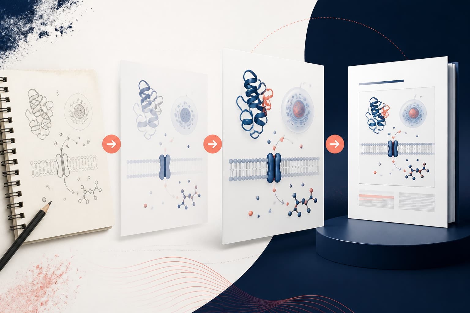
If you are starting from a blank page, choose the example type that matches your paper first. Do not start with icons. Start with the story shape. Is it a mechanism, comparison, workflow, intervention, or translation? Once that is clear, the design decisions become easier.
Graffiy is built for researchers who need scientific visuals without wrestling with generic design tools. You can create with Graffiy to explore layouts, scientific icon styles, and visual structures that fit your research message. We think the best tool should help you make better decisions, not just make prettier objects.

Before finalizing, reduce the abstract by 10 percent. Remove one label, one arrow, or one decorative icon. Then check whether the message is stronger. It often is. Scientific design improves when every element has a job.
A quick checklist before you submit
- One message: Communicate the primary finding, not the full discussion section.
- Readable flow: Make the reading path obvious without verbal explanation.
- Clear hierarchy: Make the main discovery the first thing people notice.
- Consistent symbols: Treat similar concepts in similar ways.
- Short labels: Use direct phrases that support the image.
- Evidence matched to claim: Do not imply more than the study supports.
Use these graphical abstract examples as starting points, not templates you obey blindly. Your science has its own structure. The abstract's job is to make that structure visible. If a reader can understand the question, action, and result in seconds, you are on the right track.
A strong graphical abstract is not the most detailed version of your research. It is the clearest visual promise of what the reader will learn.
The practical takeaway is simple. Pick the story shape, remove anything that distracts from the central message, and design the hierarchy before polishing the style. That is how graphical abstracts get attention for the right reason: they make the science easier to understand.
Frequently Asked Questions
What makes graphical abstract examples effective?
Effective graphical abstract examples focus on one main message, use a clear reading path, and make the key result visually dominant. They also avoid unnecessary labels, decorative arrows, and crowded figure like panels.
How many elements should I include in a graphical abstract?
Most graphical abstracts work best with three to seven major visual elements. If you need more, group related items into simple sections so the reader still sees a clear structure. The goal is fast comprehension, not complete experimental detail.
Can I use these examples for journal submission inspiration?
Yes, but you should always check the target journal's graphical abstract requirements before submitting. Use the examples as design patterns for clarity, flow, and hierarchy, then adapt them to match your study and the journal's technical specifications.
Written by
Shobajo AbdulAzeez
Tags
Share this article