
Tools & Resources
Canva vs Figma for labs: Template Speed or Systems Thinking?
Canva vs Figma for labs is not a simple popularity contest. The better choice depends on whether your team needs fast templates or a shared design system.
Canva vs Figma for labs is not a simple popularity contest. The better choice depends on whether your team needs fast templates or a shared design system.

Figma for scientists turns out to be a remarkably capable tool for producing polished lab graphics, figures, and presentation assets. This guide walks research teams through collaboration features, reusable components, and templates that actually save time.
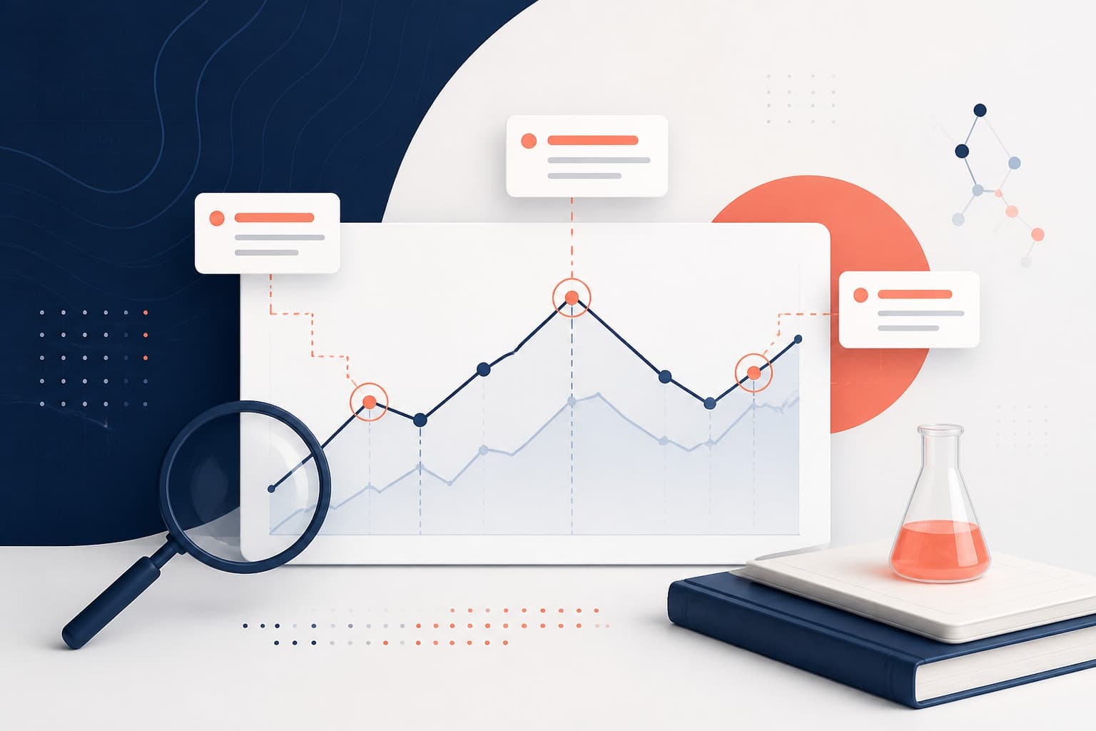
Annotated charts research helps your audience notice the finding, not just the figure. This guide shows how to use callouts and labels to make results clearer.
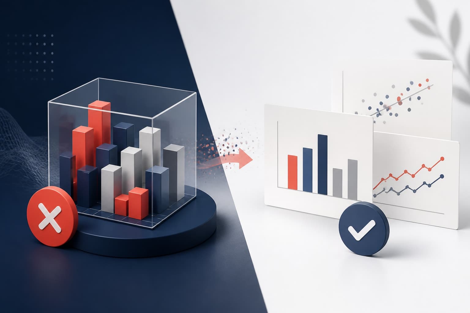
A 3D chart research figure can make a slide look polished, but it usually makes the data harder to read. Here is why flat, precise visuals win in research presentations.
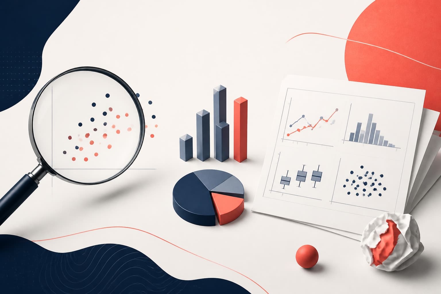
These data visualization mistakes research authors make can weaken clear findings and slow down review. Use this practical list to fix scales, legends, labels, and figure choices before submission.

This guide explains figure legend attribution for authors reusing icons, maps, and adapted visuals, with exact wording editors can understand.
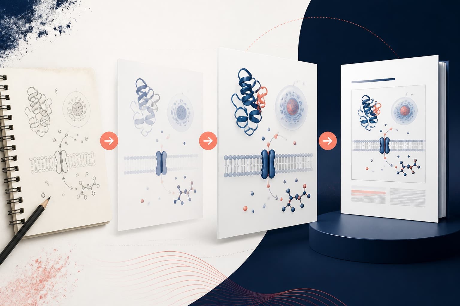
Transform your chaotic design process into a systematic graphical abstract workflow that moves smoothly from rough sketches to publication-ready visuals.

Finding the right graphical abstract icons can make or break your research visualization, and these free libraries offer quality options without breaking your budget.

A review article graphical abstract should not look like a single experiment summary. This guide shows how to design one around structure, comparisons, and concept clarity.
This graphical abstract Inkscape tutorial shows researchers how to build a clean vector workflow, import icons, edit elements, and export publication-ready files.

An AI graphical abstract can speed up ideation and layout, but it should not replace scientific judgment. This guide shows you how to use AI responsibly from first prompt to final submission.
Creating an effective graphical abstract color palette requires balancing visual impact with scientific clarity and accessibility.
Getting graphical abstract dimensions right is crucial for journal submission. We break down publisher requirements into simple, actionable export rules.

These graphical abstract examples show how clarity, flow, and visual hierarchy can turn dense research into a fast, memorable visual story.

This guide shows lab managers and PI accounts how to design social media for research labs with clearer visuals, stronger branding, and less wasted effort.

While Canva for scientists offers accessible design tools, it has significant limitations for research visuals that dedicated scientific platforms handle better.