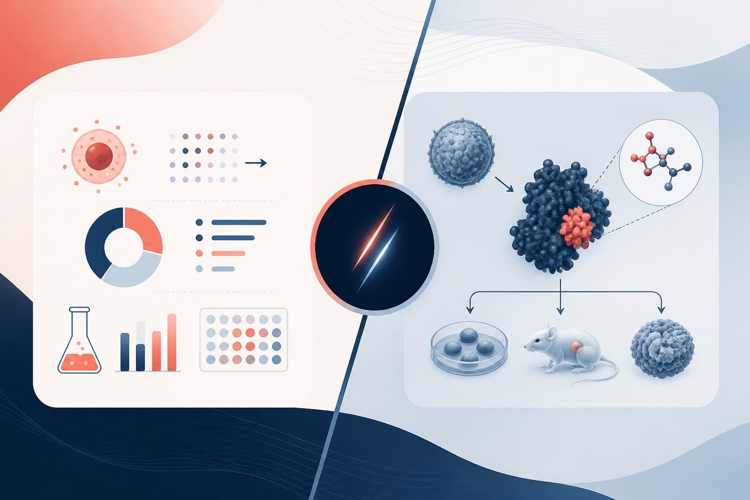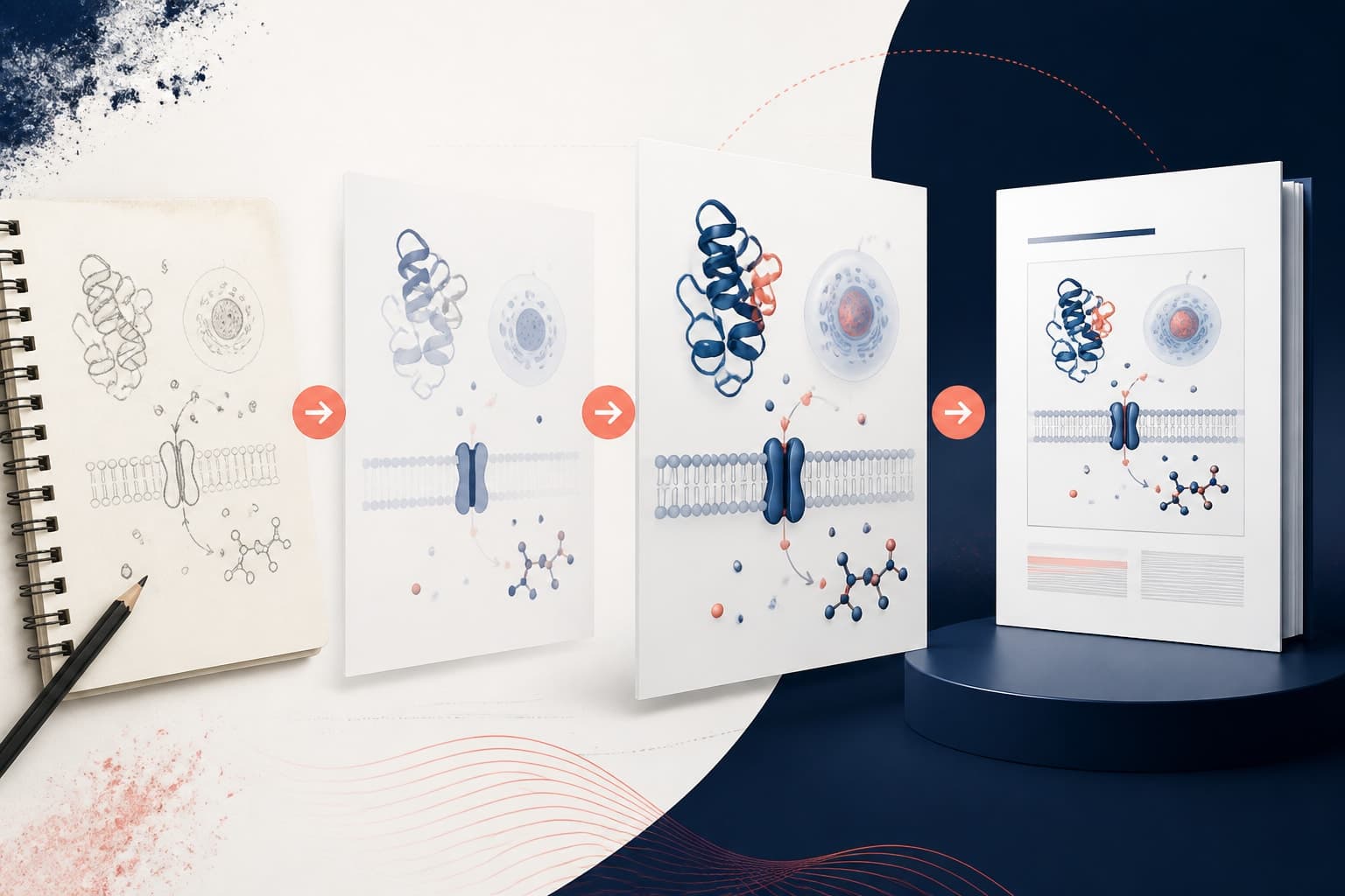
How to Make a graphical abstract Inkscape Tutorial for Researchers
In This Article
Why use Inkscape for a graphical abstract?
A graphical abstract Inkscape workflow is a practical choice when you need clean vector art without paying for a design suite. Inkscape is open source, works on major operating systems, and gives you control over paths, icons, text, color, and export formats. That matters when a journal asks for a specific width, resolution, or file type.
The goal is not to make a poster full of decoration. A graphical abstract should explain one core research message in seconds. Inkscape helps because every shape stays editable. You can resize icons, adjust arrows, recolor pathways, and export a sharp file for submission.
This tutorial is for researchers who want an open source workflow. We will build the structure, import scientific icons, edit vector elements, and export the final artwork. If you want an AI assisted starting point before refining your design, you can also create with Graffiy and use the result as a visual direction.
Plan the message before opening Inkscape
Before you draw anything, write one sentence that describes the finding. Keep it specific. For example, “Nanoparticle coating improves tumor uptake by reducing macrophage clearance” is stronger than “New nanoparticles improve cancer therapy.” Your graphical abstract should support that sentence, not compete with it.
Next, choose a simple structure. Most scientific graphical abstracts fit one of four patterns: process, comparison, mechanism, or workflow. A process shows steps over time. A comparison shows control versus treatment. A mechanism shows cause and effect. A workflow shows experimental stages, such as sample collection, sequencing, analysis, and validation.
For a graphical abstract Inkscape project, sketch three to five visual blocks on paper first. Do not start with ten panels. Most journals display graphical abstracts at small sizes, so dense layouts fail quickly. If a label is unreadable when zoomed out, remove it or simplify it.
Set up your document and canvas
Open Inkscape and create a new document. Go to the document properties panel and set the page size required by your target journal. If you do not have journal rules yet, a wide rectangle is a safe starting point. Try 1200 by 675 pixels for a digital abstract, or 180 by 100 millimeters for a print aware layout.
Set display units to pixels or millimeters and keep them consistent. Turn on the page border so you can see the submission area. Then enable a grid or guides. Guides help you align panels, arrows, icons, and labels without guessing.
Use margins. A common beginner mistake is placing text too close to the edge. Leave at least 5 percent of the canvas width as breathing room. Journals may crop thumbnails, and a little empty space makes the figure look more confident.
Create a background rectangle the size of the page. Fill it with white or a very pale neutral color. Lock this layer. Then create separate layers for background elements, icons, arrows, and text. Layers are not just organizational. They prevent accidental edits when your file becomes crowded.
Build a graphical abstract Inkscape vector workflow
A strong graphical abstract Inkscape workflow starts with large shapes, then moves to details. First, block out the visual path. Use rectangles, circles, or soft rounded boxes for major sections. Arrange them left to right if you are showing a process. Use top to bottom if your story has inputs, analysis, and outputs.
Keep the layout obvious. Readers should know where to look first. If you use arrows, make their direction consistent. If you use a central mechanism, place the main interaction in the middle and keep supporting details around it.
Use the rectangle tool for panels and the ellipse tool for cells, particles, organs, or droplets. Hold the control key to draw perfect circles. Use the node tool when you need to edit curves. Inkscape paths are powerful, but they can get messy. Convert only when needed.
For arrows, draw a line with the Bezier tool or pencil tool, then apply a marker at the end in the stroke settings. Keep arrowheads simple. Oversized arrowheads make scientific figures look cartoonish. Thin arrows disappear in thumbnails, so test the design at small scale.
Use a limited color palette. Pick one main color, one accent color, and one neutral color family. For example, blue for treatment, orange for response, and gray for context. If you use red and green, check color accessibility. Many readers have trouble distinguishing those colors.
The official Inkscape tutorials are a useful reference if you need more detail on paths, fills, strokes, and object operations. Learn the basics once, and you will reuse them in every graphical abstract Inkscape file.
Import icons without making a messy file
Scientific icons save time, but they need to be handled carefully. You can import SVG icons, PDF elements, or cleaned vector exports from other tools. SVG is usually best because it remains editable. Avoid low resolution PNG icons unless they are only temporary placeholders.
To import an icon, use File, Import, then choose your SVG or PDF. Inkscape may ask how to handle the file. For SVG icons, keep them editable. For PDFs, choose the page and import method that preserves text and vectors when possible.
After importing, immediately check the size, grouping, and colors. Many icons arrive as grouped objects. Use Object, Ungroup to access individual parts. You may need to ungroup more than once. Do not ungroup everything blindly, though. Keep complex icons grouped after editing so the file stays manageable.
Icons from different sources often clash. One might have thick outlines, another might use gradients, and another might be flat. Standardize them. Set similar stroke widths, use matching colors, and remove unnecessary shadows. A consistent icon style is one of the fastest ways to make a graphical abstract look professional.
When importing scientific symbols, keep accuracy ahead of style. A mitochondrion should not look like a bacterium. A lipid nanoparticle should not look like a generic bubble if the structure matters. Your audience will notice. Clean design helps, but scientific trust comes first.
Edit icons, paths, and text like a scientist designer
Once your icons are imported, edit them to fit the story. Select an icon and use the fill and stroke panel to change colors. Use the align and distribute panel to line up repeated items. Use duplicate instead of copy and paste when you want consistent spacing. Duplicate keeps your workflow fast.
If an icon contains too much detail, simplify it. Remove extra internal lines, tiny labels, and decorative highlights. In a graphical abstract Inkscape file, details should support recognition. They should not make the image noisy.
Use path operations for custom shapes. Union combines shapes. Difference subtracts one shape from another. Intersection keeps only the overlapping area. These tools are useful for clipping a microscope field, making partial cells, or creating clean cutaway diagrams.
Text deserves special attention. Use one readable typeface, preferably a sans serif font. Keep labels short, such as “Drug loaded NP,” “Macrophage uptake,” or “Tumor accumulation.” Avoid full sentences inside the artwork. If you need a sentence, your layout is probably doing too much.
Set a clear text hierarchy. The main finding can be larger. Process labels should be medium. Minor annotations should be smaller, but still readable. As a quick test, zoom out until the canvas is thumbnail size. If a label becomes gray fuzz, increase size or remove it.
Use alignment tools constantly. Select objects, choose a reference, then align left, center, top, or middle. Manual alignment looks fine while you work, but small errors become obvious in the final export. Clean alignment reduces visual friction.
Use layers, groups, and naming to stay sane
As the figure grows, organization matters. Put each major stage of the abstract into a group. Name important layers clearly, such as “background,” “cells,” “arrows,” “labels,” and “legend.” You do not need perfect file hygiene, but you do need to find things quickly before a deadline.
Lock finished parts. If your background, title, or panel grid is complete, lock that layer. This prevents the classic problem where you try to move an arrow and accidentally shift the whole canvas.
Keep an editable master file. Save it as an SVG before exporting anything. If you need to submit a PNG, TIFF, or PDF, export from the master. Never flatten your only working file. Journal revisions happen, and you will thank yourself later.
| Task | Best Inkscape tool | Practical tip |
|---|---|---|
| Align panels | Align and Distribute | Use one reference object for consistent spacing. |
| Edit icon color | Fill and Stroke | Apply your palette across all icons. |
| Create custom diagrams | Path operations | Duplicate objects before destructive edits. |
| Prepare export | Export panel | Check size, DPI, and background before submission. |
Export your graphical abstract for journals
Export is where many good figures lose quality. First, save the editable SVG. Then check the journal instructions. Some journals request TIFF at 300 DPI. Others accept PDF, EPS, SVG, JPG, or PNG. Requirements differ, so do not guess.
For raster export, open the export panel and choose the page as the export area. Set the pixel dimensions or DPI based on the journal requirement. Use PNG if you need a clean digital version. Convert to TIFF only if the journal specifically asks for it, using a reliable image tool after export if needed.
For vector export, PDF is often the safest option. Before exporting to PDF, consider converting text to paths if the journal system may not preserve fonts. Keep a separate editable version with live text. Once text becomes paths, editing labels is slower.
Check the background. Transparent backgrounds can create surprises in submission systems. If the journal wants a white background, include a locked white rectangle behind everything. Also check that thin white lines do not appear between shapes after export.
Open the exported file outside Inkscape. Use a PDF reader, browser, or image viewer. Look for missing icons, shifted text, wrong colors, and jagged edges. Then view it at the approximate size readers will see. If the thumbnail works, the full size version will usually work too.
Quality checklist before submission
Before you upload, review the figure as a reader, not as the person who made it. Ask whether the main message is clear within five seconds. If it is not, reduce complexity. Clarity beats cleverness in scientific design.
- One main message: The visual should support a single research claim or process.
- Readable labels: Text should remain legible at journal preview size.
- Consistent icon style: Match stroke width, color style, and level of detail.
- Logical flow: Arrows and grouping should guide the eye naturally.
- Accurate science: Simplification is fine, but misleading biology, chemistry, or methods are not.
- Correct export: File type, size, DPI, and background should match the journal rules.
It also helps to ask a colleague outside your immediate project to interpret the abstract. Do not explain it first. Show the image and ask what they think is happening. Their confusion is useful. It tells you where to simplify labels, reorder panels, or strengthen visual cues.
When you refine a graphical abstract Inkscape design, make changes in passes. First fix the science. Then fix layout. Then fix colors and labels. Finally export. Jumping between all four at once slows you down and creates avoidable mistakes.
A simple workflow you can reuse
Here is a reliable process for your next graphical abstract Inkscape project. Start with the message sentence. Sketch the structure. Set up the canvas. Build large panels. Import icons. Standardize icon style. Add arrows and labels. Test at small size. Export according to the journal rules.
This workflow is not fancy, and that is the point. Researchers do not need a bloated design process. You need a repeatable method that produces clear, editable, publication ready figures.
Inkscape gives you control, but it also rewards restraint. Use fewer colors, fewer labels, and fewer visual effects than you think you need. Let the science do the heavy lifting. The design should make the finding easier to understand, not louder.
If you want to move faster, begin with a structured concept from Graffiy, then refine the vector details in Inkscape. That combination works well for researchers who want both speed and control. A good graphical abstract Inkscape workflow should feel calm, editable, and easy to revise when reviewer comments arrive.
Frequently Asked Questions
Can I make a graphical abstract Inkscape file for journal submission?
Yes, Inkscape can create editable vector artwork suitable for many journal graphical abstract requirements. Always check the target journal rules for size, file type, color mode, and resolution before exporting.
What file format should I export from Inkscape?
Save your master file as SVG first so it stays editable. For submission, export PDF for vector quality when accepted, or PNG and TIFF when the journal requests raster images.
How do I import scientific icons into Inkscape without losing quality?
Use SVG icons when possible because they remain editable and scale cleanly. After importing, ungroup only as needed, standardize stroke widths and colors, then regroup edited icons to keep the file organized.
Written by
Shobajo AbdulAzeez
Tags
Share this article