9 data visualization mistakes research figures often make
In This Article
The most common data visualization mistakes research figures make are rarely about fancy aesthetics. They are about trust. If a reviewer has to guess what a scale means, chase a legend across panels, or decode weak labels, your figure is doing unnecessary damage to your argument. Good scientific visuals should reduce effort, not add it.
This list focuses on practical fixes authors and reviewers can apply before a manuscript moves forward. We will look at misleading scales, cluttered legends, weak labels, poor chart choices, and a few smaller problems that quietly make figures harder to evaluate.

1. Misleading scales that exaggerate the result
Scale problems are the fastest way to lose reviewer confidence. A truncated axis can make a modest change look dramatic. A stretched axis can make a real effect look tiny. Neither helps the reader judge the evidence fairly.
Bar charts are especially risky when the y axis does not start at zero. If the bars encode magnitude, cutting the axis changes the visual ratio between groups. A small numerical difference can look like a large visual difference. That does not mean every axis must start at zero, but it does mean the choice needs to match the encoding.
For line charts, scatter plots, and plots of change over time, a nonzero baseline may be acceptable. Even then, you should signal it clearly. Use explicit axis values, avoid awkward cropping, and mention the scale choice in the caption if it affects interpretation.
A strong review comment is simple: would the conclusion still feel the same if the axis used a more neutral range? If the answer is no, the figure needs revision.
2. Unequal axes across panels
Multi-panel figures often compare groups, conditions, time points, or tissues. When each panel uses a different axis range, visual comparison becomes unreliable. The reader may think one condition varies more than another, when the difference comes from scaling rather than data.
This is one of the subtler data visualization mistakes research reviewers catch when they inspect panels side by side. It happens because software auto-scales each plot separately. Auto-scaling is convenient during exploration, but it can be misleading in final figures.
Use shared axes when panels are meant to be compared directly. If shared axes would hide important variation, use a clear visual cue and explain it. For example, note that each panel has an independent y axis. Better yet, add a summary panel that supports fair comparison.
Authors should check this before submission. Reviewers should ask whether the visual comparison matches the statistical comparison. If the manuscript claims condition A has stronger variability than condition B, the axes must support that claim honestly.
3. Cluttered legends that force readers to hunt
A legend is not a puzzle key. If readers must bounce between a crowded legend and the data marks, the figure becomes slow to read. This is especially frustrating in manuscripts with small panels, dense scatter plots, and many experimental groups.
Cluttered legends often appear when authors use too many colors, shapes, line styles, or group names. The figure may technically contain all information, but the reader pays for it with attention. That is a poor trade.
Whenever possible, label data directly. Put group names near the lines they describe. Place condition labels beside clusters or panels. If direct labels would overlap, simplify the design before adding a massive legend.
Legends work best when they are short, close to the data, and ordered to match the visual order in the plot. If the top line is the treatment group, the first legend item should also be the treatment group. Small alignment choices reduce cognitive load.
4. Weak labels that assume too much
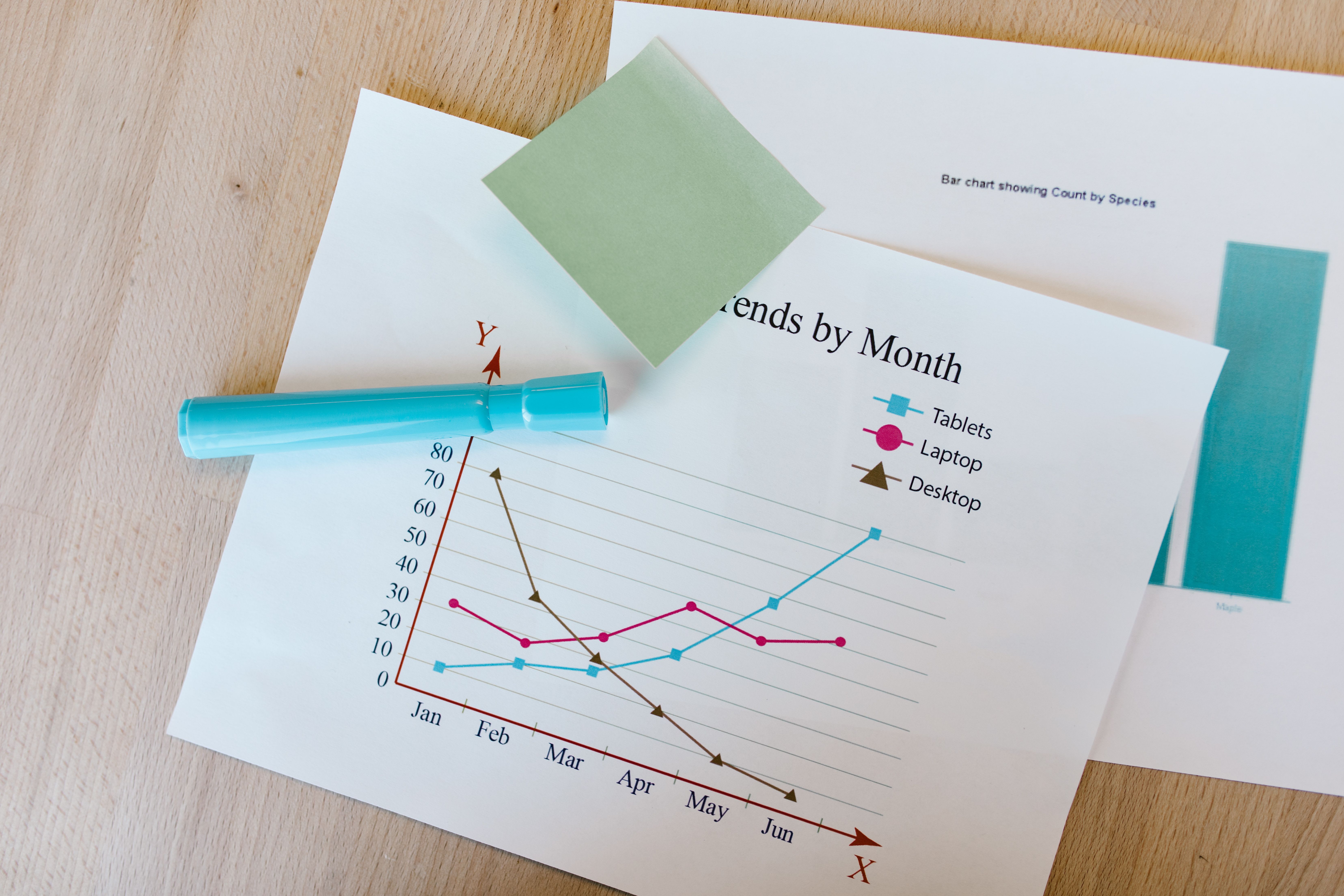
Weak labels are one of the most common sources of confusion in research figures. Axis labels such as “value,” “score,” or “response” do not say enough. Reviewers should not need to search the methods section to understand the basic measurement.
A good label names the variable, unit, and transformation when relevant. “Gene expression” is better than “value.” “log2 normalized expression” is better still, if that is what the axis shows. For physical measurements, include units every time.
Panel labels also matter. Letters such as A, B, and C are useful for citation, but they are not descriptions. Add short panel titles that state the comparison or measurement. Readers should understand the figure structure within seconds.
Captions should not rescue vague labels. The caption can add context, sample size, method detail, and statistical notes. The figure itself should still carry the essential meaning. If the axis label cannot stand alone, strengthen it.
5. Chart types that hide the actual data
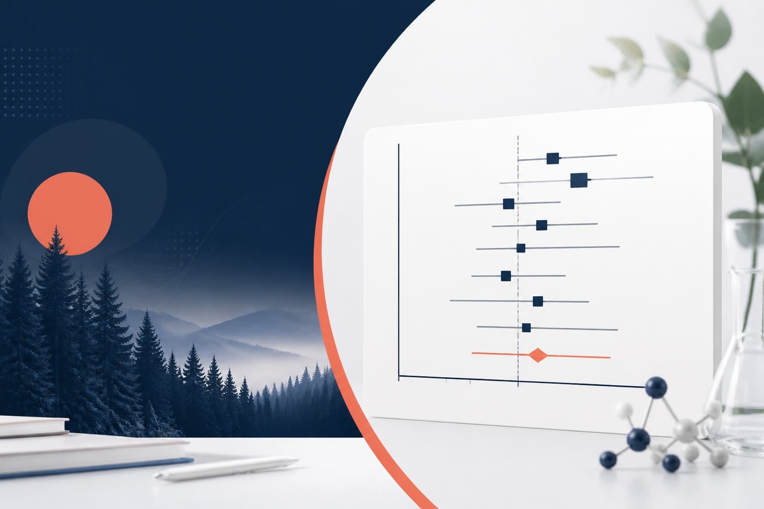
Some chart types summarize too aggressively. Bar charts with error bars are common in biomedical and behavioral research, but they often hide sample size, distribution shape, outliers, and clustering. The mean may be correct, yet the figure can still be uninformative.
For small to moderate sample sizes, show the raw data when possible. Use dot plots, jittered points, box plots, violin plots, or estimation plots. These choices help readers see whether an effect is driven by most observations or by a few extreme values.
The American Statistical Association and many visualization researchers have argued for clearer display of uncertainty and distributional structure. A useful external reference is the PLOS Computational Biology article Ten Simple Rules for Better Figures, which remains a practical guide for scientific authors.
This does not mean bar charts are banned. They can work for counts, proportions, and categorical summaries. The problem is using them as a default for every continuous outcome. Choose the chart that shows the evidence, not the one your lab has always used.
6. Color choices that confuse or exclude readers
Color should carry meaning with discipline. Too many palettes in one figure make it hard to identify groups. Red and green combinations can exclude readers with common forms of color vision deficiency. Low contrast colors can disappear in print or on projectors.
Use color for the most important distinction. Use shape, line style, position, or direct labels as backup. If a figure only works when color is perceived perfectly, it is fragile.
A practical test is to convert the figure to grayscale. If the main comparison disappears, revise the encoding. Another test is to view the figure at final publication size. Colors that look distinct on a large monitor may merge when reduced to a journal column.
Be consistent across the manuscript. If blue means control in Figure 1, do not make blue mean treatment in Figure 3. Consistency helps reviewers build a visual memory of the study.
7. Missing sample sizes and uncertainty
Figures that show effects without sample size and uncertainty ask readers to trust too much. A clean point estimate is not enough. Reviewers need to know how much data supports the estimate and how variable the measurement is.
Include sample sizes in the figure, caption, or both. If sample sizes vary by group, show them near the relevant labels. Do not bury them in supplementary methods unless the main figure would truly become unreadable.
Uncertainty should match the analysis. Use standard deviation to describe spread among observations. Use standard error or confidence intervals to describe uncertainty around an estimate. Label these choices clearly because they are not interchangeable.
This is another area where data visualization mistakes research authors make can distort interpretation without obvious intent. A tiny error bar may look persuasive, but it means different things depending on how it was calculated.
8. Overloaded panels with too many messages
A figure should have a job. Many research figures try to show mechanism, validation, time course, subgroup analysis, and statistical summary in one crowded panel. The result is a visual traffic jam.
When a figure has too many messages, reviewers struggle to identify the primary claim. They may also miss supporting evidence because the layout makes every element compete for attention. More content does not always mean more clarity.
Break complex findings into a clear sequence. Use one panel for the experimental setup, one for the primary result, and one for supporting analysis. Keep related comparisons close together. Move secondary details to supplementary figures when they are not central to the claim.
White space is not wasted space. It is a tool that separates ideas. A well-spaced figure often looks more credible because it lets the evidence breathe.
9. Inconsistent styling across the manuscript
Inconsistent styling may seem cosmetic, but it affects comprehension. When fonts, axis treatments, colors, line weights, and label formats change from figure to figure, readers must relearn the visual system each time.
Use a simple figure style guide for the manuscript. Decide on font size, axis line weight, color palette, panel label placement, and statistical annotation format. Then apply those choices consistently.
This is especially important for authors working across teams. Different software tools can create mismatched visuals. One panel may come from R, another from GraphPad, another from Python, and another from an illustration tool. Without a final harmonization pass, the figure set can look patched together.
If you want a faster way to create polished research visuals and maintain consistency, you can create with Graffiy. We built Graffiy for researchers who need scientific figures, visual abstracts, and educational visuals without wrestling every label into place by hand.
10. Statistical annotations that are vague or noisy
Asterisks are familiar, but they are often overused. A figure covered in brackets and stars can look important while saying very little. Reviewers still need to know what test was used, what comparison was made, and what the effect size looks like.
Use statistical annotations sparingly. Mark only comparisons that support the figure’s message. If every pairwise comparison appears, the visual hierarchy collapses.
Whenever possible, pair p values with effect sizes and confidence intervals. A significant result with a tiny effect may not matter scientifically. A non-significant result with a wide interval may simply be underpowered. Good visualization makes these distinctions easier to see.
Put detailed statistical methods in the caption or methods section. The visual annotation should guide the reader, not replace the analysis.
11. Captions that do not explain the figure
A caption should answer the first questions a reviewer will ask. What is being measured? What are the groups? How many samples are included? What do the symbols, lines, colors, and error bars mean? What statistical test supports the comparison?
Weak captions create friction. They force readers to jump between the figure, methods, results, and supplementary files. That slows review and increases the chance of misunderstanding.
Write captions after the figure is nearly final, not before. Then read the figure without the main text. If the caption and visual cannot explain the core message together, revise both.
Do not use the caption to make claims the figure cannot support. A caption should clarify evidence, not exaggerate it. This matters because data visualization mistakes research reviewers flag often come from the gap between what the visual shows and what the text claims.
12. Accessibility and export problems
A figure can be analytically sound and still fail in production. Tiny text, low resolution, poor contrast, and rasterized labels can ruin an otherwise strong visualization. Authors often catch these issues too late, after submission formatting compresses the figure.
Export figures at the required size and resolution. Check the journal guidelines before final assembly. Use vector formats for line art when allowed. Keep text editable as long as possible, and avoid screenshots of plots.
Print the figure or view it at actual size. If axis labels are hard to read, reviewers will notice. If symbols overlap, increase spacing or simplify the plot. If a color boundary is unclear, adjust contrast.
Accessibility is not extra polish. It is part of scientific communication. The figure should work for readers with different devices, vision profiles, and reading contexts.
Quick reviewer checklist for data visualization mistakes research figures
Use this checklist before submission or during review. It is deliberately practical. A figure does not need to be beautiful to pass, but it must be honest, readable, and aligned with the claim.
- Scale: Are axes honest, labeled, and comparable where comparison is intended?
- Legend: Can labels be placed directly on the figure instead of hidden in a crowded key?
- Labels: Do axes include variable names, units, and transformations?
- Data: Are raw observations, distributions, sample sizes, and uncertainty visible where needed?
- Color: Does the figure still work in grayscale and for readers with color vision deficiency?
- Consistency: Do panels and figures use the same visual rules across the manuscript?
- Caption: Does the caption define symbols, groups, sample sizes, error bars, and tests?
The best fix is not decoration. It is alignment. The visual design, statistical analysis, caption, and manuscript claim should all point in the same direction. When they do, reviewers can focus on the science instead of repairing the figure in their heads.
Final thoughts
Most data visualization mistakes research authors make are fixable before submission. Misleading scales, cluttered legends, and weak labels are not minor style issues. They shape how evidence is perceived.
As an author, your goal is to make the strongest honest version of the result. As a reviewer, your goal is to protect readers from confusion and overstatement. Better figures help both sides. They make peer review clearer, publication smoother, and the science easier to trust.
Frequently Asked Questions
What are the most common data visualization mistakes research reviewers notice first?
Reviewers often notice misleading scales, inconsistent axes across panels, cluttered legends, and labels that omit units or transformations. These problems make it harder to judge whether the visual evidence supports the manuscript claim.
Should every research figure axis start at zero?
No, not every axis must start at zero. Bar charts usually need a zero baseline because bar length represents magnitude, while line charts and scatter plots may use tighter ranges when clearly labeled. If the scale choice could change perception, explain it in the caption.
How can authors fix cluttered legends in scientific figures?
Start by labeling groups directly near the data when space allows. Reduce the number of colors, order legend items to match the plot, and move nonessential details into the caption. If a legend still feels crowded, the figure may be trying to show too many groups at once.
Written by
Shobajo AbdulAzeez
Tags
Share this article