A data visualization checklist for research manuscripts
In This Article
Why a data visualization checklist belongs in your manuscript workflow
A data visualization checklist is not busywork. It is a practical safeguard against figure problems that can weaken a strong manuscript. Before submission, your charts should help reviewers understand the evidence quickly, not make them guess what changed, what was measured, or whether a visual pattern is real. Good figures reduce friction. They make your methods easier to follow, your results harder to misread, and your argument more convincing.

Researchers often polish the text for weeks, then treat figures as final because they were generated by the analysis software. That is risky. Default plots are rarely manuscript ready. They may use vague axis labels, cramped legends, unnecessary colors, or scales that hide important variation. The goal of this guide is simple: review chart choice, labels, scales, colors, annotations, captions, and accessibility before you submit.
If you want to redesign or refine scientific figures faster, you can create with Graffiy and turn rough results into clearer visual communication. Still, software cannot replace judgment. Use the checklist below as your final pass before a coauthor review, journal submission, conference abstract, or preprint.
The data visualization checklist for research manuscripts
Use this data visualization checklist after statistical analysis is complete but before figures are exported. It works best when you review each figure in context, next to the results paragraph, methods description, and caption. A chart that looks beautiful in isolation can still fail if it does not answer the manuscript question.
Start by asking one direct question: what should the reader learn from this figure in ten seconds? If the answer is unclear, the figure is not ready. The best manuscript figures usually have a single primary message, supported by enough detail for scrutiny. They are not decorative summaries. They are visual evidence.
Here is the high level checklist:
- Chart choice: Does the figure type match the data structure and scientific question?
- Labels: Are variables, units, groups, and statistical summaries clearly named?
- Scales: Are axes honest, consistent, and appropriate for the measurement?
- Colors: Do colors encode meaning without causing confusion?
- Annotations: Are key findings highlighted without cluttering the chart?
- Captions: Can the figure be understood without hunting through the manuscript?
- Accessibility: Can readers with different visual abilities still interpret the result?
This sequence matters. Do not start with color palettes. If the chart type is wrong, a better palette only makes the wrong chart prettier. First confirm the figure answers the research question. Then improve readability, emphasis, and accessibility.
Check chart choice against the research question
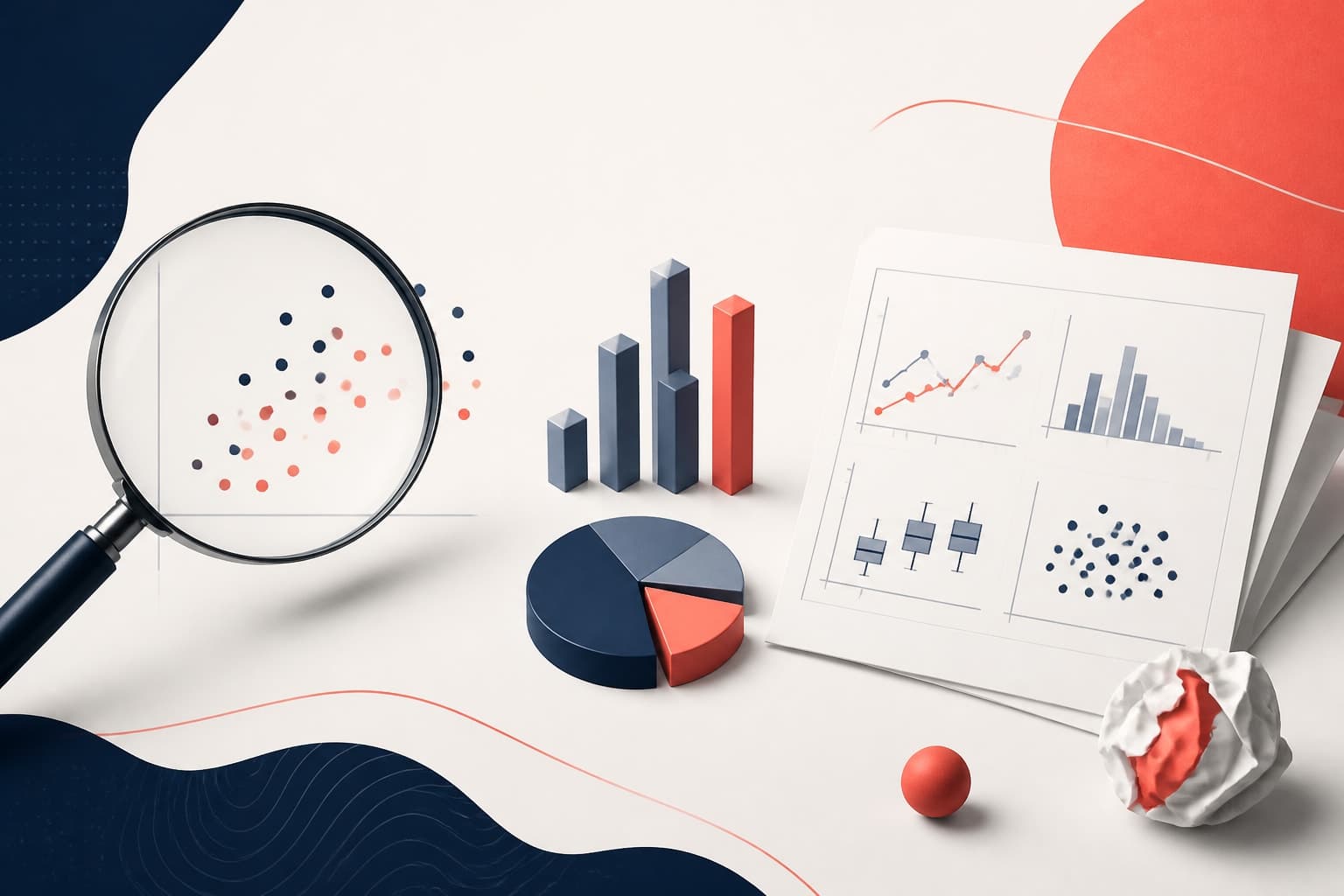
Chart choice is the first and most important checkpoint. A mismatch between data and chart type can create false confidence or unnecessary confusion. For example, bar charts are often used for continuous distributions, but they hide sample size, spread, skew, and outliers. If your claim depends on distributional differences, use a box plot, violin plot, dot plot, raincloud plot, or histogram instead.
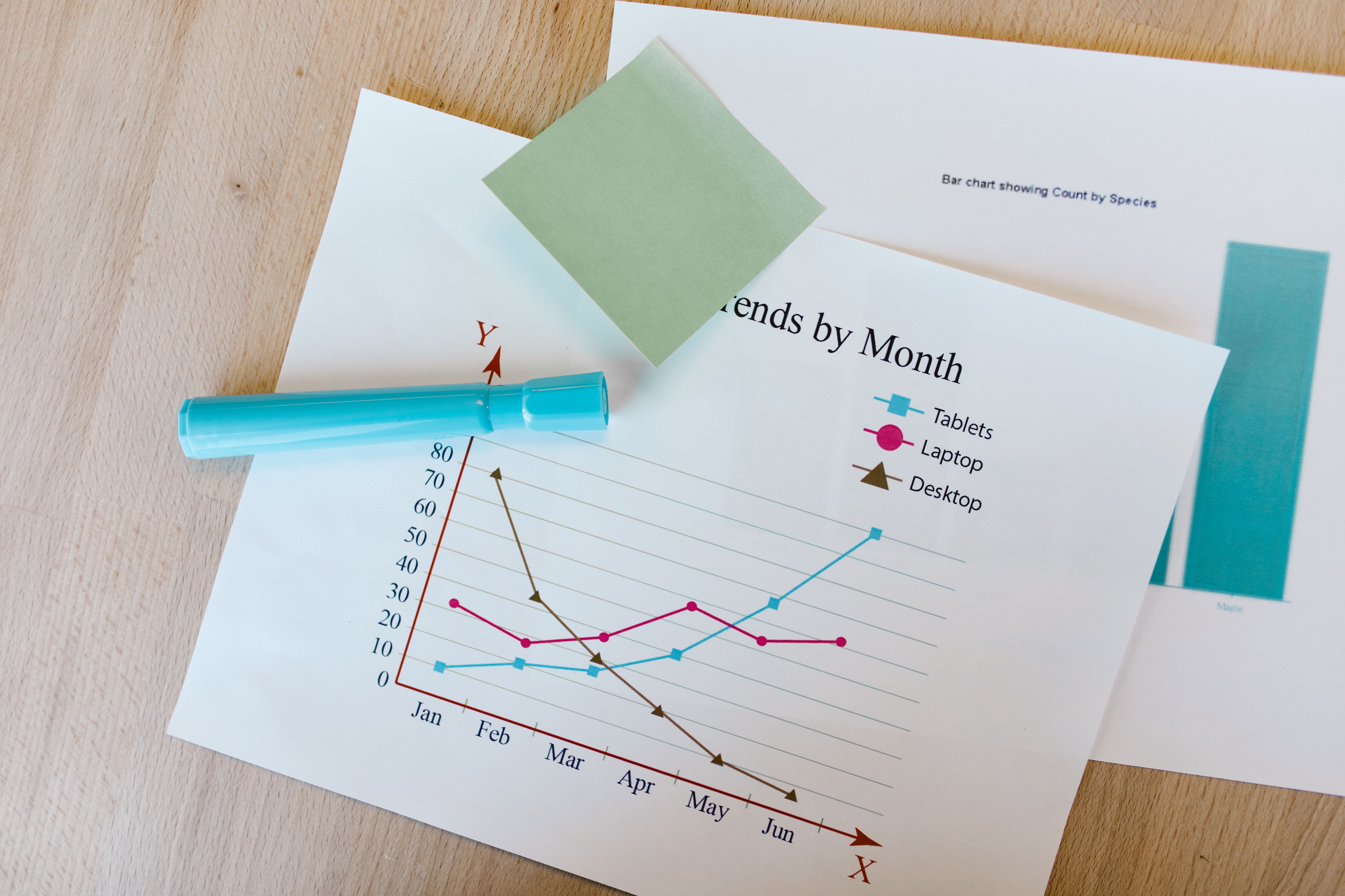
For comparisons between groups, show individual data points when sample sizes are modest. Add summary statistics only when they support the message. For time series, use line charts when observations are ordered and connected meaningfully. For independent categories, avoid connecting points with lines unless the sequence has scientific meaning.
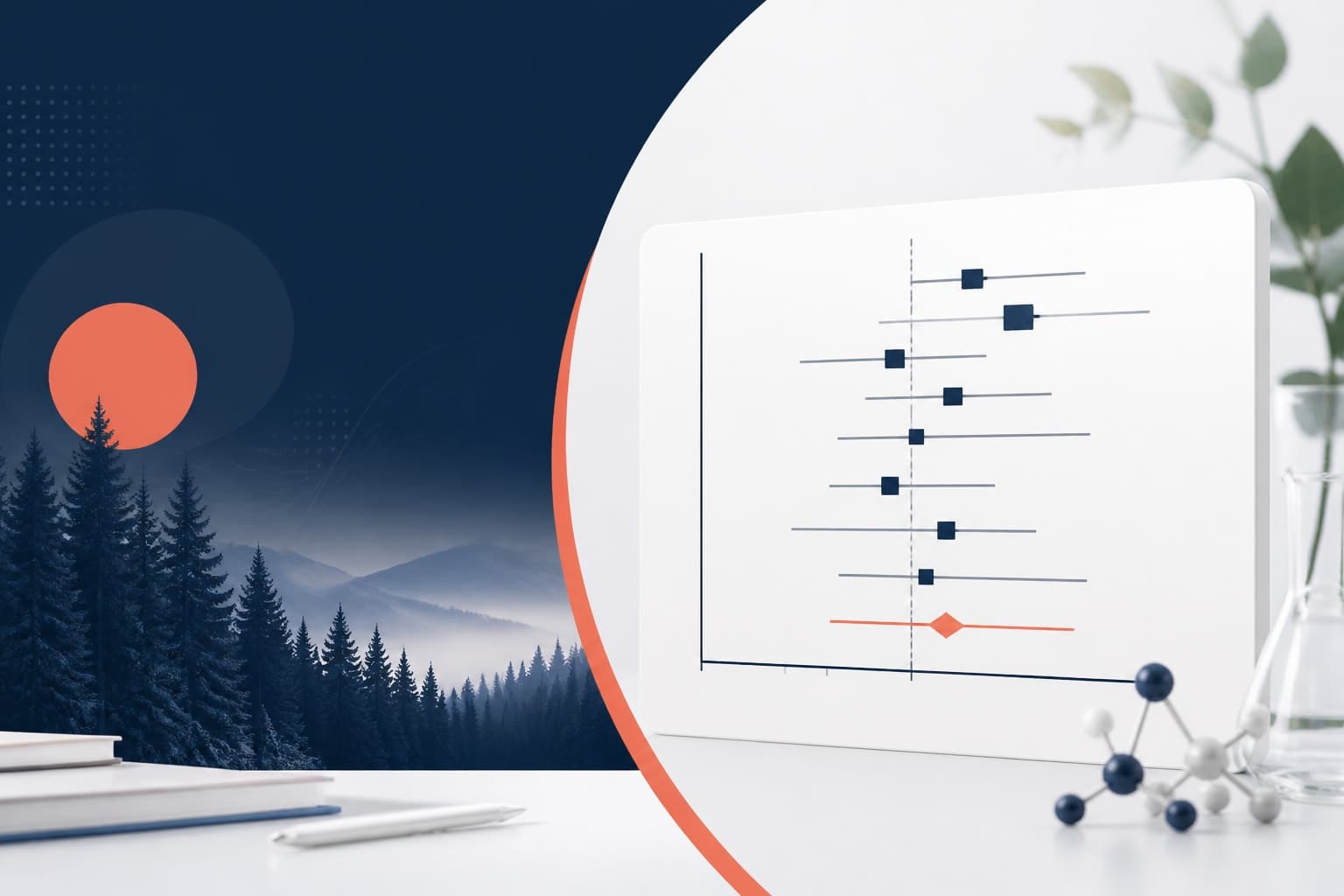
For relationships between two continuous variables, a scatter plot is usually the honest starting point. Add regression lines only if a model is appropriate and described in the methods. If you are showing uncertainty, use confidence intervals, credible intervals, prediction bands, or error bars that are clearly defined. Never assume readers know what your error bars mean.
For part to whole relationships, be cautious with pie charts. They can work for a few simple proportions, but they are poor for precise comparison. Stacked bars are better for compact composition comparisons, while small multiples often work better when categories or conditions multiply.
Ask whether the chart reveals the level of detail needed for the conclusion. If the manuscript claims heterogeneity, show heterogeneity. If it claims a trend, show the trend. If it claims an effect size, avoid designs that emphasize only statistical significance.
Review labels, legends, and units before export
Labels are where many figures fail. Reviewers should not decode abbreviations, infer units, or search the caption for basic axis meaning. Each axis label should include the variable name and unit where relevant. Write “Concentration (ng/mL)” instead of “Conc.” Write “Time after treatment (hours)” instead of “Time.” Clear labels make figures easier to review and easier to reuse in presentations.
Legend labels should match terminology in the manuscript. If the text says “control,” do not label the figure “untreated” unless those terms truly mean different things. If you use abbreviations, define them in the caption or legend. Better yet, avoid abbreviations when space allows.
Group labels should be specific enough to prevent ambiguity. “Low,” “medium,” and “high” may be meaningful to your lab, but reviewers need thresholds. “Low dose (5 mg/kg)” is stronger. If experimental groups differ by multiple variables, consider direct labels on the plot or a small table in the figure panel.
Also check font size after export. A label that looks readable inside your plotting software may become tiny when placed into a two column manuscript layout. Print the figure or view it at final publication width. If you have to zoom in to read the labels, reviewers will struggle too.
Finally, remove redundant labels. If every panel repeats the same y axis and the layout is clear, one shared label may be enough. The aim is not to label everything. The aim is to label what readers need without wasting attention.
Audit scales, baselines, and transformations
Scales influence interpretation. This part of the data visualization checklist is about honesty and consistency. For bar charts, a zero baseline is usually necessary because bar length visually encodes magnitude. For line charts and scatter plots, a nonzero axis can be acceptable, but it must not exaggerate change or hide context.
Use consistent scales when comparing panels. If two panels show the same variable under different conditions, changing the y axis can make small differences look large or large differences look small. When different scales are scientifically necessary, make that choice obvious. Use clear axis labels, panel notes, or annotations.
Log scales can be excellent for measurements spanning orders of magnitude, such as gene expression, microbial counts, or concentration ranges. However, log transformations must be clearly labeled. Readers should know whether they are looking at raw values on a log axis, log transformed values, or normalized values. These are not interchangeable.
Check tick marks and significant digits. Too many decimal places imply false precision. Too few can hide meaningful differences. Use intervals that make visual comparison easy, such as 0, 25, 50, 75, and 100 for percentages. Avoid awkward tick sequences unless the measurement requires them.
Also consider whether your figure includes uncertainty in a scale appropriate way. Error bars that extend below zero for impossible values may signal that a different summary, transformation, or model based interval is needed. Visual design should respect the measurement scale.
Use color to clarify, not decorate
Color should carry meaning. If color does not encode a variable, separate groups, or guide attention, it may be decorative noise. In research manuscripts, unnecessary color can reduce clarity, increase printing problems, and make figures harder for color blind readers.
Use a limited palette. For categorical data, choose distinct colors with similar visual weight. For ordered data, use a sequential palette that moves from light to dark. For values around a meaningful midpoint, such as change from baseline, use a diverging palette with a neutral center.
Do not rely on red and green alone. Many readers have some form of red green color vision deficiency. The Web Content Accessibility Guidelines from W3C are a useful reference for thinking about color, contrast, and non color cues: W3C accessibility guidelines. Scientific figures are not websites, but the principle is the same. Information should not depend on color alone.
Add shape, line style, direct labels, or pattern when color encodes critical categories. In grayscale, the figure should still be interpretable. This is especially important for printed PDFs, reviewer markups, and readers using assistive viewing settings.
Color intensity can also distort emphasis. A bright red group will attract attention even if it is not the main result. Reserve strong colors for the message you want readers to notice first. Use neutral grays for context when needed.
Add annotations that help the reader think
Annotations are most useful when they reduce cognitive effort. They should answer questions such as “where is the main comparison,” “what changed after intervention,” or “which subgroup matters.” Good annotations guide attention without replacing the data.
Use arrows, labels, brackets, and callouts sparingly. If every point is labeled, none of them stand out. Instead, label the key outlier, important threshold, or main comparison. For multi panel figures, short panel titles can do more work than long captions alone.
Statistical annotations deserve special care. Asterisks are compact, but they are often overused and under explained. If you include significance markers, define them in the caption. Better, where space allows, report effect sizes and intervals. A figure that shows only p values can encourage readers to miss practical importance.
For thresholds, explain the source. A dashed line marking a clinical cutoff, detection limit, or regulatory standard should be labeled directly. Do not assume the reader knows why that line exists. If the threshold comes from prior literature or a protocol, mention it in the caption.

Write captions that make figures stand alone
A figure caption is not a dumping ground for leftover methods. It is a reading aid. Reviewers often move between abstract, figures, and results before reading every method detail. A strong caption lets them understand what was measured, who or what was included, how groups were defined, and what summary statistics are shown.
Start with the main point or figure purpose. Then provide enough context to interpret the visual elements. Define symbols, colors, abbreviations, error bars, sample sizes, and statistical tests. If the figure has multiple panels, describe each panel in order.
A useful caption often includes five elements: study material, measurement, visual encoding, statistical summary, and key definitions. For example, “Points show individual animals, bars show median values, and whiskers show interquartile range” is far clearer than “Data are shown with error bars.”
Be consistent across captions. If Figure 2 says error bars show standard deviation and Figure 3 says they show standard error, readers may wonder why. If there is a reason, explain it. If not, standardize your summaries.
Captions should not overclaim. Avoid language that says a result “proves” a mechanism unless the study design supports that claim. The visual and caption should match the statistical inference in the manuscript.
Check accessibility and final production quality
Accessibility is part of scientific rigor. A figure that excludes readers because of low contrast, tiny text, color dependence, or missing descriptions is not fully communicating the science. This final data visualization checklist step catches issues that are easy to miss when you know the data too well.
Check contrast between text and background. Avoid light gray labels, thin pale lines, and transparent colors that disappear in print. Use readable font sizes and sufficient line weights. If your journal compresses figures, delicate visual elements may degrade.
Review the figure in grayscale. Then review it at the size expected in the final manuscript. If possible, ask a colleague outside the project to explain what they see. Their confusion is useful. It reveals what reviewers may also miss.
Make sure file formats match journal requirements. Vector formats such as PDF, SVG, or EPS are best for diagrams, line art, and many plots. High resolution raster formats may be needed for microscopy, imaging, or heatmaps. Check resolution, color mode, and embedded fonts before submission.
Alt text may not be required by every journal submission system, but it is still worth preparing. A concise alt text description helps accessible publishing workflows and can improve figure reuse. Describe the chart type, variables, and primary pattern without repeating the full caption.
A practical pre submission review table
Use this table as a quick review before manuscript upload. It is intentionally strict. If you cannot answer “yes” to most items, the figure likely needs another revision.
| Checklist area | Question to ask | Common fix |
|---|---|---|
| Chart choice | Does the chart match the data and claim? | Switch from bars to points, distributions, lines, or small multiples. |
| Labels | Can a reader identify variables, groups, and units immediately? | Rewrite labels with full variable names and units. |
| Scales | Are axes honest, consistent, and clearly transformed if needed? | Standardize panel scales or label transformations directly. |
| Colors | Does color encode meaning accessibly? | Use fewer colors and add non color cues. |
| Annotations | Do annotations clarify the main comparison? | Remove clutter and label only essential features. |
| Captions | Can the figure stand alone? | Define sample size, symbols, summaries, and tests. |
| Accessibility | Is the figure readable at final size and in grayscale? | Increase contrast, font size, and line weight. |
This table is also useful for coauthor review. Ask each coauthor to mark only the figures in their area of expertise. That keeps feedback specific and avoids vague comments like “make it cleaner.”
Final pass before submission
Your last review should happen after figures are placed in the manuscript, not only as separate files. Layout changes can introduce new problems. A legend may wrap awkwardly. A panel label may become too small. A color that looked distinct on a white canvas may fade against the journal template.
Read the results section with each figure visible. Every figure should be mentioned in the text, and every visual claim should be supported by the figure. If the text says “substantially higher,” the chart should make that comparison clear. If the chart shows a surprising pattern that the text ignores, either explain it or reconsider whether it belongs.
Check numbering, panel letters, cross references, supplementary links, and caption consistency. These small errors can annoy reviewers because they slow evaluation. They also suggest the manuscript was rushed, even when the science is careful.
Finally, export a submission quality PDF and inspect it as a reader. Do not trust the editable file alone. Zoom to 100 percent, print a page if possible, and review figures in sequence. This is where small readability problems become obvious.
A strong data visualization checklist will not turn weak evidence into strong evidence. That is not its job. Its job is to make sure the evidence you have is presented clearly, honestly, and accessibly. For research manuscripts, that is more than design polish. It is part of responsible scientific communication.
Frequently Asked Questions
What is a data visualization checklist for research manuscripts?
A data visualization checklist is a structured review of each figure before submission. It helps you confirm that chart type, labels, scales, colors, annotations, captions, and accessibility support the scientific claim. It is especially useful when multiple coauthors are editing figures.
When should I review figures before manuscript submission?
Review figures after the analysis is final and again after the figures are placed in the manuscript. The second review matters because sizing, layout, and caption placement can create new readability problems. A final PDF check is strongly recommended.
Should research figures show raw data or summary statistics?
Whenever practical, show raw data alongside summary statistics, especially for small or moderate sample sizes. Raw points reveal spread, outliers, and sample size in ways that bars alone often hide. If the dataset is very large, use density plots, transparency, binning, or summaries that preserve the main distributional pattern.
Written by
Shobajo AbdulAzeez
Tags
Share this article