How to Turn Paper Into Graphical Abstract: A Step-by-Step Guide
In This Article
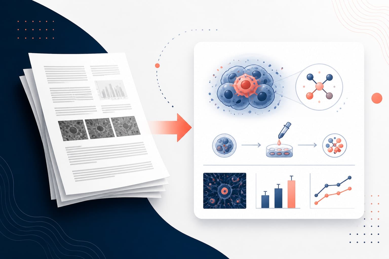
Your research paper represents months or years of meticulous work, but most readers will spend less than thirty seconds deciding whether to read it. This is where learning how to turn paper into graphical abstract becomes crucial for your scientific communication strategy. A well-crafted graphical abstract transforms complex research into an immediate visual story that captures attention and conveys your core message at a glance.

The challenge lies not just in creating attractive visuals, but in distilling your entire study into its most essential elements. You need to identify what matters most, translate technical concepts into accessible imagery, and arrange everything in a logical flow that tells your research story effectively. This comprehensive guide will walk you through each step of this transformation process.
Understanding the Core Purpose of Graphical Abstracts
Graphical abstracts serve as visual ambassadors for your research. They appear in journal feeds, conference programs, and social media shares, often determining whether someone engages with your work or scrolls past it. Unlike traditional abstracts that summarize your paper in text, graphical abstracts communicate through carefully chosen visuals, icons, and minimal text.
The most effective graphical abstracts focus on three key elements: your research question or problem, your methodology or approach, and your main findings or conclusions. These elements must work together to create a cohesive narrative that stands alone while encouraging deeper engagement with your full paper.
Publishers increasingly require graphical abstracts because they significantly boost article visibility and citation rates. Studies by major publishers like Elsevier show that articles with graphical abstracts receive more downloads and social media engagement than those without.
Your graphical abstract should answer the fundamental question: what would someone need to understand about your work if they had only ten seconds to look at it? This constraint forces clarity and prioritization that ultimately strengthens your scientific communication.
How to Turn Paper Into Graphical Abstract: The Four-Step Framework
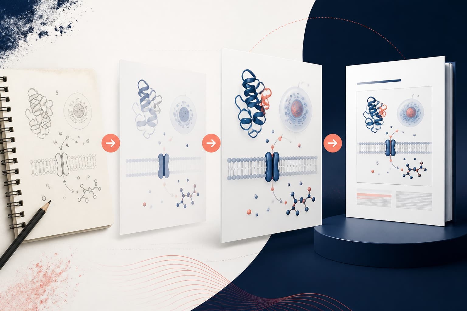
Successfully transforming your manuscript requires a systematic approach that breaks down the complexity into manageable components. We recommend following our four-step framework: message extraction, visual mapping, flow design, and label optimization.
Start by identifying your core message. Read through your abstract, conclusion, and key results sections. Write down the single most important takeaway from your research in one sentence. This becomes your guiding principle for every design decision that follows.
Next, inventory your paper's visual elements. Look for data that can be represented graphically, processes that can be illustrated as workflows, concepts that can be symbolized with icons, and relationships that can be shown through diagrams or arrows. Create a list of potential visual elements before you start designing.
Consider your target audience carefully. A graphical abstract for a specialized medical journal will differ significantly from one intended for a broader scientific audience. Adjust your level of technical detail, terminology, and visual complexity accordingly.
Extracting Your Core Message and Key Elements
Begin message extraction by analyzing your paper's structure systematically. Your introduction establishes the research problem, your methods describe your approach, your results present your findings, and your discussion interprets their significance. Each section contributes essential elements to your graphical abstract.
From your introduction, identify the gap in knowledge or problem your research addresses. This often translates into a question mark, puzzle piece, or problem symbol in your visual design. Your research question provides the starting point for your visual narrative.
Your methodology section contains the procedural elements that form the middle section of most graphical abstracts. Look for experimental steps, analytical techniques, or theoretical frameworks that can be represented visually. These elements show how you moved from question to answer.
Results and conclusions provide your ending: the discovery, solution, or new understanding your work contributes. This might be represented through before-and-after comparisons, improved outcomes, or new relationships between variables.
Write a 25-word summary of your entire paper. Every word should be essential. This constraint forces you to eliminate everything except your most critical points. Use this summary as your blueprint for visual selection.
Create a hierarchy of importance for all potential elements. Not everything from your paper belongs in your graphical abstract. Rank elements by their relevance to your core message and their visual potential. Focus on the top five to seven elements maximum.
Designing Visual Elements and Selecting Appropriate Icons
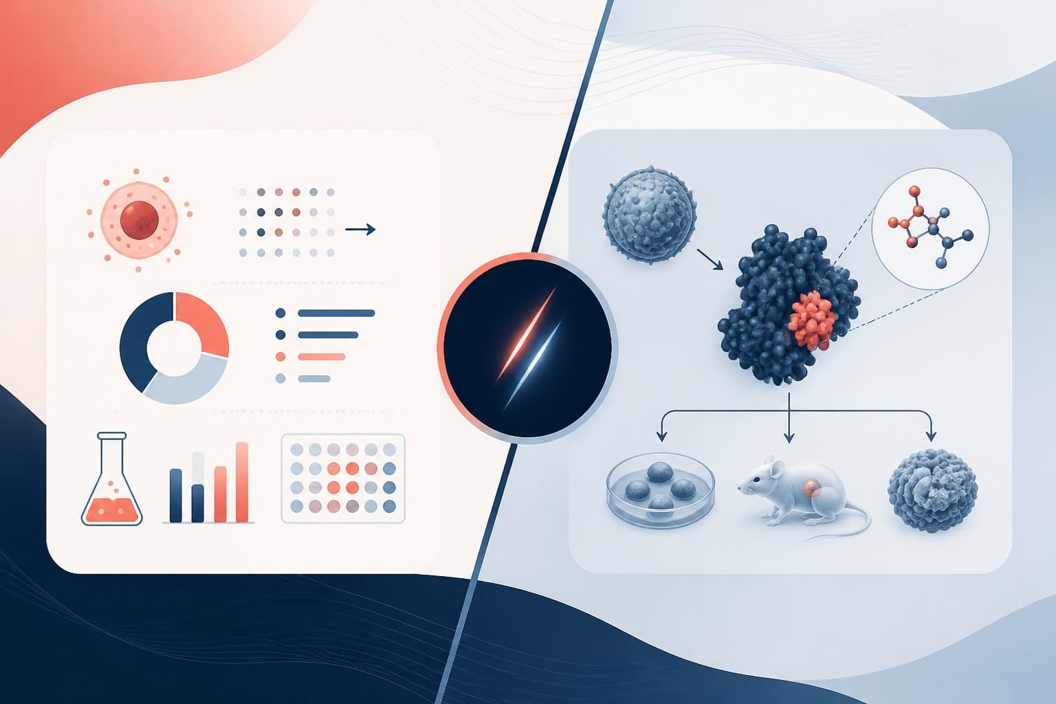
Visual design transforms abstract concepts into concrete imagery that viewers can quickly process and understand. Start by categorizing your content into different visual types: processes work well as flowcharts, comparisons suit before-and-after panels, relationships benefit from network diagrams, and quantities translate into charts or graphs.
Choose icons and symbols that align with scientific conventions in your field. Molecular biology papers might use DNA helixes and protein structures, while engineering papers could incorporate gears, circuits, or mechanical components. Consistency in visual language helps viewers navigate your abstract intuitively.
Color serves both aesthetic and functional purposes. Use color strategically to group related elements, highlight key findings, or guide the viewer's eye through your narrative flow. Limit your palette to three or four colors maximum to maintain visual coherence and professional appearance.
Typography plays a crucial supporting role. Select clean, readable fonts that complement rather than compete with your visuals. Maintain consistent text sizing and spacing throughout your design. Remember that your graphical abstract may be viewed at various sizes, from full-screen displays to small thumbnails.
Consider accessibility in your design choices. Ensure sufficient contrast between text and backgrounds, avoid relying solely on color to convey information, and use clear, legible fonts. Your abstract should be understandable by viewers with different visual capabilities.

Creating Logical Flow and Narrative Structure
Effective graphical abstracts guide viewers through a clear narrative progression, typically following a left-to-right, top-to-bottom reading pattern familiar to most audiences. Your visual flow should mirror the logical progression of your research: problem identification, methodological approach, key findings, and implications or applications.
Use connecting elements like arrows, lines, or sequential numbering to show relationships between different components of your research. These connectors should be subtle enough not to overwhelm your content but clear enough to guide understanding.
Balance is crucial in layout design. Distribute visual weight evenly across your composition to avoid creating areas that feel too dense or too empty. White space is not wasted space; it provides visual breathing room that makes complex information more digestible.
Consider multiple layout options before settling on your final design. Horizontal layouts work well for process-heavy research, while vertical arrangements suit hierarchical relationships. Grid-based layouts help organize complex information systematically.
Test your flow logic by showing your draft to colleagues unfamiliar with your specific research. Can they follow your narrative without additional explanation? Do they understand the relationship between different elements? Their feedback reveals areas where your visual logic needs strengthening.
Remember that viewers typically spend only seconds scanning your graphical abstract initially. Your flow should support both quick scanning and deeper engagement. Key information should be immediately apparent, while secondary details reward closer examination.
Optimizing Labels and Text for Maximum Impact
Text in graphical abstracts serves as supporting context rather than primary content. Every word must earn its place by adding essential information that cannot be conveyed visually. Aim for conciseness without sacrificing clarity or accuracy.
Use active voice and strong verbs in your labels. Instead of "improvements were observed," write "treatment improved outcomes by 40%." Specific, action-oriented language creates more engaging and informative labels.
Maintain consistency in your terminology throughout the abstract. If you use "participants" in one section, do not switch to "subjects" elsewhere. Consistent language reduces cognitive load and maintains professional appearance.
Consider your text hierarchy carefully. Major headings should be larger and bolder than supporting text. Use font weight and size to guide attention to the most important information first. Maintain sufficient contrast between text and background elements.
Acronyms and abbreviations can save space but should be used judiciously. Spell out terms that might be unfamiliar to broader audiences, and ensure any abbreviations you use are standard in your field. Your goal is communication, not compression.
Quantify your results when possible. Specific numbers convey more impact than general statements. "Reduced energy consumption by 35%" is more compelling than "significantly reduced energy consumption." Include units and statistical significance where appropriate.
Common Mistakes to Avoid When Creating Graphical Abstracts
One of the most frequent errors is attempting to include too much information. Remember that your graphical abstract should highlight your key contribution, not summarize every aspect of your research. Overcrowded designs confuse rather than clarify.
Another common mistake involves inconsistent visual styles within a single abstract. Mixing different illustration styles, color schemes, or typography creates a disjointed appearance that undermines your professional credibility. Establish visual guidelines early and follow them consistently.
Many researchers underestimate the importance of proper resolution and formatting. Graphical abstracts appear in various contexts, from high-resolution journal websites to compressed social media posts. Design at high resolution and test how your abstract appears when scaled down significantly.
Avoid using copyrighted images or icons without proper licensing. Many free resources exist for scientific illustration, and investing in licensed imagery protects you from legal complications while ensuring professional quality.
Do not neglect journal-specific requirements. Different publications have varying size restrictions, format preferences, and style guidelines. Review these requirements before beginning your design process, not after completing it.
Poor contrast and readability issues plague many graphical abstracts. Text that looks clear on your computer screen may become illegible when printed or viewed on different devices. Always test readability across multiple viewing conditions.
Tools and Resources for Creating Professional Graphical Abstracts
Modern design tools have made professional-quality graphical abstracts accessible to researchers without extensive design training. Create with Graffiy to access AI-powered design assistance specifically tailored for scientific communication, helping you transform your research into compelling visual narratives efficiently.
Traditional design software like Adobe Illustrator offers comprehensive control over every design element but requires significant learning investment. Free alternatives like Inkscape provide similar vector-based capabilities without licensing costs, though with steeper learning curves.
Template-based platforms can accelerate your design process by providing professionally structured layouts that you customize with your content. However, ensure your chosen platform offers sufficient flexibility to accommodate your specific research needs.
Icon libraries and scientific illustration databases provide high-quality visual elements that maintain consistency across different graphical abstracts. Invest time in identifying reliable sources for your field-specific imagery needs.
Color palette generators help you select harmonious color combinations that enhance rather than distract from your content. Consider tools that offer accessibility checking to ensure your color choices work for all viewers.
Collaboration features become important when working with co-authors or design professionals. Choose tools that support version control and feedback integration to streamline your revision process.
Testing and Refining Your Graphical Abstract
Effective testing begins with distance and time. Step away from your design for at least 24 hours, then return with fresh eyes. This break helps you identify areas where familiarity with your research may have led to unclear communication.
Gather feedback from diverse audiences. Show your graphical abstract to colleagues in your field, researchers from related disciplines, and educated non-specialists. Each group will identify different clarity issues and communication gaps.
Test scalability by viewing your design at various sizes. Print it as a small thumbnail and as a full-page image. Check how it appears on different devices and screen resolutions. Your design should remain clear and readable across all viewing conditions.
Time your viewers' comprehension. Can someone understand your main message within 10 seconds? Do they need additional explanation to follow your narrative flow? These timing tests reveal whether your visual communication achieves its intended efficiency.
Conduct A/B testing when possible by creating multiple versions and measuring audience engagement. Different layout approaches, color schemes, or text treatments may perform differently with your target audience.
Document the feedback you receive and track which suggestions improve comprehension versus those that simply reflect personal preferences. Focus your revisions on changes that genuinely enhance understanding and accessibility.
Publishing and Sharing Your Graphical Abstract Effectively
Once your graphical abstract is complete, strategic sharing maximizes its impact beyond journal publication. Social media platforms favor visual content, making your graphical abstract an ideal tool for broader research dissemination.
Optimize your abstract for different platform requirements. Twitter, LinkedIn, and research-specific networks each have different image dimensions and audience expectations. Create platform-specific versions when necessary to ensure optimal presentation.
Include your graphical abstract in conference presentations, grant applications, and research portfolios. It serves as a powerful visual summary that can enhance various professional communications beyond its original journal context.
Track engagement metrics when possible to understand how effectively your graphical abstract communicates with different audiences. This data informs future design decisions and helps you refine your visual communication skills.
Consider creating a series of related visual materials that maintain consistency with your graphical abstract. Presentation slides, poster headers, and social media graphics that echo your abstract's visual language create a cohesive research brand.
Remember that your graphical abstract represents not just your current research, but your overall approach to scientific communication. Investing in quality design pays dividends through improved visibility, engagement, and professional recognition throughout your career.
Frequently Asked Questions
How long should it take to turn paper into graphical abstract?
The process typically takes 8-15 hours spread over several days, including initial concept development, design creation, and refinement based on feedback. Rushing this process often results in unclear communication that defeats the purpose of creating a graphical abstract.
What software do I need to create a professional graphical abstract?
You can create excellent graphical abstracts using various tools, from specialized platforms like Graffiy to general design software like Adobe Illustrator or free alternatives like Canva. The key is choosing a tool that matches your design skills and provides the visual elements you need for your specific research field.
How do I know if my graphical abstract effectively communicates my research?
Test your abstract by showing it to colleagues unfamiliar with your work and timing their comprehension. If they can understand your main research contribution within 10-15 seconds and follow your methodology without additional explanation, your abstract successfully communicates your work. Gather feedback from multiple viewers to identify areas needing improvement.
Written by
Shobajo AbdulAzeez
Tags
Share this article