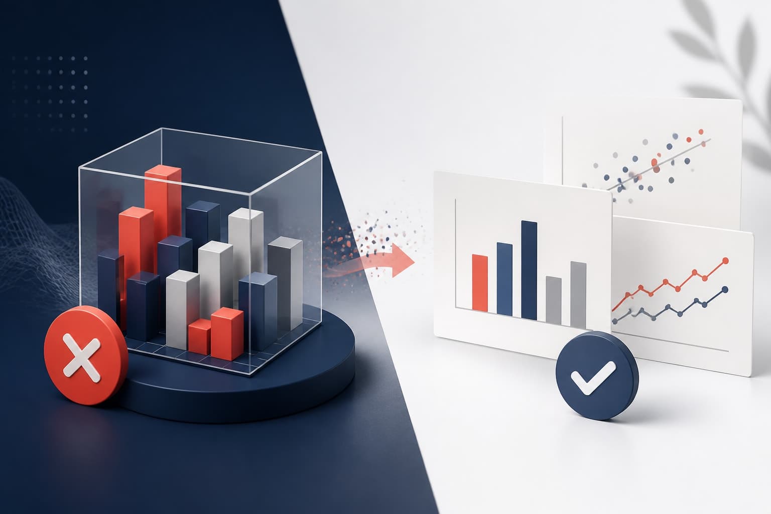
Why a 3D chart research figure is usually a bad idea
In This Article
A 3D chart research figure often promises more than it delivers. It looks polished at first glance, especially on a presentation slide, but the extra dimension usually creates a reading problem. Values become harder to compare, axes become harder to trust, and the audience spends energy decoding the graphic instead of thinking about your result.
That is the core issue. Research figures are not decoration. They are arguments built from evidence. If a chart makes the evidence less clear, it is working against you.

This is not an argument against all 3D scientific visuals. Molecular structures, anatomical models, terrain, microscopy volumes, and spatial simulations often need depth. But a 3D column chart, pie chart, or surface effect used to show simple quantities is a different thing. Most of the time, it adds visual drama while subtracting accuracy.
Why a 3D chart research figure hides the answer
The biggest problem with a 3D chart research figure is that it changes the visual task. In a normal bar chart, your audience compares lengths against a shared baseline. That is one of the easier things for the eye to do. In a 3D bar chart, they compare tilted faces, hidden back edges, perspective, shadows, and a baseline that may not sit where it appears to sit.
That shift matters. A small visual distortion can change the perceived size of a result. The viewer may see the front bar as larger because it is closer, or miss a back bar because it is partly blocked. When you present a p value, an effect size, or a dose response pattern, that confusion is not harmless.
The same applies to 3D pie charts. The slice at the front often appears larger because it has visible thickness. The slice at the back appears smaller because it is compressed by perspective. Yet the data values did not change. The chart changed the audience's perception of those values.
Research audiences are trained to be skeptical, but they are still human. Visual perception is not a spreadsheet. A classic paper by Cleveland and McGill showed that people read some visual encodings more accurately than others, especially position along a common scale compared with area, angle, and volume. You can read the classic Cleveland and McGill study on graphical perception for the deeper evidence behind that point.
Depth makes simple comparisons harder
Most presentation graphics in research ask a simple question. Which condition is higher? How much did the treatment change the response? Is the difference large enough to care about? A 3D chart research figure makes those questions slower to answer.
Consider a chart comparing three experimental groups. In a flat bar chart, the tops of the bars align with the y axis grid. Your viewer can estimate values quickly. In a 3D version, the tops may sit on angled planes. The back edge may line up differently from the front edge. Gridlines may run into the depth axis. Now the viewer has to decide which edge represents the real value.
That is a bad trade. You do not gain information. You gain ambiguity. The extra dimension does not represent a measured variable, it is just visual styling. When a visual element does not encode data, it should be treated with suspicion.
Depth can also weaken comparisons across categories. Bars in the back row may appear smaller. Bars in the front row may appear more important. If the chart uses perspective, objects farther away shrink. If it uses isometric depth, the volume still competes with the actual height. Either way, the clean comparison is gone.
A research figure should reduce cognitive work. If your audience has to solve the chart before they can discuss the finding, the chart is too busy.
The 3D effect competes with your message
A 3D chart research figure does not just hide values. It also attracts attention to the wrong thing. Shadows, bevels, glossy surfaces, and perspective grids pull the eye away from the pattern in the data. They make the chart look designed, but not necessarily more informative.
In a presentation, attention is scarce. Your audience is listening to you, reading labels, remembering methods, and checking whether your interpretation follows from the evidence. A heavy 3D effect adds another task. It says, in effect, please admire the object before you inspect the result.
This is especially risky when your result is subtle. Many research findings are not huge visual events. Maybe one subgroup changes modestly. Maybe a confidence interval overlaps less than expected. Maybe a trend matters because it is biologically plausible, not because it is visually dramatic. A 3D treatment can overpower that nuance.
There is also a credibility issue. Many scientists associate 3D business charts with marketing decks, not careful analysis. That may be unfair in some cases, but perception matters. If your figure looks like it was chosen for impact rather than accuracy, reviewers and colleagues may question the rest of the slide.
What to use instead
The alternative is not boring design. The alternative is better design. A clear flat chart can look polished, modern, and professional without distorting values. The trick is to make the data structure visible and remove everything that does not help.
For most research presentation graphics, start with one of these options:
- Bar chart: Use for discrete categories when the baseline matters and sample sizes are clear.
- Dot plot: Use when you want to compare groups with less visual weight than bars.
- Line chart: Use for ordered time, dose, sequence, or repeated measures.
- Scatter plot: Use when relationships, variation, or clustering matter.
- Box plot or violin plot: Use when distribution matters more than a single summary value.
- Heatmap: Use for matrix patterns, but label carefully and choose a readable color scale.
A dot plot is often better than a bar chart in research because it uses less ink and makes comparisons clean. If you have means with uncertainty, show the mean and interval directly. If you have individual observations, show them when the sample size allows. That is usually more honest than hiding everything behind a solid block.
You can also improve readability with small choices. Use direct labels when possible. Keep gridlines light. Avoid unnecessary borders. Choose colors that separate groups without shouting. Place the most important comparison where the eye naturally lands. None of these choices require fake depth.
If you want to build clean figures faster, you can create with Graffiy and focus on the story your data needs to tell. We built Graffiy for researchers who want figures that feel designed without losing scientific clarity.
A practical test for any chart
Before you put a 3D chart research figure into a talk, run a simple test. Show it to someone for five seconds. Then hide it and ask what the main result was. If they remember the shape, shine, or perspective before they remember the result, the chart is failing.
You can also ask these questions:
- Does the third dimension encode a real variable?
- Can viewers compare values from a common baseline?
- Are any data marks hidden behind other marks?
- Does perspective change the apparent size of categories?
- Would the same data be clearer as a flat chart?
If the third dimension does not encode real data, remove it. If it hides a value, remove it. If it makes a small difference look large, remove it. This sounds strict, but it is a useful discipline. Research figures need to earn attention.

The five second test is not a replacement for peer review or statistical rigor. It is a presentation check. Your slide may be technically accurate but still visually confusing. A chart that cannot pass a quick comprehension test will struggle in a conference room.
Where 3D can be justified
There are legitimate uses for 3D in scientific communication. If your data are spatial, volumetric, or structural, three dimensions may be essential. A protein model, a brain scan reconstruction, a geological surface, or a 3D cell culture image can carry information that a flat chart cannot fully express.
The key question is whether depth represents data. If the x, y, and z dimensions all map to measured quantities, you may have a real 3D visualization. Even then, be careful. Rotating views, occlusion, color scales, and camera angles can still affect interpretation.
A 3D chart research figure becomes weak when depth is only decorative. A 3D bar chart showing group means usually falls into that category. A 3D pie chart showing proportions almost always does. The effect may look impressive, but it is not doing scientific work.
| Chart goal | Weak 3D choice | Clearer alternative |
|---|---|---|
| Compare group means | 3D column chart | Dot plot with intervals |
| Show proportions | 3D pie chart | Sorted bar chart |
| Show change over time | 3D ribbon chart | Line chart with direct labels |
| Show distribution | 3D histogram effect | Histogram, box plot, or violin plot |
This table is not a style rule for every possible dataset. It is a bias toward clarity. If the audience needs to compare values, give them the strongest visual encoding you can.
Presentation figures need speed and trust
A paper figure can be studied. A presentation figure must be understood while the speaker keeps moving. That changes the standard. In a talk, your audience may have only a few seconds to grasp the axis, compare the groups, and connect the figure to your claim.
That is why 3D is such a poor default for presentation graphics. It asks for more time when you have less time. It invites interpretation when you need recognition. It creates visual confidence while reducing numerical confidence.
Good research slides are not plain because scientists lack imagination. They are plain because precision is beautiful when the point matters. A clean chart tells your audience that you respect their time and your own evidence.
If you want visual interest, add it where it helps. Use a strong title that states the finding. Annotate the key comparison. Highlight one treatment group and mute the rest. Use layout, spacing, and hierarchy to guide the eye. These design choices support the argument instead of competing with it.
My rule: never use 3D by default
My opinion is simple. A 3D chart research figure should be treated as guilty until proven useful. The third dimension has to earn its place. If it does not encode data, clarify structure, or reveal a spatial relationship, it should not be there.
This rule saves time. It prevents last minute slide polishing from turning into visual distortion. It also gives you a defensible answer when someone says the chart looks too simple. You can say, yes, that is the point. The figure is built for reading, not decoration.
There is a quiet confidence in a clear chart. It does not beg for attention. It shows the evidence and lets the audience think. That is exactly what a research figure should do.
So, before you add bevels, shadows, or a tilted 3D plane, ask what the viewer gains. If the answer is only that the chart looks more exciting, choose the flat version. Your data deserve better than a visual effect that hides them.
Frequently Asked Questions
Is a 3D chart research figure ever acceptable?
Yes, but only when the third dimension represents real data or a real spatial structure. Examples include molecular models, anatomical volumes, terrain, or 3D microscopy. Decorative 3D bars and pies usually make comparisons less accurate.
What is the biggest problem with 3D charts in research presentations?
The biggest problem is that 3D changes how viewers perceive values. Perspective, depth, shadows, and hidden edges can make one category look larger or smaller than it is. That slows comprehension and can weaken trust in the figure.
What should I use instead of a 3D chart for group comparisons?
Use a flat bar chart, dot plot, or box plot depending on what you need to show. Dot plots with confidence intervals are often especially useful for research talks. They show comparisons clearly without adding visual weight or distortion.
Written by
Shobajo AbdulAzeez
Tags
Share this article