poster figure design: How to Make Figures Stand on Their Own
In This Article
poster figure design starts before the poster layout
Strong poster figure design is not decoration. It is the shortest path between your data and a viewer who has three minutes, a coffee cup, and five more posters to visit. If your figure cannot explain its main message without a long paragraph beside it, the poster will work too hard. Your goal is simple: make the visual understandable at a glance, then reward closer reading with detail.
A stand alone figure does not mean a figure with no context. It means the essentials are visible inside the visual system. The title tells the claim. The labels name the variables. The annotations point to the result. The caption or nearby note confirms what matters. When these parts work together, viewers can understand the figure before they commit to reading every sentence.
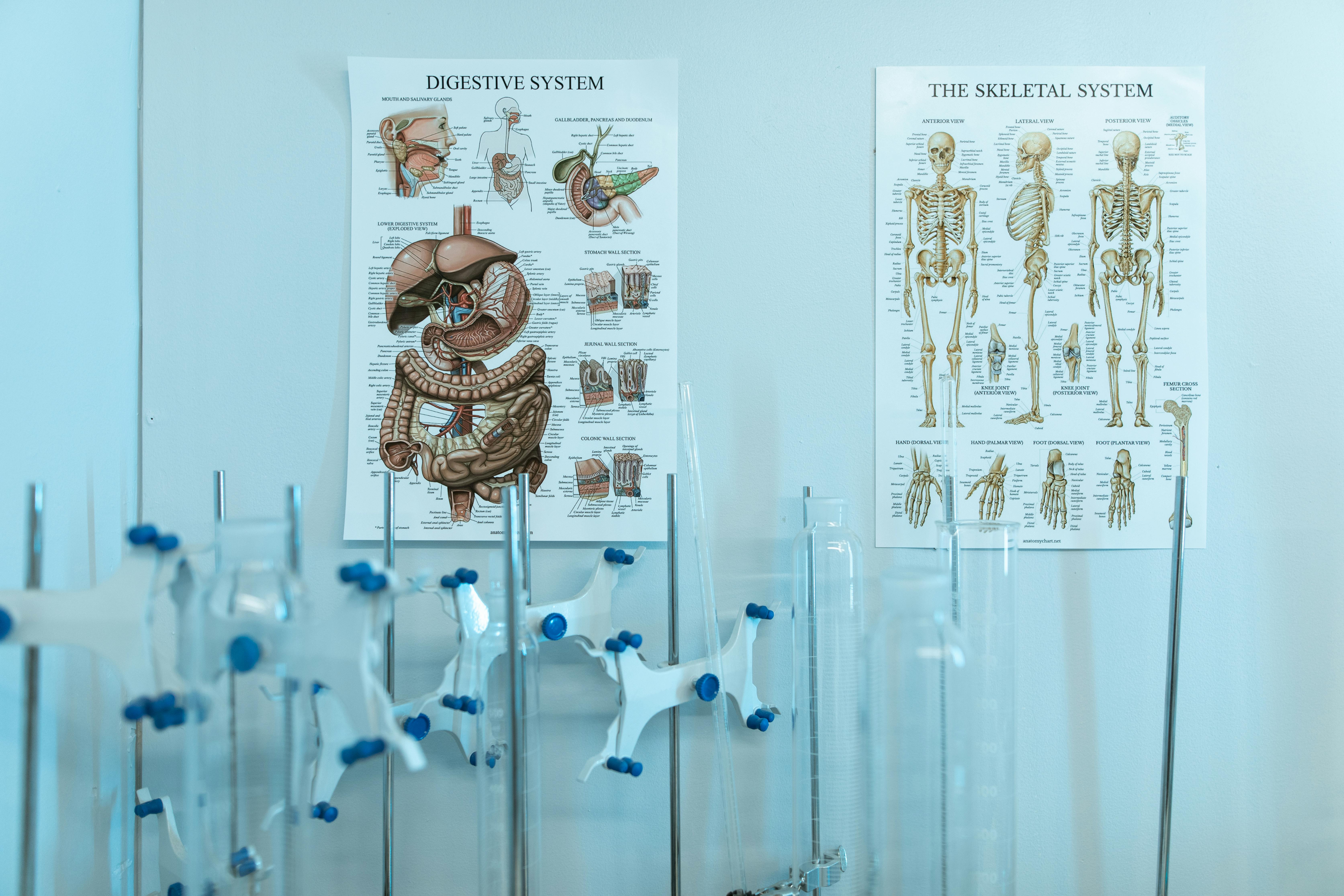
This matters because poster viewing is selective. People scan first, then choose where to stop. A clear figure becomes an invitation. A crowded figure becomes a wall. We prefer figures that act like helpful guides, not puzzles. That is especially true for researchers presenting dense data, complex methods, or results that need careful interpretation.
Start with the one sentence takeaway
Before you open a design tool, write the sentence your figure should prove. Keep it specific. Not “treatment results,” but “Treatment A reduced inflammatory marker levels compared with control after 48 hours.” This sentence becomes the anchor for your poster figure design decisions.
If a chart, diagram, or image panel does not support that sentence, it may not belong in the main figure. It might move to a supplementary handout, a QR linked preprint, or a smaller secondary panel. Posters have limited attention space. Spend it on the visual evidence that supports the central claim.
Use the takeaway to choose your chart type. Comparisons need bars, dots, box plots, violin plots, or paired plots, depending on the data. Trends need line charts. Relationships need scatter plots. Processes need diagrams. Spatial findings need maps or annotated images. Do not choose a format because it looks impressive. Choose the format that answers the viewer’s first question.
A useful test is to cover the paragraph beside the figure. Then ask a colleague, “What do you think this figure is saying?” If their answer is close to your takeaway, the design is working. If they describe the chart structure but miss the result, the visual needs a stronger hierarchy.
Build a visual hierarchy that tells viewers where to look
Viewers do not read poster figures evenly. Their eyes jump to the largest, darkest, sharpest, most colorful, or most isolated element. Good poster figure design uses that behavior instead of fighting it.
Start by deciding the first, second, and third thing viewers should notice. The first thing is usually the result. The second is the comparison or condition. The third is supporting detail, such as sample size, confidence interval, or method note. Then use size, contrast, color, and placement to match that order.
Do not give every element the same visual weight. Equal weight creates visual noise. Axis labels, gridlines, legends, annotations, and panel letters should not compete with the data. Make the data marks prominent. Make support elements quieter. Remove anything that does not help the viewer interpret the result.
For example, a line chart showing a meaningful increase over time should not bury the line under heavy gridlines. Use light gridlines, clear axis labels, and a direct label at the end of the line. If one condition matters most, highlight it and mute the others. That is not manipulation if the full data remain visible. It is guidance.
A poster figure should answer three questions fast: what am I looking at, what changed, and why should I care?
Design titles that make claims, not labels
Many scientific posters use figure titles such as “Results,” “Cell viability assay,” or “RNA expression.” These labels are technically correct, but they do not help a viewer understand the point. A stronger title states the finding. It gives the figure a job.
Compare these two titles. “Cytokine levels by condition” is a topic. “Treatment A lowered IL 6 and TNF alpha after stimulation” is a message. The second title lets a viewer understand the figure before reading the axis labels. It also helps them decide whether to spend more time with the data.
Claim based titles are especially useful for posters because people often view figures out of order. They may see the center panel before the introduction. They may skip your methods. A clear title supplies enough context to prevent confusion.
Keep titles concise. Aim for one line when possible, two lines when needed. Avoid vague verbs such as “affects” or “impacts” if you can use clearer language such as “increases,” “decreases,” “delays,” “clusters,” or “predicts.” Specific verbs make the figure easier to interpret.
Make labels and legends do less work
Legends are often where poster figure design breaks down. Viewers should not have to look back and forth between a chart and a legend six times. That constant eye travel adds friction. It also increases the chance that someone misreads a condition.
Whenever possible, label data directly. Put condition names near lines, bars, groups, or image panels. Use legends only when direct labeling would create clutter. Direct labels are especially helpful for line charts, microscopy panels, workflows, and multi condition comparisons.
Axis labels should include units. If the y axis says “Expression,” viewers still need to know whether you mean fold change, normalized counts, relative fluorescence, or something else. Write “Gene expression (fold change vs control)” or “Fluorescence intensity (a.u.).” The extra words prevent confusion.
Panel labels should also carry meaning. Instead of only “A,” “B,” and “C,” pair panel letters with short subtitles. For example: “A. Study workflow,” “B. Protein expression,” and “C. Survival by risk group.” This helps viewers understand a multi panel figure without hunting through the body text.
Use annotations to point at the evidence
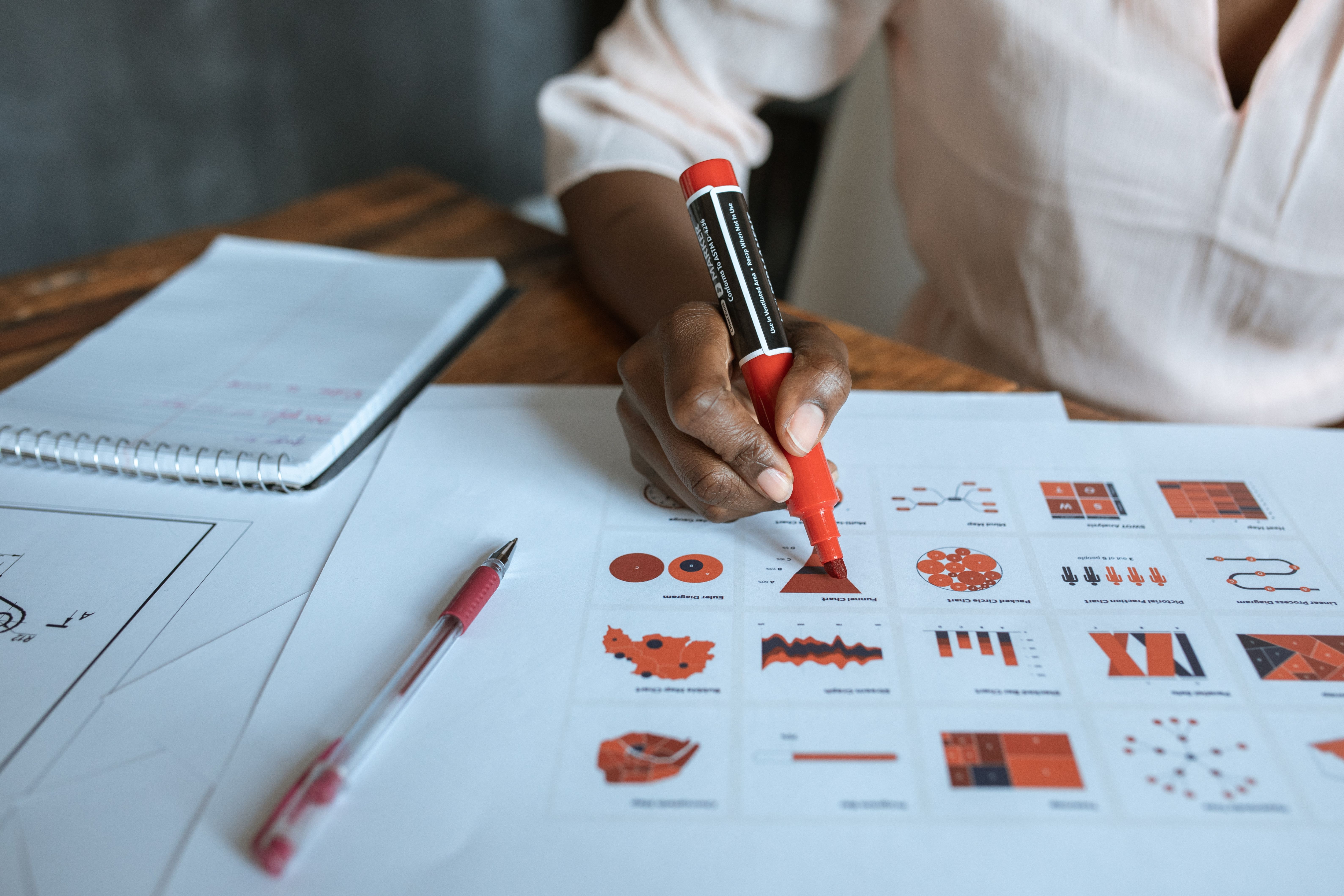
Annotations are one of the most practical tools for stand alone figures. A small arrow, bracket, label, or callout can direct attention to the exact pattern that matters. Without annotations, viewers may notice the wrong feature or miss the key difference entirely.
Use annotations sparingly. One or two strong notes usually work better than five weak ones. A good annotation states what the viewer should see, not just where to look. “Largest decrease at 48 hours” is better than “significant.” “Cluster enriched for responders” is better than “Group 2.”
Be careful with statistical symbols. Asterisks can be useful, but they are not explanations. If you use them, define them nearby. Better yet, pair them with effect sizes or confidence intervals when appropriate. Scientific audiences care about significance, but they also need magnitude.
The PLOS Computational Biology article Ten Simple Rules for Better Figures is a useful reference because it treats figures as communication tools, not just containers for results. That mindset fits poster work well. Your figure should help the reader interpret the science, not merely display output from software.
Choose color for meaning, not decoration
Color should carry information. If red appears in one panel as the treatment group, do not use red in another panel for the control group. Consistency reduces cognitive load. It lets viewers learn your visual language once, then apply it across the poster.
Limit your palette. Most poster figures only need one accent color, one comparison color, and neutral grays. Too many colors make the figure look busy and can weaken the main finding. When everything is colorful, nothing is important.
Use colorblind aware palettes whenever possible. Avoid relying only on red and green differences. Pair color with shape, label, pattern, or position. This helps more viewers read the figure accurately, including people viewing from a distance or under poor conference lighting.
Also consider contrast. Pale yellow on white may look elegant on your laptop, but it can disappear when printed. Test your figure at the final poster size. If you cannot read labels from several feet away, your audience will struggle too.
Simplify multi panel figures without losing rigor
Many research posters need multi panel figures. That is fine, but each panel should have a reason to exist. A common mistake is importing a manuscript figure directly into a poster. Manuscript figures are designed for slow reading. Poster figures need faster orientation.
Start by grouping panels by question. Put methods diagrams before results if they help interpretation. Put the strongest result in the most visible position, usually upper left or center, depending on your poster layout. Do not hide the best evidence in panel F.
Use shared scales when comparisons matter. If two panels show the same measurement but use different y axis ranges, viewers may misjudge the effect. If you must use different scales, mark that clearly. Transparency builds trust.
Reduce repeated labels. If three panels share the same x axis, one clear shared label may work better than three tiny duplicates. But do not remove labels that viewers need for interpretation. Simplification should make the figure clearer, not cryptic.
| Figure problem | Better design choice | Why it helps |
|---|---|---|
| Long legend separated from chart | Direct labels beside data | Reduces eye travel |
| Neutral title such as “Results” | Claim based title | States the takeaway fast |
| Heavy gridlines and borders | Light support lines | Keeps focus on data |
| Too many colors | Small, consistent palette | Makes meaning easier to track |
Write captions for skimmers
A poster caption is not a manuscript caption. It should not be a dense block of methods, abbreviations, and statistical notes. It should help a viewer confirm the message after they inspect the visual.
Use a simple caption structure. First, state what the figure shows. Second, identify the most important comparison. Third, define any essential method or statistic. If the caption takes more than four short sentences, it may be doing work that belongs inside the figure or in the methods section.
For example: “Each dot represents one participant. Treatment A reduced serum marker levels after 48 hours compared with control. Bars show median and interquartile range. P values were calculated using a two sided Mann Whitney test.” That caption is compact, but it gives viewers enough information to interpret the plot.
Do not bury sample size. Put n values where people can find them. Depending on the figure, that may be in the caption, below group labels, or inside a small note. Clear sample size reporting helps viewers judge strength without searching.
Check distance, sequence, and independence
Before you finalize a poster, test every major figure in three ways. First, check distance. Print the figure at final size or view it on screen from across the room. If the title, labels, and main data pattern are not readable, increase size or simplify.
Second, check sequence. Ask whether viewers can understand the figure if they encounter it before reading the poster introduction. This happens often. A stand alone visual should provide enough context to orient someone who arrives mid story.
Third, check independence. Cover the surrounding paragraph and ask whether the visual still communicates the main point. If not, add a claim title, direct labels, annotations, or a short explanatory note. Do not make the paragraph rescue a weak figure.

This is where tools can help. If you want to create with Graffiy, visit create with Graffiy and build scientific visuals with poster readability in mind from the start. The best workflow is not to make a complex figure and fix it later. It is to design for comprehension while the figure is still flexible.
A practical poster figure design checklist
Use this checklist before you send your poster to print. It is intentionally direct. Posters punish ambiguity, so your review process should be practical.
- Takeaway: Can you state the figure’s message in one sentence?
- Title: Does the title make a claim rather than name a topic?
- Data focus: Are the data more visually prominent than gridlines, borders, and decorative elements?
- Labels: Are variables, units, conditions, and sample sizes easy to find?
- Legend: Can any legend be replaced with direct labels?
- Annotations: Do callouts point to the evidence that supports the message?
- Color: Are colors consistent, meaningful, and readable for colorblind viewers?
- Distance: Can someone understand the main pattern from several feet away?
- Independence: Does the figure make sense without reading the full paragraph?
If you answer no to several items, do not just shrink the font or add another note. Rebuild the figure around the takeaway. Remove weak panels. Increase the size of the main result. Replace a generic chart title with a message. Small changes often make a large difference.
Design for the viewer you actually have
Your poster audience is smart, but they are busy. They may not share your subfield. They may be tired, distracted, or halfway through a crowded session. Good poster figure design respects that reality. It does not lower the science. It lowers the effort needed to enter the science.
The strongest poster figures feel almost self explanatory. They still include rigor, but they do not force viewers to assemble the story from scattered clues. They show the main result, name the comparison, define the measurement, and point to the evidence.
When your figures stand on their own, your conversations get better. Viewers arrive with sharper questions because they already understand the basics. You spend less time explaining the axes and more time discussing the implications. That is the real value of clear scientific design: it makes room for better science conversations.
Frequently Asked Questions
What does poster figure design mean for research posters?
poster figure design is the process of shaping charts, diagrams, images, labels, and captions so viewers can understand the main result quickly. For research posters, it means designing figures that communicate the takeaway even when someone skims or reads sections out of order.
How much text should a stand alone poster figure include?
Use enough text to orient the viewer, but not so much that the figure becomes a paragraph. A claim based title, direct labels, units, a few annotations, and a concise caption are usually enough. If you need a long explanation, the visual structure probably needs work.
Should I use manuscript figures on my poster?
You can start with manuscript figures, but you should adapt them for poster viewing. Increase label size, simplify legends, add clearer titles, and remove panels that do not support the main poster message. Manuscript figures are often built for close reading, while posters need fast comprehension from a distance.
Written by
Shobajo AbdulAzeez
Tags
Share this article