How to Make colorblind safe scientific figures
In This Article
Why colorblind safe scientific figures matter
Colorblind safe scientific figures are not a nice extra. They are part of clear research communication. If a reader cannot separate two curves, map regions, cell types, or treatment groups, the figure has failed part of its job. That reader might be a reviewer, a student, a collaborator, or a clinician scanning your paper between tasks.
Color vision deficiency is common enough that every research group should plan for it. Red and green confusion is especially frequent, but blue and yellow problems also occur. Even readers with typical color vision may struggle with low contrast, small labels, poor lighting, projector distortion, or grayscale printing.
The practical goal is simple: do not make color carry the whole message. Use safer palettes, enough contrast, direct labels, patterns, line styles, symbols, and layout. When you add redundant cues, the figure becomes easier for everyone, not only colorblind readers.
This guide is written for researchers and teaching staff who prepare journal figures, conference slides, lab handouts, course diagrams, and public science content. You do not need to be a designer. You do need a reliable checklist and a willingness to stop using risky default colors.
Start with the message before choosing colors
Before you choose a palette, decide what the figure must help the reader understand. Are you comparing groups, showing ordered intensity, mapping categories, or highlighting an exception? Color choice depends on that structure. A categorical palette for six treatment groups is different from a sequential palette for concentration.
Many accessibility problems begin when color is added too early. Researchers often open plotting software, accept default colors, and then try to fix the figure later. That approach creates avoidable trouble. Instead, sketch the logic first. Decide which variables need visual separation and which ones can be moved to labels, panels, or annotations.
For example, if the figure compares control, low dose, medium dose, and high dose, you may not need four unrelated colors. A light to dark single hue scale can communicate order more clearly. If the figure compares unrelated cell types, you need distinct categories and should avoid pairs that collapse for colorblind readers.
Ask one blunt question: if this figure were printed in grayscale, would the main conclusion still be visible? If the answer is no, you are depending too heavily on color. That does not mean every figure must look perfect in black and white. It means color should reinforce the design, not rescue it.
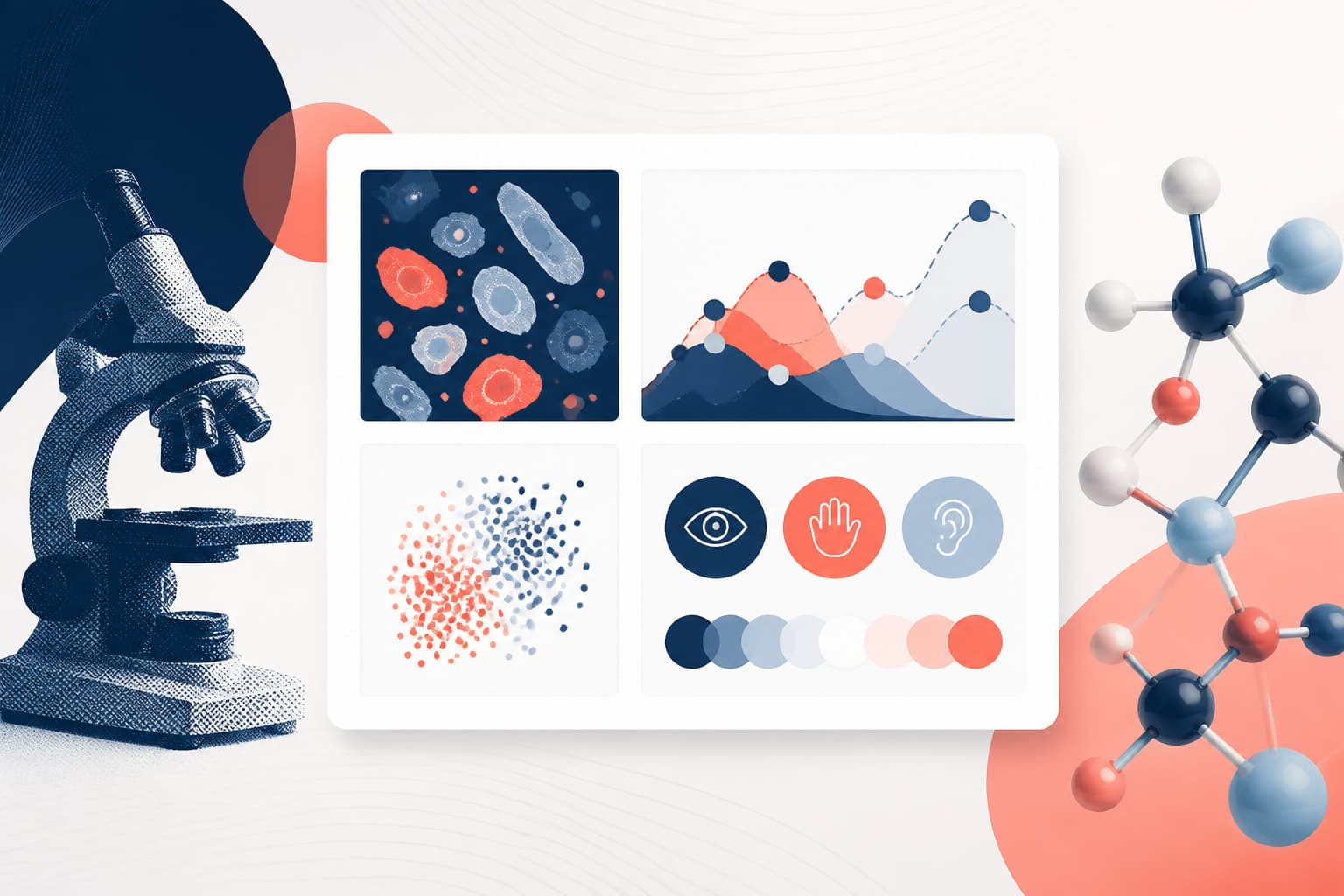
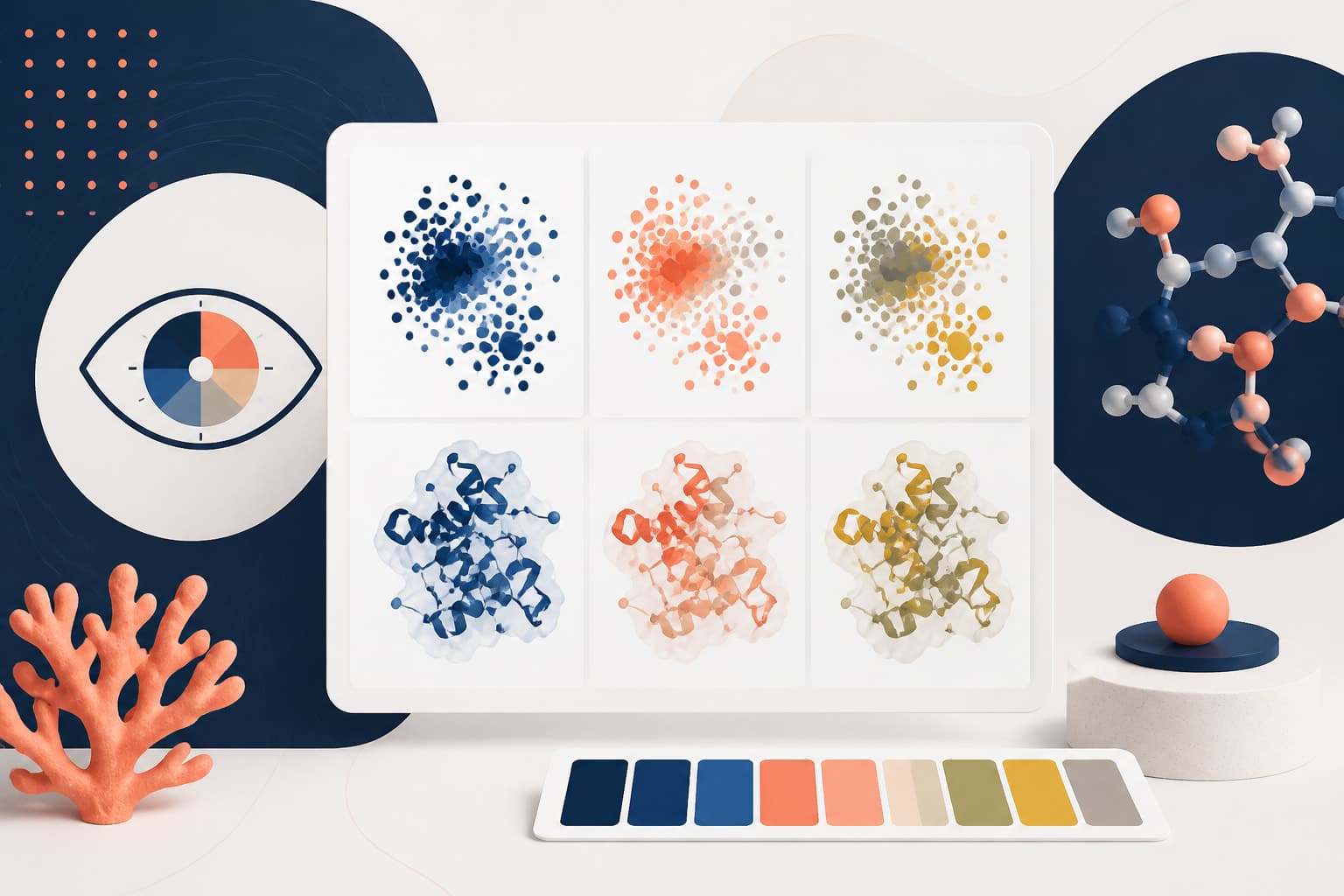
Use safer palettes for colorblind safe scientific figures
The most common risky combination is red and green. It appears in heat maps, microscopy overlays, bar charts, line plots, pathway diagrams, and classroom slides. Red versus green can work for some readers, but it fails too often to be a responsible default. Treat it as a warning sign, especially when the colors have similar brightness.
A better two color comparison is often blue and orange. Another workable pair is purple and green, if contrast is strong and the hues are not too muted. For three or more categories, choose palettes designed for perceptual separation. Do not build a rainbow by instinct. Rainbow scales create false boundaries and are often hard to interpret.
For continuous data, use sequential palettes such as light to dark blue, light to dark purple, or gray to dark teal. For data with a meaningful midpoint, such as change from baseline, use a diverging palette with a neutral center. Make sure both ends differ in lightness, not only hue.
The Color Universal Design recommendations from Masataka Okabe and Kei Ito remain a useful reference for accessible color choices. You can review their guidance on color universal design, including examples of palettes and simulations. It is a practical source, not just a theoretical one.
If you use Graffiy, you can also create with Graffiy and build figures with accessibility in mind from the start. The point is not to outsource judgment. The point is to give yourself better defaults and fewer chances to publish a confusing visual.
Avoid risky color combinations
Some color pairs are especially likely to cause trouble. Red and green are the obvious pair, but they are not the only problem. Green and brown can merge. Blue and purple can be difficult when values are close. Yellow on white may vanish. Cyan on white may look bright on screen but faint in print.
Also watch out for combinations that technically use different hues but share similar lightness. Two lines can be impossible to tell apart if both are medium brightness, even if one is red and one is green. This is why checking figures in grayscale is so useful. If the shapes collapse into the same gray, the color design is weak.
| Risky choice | Why it fails | Safer option |
|---|---|---|
| Red and green categories | Common red green confusion | Blue and orange with labels |
| Rainbow heat map | False boundaries and uneven contrast | Single hue or perceptually uniform scale |
| Yellow on white | Low contrast on screens and paper | Darker gold, navy, or black text |
| Thin colored lines only | Hard to distinguish in dense plots | Different line styles and direct labels |
| Red green microscopy overlay only | Signals may merge or disappear | Magenta green plus separate channels |
For microscopy, red and green overlays are still common because older conventions are sticky. A magenta and green overlay is often more accessible, and separate channel panels help even more. If colocalization matters, show the merged image and the individual channels. Do not make readers infer everything from one blended image.
For teaching slides, be extra conservative. Projectors wash out color, classroom lighting varies, and students may view slides on small screens. High contrast and direct labeling will beat subtle color theory almost every time.
Add redundant cues so color is never the only signal
Redundant cues are the backbone of colorblind safe scientific figures. A redundant cue repeats the same meaning through another visual feature. If group A is blue, it can also use circles. If group B is orange, it can also use triangles. If a map region is shaded, it can also use a pattern or boundary label.

In line charts, combine color with line style. Use solid, dashed, dotted, and dot dash patterns only when the lines remain readable. Avoid overly thin lines. Increase line weight before adding more decorative details. A slightly thicker line often solves more problems than a complicated legend.
In scatter plots, use shape as well as color. Circles, squares, triangles, and diamonds are easy to tell apart when points are large enough. If points overlap heavily, use transparency carefully, or consider faceting the data into small panels. A crowded cloud of colored dots can still be inaccessible, even with a good palette.
In bar charts, add direct labels or use patterns when categories must be distinguished without color. However, do not overfill bars with busy stripes. Patterns should help, not turn the chart into visual noise. When possible, label each bar directly and keep the legend short.
In diagrams and pathways, use labels, icons, arrow styles, and spatial grouping. If activation is green and inhibition is red, you have a problem. Use arrowheads, blunt ends, plus signs, minus signs, or words such as increases and decreases. Biology is complex enough without a secret color code.
Check contrast, not just hue
Colorblind accessibility is not only about hue. Contrast matters for every reader. A pale blue line on a white background may be technically distinguishable from an orange line, but still too faint to read. A figure should survive on a laptop, a printed PDF, and a lecture hall screen.
Use dark text on a light background or light text on a dark background. Avoid mid tone text on mid tone backgrounds. Axis labels, tick labels, scale bars, legends, and annotations deserve the same attention as the data marks. Tiny gray labels may look elegant, but they often punish readers.
For web and digital teaching materials, the W3C contrast guidance is a helpful reference. Scientific figures are not always simple text interfaces, but the principle still applies. Readers need enough contrast to separate foreground from background without effort.
When checking contrast, zoom out. Many researchers inspect figures at 200 percent while editing, then submit them at journal size. That hides problems. View the figure at the size a reader will see it. Then print it in grayscale if the final format may be printed.
Also test contrast after export. Some file conversions alter color profiles, compress images, or thin lines. A figure that looks fine in your plotting window may look weaker in a PDF. Always inspect the final exported file, not only the editable version.
Design legends and labels for quick interpretation
Legends are often where accessible figures go to die. If readers must look back and forth between a legend and six nearly identical colors, they will lose time and may make mistakes. Direct labels reduce that burden. Place labels near line ends, next to clusters, or inside empty plot space.
Use short, meaningful labels. Control, low dose, and high dose are better than Group 1, Group 2, and Group 3. If abbreviations are necessary, define them in the caption. Do not assume every reader knows your lab shorthand.
Order legends to match the figure. If the top line represents high dose, put high dose at the top of the legend. If bars appear left to right, list legend items in the same order. This small detail reduces mental switching and helps students learn from the figure faster.
Captions can also add redundancy. A caption that says, “The dashed orange line indicates the treated group,” gives readers another route to the meaning. Be concise, but do not be cryptic. A clear caption is part of the figure, not an afterthought.
Handle heat maps, images, and maps with care
Heat maps are risky because color often carries nearly all the information. If you use a rainbow scale, readers may see bands that are not meaningful. Choose perceptually uniform palettes where equal data steps look like equal visual steps. Sequential palettes work well for one direction of intensity.
For diverging heat maps, make the midpoint meaningful. Zero, baseline, or no change can sit at a neutral color. Avoid saturated red and green endpoints. Blue and orange, purple and green, or blue and red can work, but only if contrast and lightness are handled carefully.

Always include a readable color bar with numeric values. If the color bar is tiny, the palette becomes a decoration. Use clear tick marks, units, and a label explaining what the colors represent. When a threshold matters, mark it directly on the scale or with contour lines.
For geographic or anatomical maps, avoid relying only on filled regions. Add borders, labels, symbols, or patterns. If a map has many categories, consider whether it should become several smaller maps. Small multiples often beat a single overstuffed legend.
For microscopy and imaging figures, include scale bars, channel labels, and separate panels when needed. If colors correspond to stains or markers, label them directly. Use consistent channel colors across the whole paper or lecture. Switching colors between figures is a good way to confuse readers.
Test your figure before you submit or teach
You do not need a large user study for every plot. You do need a quick accessibility review. Start by converting the figure to grayscale. If the message disappears, revise. Then use a color vision deficiency simulator to inspect common types of colorblindness. Simulators are not perfect, but they catch many obvious failures.
Next, ask someone outside the project to explain the figure. Do not begin with a long explanation. Show the figure and ask, “What do you think this shows?” If they miss the main comparison, the design needs work. This test is humbling, but useful.
Check small sizes. Put the figure into a slide, a manuscript page, and a PDF viewer at normal zoom. Can you read labels without leaning forward? Can you distinguish groups without the caption? Are the important differences visible within a few seconds?
Finally, check consistency across the full set. If control is blue in Figure 1, keep it blue in Figure 2 unless there is a strong reason to change. Consistency is a form of accessibility. It reduces memory load for readers and helps teaching staff explain material cleanly.
A practical checklist for your next figure
Use this checklist before exporting final files. It is intentionally direct because accessibility work should not depend on guesswork. If a figure fails one item, fix that issue before moving on.
- Define the message first. Know what comparison, trend, or structure the reader must see.
- Avoid red green defaults. Use safer pairs such as blue and orange, or accessible categorical palettes.
- Add redundant cues. Combine color with labels, symbols, patterns, line styles, or spatial grouping.
- Check grayscale. The main conclusion should remain understandable without color.
- Use enough contrast. Text, lines, markers, and annotations must be readable at final size.
- Label directly when possible. Reduce dependence on long legends and memory.
- Test final exports. Inspect the PDF, slide, or image file that readers will actually see.
- Keep conventions consistent. Do not change category colors across a paper or lecture without reason.
This is not about making figures bland. Accessible figures can be sharp, attractive, and memorable. The best ones feel effortless because the design decisions are doing quiet work in the background.
If you are preparing a manuscript, build accessibility into the first draft rather than patching it at submission. If you are teaching, make accessible visuals part of your course standard. Students notice when figures are easier to read. Reviewers notice too, especially when the result is a cleaner argument.
Colorblind safe scientific figures are really just better scientific figures. They respect the reader, protect your message, and reduce avoidable misunderstanding. Avoid risky color combinations, add redundant cues, and test the final result. Those three habits will improve nearly every figure you make.
Frequently Asked Questions
What are colorblind safe scientific figures?
Colorblind safe scientific figures are figures that remain understandable for readers with common forms of color vision deficiency. They use safer palettes, strong contrast, and redundant cues such as labels, shapes, patterns, or line styles. The goal is not to remove color, but to stop color from being the only source of meaning.
Is blue and orange always the best color combination?
Blue and orange is often a safer two category choice than red and green, but it is not automatically perfect. You still need enough contrast, readable labels, and a design that works at final size. For more than two categories, use a tested accessible palette and add non-color cues.
How can I quickly test whether my research figure is colorblind safe?
Convert the figure to grayscale and check whether the main conclusion is still visible. Then use a color vision deficiency simulator and inspect the exported PDF or slide at normal viewing size. If the figure depends on subtle color differences, add labels, marker shapes, line styles, or separate panels.
Written by
Shobajo AbdulAzeez
Tags
Share this article