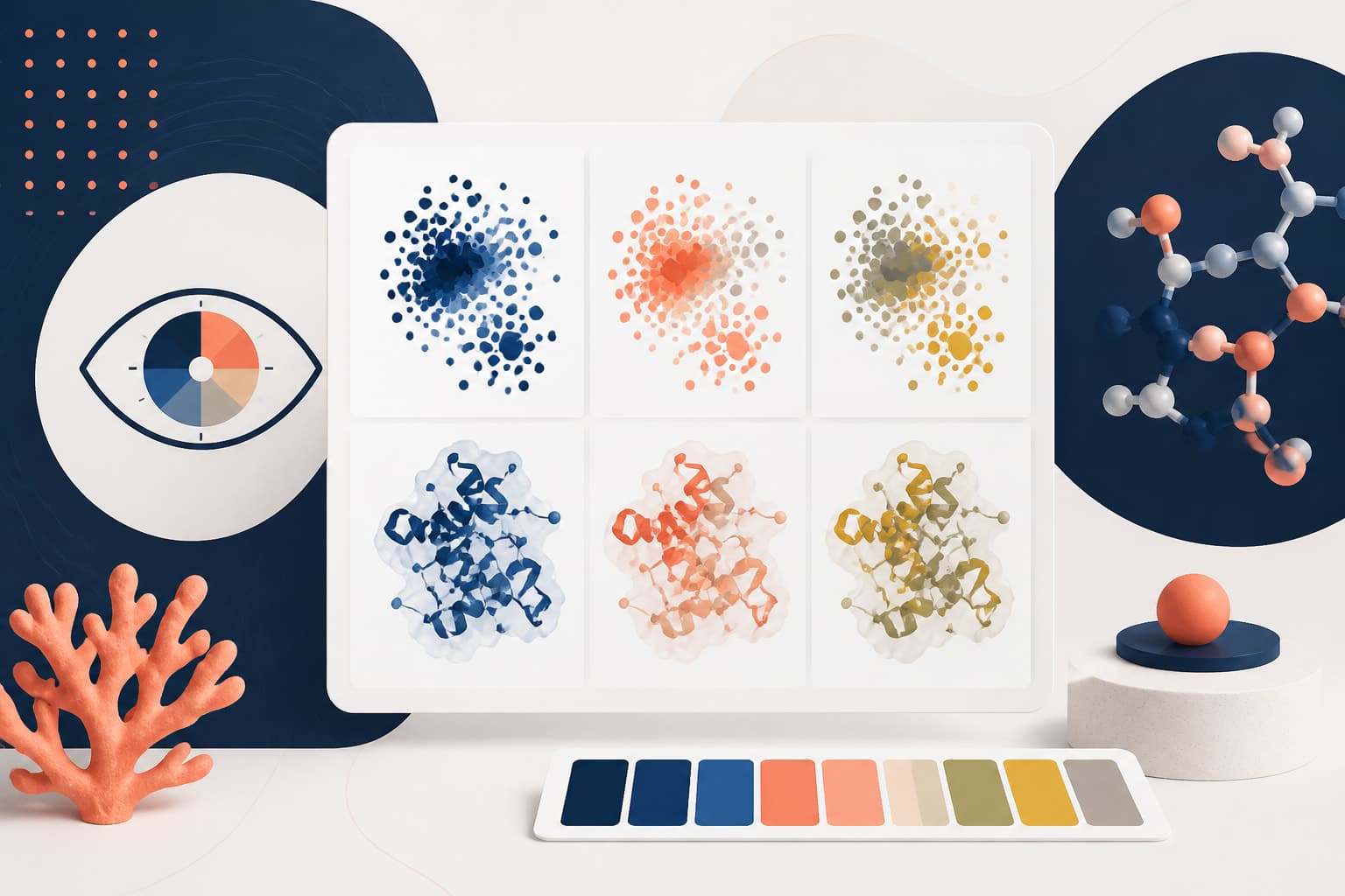
scientific figure white space: Margins and Cropping Guide
In This Article
Why scientific figure white space matters
scientific figure white space is one of the easiest ways to make a figure feel clearer without changing the data. It gives labels room to breathe, separates panels, and helps readers understand where to look first. Good spacing is not about making a figure look sparse. It is about removing visual friction while keeping file dimensions, export size, and journal requirements under control.
Researchers often treat white space as something to trim away at the end. That is understandable, especially when a journal has strict width limits. But if you crop too aggressively, the figure becomes tense. Axis labels touch tick marks. Panel letters float awkwardly. Legends feel like afterthoughts. A little planning gives you a cleaner figure and fewer revision headaches.
White space also affects how reviewers experience your work. A crowded figure asks them to work harder before they even judge the evidence. A balanced figure signals care, accuracy, and confidence. That does not guarantee acceptance, of course, but it removes one avoidable barrier.
In this guide, we will walk through practical spacing, margins, and cropping choices for researchers polishing visuals. The goal is simple: improve readability while keeping the final file compact, predictable, and ready for submission.
White space is structure, not decoration
White space is the visible empty area around and between figure elements. It includes outer margins, panel gaps, label padding, legend spacing, and the space inside plots. In scientific figures, it should serve a job. It groups related elements, separates unrelated elements, and protects information from visual clutter.
Think of white space as a layout tool. When two panels belong together, the gap between them can be smaller. When two panels represent different experiments or conditions, a slightly larger gap helps the reader understand the shift. This is faster than explaining the relationship in a long caption.
The most common mistake is using equal spacing everywhere. Equal spacing sounds tidy, but it can make a complex figure harder to scan. A multi-panel figure needs hierarchy. Panel groups, legends, annotations, and scale bars each need appropriate breathing room.
Another mistake is confusing white space with wasted space. Scientific readers do not need decorative emptiness. They need readable labels, visible symbols, and enough separation to avoid misreading. The best scientific figure white space is almost invisible because the figure simply feels easy to understand.
Set outer margins before you crop
Outer margins define the boundary between the figure and the page or slide around it. If they are too wide, the exported figure wastes dimensions. If they are too tight, labels may be clipped or look cramped after resizing. The sweet spot depends on the final use.
For journal figures, start with the final target width. Common widths include single column, one and a half column, and full page width. Journals vary, so always check the author instructions. For example, PLOS provides detailed figure preparation guidance, including file and sizing expectations, in its figure guidelines.
Once you know the target width, design at that size or at a clean multiple of it. Do not create a huge canvas and hope cropping will fix everything later. Oversized canvases encourage inconsistent margins, bloated files, and unpredictable scaling.
A practical starting point is to leave a modest outer margin around the full figure, then adjust only where needed. More margin may be needed below x axis labels or beside a long y axis label. Less margin may be needed around a panel that has no external labels.
If the figure will appear on slides, margins can be slightly more generous. Projected figures need room because viewers are farther away. For manuscripts, be more economical, but do not let page limits bully your labels into the edges.
Use panel spacing to guide the eye
Panel spacing is where many scientific layouts succeed or fail. In a multi-panel figure, readers usually scan by panel letter, title, data region, axes, and annotations. Your spacing should support that path. It should not force the reader to guess which label belongs to which plot.
Keep the gap between a panel letter and its panel consistent. Panel letters work best when they sit slightly outside or at the upper left of each panel area. If some letters sit inside plots and others sit in the margin, the layout feels improvised.
For related panels, align plot areas, not just the outer boxes. Axes, heatmaps, microscopy images, and charts should share clear baselines where possible. A small mismatch in plot alignment can make the figure look less trustworthy, even when the data are correct.
For panel groups, use spacing to show relationships. Suppose panels A, B, and C show the same assay, while panels D and E show validation. The gap between A, B, and C can be smaller than the gap before D. That layout tells a story before the caption begins.
Avoid using thick boxes to fix unclear grouping. Borders can help in some image grids, but they add visual weight. Often, adjusted scientific figure white space does the job with less clutter.
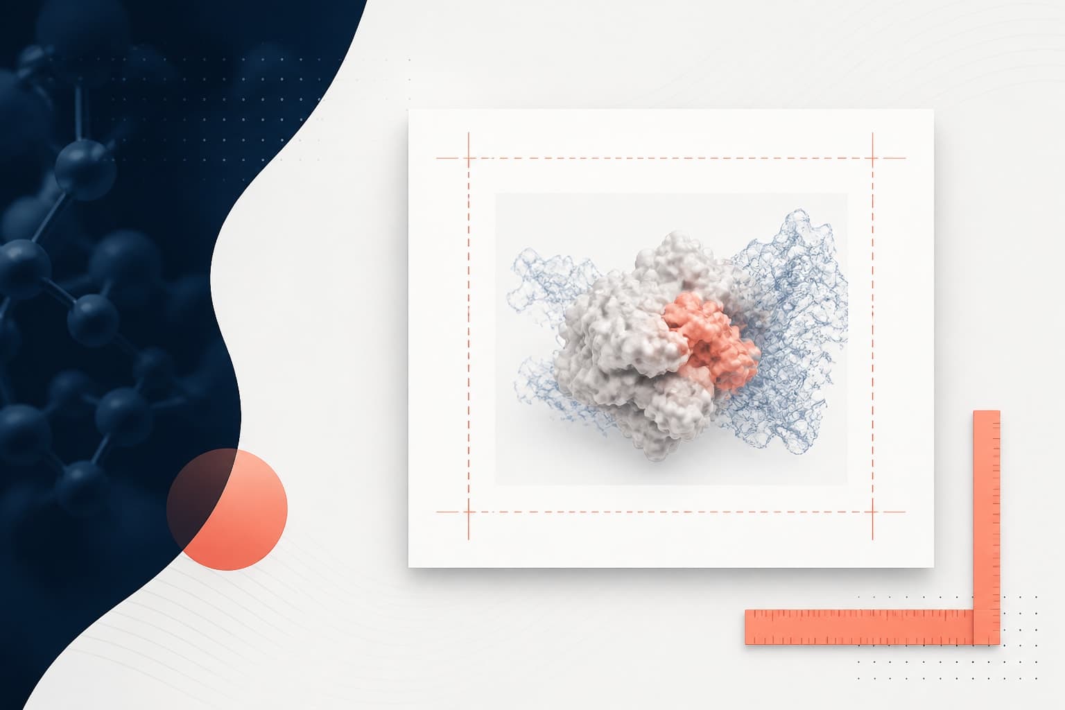
Crop for meaning, not just tightness
Cropping is the act of removing unnecessary canvas or image area. Good cropping focuses attention. Bad cropping removes context, clips labels, or creates a figure that feels trapped. The best crop depends on what the reader needs to compare.
For charts, crop the canvas, not the data. Leave enough room for tick labels, axis titles, error bar caps, significance markers, and legends. Be especially careful with rotated x axis labels. They often extend farther than expected after export.
For microscopy or field images, crop consistently when comparison matters. If two images are meant to show differences in morphology, abundance, or localization, use matched magnification and similar framing. Cropping one image tighter than another can imply a difference that comes from layout rather than biology.
For gels, blots, and plates, cropping should preserve relevant lanes, markers, and controls. Do not crop so tightly that the evidence loses context. Many journals have specific rules for image integrity, so keep original files and document any cropping decisions.
A useful test is to shrink the figure to its final printed size. If the crop still preserves labels, scale bars, and comparisons, it is probably safe. If it only works when viewed at 200 percent zoom, revise the crop.
Control file dimensions without sacrificing readability
White space and file dimensions are connected, but not always in the way people assume. Removing unnecessary empty canvas can reduce dimensions. However, compressing the layout too much may force you to use tiny labels, dense legends, or oversized raster exports to compensate.
Start by separating three ideas: canvas dimensions, resolution, and file size. Canvas dimensions describe width and height, such as 180 mm by 120 mm. Resolution describes pixels per inch for raster images. File size describes how much storage the file uses. Scientific figure white space affects all three, but each needs its own decision.
Vector content, such as line charts, text, arrows, and simple shapes, usually stays sharp at small file sizes. Raster content, such as microscopy images or heatmaps exported as pixels, can become heavy quickly. If your figure combines both, keep vector elements vector whenever possible.
Do not export a full page figure when the journal will print it as a single column. Oversized exports invite huge files and small text after scaling. Instead, choose the final physical width first, then set font sizes, line weights, and spacing for that width.
For raster images, crop before placing them into the figure. A massive microscopy image hidden behind a small frame can still inflate the file. Trim unused image area in a copy, preserve the original, then place the cropped version into the layout.
When you need a fast starting point for balanced layouts, you can create with Graffiy and refine spacing, annotations, and composition with publication readability in mind. Tools help, but judgment still matters. The figure should serve the evidence, not the software.
Practical margin and spacing rules that work
Rules are not laws, but they help you move faster. Use them as a first pass, then adjust for your data. Scientific figure white space should be consistent enough to feel organized and flexible enough to handle real figure content.
- Use consistent outer margins. Keep top, side, and bottom margins visually related, but allow extra room for axis labels or legends.
- Align plot regions. Align the data areas across panels when comparison is important.
- Keep label padding comfortable. Axis titles should not touch tick labels, and tick labels should not touch the plotting area.
- Separate groups with larger gaps. Use spacing changes to show structure in a multi-panel figure.
- Crop raster images before layout. This helps control file dimensions and avoids hidden pixels.
- Check at final size. A figure that looks good on a large monitor may fail in a manuscript PDF.
A good visual check is to blur your eyes or zoom out. You should still see the main structure: title or panel letters, panels, groups, legends, and major comparisons. If everything collapses into a gray block, the spacing is too tight or the contrast is too low.
Another useful check is to remove the caption temporarily. Can a knowledgeable reader still identify what belongs together? If not, spacing and alignment need more work.
Balance legends, labels, and annotations
Legends are frequent offenders in scientific figure design. They often sit too far from the data, or they consume valuable space inside a panel. The right choice depends on complexity. A small legend can sit inside unused plot space if it does not cover data. A complex legend usually belongs outside the plot but close to the relevant panel.
Do not let legends dictate the entire canvas unless they are central to interpretation. If a legend has many categories, consider direct labels, grouped keys, or a simplified color strategy. Every extra category increases the spacing burden.
Axis labels need enough padding to remain legible after reduction. This is especially important for units, superscripts, subscripts, and italic gene or species names. If the label is long, rewrite it before making the figure wider. Short labels often solve spacing problems better than cropping.
Annotations should sit close to the feature they explain. Arrows, brackets, and significance markers need separation from data points and error bars. If annotations pile up, the problem may not be margin size. It may be that the panel is trying to say too much.
Common white space problems and fixes
Some layout problems appear again and again. They are easy to miss when you have stared at a figure for hours. Use this table as a quick diagnostic before submission.
| Problem | Likely cause | Practical fix |
|---|---|---|
| Labels are clipped after export | Outer margins are too tight or export bounds are wrong | Add margin, then export using the correct artboard or page area |
| Panels feel unrelated | Gaps are too large or inconsistent | Group related panels with smaller spacing and align their plot areas |
| File is very large | Hidden raster image area or oversized canvas | Crop raster images before placement and export at final dimensions |
| Legend dominates the figure | Too many categories or poor placement | Simplify categories, use direct labels, or place the legend near the relevant data |
| Figure looks cramped in PDF | Designed too large, then reduced | Design at final width and increase spacing relative to text size |
These fixes sound simple because they are. The hard part is applying them before the figure becomes crowded. Build spacing into the design from the start, then crop carefully at the end.
A submission-ready workflow
Use a repeatable workflow when polishing figures. First, confirm the final output context. Is the figure for a journal, preprint, grant, poster, lecture, or social graphic? Each context has different spacing needs.
Second, set the canvas to the intended final size. Add panels and align data regions. Place labels, legends, and annotations before judging margins. A figure with no labels always looks spacious, so spacing decisions made too early can be misleading.
Third, inspect scientific figure white space at three zoom levels. At full size, check precision. At final display size, check readability. At thumbnail size, check structure. If the figure works at all three levels, it is in good shape.
Fourth, crop with a safety margin. Do not trim to the exact outer pixel of the last label. Leave a small buffer so PDF viewers, journal systems, and slide exports do not clip edges. This is especially important for letters with descenders, italic text, and thin lines.
Fifth, export and reopen the file. This step catches problems that the design view hides. Check for missing fonts, clipped labels, rasterized text, unexpected borders, and bloated dimensions. If possible, place the exported figure into a mock manuscript page and review it there.
Finally, keep editable originals. Save layered or editable versions before flattening or compressing. If a reviewer asks for a changed label, new panel, or different crop, you do not want to rebuild the figure from scratch.
Final thoughts on readable, compact figures
Good scientific figures do not happen by squeezing everything into the smallest possible rectangle. They happen when every element has a reason to be there and enough space to be read. White space is part of that reasoning.
Use margins to protect the figure, panel spacing to explain structure, and cropping to focus attention. Keep file dimensions under control by designing at the final size, preserving vector elements, and cropping raster content before layout. This approach gives you cleaner exports and more readable figures.
Most importantly, judge the figure as your reader will see it. If the evidence is clear at final size, the labels are comfortable, and the file is not carrying hidden excess, your scientific figure white space is doing its job.
Frequently Asked Questions
What is scientific figure white space?
scientific figure white space is the empty area around and between figure elements, including margins, panel gaps, label padding, and unused plot area. It helps readers separate information, follow comparisons, and avoid misreading crowded visuals.
How much margin should I leave around a scientific figure?
Use enough margin to prevent labels, panel letters, legends, and annotations from feeling cramped or being clipped after export. For manuscripts, keep margins economical, but always check the figure at its final printed or PDF size before submission.
Does cropping reduce scientific figure file size?
Cropping can reduce file size when it removes unused raster image area or unnecessary canvas. It will not always help if the figure is mostly vector content, but it can still improve focus and keep dimensions more predictable.
Written by
Shobajo AbdulAzeez
Tags
Share this article