What Makes a Good Scientific Illustration? Principles and Examples
In This Article
What a scientific illustration must do
A strong scientific illustration is not decoration. It is a visual argument, a teaching tool, and often the fastest route to understanding a complex idea. Whether you are showing a signaling pathway, a microscopy workflow, a climate process, or an anatomical structure, the illustration should help viewers see what matters first, then understand the details.
Good work sits at the intersection of scientific accuracy and visual clarity. If it is beautiful but misleading, it fails. If it is accurate but visually confusing, it also fails. The best examples respect the data, guide attention, and reduce unnecessary mental effort.
For researchers and science communicators, this matters because figures travel farther than manuscripts. They appear in talks, posters, grant proposals, classrooms, graphical abstracts, social posts, and press releases. A good figure can make the difference between curiosity and confusion.
Start with clarity, not decoration
Clarity is the first test of any scientific illustration. Before choosing colors or textures, ask one blunt question: what should the viewer understand after five seconds? If the answer is not obvious, the figure needs editing.
A clear illustration has one primary message. Supporting details can remain, but they should not compete with the main idea. For example, a figure explaining CRISPR editing should make the sequence of recognition, cutting, and repair visible before it introduces secondary proteins, cell context, or experimental variations.
Clarity improves when you remove visual noise. Extra gradients, shadows, decorative icons, redundant arrows, and tiny background elements usually make the science harder to read. Use detail only when it carries meaning. A clean mitochondrion diagram may need inner membrane folds, but it probably does not need photorealistic texture if the topic is ATP production.
Scale also affects clarity. A figure that works on a large monitor may fail in a journal column or a conference slide screenshot. Test your illustration at the smallest expected size. If labels blur, arrows merge, or symbols become ambiguous, simplify before submission.
One useful habit is to write the figure caption before final design. The caption exposes the message, sequence, and terminology. Then the visual can be built to match that logic, rather than becoming a collection of attractive parts.
Accuracy is the backbone of trust
Scientific audiences are generous about style, but not about false information. Accuracy includes factual correctness, proportional relationships, spatial relationships, sequence, scale, uncertainty, and terminology. A polished scientific illustration with a wrong protein location or reversed anatomical orientation can damage credibility quickly.
Start with sources. Use primary literature, trusted databases, lab data, imaging references, protocol notes, or direct expert review. If you are illustrating a structure from microscopy, do not rely on memory. If you are drawing a pathway, confirm directionality, activation, inhibition, and compartment location.
Accuracy does not always mean literal realism. A simplified schematic can be accurate if the abstraction is intentional and honest. For example, a synapse diagram may enlarge vesicles and receptors to make the mechanism visible. That is acceptable when the figure is not claiming exact scale. If scale matters, include a scale bar, note, or proportional guide.
Be careful with biological conventions. DNA strands have direction. Antibodies have recognizable geometry. Organs have orientation. Microscopy images use scale bars rather than decorative rulers. Chemical structures should follow accepted notation. Small errors here are easy to make and easy for specialists to spot.
If the illustration represents uncertain or hypothetical mechanisms, show that visually. Dotted arrows, question marks used sparingly, lighter opacity, or caption notes can signal uncertainty. Do not present a proposed model as established fact unless the evidence supports it.
Build visual hierarchy so the eye knows where to go
Visual hierarchy is the order in which people notice information. In scientific illustration, hierarchy is not a styling extra. It is how you control reading order, reduce confusion, and keep viewers from treating every element as equally important.
The main subject should be visually dominant. You can create dominance with size, contrast, placement, color, line weight, or empty space. If a pathway figure is about a receptor, the receptor should not be the same visual weight as every minor adaptor protein. If a climate diagram is about ocean heat uptake, the ocean layer should command attention.
Group related elements close together. Separate unrelated elements with space. Alignment also matters. When labels, icons, and arrows line up predictably, the viewer spends less time decoding the layout and more time understanding the science.

Use arrows with discipline. Arrows should show direction, movement, causality, or sequence. When every line has an arrowhead, the viewer stops trusting them. Keep arrow styles consistent: one style for flow, another for inhibition, and another for transport if needed.
Reading order should match the story. Many audiences read left to right and top to bottom, but not all figures must follow that pattern. Circular processes, spatial anatomy, and layered systems may require different layouts. Whatever the structure, make the path obvious through numbering, arrows, panels, or captions.
Color theory for science, not just aesthetics
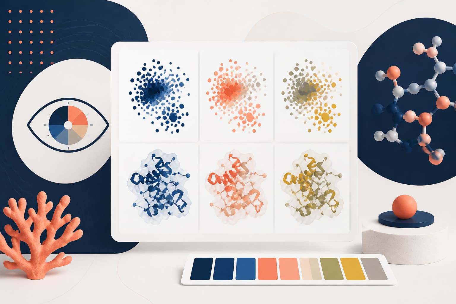
Color should carry meaning, not just mood. In scientific illustration, color can separate categories, show intensity, highlight a key structure, or encode data. It can also confuse viewers if chosen casually.
Start by deciding what color means in the figure. If blue marks treated samples in one panel, it should not mark controls in another. If red shows activation, avoid using red for unrelated decoration. Consistent color logic is one of the simplest ways to make complex visuals easier to follow.
Use limited palettes. Three to five meaningful colors are usually enough for a schematic. Too many colors create a carnival effect and make the figure harder to remember. Neutral grays can support context, while brighter colors highlight the active elements.
Accessibility is not optional. Many viewers have some form of color vision deficiency, and many figures are printed, projected, compressed, or viewed on poor screens. Avoid relying only on red and green differences. Pair color with labels, patterns, line styles, or shapes.
The Web Content Accessibility Guidelines offer useful contrast principles for readable text and graphics. Their contrast guidance is not written only for scientific figures, but it is highly relevant when you are designing labels, legends, and annotations. You can review the standard through the W3C guidance on contrast minimums.
Color intensity should reflect importance. A bright saturated color draws attention. Use it for the main mechanism, key comparison, or selected region of interest. If everything is saturated, nothing stands out. Subtlety is often more scientific than spectacle.
Labeling conventions that prevent confusion
Labels are part of the illustration, not an afterthought. Poor labeling can ruin an otherwise elegant scientific illustration. Good labels are concise, consistent, and positioned where the viewer needs them.
Use the terminology your audience expects. A specialist figure may use gene symbols, receptor names, or anatomical abbreviations. A public facing explainer may need plain language first, with technical terms in parentheses. Neither approach is universally correct. The right choice depends on the viewer and the purpose.
Keep label placement close to the object. Long leader lines create visual clutter and increase the chance of misreading. When possible, label directly on or beside the structure. If many labels are required, group them in a clean legend or use numbered callouts.
Typography should be boring in the best way. Choose readable type, use consistent capitalization, and avoid tiny text. Italicize gene symbols when the convention requires it. Use Greek letters, superscripts, and subscripts correctly, especially in chemistry, genetics, and physiology.
Legends should explain symbols, colors, line styles, and abbreviations. A legend is not a place to repeat the entire caption. It should remove ambiguity quickly. If a viewer cannot tell whether a dashed line means inhibition, uncertainty, or hidden structure, the legend has not done its job.

Examples of good scientific illustration decisions
Consider a molecular pathway diagram. A weak version shows every molecule in equal size, uses ten colors, and fills the canvas with crossing arrows. A stronger version groups proteins by cellular compartment, highlights the key pathway in one accent color, fades background context, and uses a consistent arrow system for activation and inhibition.
Now consider an anatomical illustration for a patient education handout. The goal is not to show every vessel and nerve. The goal is to explain a condition or procedure. The best version simplifies surrounding anatomy, keeps orientation familiar, uses labels in plain language, and avoids frightening color choices unless they communicate a real clinical concern.
A microscopy workflow illustration has different needs. It may need to show sample preparation, staining, imaging, segmentation, and quantification. Here, a panel sequence works well. Each step should have a short title, a simple icon or image crop, and an arrow that shows progression. The viewer should understand the workflow before reading the caption.
A graphical abstract for a research article should be even more selective. It cannot carry the whole paper. It should show the question, method, main finding, and implication in one clear visual path. This is where many figures fail because authors try to include every experiment. Restraint is not dumbing down. It is communication.
For broader best practices, the article Ten Simple Rules for Better Figures is a useful reference for researchers who want practical guidance on figure purpose, audience, and design discipline.
A practical workflow for researchers and science communicators
A good workflow starts before design software opens. Define the audience, message, format, and constraints. Is the figure for a specialist journal, a grant panel, a classroom, or a public article? Each audience has a different tolerance for detail and terminology.
Next, sketch the idea in rough form. Use boxes, arrows, circles, and notes. Do not worry about polish. The sketch should answer three questions: what is the main subject, what is the reading order, and what can be removed?
Then build the illustration in layers. Start with structure, then hierarchy, then labels, then color, then final polish. This order prevents a common mistake: spending time on style before the communication problem is solved.
Review with both experts and non experts when possible. Experts catch scientific errors. Non experts reveal where the visual story breaks down. If both groups understand the main point, the figure is on the right track.
Tools also matter. A platform that supports clean scientific assets, editable layouts, and fast iteration can save hours. If you want to move from rough concept to polished research visual more efficiently, you can create with Graffiy and keep your focus on the science instead of fighting with generic design tools.
Common mistakes to avoid
The most common mistake is trying to show too much. A figure is not a storage container for every detail in the project. It is a guide. If a detail does not support the message, remove it, fade it, or move it to another panel.
Another mistake is inconsistent symbolism. Do not change arrow meanings, colors, or shapes between panels without explanation. Consistency reduces cognitive load and helps viewers trust the figure.
A third mistake is leaving accessibility until the end. Contrast, readable labels, and color safe palettes should be part of the first design pass. Fixing them later often requires rebuilding the figure.
Finally, do not confuse complexity with sophistication. Some of the best scientific illustration work looks simple because the hard thinking is hidden. The designer has already decided what matters, what can be simplified, and how the viewer should move through the information. That is the standard worth aiming for.
Frequently Asked Questions
What is the main purpose of scientific illustration?
The main purpose of scientific illustration is to make scientific information easier to understand while preserving accuracy. It can explain structures, mechanisms, workflows, comparisons, or experimental results. A good illustration guides attention and reduces confusion without changing the meaning of the science.
How detailed should a research illustration be?
It should include enough detail to support the message and audience, but not so much that the main point gets buried. A specialist pathway figure may need precise protein names and compartments, while a public explainer may need simplified anatomy and plain language. The best test is whether each detail helps the viewer understand the core idea.
What makes color effective in a scientific figure?
Effective color has a clear job, such as grouping categories, highlighting a key structure, or showing intensity. It should be consistent across panels and readable for people with color vision differences. Pair color with labels, shapes, or patterns so meaning does not depend on color alone.
Written by
Shobajo AbdulAzeez
Tags
Share this article