How to Create a graphical abstract for social media Reuse
In This Article
A graphical abstract for social media has a different job than the figure inside your paper. It needs to stop the scroll, explain the finding, and invite the right reader to learn more. That is a lot to ask from one image, so the best approach is not to make a new design for every channel. Instead, design one strong core visual, then adapt it for a single post, a carousel, and a newsletter feature.
This guide is for authors promoting papers online. We will keep the science accurate, the visuals clean, and the workflow practical.
Why a graphical abstract for social media needs a reuse plan
Most paper promotion fails for a simple reason: the visual was made for one place only. A square post looks cramped in a newsletter. A wide banner gets cropped on LinkedIn. A carousel made without a story feels like a chopped-up poster. You do not need more design effort. You need a reusable structure.
A graphical abstract for social media should start with a clear visual system. That system includes one key message, one main visual, a limited color palette, consistent labels, and enough empty space to survive resizing. When those parts are stable, you can rebuild the format without rewriting the science.
Think of your design as a kit, not a single file. The kit contains the paper title in plain language, the main outcome, the method or model, a result visual, a citation block, and a call to action. Each channel uses those pieces differently.
That also protects accuracy. When you create three unrelated graphics for one paper, small errors creep in. Terms change. Sample sizes disappear. A claim becomes stronger than the evidence. A reusable graphical abstract reduces that risk because every version comes from the same source.
Start with one message, not the whole paper
Your paper may include several hypotheses, experiments, limitations, and subgroups. Social media does not have room for all of them. A strong graphical abstract for social media usually communicates one answer to one reader question.
Start by writing this sentence: “We found that [main finding] in [system or population], which matters because [practical or scientific significance].” If that sentence is hard to write, the design will be hard to read. Do not skip this step.
Next, choose the audience. Are you speaking to researchers in your field, clinicians, funders, educators, journalists, or a general science audience? The same paper may need different wording for each group, but the core visual can remain consistent.
For example, a molecular biology paper might use pathway language for researchers, but use “cell stress response” for a broader audience. A public health paper might show a risk pattern for specialists, but show a community-level implication for policymakers. Clarity does not mean oversimplifying. It means removing friction.
A useful test is the five-second scan. Show the draft to someone near your target audience. Ask them what the paper is about, what changed, and why it matters. If they cannot answer, simplify the message before adjusting the colors.
Build a modular visual system
Design reuse begins with modules. A module is a piece of content that can move between layouts without losing meaning. For a graphical abstract for social media, the most useful modules are the hook, the study setup, the finding, the interpretation, and the source.
The hook is a short headline. It should not be the full article title unless the title is unusually clear. Use plain language, active verbs, and no more than 12 words when possible. The study setup answers what was tested, in whom, or under what conditions. The finding shows the result, preferably as a simple visual comparison.
The interpretation explains why the result matters. This is where authors often overclaim. Keep it grounded. “Associated with lower risk” is not the same as “prevents disease.” “Improved signal detection in this model” is not the same as “ready for clinical use.” Your credibility depends on that distinction.
The source module should include a short citation, DOI or journal link, and author or lab handle if appropriate. Make it small but readable. If your journal has rules for article promotion, follow them.

Recommended module hierarchy
- Primary message: the main finding or takeaway, always largest.
- Visual evidence: chart, process, comparison, pathway, map, or image-derived illustration.
- Context: study type, sample, model, or condition.
- Qualifier: limitation, uncertainty, or scope note when needed.
- Action: read the paper, share with a colleague, sign up, or view the preprint.
This hierarchy helps you decide what to cut when space gets tight. If a square post feels crowded, remove decorative elements first. Then shorten context. Do not shrink everything until it becomes unreadable.
Choose a format that adapts cleanly
Before you design, choose a base canvas that can convert well. A square canvas is often the safest starting point for a graphical abstract for social media because it works on LinkedIn, Instagram, Bluesky previews, and many website cards. A 4:5 vertical layout can perform well on mobile feeds, but it may need cropping elsewhere.
However, the base canvas is not the final strategy. Create a central safe zone where the main message and key visual sit. Keep logos, citations, and secondary labels away from the edges. This makes resizing less painful.
Use large type. Many readers will see the graphic on a phone. If the label would be hard to read at arm’s length, it is too small. Aim for fewer words, not smaller words. Also check contrast. The Web Content Accessibility Guidelines explain contrast principles clearly, and the W3C contrast guidance is a reliable reference when you are choosing text and background colors.
For figures, avoid importing a full multi-panel result from the paper unless it is already simple. Most published figures were designed for close reading, not social scanning. Redraw the essential pattern instead. A simplified bar chart, dose response curve, timeline, or flow diagram usually works better.
| Reuse format | Best role | What to adapt |
|---|---|---|
| Single post | Fast awareness and sharing | Use the hook, main visual, and citation |
| Carousel | Step-by-step explanation | Split modules into a short narrative |
| Newsletter | Context and click-through | Add a short paragraph and a clear link |
Adapt the design for a single social post
The single post version is your fastest entry point. It should communicate the paper without requiring a long caption, although the caption should still add context. Treat the graphic as the summary and the caption as the explanation.
For this version, use a strong title at the top, one central visual, and one takeaway line. Place the citation or DOI in a footer. If author handles are useful, include them carefully. Do not let handles compete with the result.
A good single post layout often follows this order: headline, visual, takeaway, source. The headline frames the question. The visual answers it. The takeaway tells the reader what to remember. The source tells them where to verify it.
Keep the caption complementary. Start with the plain-language finding, then add one sentence about the study design. Add a limitation if the result might be misread. End with a link, DOI, or instruction to find the paper. If the platform does not allow clickable links in the caption, use a clear short link or direct readers to the profile link.
When creating a graphical abstract for social media, resist the urge to add every coauthor logo, institutional badge, and award banner. Promotion is not decoration. If the reader cannot identify the finding quickly, the graphic is not doing its job.
Turn the same design into a carousel
A carousel gives you more room, but it also creates a new responsibility: sequence. Each slide should earn the next swipe. Do not simply crop your poster into five pieces. Build a short story from the same modules.
Start with a cover slide that uses the same hook and visual style as the single post. Slide two can show the problem or knowledge gap. Slide three can explain the method or study design. Slide four can show the key result. Slide five can interpret the result and include the paper link or citation.
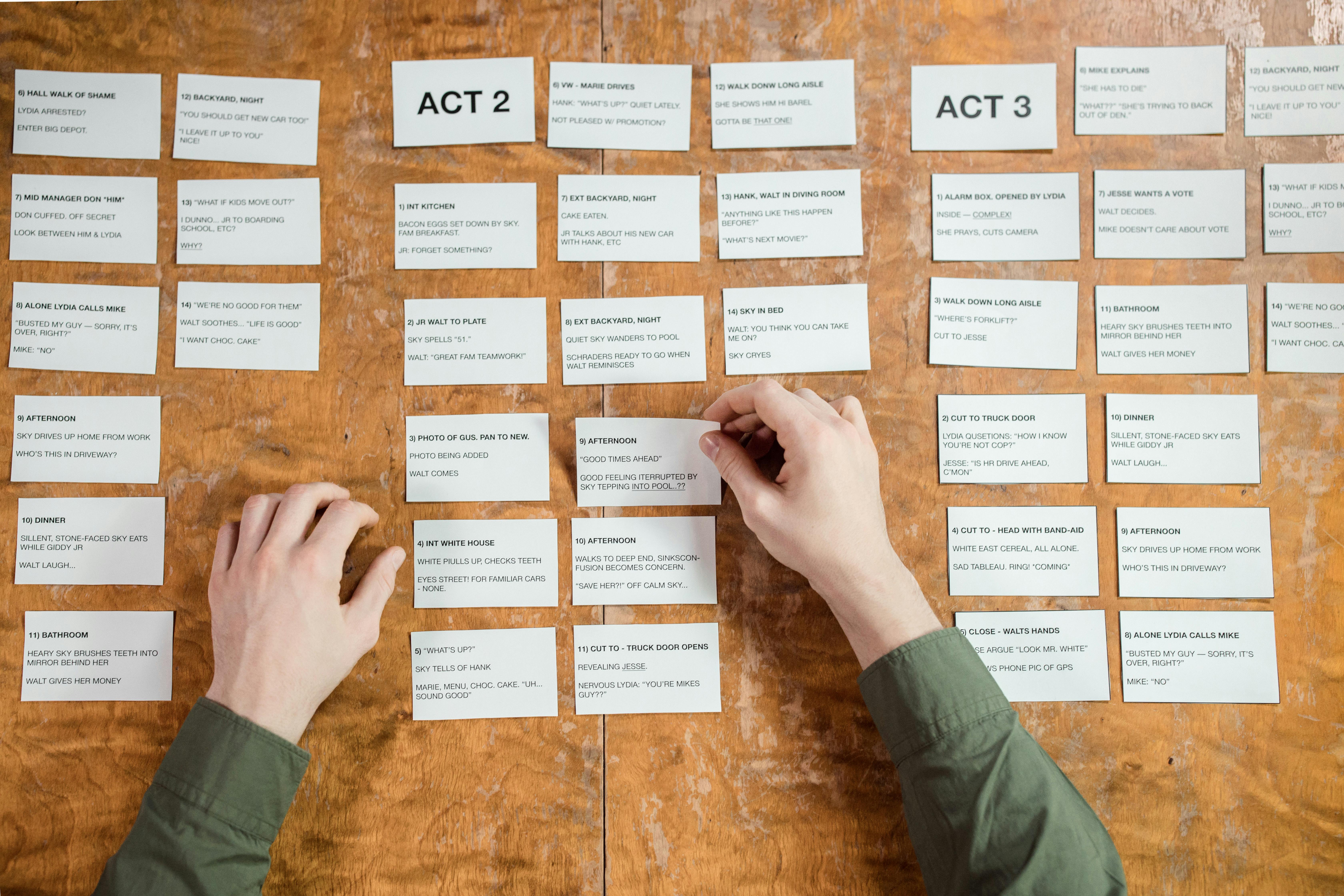
The carousel version of a graphical abstract for social media can include more explanation, but every slide should remain visually light. Use one idea per slide. If you need tiny labels to make a slide work, split it into two slides or rewrite it.
Use repeated visual anchors. Keep the same colors for treatment groups, populations, molecules, or outcomes across slides. If blue means control on slide two, it should not mean intervention on slide four. Consistency lowers cognitive load.
End with a slide that makes the next step obvious. “Read the open access paper,” “Download the preprint,” “View the dataset,” or “Share with someone studying this pathway” are all better than a vague “Learn more.”
Adapt the visual for a newsletter
Newsletter readers behave differently from social scrollers. They have already chosen to open an email, so they may tolerate more context. Still, the visual must be clear because many readers skim.
For a newsletter, you can use a wide header crop or a compact feature block. The same core graphical abstract can sit above a short summary. If your email template is narrow, stack the title, image, and text vertically. Avoid placing critical labels at the far left or right, where mobile email clients may compress the design.
The newsletter version should include a short text summary beside or below the image. Use two to four sentences: what the paper studied, what it found, why it matters, and where to read more. This is a good place to add nuance that did not fit inside the social post.
If the paper is technical, add a “why this matters” line. If the result is preliminary, add a scope note. If the paper is open access, say so. These details help readers decide whether to click, save, or forward.
You can create with Graffiy at Graffiy when you want a faster way to turn research concepts into polished scientific visuals. The practical benefit is simple: keep the visual language consistent while adapting the layout for each channel.
Design details that make reuse easier
Reusable design is built from decisions that seem small at first. File organization matters. Name layers clearly. Keep text editable. Save icons, labels, and result graphics separately. Export each channel version from the same master file, not from screenshots.
Use vector shapes when possible. They scale better than low-resolution images. If you must use microscopy, scans, or imaging data, crop carefully and avoid misleading enhancement. Add scale bars where they matter. Do not use a beautiful image if it makes the science less clear.
Color should carry meaning, not just style. Use one accent color for the main finding and neutral colors for background information. Be careful with red and green pairings because they can be difficult for many viewers. Add direct labels instead of relying only on legends.
Typography also affects trust. Use one type family, or at most two. Make the title bold, the labels medium, and the citation smaller. Avoid novelty fonts. They may look playful, but they often reduce readability in scientific communication.
Finally, build an export checklist. Check spelling, sample sizes, units, abbreviations, author names, journal title, DOI, and permissions. Confirm that every platform crop preserves the main message. Read the graphic on your phone before posting. That final phone check catches many problems.
A practical workflow from paper to reusable assets
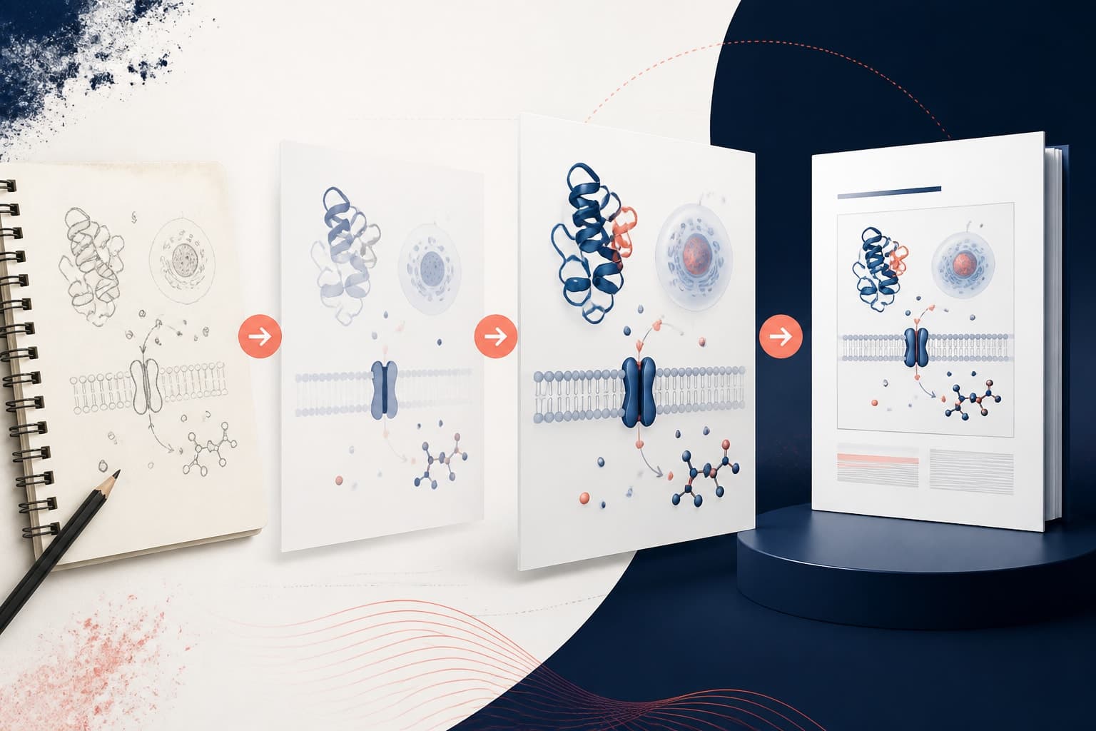
Here is a simple workflow we recommend. First, extract the paper’s main claim and rewrite it in plain language. Second, select the visual pattern that best represents the result. Third, create the base graphical abstract for social media as a square or 4:5 design. Fourth, make the single post version.
Next, duplicate the base design and expand it into a carousel storyboard. Keep the same colors, icons, and terminology. Then make a newsletter version with a wider or simpler crop and a short text summary. Finally, export all formats and store them with the manuscript ID or DOI.
This workflow reduces revision time because feedback applies across assets. If a coauthor corrects the wording of the outcome, you update the shared module and then export the formats again. That is much easier than fixing three unrelated designs.
It also helps teams coordinate promotion. The corresponding author, lab account, institution, and coauthors can share visuals that look related without posting identical content. One person can post the single visual, another can share the carousel, and the newsletter can feature the wider summary.
A well-made graphical abstract for social media does not replace the paper. It opens the door to it. Your goal is not to compress years of work into one square. Your goal is to give the right reader enough understanding and confidence to click, read, and share responsibly.
Common mistakes to avoid
The most common mistake is overcrowding. Authors know the work deeply, so every detail feels important. Readers do not have that context yet. Give them a clear path before giving them complexity.
Another mistake is using a result chart without interpretation. A plot may be accurate but still fail as communication. Add a short takeaway that explains what pattern the reader should notice. Make the visual evidence and the verbal message support each other.
A third mistake is changing terminology between formats. If the post says “immune activation,” the carousel says “inflammatory signaling,” and the newsletter says “host response,” readers may wonder whether these mean the same thing. Consistency builds trust.
Finally, avoid treating the newsletter as an afterthought. Email can be one of the best formats for serious readers because it allows context and direct links. If you already designed the core visual well, the newsletter adaptation should be quick.
Final checklist before you publish
- Can a target reader understand the main finding in five seconds?
- Does the graphic include one clear hook, one main visual, and one takeaway?
- Are claims accurate, qualified, and aligned with the paper?
- Is text readable on a phone?
- Do colors have enough contrast?
- Are abbreviations defined or avoided?
- Does every adapted format use the same visual language?
- Is the citation, DOI, or paper link present where needed?
- Have all coauthors approved the wording?
- Have you checked platform crops before posting?
If you follow this process, you can design once and reuse intelligently. The single post creates quick awareness. The carousel teaches the story. The newsletter adds context and drives clicks. Together, they turn one graphical abstract for social media into a small communication system for your paper.
Frequently Asked Questions
What size should I use for a graphical abstract for social media?
A square format is a safe starting point because it adapts well across many platforms. If your audience is mostly mobile, a 4:5 vertical version can also work well. Keep the main message in a central safe zone so platform crops do not remove important information.
How do I reuse one graphical abstract for posts, carousels, and newsletters?
Design the core visual as reusable modules: hook, study setup, main finding, interpretation, and citation. Use the single post for the shortest version, split the modules into a carousel story, and place the same visual beside a short summary in your newsletter. This keeps the science consistent while giving each format the right amount of context.
Should a graphical abstract for social media include all results from the paper?
No, it should focus on the main finding that matters most to your target audience. You can mention scope, limitations, or study design in the caption, carousel, or newsletter text. Trying to include every result usually makes the graphic harder to understand and less likely to be shared.
Written by
Shobajo AbdulAzeez
Tags
Share this article