The Researcher's Guide to Data Visualization for Researchers: Charts That Tell a Story
In This Article
Your research data holds powerful stories, but only if you can tell them effectively. Data visualization for researchers isn't just about making pretty charts. It's about transforming complex datasets into clear, compelling narratives that advance scientific understanding and drive meaningful discoveries.
The difference between good and great research often comes down to how well you communicate your findings. A poorly chosen chart can obscure breakthrough insights, while the right visualization can illuminate patterns that change entire fields of study.
Understanding Your Data Before You Visualize
Before selecting any chart type, you need to understand what your data is trying to say. This means looking beyond the numbers to identify the underlying story.
Start by asking yourself three fundamental questions. What is the primary message you want to convey? Are you showing relationships, comparisons, distributions, or changes over time? What action or understanding do you want your audience to take away?
Different data types require different approaches. Categorical data works well with bar charts and pie charts, while continuous data often benefits from line graphs, scatter plots, or histograms. Time series data has its own set of best practices, typically favoring line charts or area graphs that show progression clearly.
Consider your audience's statistical literacy level. Academic peers can handle complex visualizations with multiple variables, while public presentations might require simpler, more focused charts. The same dataset might need three different visualizations depending on whether you're presenting to fellow researchers, funding committees, or the general public.
Choosing the Right Chart Type for Research Data
The chart type you choose can make or break your research presentation. Each visualization method serves specific purposes and works better with certain data structures.
Bar charts excel at comparing discrete categories or showing rankings. They're particularly effective for survey responses, experimental conditions, or any situation where you need to compare magnitudes across different groups. Horizontal bar charts work better when category names are long or when you have many categories to display.
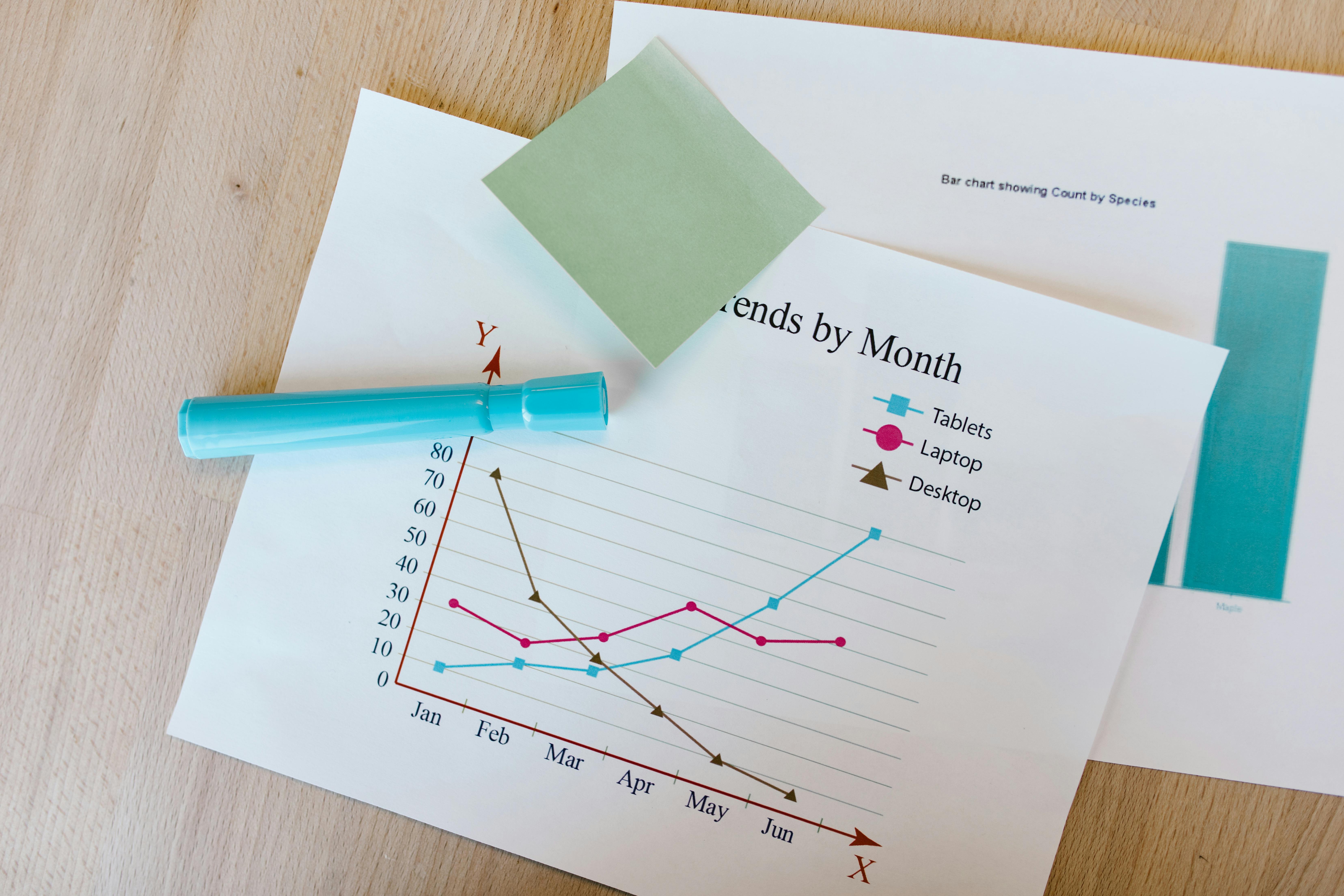
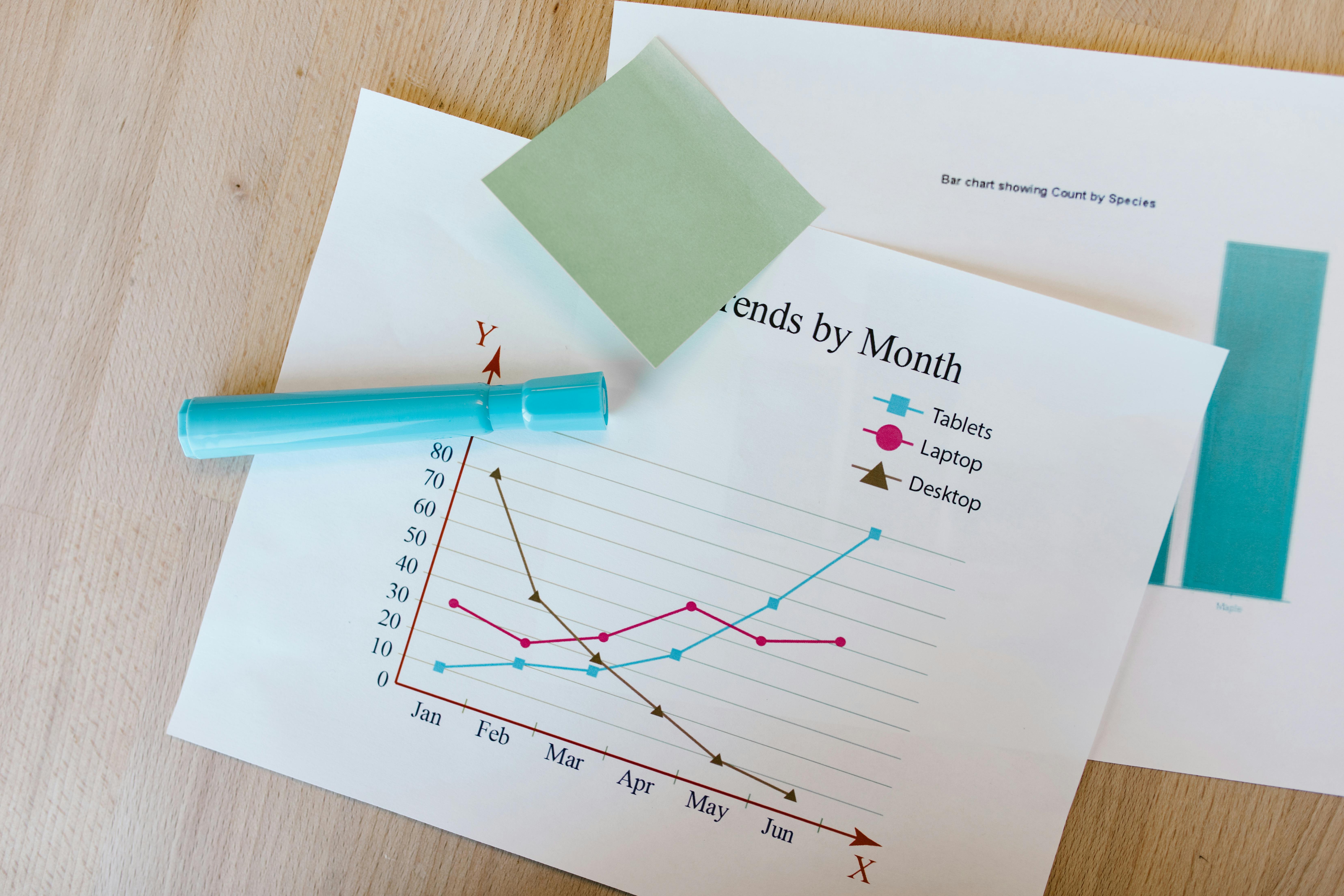
Line charts shine when showing trends over time or continuous relationships between variables. They're essential for longitudinal studies, time series analysis, or any research tracking changes across sequential points. Multiple line charts can compare trends between different groups or conditions.
Scatter plots reveal relationships between two continuous variables and are invaluable for correlation analysis. They help identify patterns, outliers, and potential causal relationships that might not be obvious in raw data tables.
Histograms and box plots are your go-to choices for showing distributions. Histograms reveal the shape of your data distribution, while box plots efficiently display median, quartiles, and outliers. These are particularly useful for preliminary data exploration and assumption checking in statistical analyses.
Heat maps work exceptionally well for correlation matrices, geographic data, or any situation where you need to show intensity across two dimensions. They're increasingly popular in genomics, social sciences, and market research.
Common Data Visualization Mistakes That Undermine Research
Even experienced researchers fall into visualization traps that can distort their findings or confuse their audience. Recognizing these pitfalls helps you avoid them in your own work.
The most damaging mistake is manipulating scales to exaggerate differences. Starting bar charts at non-zero values or using inconsistent scales across multiple charts can make small differences appear massive. Always start bar charts at zero and use consistent scales when comparing related data.
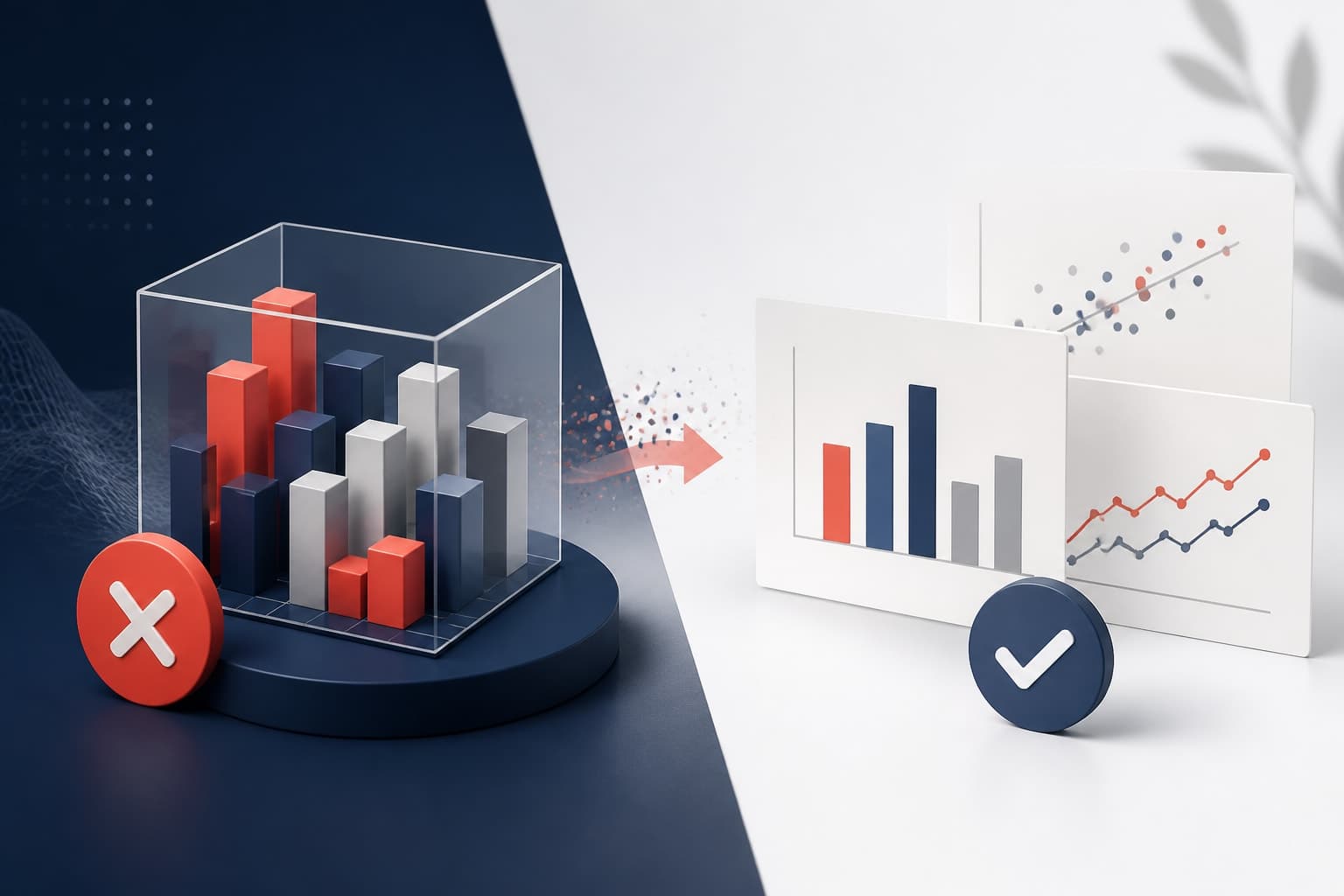
Overcomplicating visualizations is another common trap. Adding unnecessary 3D effects, excessive colors, or too many data series can obscure your message. The goal is clarity, not visual complexity. If your audience needs more than 30 seconds to understand your chart, it's probably too complicated.
Pie charts are frequently misused in research. They work only when showing parts of a whole that add up to 100 percent. They become unreadable with more than five or six categories, and humans struggle to accurately compare pie slice sizes. Bar charts almost always communicate the same information more effectively.
Correlation and causation confusion appears in visualizations too. Just because two variables trend together in your chart doesn't prove causation. Be explicit about the limitations of your visual analysis and avoid implying causal relationships when showing correlational data.
Missing or inadequate labels create unnecessary confusion. Every chart needs a clear title, axis labels with units, and a legend when multiple data series are present. Your visualization should be self-explanatory without requiring extensive explanation.
Core Principles of Data Visualization for Researchers
Effective data visualization for researchers follows fundamental principles that ensure scientific accuracy and clear communication. These core concepts form the foundation of all successful research visualizations.
Clarity trumps creativity in research contexts. Your primary goal is communicating findings accurately, not impressing viewers with elaborate designs. Simple, clean visualizations often convey complex information more effectively than ornate alternatives.
Consistency builds trust and reduces cognitive burden. When presenting multiple related visualizations, maintain uniform color schemes, scaling approaches, and formatting conventions. This consistency helps your audience focus on data patterns rather than decoding different visual languages.
Honesty in representation means showing your data without distortion or bias. This includes using appropriate scales, acknowledging uncertainty, and avoiding visual tricks that might mislead viewers about the strength or nature of your findings.
The principle of proportionality ensures that visual elements accurately reflect data magnitudes. Area-based charts should use area to encode values, not height or width alone. This prevents misinterpretation of the relative importance of different data points.
Color Theory and Accessibility in Research Visualization
Color choices in your visualizations affect both comprehension and accessibility. Poor color decisions can exclude colorblind readers or create misleading impressions about your data.
Approximately 8 percent of men and 0.5 percent of women have some form of color vision deficiency. This means traditional red-green color schemes exclude a significant portion of your potential audience. Instead, use color palettes designed for colorblind accessibility, such as blue-orange combinations or specifically tested colorblind-friendly schemes.
Color intensity and saturation carry implicit meaning. Darker, more saturated colors suggest higher values or greater importance, while lighter colors imply lower values. Make sure your color choices align with your data's actual meaning rather than working against it.
Sequential color palettes work best for continuous data with natural ordering, such as temperature, time, or magnitude. Diverging palettes are ideal when your data has a meaningful center point, like correlation coefficients or survey responses with neutral midpoints. Qualitative palettes work for categorical data without inherent ordering.
The ColorBrewer tool provides scientifically tested color schemes for different data types and accessibility needs. It's an invaluable resource for researchers who want to ensure their visualizations are both effective and inclusive.
Consider cultural associations with colors, especially if your research will be shared internationally. Red might signal danger or importance in Western contexts but has different connotations in other cultures. When in doubt, stick to neutral color schemes that rely more on position and size than color for meaning.

Essential Tools for Research Data Visualization
The right tools can streamline your visualization workflow and improve the quality of your research presentations. Different tools serve different purposes, from quick exploratory analysis to publication-ready figures.
R remains the gold standard for statistical visualization, with ggplot2 providing publication-quality graphics and extensive customization options. The learning curve is steep, but the flexibility and reproducibility make it worthwhile for serious research applications. R's ecosystem includes specialized packages for specific visualization needs, from network diagrams to genomic plots.
Python's matplotlib and seaborn libraries offer similar capabilities with a more programming-focused approach. Python integrates well with machine learning workflows and handles large datasets efficiently. Plotly adds interactivity that's particularly useful for exploratory data analysis.
For researchers who prefer graphical interfaces, tools that create with Graffiy provide AI-powered assistance for creating professional scientific visualizations without requiring programming knowledge. These platforms can significantly reduce the time needed to create publication-ready figures while maintaining scientific accuracy.
Tableau and Power BI excel at interactive dashboards and business-oriented visualizations, though they're less common in academic settings. They're worth considering for large-scale data exploration or when creating visualizations for non-academic stakeholders.
Excel and Google Sheets serve basic visualization needs and remain widely accessible. While limited compared to specialized tools, they're often sufficient for simple charts and preliminary data exploration. Their familiarity makes them valuable for collaborative work where not all team members have advanced visualization skills.
The Nature Methods journal regularly publishes guidance on visualization tools and techniques specifically for scientific research, providing valuable insights into current best practices and emerging technologies.
Best Practices for Research Data Visualization
Effective research visualization follows principles that enhance understanding and maintain scientific integrity. These practices separate professional research communication from amateur chart-making.
Always prioritize accuracy over aesthetics. Your visualization should faithfully represent the underlying data without distortion or bias. This means using appropriate scales, including confidence intervals where relevant, and clearly marking any data transformations or adjustments.
Context is crucial for research visualizations. Include sample sizes, data collection periods, and relevant statistical information. Your audience needs to evaluate the reliability and generalizability of your findings, which requires understanding the data's context and limitations.
Consistency across related visualizations builds trust and reduces cognitive load. Use the same color schemes, axis ranges, and formatting conventions throughout a presentation or paper. This helps your audience focus on the data rather than decoding different visual languages.
White space is your friend. Cluttered visualizations overwhelm viewers and obscure important patterns. Leave adequate margins, space between chart elements, and avoid cramming too much information into a single visualization. Sometimes multiple simpler charts communicate better than one complex chart.
Test your visualizations with colleagues before important presentations. What seems obvious to you might confuse others. Fresh eyes can catch labeling issues, scaling problems, or interpretation difficulties that you've become blind to through familiarity.
Consider the medium where your visualization will appear. Charts designed for large projection screens need different considerations than figures in printed journals or mobile-friendly web presentations. Font sizes, line weights, and color contrasts that work in one context might fail in another.
Advanced Techniques for Complex Research Data
Complex research often requires sophisticated visualization approaches that go beyond basic chart types. These techniques help reveal patterns in multidimensional or highly complex datasets.
Small multiples or faceting divides complex data into multiple simple charts, each showing a subset of the data. This technique works particularly well for comparing patterns across different groups, time periods, or experimental conditions. Instead of overwhelming viewers with one complicated chart, small multiples let them compare patterns systematically.
Interactive visualizations allow deeper data exploration, particularly useful for large datasets or when presenting to technical audiences. Hover effects can reveal additional detail without cluttering the main display. Filtering and zooming capabilities let viewers focus on specific aspects of the data.
Animation can effectively show changes over time, particularly for geographic or network data. However, use animation sparingly and always provide static alternatives. Moving visualizations can be distracting and inaccessible to some users.
Uncertainty visualization becomes crucial as data complexity increases. Error bars, confidence intervals, and uncertainty bands help viewers understand the reliability of your findings. This is particularly important in fields where measurement error or sampling uncertainty significantly affects conclusions.
Network visualizations reveal relationships in connected data, such as citation networks, protein interactions, or social connections. These require specialized tools and careful consideration of layout algorithms to avoid visual chaos.
Quality Control and Peer Review for Visualizations
Research visualizations deserve the same scrutiny as other aspects of your methodology. Implementing quality control processes helps maintain scientific standards and improves communication effectiveness.
Create visualization checklists that cover common issues: appropriate chart type for data structure, accurate scales and labels, accessible color choices, clear legends, and adequate context information. Systematically reviewing these elements catches many common mistakes.
Seek feedback from diverse perspectives. Colleagues in your field can evaluate technical accuracy, while those outside your specialty can assess general comprehensibility. Both perspectives are valuable for creating visualizations that serve their intended purpose.
Document your visualization decisions, particularly for complex analyses. Future reviewers, collaborators, or even your future self will benefit from understanding why you chose specific approaches. This documentation also helps maintain consistency across related projects.
Version control becomes important for iterative visualization development. Keep records of different approaches you tried and why you settled on your final choices. This process improves your visualization skills over time and helps justify decisions to skeptical reviewers.
Consider the ethical implications of your visualization choices. Are you presenting data fairly? Could your visual choices inadvertently bias interpretation? Research visualization carries responsibility for accurate communication of scientific findings.
Frequently Asked Questions
What's the most important factor when choosing data visualization for researchers?
The most critical factor is matching your chart type to your data structure and research message. Understanding whether you're showing comparisons, relationships, distributions, or trends over time determines which visualization will most effectively communicate your findings. Always prioritize clarity and accuracy over visual complexity.
How can I make my research charts accessible to colorblind readers?
Use colorblind-friendly palettes that avoid problematic red-green combinations. Tools like ColorBrewer provide scientifically tested color schemes for accessibility. Additionally, don't rely solely on color to convey information. Use different shapes, patterns, or direct labeling to ensure your message remains clear regardless of color perception.
Which tools are best for creating professional research visualizations?
R with ggplot2 remains the gold standard for statistical visualization, offering publication-quality output and extensive customization. Python's matplotlib and seaborn are excellent alternatives for programming-oriented researchers. For those preferring user-friendly interfaces, AI-powered platforms like Graffiy can create professional scientific figures without requiring coding skills.
Written by
Shobajo AbdulAzeez
Tags
Share this article