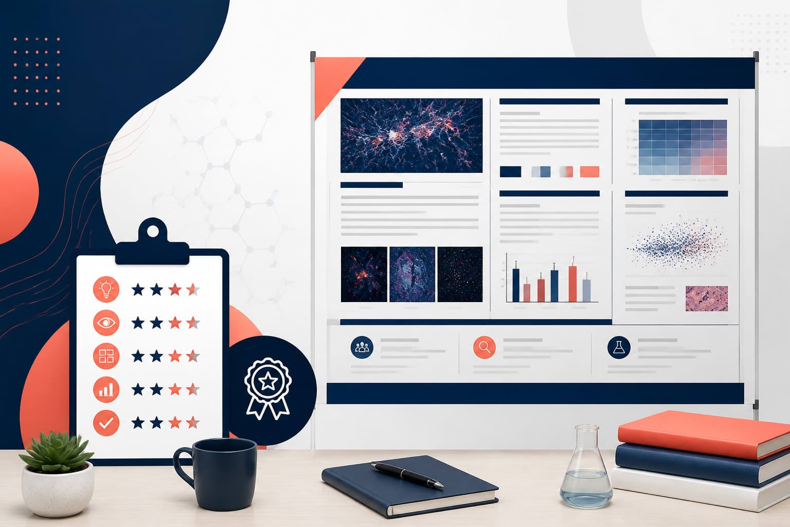
What to Put in the Poster Results Section: A Guide for Scientific Researchers
In This Article
The poster results section serves as the heart of your scientific poster, where your research findings take center stage. This critical component transforms months or years of work into digestible visual insights that conference attendees can grasp in seconds. Unlike written papers, poster presentations demand a fundamentally different approach to sharing results.
Your poster results section must communicate your key findings through strategic visual design rather than dense paragraphs of text. Conference attendees typically spend 30 seconds to two minutes scanning each poster, making visual clarity your primary weapon for scientific communication.
Essential Components of an Effective Poster Results Section
Every strong poster results section contains specific elements that work together to tell your research story. These components should flow logically from your research questions and connect directly to your conclusions.
Start with your most significant finding. Position this primary result prominently, using the largest visual element in your results area. This approach immediately signals to viewers what matters most in your work. Secondary findings should support or elaborate on this main discovery without competing for attention.
Include only results that directly address your research objectives. Resist the temptation to showcase every interesting finding from your study. Focus creates impact, while too much information dilutes your message and confuses your audience.
Statistical significance indicators should be clear but not overwhelming. Use consistent symbols throughout your poster, and include a small legend if necessary. However, avoid cluttering your visuals with excessive statistical notation that might intimidate non-specialist viewers.
Organizing Your Results Flow
Arrange your results in a logical sequence that tells a coherent story. Begin with foundational findings that establish context, then progress to more complex or nuanced discoveries. This progression helps viewers build understanding as they move through your poster.
Consider the physical layout of your poster when organizing results. Most readers scan from left to right and top to bottom, so place your most important findings in positions that align with natural reading patterns. The upper left quadrant typically receives the most attention after the title.
Group related findings together using visual proximity and similar design elements. This clustering helps viewers understand relationships between different aspects of your research without requiring extensive explanatory text.
Designing Your Poster Results Section for Maximum Impact
Visual design principles become crucial when presenting research results on posters. Your design choices can either enhance or undermine your scientific message, making thoughtful planning essential.
Choose colors strategically to support your data story. Use contrasting colors to highlight differences between groups or conditions, but maintain consistency across related elements. Avoid using too many colors, which can create visual chaos and distract from your actual findings.
Typography matters more than you might think. Select fonts that remain readable from three to six feet away, the typical viewing distance for poster presentations. Sans-serif fonts generally work better for poster text than serif options, especially at larger sizes.
White space serves as a powerful design tool in poster creation. Resist filling every available inch with content. Strategic white space guides the eye, creates visual rest, and prevents your poster from appearing cluttered or overwhelming.

Color Psychology in Scientific Posters
Different colors evoke different responses from viewers, which you can use to reinforce your research message. Blue conveys trust and reliability, making it excellent for presenting methodological information. Red draws immediate attention but should be used sparingly to highlight critical findings.
Green often associates with positive outcomes or growth, while orange suggests energy and innovation. However, remember that some audience members may have color vision deficiencies, so never rely solely on color to convey important information.
Maintain sufficient contrast between text and background colors to ensure readability under various lighting conditions. Conference venues often have challenging lighting situations that can wash out subtle color differences.
Data Visualization Best Practices
Effective data visualization transforms complex numerical results into immediately understandable visual insights. Your choice of visualization type should match your data characteristics and research message.
Bar charts work excellently for comparing discrete categories or groups. They provide clear visual comparisons that viewers can interpret quickly without detailed examination. Use horizontal bars when category names are long, as this orientation provides more space for readable labels.
Line graphs effectively show trends over time or relationships between continuous variables. Ensure your axes are clearly labeled and scaled appropriately. Avoid three-dimensional effects that can distort perception of your actual data values.
Scatter plots reveal correlations and patterns in your data that might not be apparent in tabular format. When showing statistical relationships, include trend lines only if they genuinely add interpretive value to your findings.
Heat maps and other specialized visualizations can highlight patterns in complex datasets. However, ensure that any advanced visualization type you choose will be familiar to your target audience. Novel visualization approaches may confuse rather than clarify your message.
According to research published in PLOS ONE, well-designed data visualizations significantly improve comprehension and retention of scientific information compared to text-based presentations.
Chart Design Principles
Remove unnecessary chart elements that don't contribute to understanding your data. Eliminate excessive gridlines, decorative borders, and three-dimensional effects that add visual complexity without informational value.
Scale your axes appropriately to accurately represent your data relationships. Starting bar charts at zero prevents misleading visual impressions about the magnitude of differences between groups.
Use consistent scales across related charts to enable easy comparisons. When this isn't possible due to vastly different value ranges, clearly indicate the scale differences to prevent misinterpretation.

Text Integration and Minimization
The poster results section should prioritize visual communication over textual explanation. However, strategic text placement enhances rather than competes with your visual elements.
Write concise captions that orient viewers to your visualizations without explaining every detail. Good captions answer the "so what" question: they tell viewers what conclusion to draw from the visual evidence presented.
Use bullet points sparingly and only for the most critical textual information. Each bullet point should convey a complete, actionable insight that viewers can understand independently.
Avoid repeating in text what your visuals already communicate clearly. Instead, use text to provide context, highlight significance, or explain methodological details that aren't apparent from the visualization alone.
Caption Writing Strategy
Effective captions follow a specific formula: they identify what the figure shows, highlight the key finding, and sometimes indicate broader significance. Keep captions under two sentences when possible.
Begin captions with strong, descriptive phrases that immediately orient readers. "Treatment A significantly reduced" is stronger and clearer than "The results showed that Treatment A had an effect on."
Include sample sizes and statistical test information in captions when space permits, but format this information consistently throughout your poster to maintain professional appearance.
Common Mistakes to Avoid
Many researchers undermine their poster effectiveness by including too much information in their results section. Remember that posters serve as conversation starters, not comprehensive research reports. Your goal is sparking interest and discussion, not communicating every detail of your methodology and findings.
Avoid using tables with too many rows or columns. Large tables become unreadable at poster viewing distances and overwhelm viewers with unnecessary detail. If you must include tabular data, limit tables to essential comparisons only.
Don't shrink font sizes to fit more content. If your text is too small to read comfortably from three feet away, you have too much content for the available space. Edit ruthlessly rather than compromising readability.
Resist the urge to explain your statistical methods in detail within the results section. Save methodological details for a separate methods section or be prepared to discuss them verbally during poster presentations.
Technical Presentation Errors
Low-resolution images destroy the professional appearance of your poster and make data difficult to interpret. Ensure all charts and graphs maintain crisp clarity when printed at full poster size.
Inconsistent formatting across different result elements creates visual confusion and appears unprofessional. Establish formatting rules for fonts, colors, and spacing, then apply them consistently throughout your poster.
Missing or unclear error bars on experimental data reduce the credibility of your findings. Include appropriate measures of variability and clearly indicate what type of error representation you're using.
Adapting Results for Different Audiences
Consider your target audience when designing your poster results section. A poster for a specialized symposium can include more technical detail than one intended for a general scientific audience.
For interdisciplinary conferences, emphasize broader implications and avoid field-specific jargon in your result presentations. Focus on findings that connect to multiple research areas or have practical applications beyond your immediate field.
When presenting to clinical audiences, highlight practical relevance and potential applications. Include effect sizes and confidence intervals that help clinicians evaluate the real-world significance of your findings.
For industry conferences, emphasize scalability, cost-effectiveness, and implementation feasibility. Frame your results in terms of problems solved or opportunities created rather than purely academic contributions.
Cultural Considerations
International conferences require sensitivity to different cultural approaches to data interpretation and scientific communication. Some cultures prefer more conservative statistical interpretations, while others embrace bold conclusions from preliminary data.
Visual design preferences also vary across cultures. Western audiences typically read left-to-right, but consider alternative scanning patterns when presenting to diverse international audiences.
Tools and Software for Creating Effective Results
Modern scientific poster creation benefits enormously from specialized design tools that understand the unique requirements of research communication. While general design software can work, purpose-built tools often provide better results with less effort.
Professional statistical software like R, Python, or SPSS generates high-quality visualizations that maintain clarity when scaled for poster printing. Export these graphics in vector formats when possible to preserve crisp lines and text at any size.
Design platforms specifically created for scientific communication offer templates and tools optimized for research presentations. When you create with Graffiy, you access AI-powered design assistance that understands scientific poster requirements and helps optimize your results section for maximum impact.
Collaboration tools become essential when multiple researchers contribute to poster creation. Cloud-based platforms enable real-time editing and feedback, streamlining the revision process that's crucial for effective poster development.
Testing and Iteration
Before finalizing your poster results section, test it with colleagues who represent your target audience. Ask them to identify your main findings after viewing your poster for one minute. Their responses will reveal whether your visual communication achieves its intended effect.
Print a small-scale version of your poster to evaluate readability and visual impact. Colors and fonts that look perfect on screen sometimes fail in printed format, especially under conference lighting conditions.
Time yourself presenting your poster to practice highlighting key results efficiently. Most poster sessions allow only brief interactions with each viewer, making concise result communication essential for success.
Iterate based on feedback and testing results. The most effective scientific posters undergo multiple rounds of refinement before reaching their final form. Each iteration should strengthen your visual communication and eliminate unnecessary complexity.
Frequently Asked Questions
How many results should I include in my poster results section?
Focus on 3-5 key findings that directly address your research questions. Including too many results dilutes your message and makes your poster difficult to follow. Quality and clarity matter more than quantity in poster presentations.
What's the best way to organize findings in a poster results section?
Start with your most significant finding prominently displayed, then arrange secondary results in logical sequence. Group related findings together using visual proximity and similar design elements. Follow natural reading patterns from left to right and top to bottom.
Should I include statistical details in my poster results section?
Include essential statistical information like p-values and confidence intervals, but avoid overwhelming viewers with excessive statistical notation. Use consistent symbols throughout your poster and include a small legend if necessary. Save detailed statistical explanations for verbal discussions.
Written by
Shobajo AbdulAzeez
Tags
Share this article