RGB, CMYK, and Grayscale: color mode journal figures Guide
In This Article
color mode journal figures: what authors must decide
Choosing the right color mode journal figures setting is one of those small production decisions that can create large headaches. Your figure may look perfect on your monitor, then appear flat in the PDF proof or too dark in print. The problem is rarely your data. It is usually a mismatch between how screens show color and how journals reproduce color.
If you are preparing final artwork, you need to know when to keep RGB, when to convert to CMYK, and when grayscale is the cleanest choice. You also need to check journal instructions before exporting, because publishers do not all ask for the same thing. This guide gives you a practical way to choose color mode journal figures settings without turning color management into a second research project.

We will keep this practical. You will learn what each mode does, where color shifts happen, how to protect meaning in your panels, and what to check before upload. If you want to build publication visuals with less manual cleanup, you can create with Graffiy and keep figure composition, labels, and export planning in one workflow.
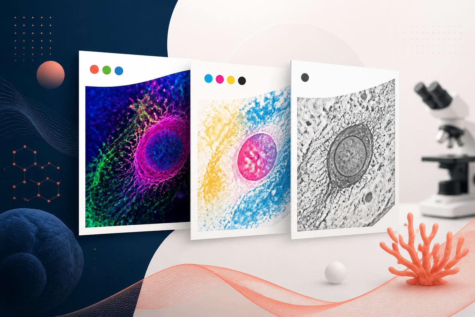
RGB, CMYK, and grayscale in plain language
RGB stands for red, green, and blue. It is the color model used by screens, digital cameras, scanners, fluorescence images, and most online journal platforms. RGB is additive, which means colors get brighter as light is added. A saturated green signal on a monitor can look vivid because the screen is emitting light directly.
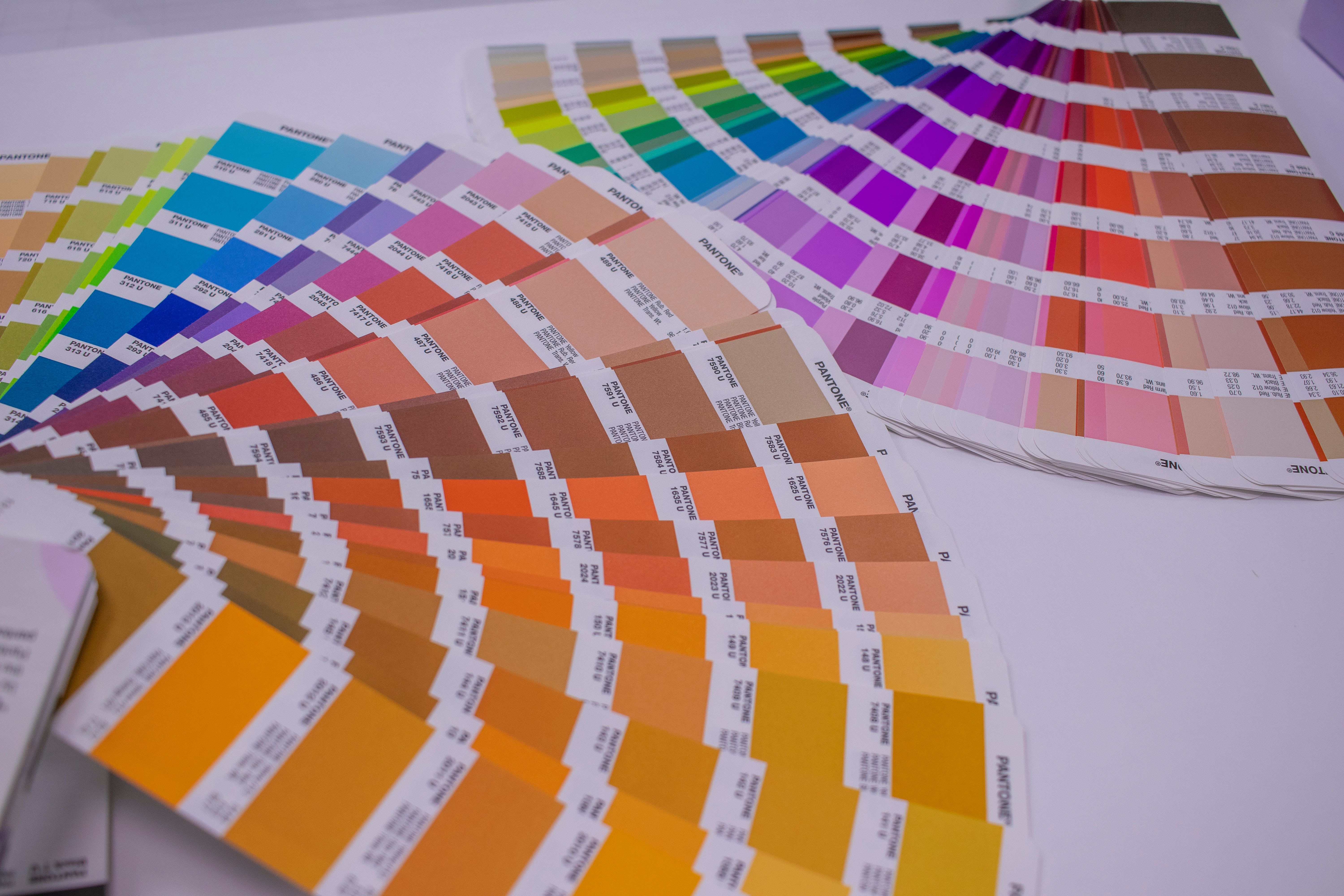
CMYK stands for cyan, magenta, yellow, and black. It is the model used for many print workflows. CMYK is subtractive, which means ink absorbs light from white paper. A color that glows on a screen may become less intense after CMYK conversion, because ink and paper cannot reproduce the same range of bright colors.
Grayscale uses shades from black to white. It is often the safest option for line art, gels, blots, simple charts, and any figure that does not require color to carry meaning. Grayscale can also reduce publication costs when a journal charges for print color. More importantly, it forces you to rely on contrast, not decoration.
The key point is simple: color mode journal figures decisions should follow the final use of the artwork. If the article is primarily viewed online, RGB may be best. If a journal explicitly requires print-ready files in CMYK, follow that. If color adds nothing, grayscale may make the figure clearer.
Start with the journal instructions, not your software default
Most figure problems begin when authors export from a familiar tool without checking the publisher’s artwork page. Some journals want RGB for online publication and handle print conversion internally. Others request CMYK for color images. Some accept both, but warn that authors are responsible for color changes after conversion.
Before final export, search the author guidelines for terms such as color mode, RGB, CMYK, grayscale, color profile, resolution, TIFF, EPS, PDF, and line art. The Elsevier artwork and media instructions are a useful example of the kind of production details publishers may specify. Your target journal may have different requirements, so check the exact page for that title.
Do not assume that a journal in the same publisher family uses the same settings. Medical, chemistry, ecology, and physics journals may have different production workflows. Supplementary figures may also have different expectations from main text figures.
Keep a short export checklist for every manuscript. Include required file format, minimum resolution, accepted color mode, font rules, maximum figure size, and whether color charges apply. This habit reduces rework during the tense final week before submission.
When RGB is the right choice
RGB is usually best for figures that will be read on screens and for images that originate in digital instruments. Fluorescence microscopy, confocal stacks, flow cytometry plots, heat maps, and multichannel images often begin as RGB or related digital color data. Keeping them in RGB preserves a wider color range during editing.
RGB is also a strong choice for online-only journals, preprints, conference posters, and educational graphics. Many modern publication platforms display articles mainly in browsers and PDF viewers. For these uses, converting to CMYK too early can remove useful brightness and make channels harder to distinguish.
However, RGB does not mean anything goes. A neon palette may look impressive but fail accessibility checks. Red and green combinations can be difficult for color blind readers, especially when differences are subtle. Use redundant cues such as labels, direct annotations, line styles, symbols, or texture when color encodes categories.
If a journal accepts RGB, export from the original file rather than from a screenshot. Use a standard color profile when available, often sRGB for general web and PDF use. Avoid repeated conversions between RGB and CMYK, because every conversion can shift values and introduce small quality losses.
When CMYK is required, and why colors shift
CMYK matters when your journal requires print-ready color files or when the printed version must closely match what you approved. The challenge is that CMYK has a smaller color gamut than RGB. Bright blues, greens, oranges, and fluorescent-like colors are common trouble spots.
When RGB colors fall outside the printable CMYK range, software must replace them with the nearest printable colors. This is called gamut mapping. The result may be acceptable, but it can surprise you. A vibrant cyan label may turn muted. A red heat map may lose separation at the high end. A colored overlay may look heavier than expected.
For color mode journal figures that must be CMYK, convert a copy of the final figure and inspect it carefully. Do not overwrite your RGB master file. After conversion, check color-coded groups, channel visibility, small labels, legend swatches, and any subtle differences between adjacent tones.
You should also check black text. In print workflows, small text is usually safest as pure black, not a rich mixture of cyan, magenta, yellow, and black. Mixed-color black can look fuzzy if plates are slightly misregistered. This is one reason final artwork should be exported intentionally, not through random defaults.
If CMYK conversion makes your figure harder to read, adjust the design before submission. Use stronger contrast, fewer similar hues, larger symbols, and clearer labels. Do not wait for the proof stage to discover that two treatment groups now look almost identical.
When grayscale is the better scientific choice
Grayscale is not a downgrade. It is often the most disciplined choice for figures where color adds no information. A bar chart with two groups may not need blue and orange. A western blot usually benefits from clean tonal contrast. A line drawing may reproduce better in grayscale than in unnecessary color.
Grayscale is especially useful when readers may print the paper, when the journal charges for print color, or when the article will be photocopied or included in teaching packets. It also helps reviewers focus on the comparison rather than the palette.
The danger is assuming that a color figure will automatically survive grayscale conversion. It often will not. Red and green can become similar gray values. Blue and purple may collapse into nearly the same tone. A heat map built from hue differences can become unreadable.
Before submitting, view any color-coded figure in grayscale as a test. If the meaning disappears, the design is too dependent on hue. Add direct labels, change line styles, vary marker shapes, increase spacing, or choose colors with different lightness values.

A practical decision table for final artwork
Use the table below as a starting point, then confirm with the target journal. It will not replace the author guidelines, but it helps you make a defensible first choice.
| Figure type | Likely best mode | What to watch |
|---|---|---|
| Fluorescence microscopy | RGB, unless CMYK is required | Channel separation, brightness, accessibility, and scale bars |
| Color heat map | RGB for online, CMYK only if requested | Loss of saturation, poor grayscale readability, unclear legends |
| Line chart with categories | RGB or grayscale | Use line styles and markers, not color alone |
| Blots and gels | Grayscale | Preserve tonal range and avoid over-adjustment |
| Vector diagrams | RGB, CMYK, or grayscale based on journal rules | Text color, fine lines, and exported fonts |
| Print-only color plate | CMYK if specified | Proof carefully after conversion |
Notice that the best choice depends on both content and destination. A microscopy image and a conceptual pathway diagram may sit in the same manuscript, but they do not have the same color needs. Treat each figure as its own final artwork file.
How to avoid color surprises before submission
The safest workflow is to keep an editable master file and export submission copies from it. Your master can stay in RGB if that matches your source data and design workflow. Then you can create CMYK or grayscale copies only when the journal requests them.
Next, run a proofing pass. Open the exported file in a different viewer from the one you used to create it. For example, check a PDF in a standard PDF reader, not only inside your design software. Zoom to 100 percent and also inspect small labels at typical reading size.
Compare the exported file against your original. Ask specific questions. Are treatment colors still distinct? Is the color bar still accurate? Do arrows and labels remain visible over the image? Are white labels sitting on bright backgrounds? Does the figure work if printed on a basic office printer?
For color mode journal figures, also check consistency across the full set. The same group should not be blue in Figure 2 and teal in Figure 5 unless there is a reason. Shared controls, treatment groups, and time points should use consistent visual language across the manuscript.
If you need CMYK, convert late and proof immediately. If you need grayscale, do not simply click desaturate and hope. Redesign the figure so the grayscale version is intentional. This usually means adjusting contrast, not just removing hue.
Common mistakes that cause rejection or rework
One common mistake is submitting low-resolution RGB screenshots instead of exported figure files. Screenshots may look acceptable in a slide deck, but they often fail journal resolution checks. They can also embed unpredictable color behavior and blurry text.
Another mistake is using color as the only carrier of meaning. This creates accessibility problems and can fail in grayscale print. If a reviewer cannot distinguish your groups without the legend, the figure needs stronger encoding.
A third mistake is converting every file to CMYK because it sounds more professional. That can be the wrong move for online-first journals. Premature conversion can dull scientific images and limit later edits. Follow instructions, not folklore.
Authors also forget to inspect the PDF proof. The proof is not a formality. It is your final chance to catch color shifts, missing labels, font changes, or altered transparency effects. Review it on a calibrated monitor if possible, and print key figures if print accuracy matters.
Finally, be careful with transparency, gradients, and overlaid colors. Some production systems flatten these effects during PDF processing. Flattening can change colors at overlaps or create thin white seams. If the figure uses complex effects, export a test PDF and inspect it before upload.
Recommended workflow for color mode journal figures
Here is a simple workflow we recommend for final artwork. First, read the journal figure instructions and record the required color mode, file type, and resolution. Second, keep your editable master file intact, preferably with separate text, data, and image layers when your software supports that.
Third, choose the color mode based on the figure’s purpose. Use RGB for screen-first color and many instrument-based images. Use CMYK only when requested or when print reproduction demands it. Use grayscale when color does not add scientific meaning.
Fourth, test readability. Check color blind safety, grayscale conversion, print output, and small text. Use direct labels when possible. A figure that is clear without a long legend is usually stronger.
Fifth, export the final file using the journal’s required format. TIFF is common for raster images, while PDF, EPS, or SVG may be used for vector artwork depending on instructions. Make sure fonts are embedded or converted according to journal rules.
Sixth, open the exported file and inspect it as a reader would. Do not rely only on the design canvas. Check the actual submitted file, because that is what the editorial office and production team will receive.
Final thoughts before you upload
Color mode journal figures choices are not about making artwork look fancy. They are about preserving meaning from your screen to the reviewer, the production system, the PDF, and sometimes the printed page. The right mode protects your evidence.
When in doubt, ask three questions. What does the journal require? How will most readers view the figure? Does the figure remain understandable if color changes? Those answers will guide you toward RGB, CMYK, or grayscale with much less guesswork.
Be slightly conservative with final artwork. Keep masters editable, convert only when needed, and proof exports before submission. Your future self will thank you when the journal asks for a quick revision and you can respond without rebuilding every panel.
Good figures do not depend on perfect devices or lucky conversions. They use color carefully, contrast intentionally, and labels generously. That is the best way to avoid color surprises and submit artwork that represents your research accurately.
Frequently Asked Questions
What is the safest color mode journal figures setting for submission?
There is no single safest setting for every journal. Check the author instructions first, then use RGB for screen-first color, CMYK when print-ready files are required, and grayscale when color does not add meaning.
Will my RGB figures look different if the journal converts them to CMYK?
They can look different, especially if the figure uses very bright greens, blues, oranges, or fluorescent-style colors. CMYK has a smaller printable color range than RGB, so some colors become duller or closer together after conversion.
Should I make all charts grayscale to avoid color problems?
Not always. Grayscale is excellent for simple charts, gels, blots, and figures where contrast is enough, but some scientific data need color to show channels or gradients. If you use color, add labels, marker shapes, or line styles so the figure still works if printed or viewed by readers with color vision differences.
Written by
Shobajo AbdulAzeez
Tags
Share this article