7 Bad Scientific Poster Examples and How to Fix Them
In This Article
We've all been there. You walk into a conference hall filled with scientific posters, and your eyes immediately glaze over. Wall after wall of tiny text, cluttered graphics, and confusing layouts that make you want to turn around and head straight for the coffee station. These bad scientific poster examples are everywhere, but they don't have to be the norm.
The truth is, most researchers never learn proper poster design. You spend years mastering complex methodologies and statistical analyses, but no one teaches you how to present that brilliant work visually. The result? Posters that bury important findings under layers of unnecessary complexity.

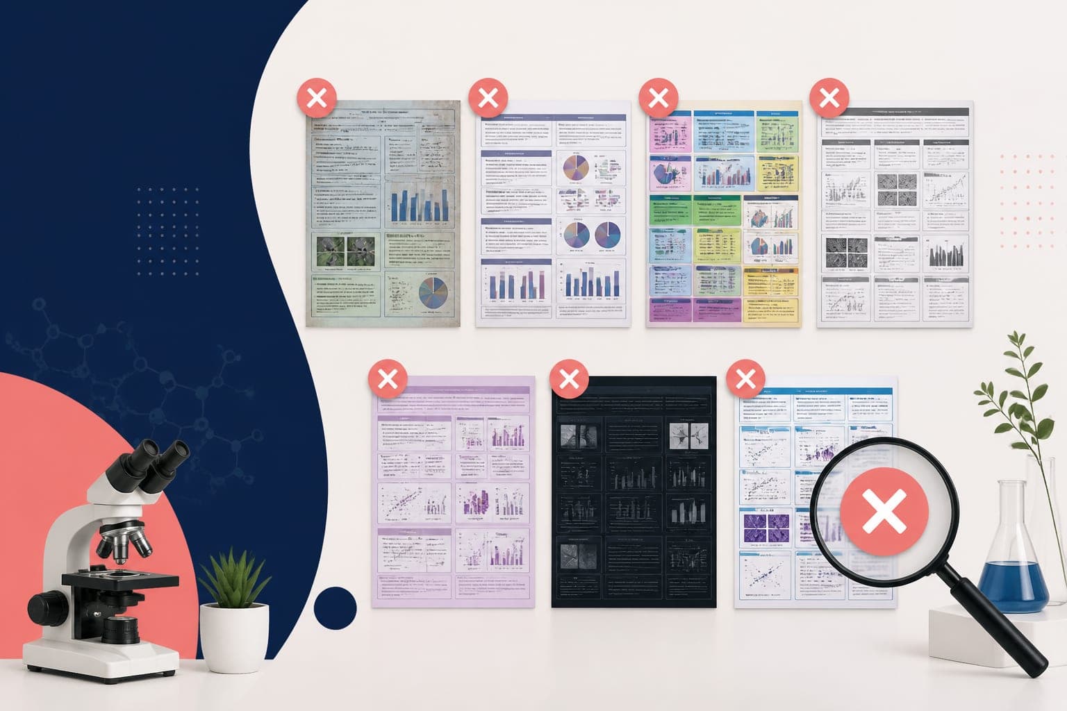
In this post, we'll examine seven common poster design mistakes that turn compelling research into visual chaos. More importantly, we'll show you exactly how to fix each problem with side-by-side comparisons that demonstrate the dramatic difference good design makes.
The Text Wall Problem: When Less Really Is More
The most common mistake in scientific poster design is treating your poster like a research paper printed on a large sheet. You've probably seen these text-heavy monsters that require a magnifying glass to read from three feet away.
Bad posters often contain entire paragraphs explaining methodology in excruciating detail. The introduction section reads like a literature review. Methods sections include every single parameter and statistical test. Results sections feature dense blocks of text describing what the figures already show.
Here's what works instead: write for scanning, not reading. Your poster should tell a story at three different levels of detail. Someone walking by should understand your main finding from 10 feet away. Someone pausing for 30 seconds should grasp your approach and key results. Only someone genuinely interested in your work should need to read detailed text.
Effective posters use bullet points instead of paragraphs. They highlight key findings with larger, bold text. They include white space that gives the eye places to rest. The National Center for Biotechnology Information recommends keeping text blocks under 50 words whenever possible.
When you're ready to create a poster that actually communicates effectively, consider tools designed specifically for scientific communication. You can create with Graffiy to build visually compelling research presentations that engage your audience instead of overwhelming them.
Color Chaos: When Rainbows Attack Your Data
The second most destructive mistake involves color choices that would make a peacock jealous. Bad posters often use every color in the spectrum, apparently believing that more colors equal more visual interest.
You'll see backgrounds that shift from blue to purple to pink. Headers in bright orange. Figure captions in green. Data points in red, yellow, and cyan. The result looks like a circus poster advertising the world's most confusing research.

Colors should serve a purpose, not distract from your message. Professional posters stick to two or three colors maximum. They use color strategically to guide attention to the most important elements. Dark text on light backgrounds ensures readability from a distance.
Consider using your institution's brand colors as a starting point. Blue and gray combinations convey professionalism. Black text on white backgrounds maximizes contrast and readability. If you need to highlight important findings, use one accent color consistently throughout the poster.
Remember that roughly 8% of men and 0.5% of women have some form of color blindness. Avoid red-green combinations, and never rely solely on color to convey important information. Use shapes, patterns, or text labels to ensure everyone can understand your data.
Font Fails: Typography That Sabotages Your Science
Typography mistakes can destroy even the most groundbreaking research. Bad posters commonly feature multiple font families competing for attention. You might see Comic Sans headers, Times New Roman body text, and Calibri captions all on the same poster.
Size problems are equally destructive. Headers that are barely larger than body text. Captions so small they're unreadable from arm's length. Text that varies randomly in size without any logical hierarchy.
Font choice matters more than most researchers realize. Serif fonts like Times New Roman work well for printed documents but can appear blurry when projected or viewed from a distance. Sans-serif fonts like Arial, Helvetica, or Calibri provide cleaner lines and better readability in poster formats.
Establish a clear hierarchy using font sizes. Your title should be the largest text on the poster, visible from 10 feet away. Section headers should be significantly smaller than the title but larger than body text. Body text should be readable from 4 feet away, which typically means 24-point font or larger.
Stick to two font families maximum. Use one for headers and another for body text, or simply use different weights and sizes of the same font family. Consistency in typography choices creates a professional appearance that lets your research shine.
Bad Scientific Poster Examples: Figure Placement Disasters
Figure placement can make or break your poster's visual flow. Bad scientific poster examples often scatter figures randomly across the available space, forcing viewers to hunt for the logical progression of your argument.
Common mistakes include placing figures before the text that introduces them. Results figures separated from their corresponding discussion points. Methods diagrams buried in corners where they're easily missed. Tables placed so far from related text that readers lose the connection.
Effective posters organize content in a logical flow that matches how people naturally scan information. In Western cultures, eyes typically move from top-left to bottom-right. Design your layout to support this natural reading pattern.
Place your most important figure prominently in the center-right area of the poster. This is where eyes naturally land after scanning the title and introduction. Use arrows, lines, or consistent spacing to guide viewers through your logical progression.
Group related elements together. Keep figure captions close to their figures. Place discussion points near the relevant data. Create clear sections that can be understood independently while contributing to the overall narrative.

Data Visualization Disasters: When Charts Attack
Even brilliant research can be undermined by poor data visualization choices. Bad posters often feature charts that obscure rather than illuminate key findings.
3D bar charts rank among the worst offenders. They look fancy but make it nearly impossible to compare values accurately. Pie charts with too many slices create visual confusion. Line graphs with dozens of overlapping series become unreadable tangles.
Color-coding without legends leaves viewers guessing. Axes without clear labels force readers to decode your intentions. Scales that don't start at zero can mislead even sophisticated audiences. Error bars without explanations raise more questions than they answer.
Simple, clean visualizations communicate more effectively than complex alternatives. Bar charts work well for comparing categories. Line graphs excel at showing trends over time. Scatter plots reveal relationships between variables. Heat maps can display complex datasets in intuitive ways.
Always include clear axis labels, appropriate scales, and comprehensive legends. Choose colors that enhance rather than distract from your data. Use consistent formatting across all figures to create a professional, cohesive appearance.
Consider your audience's familiarity with different chart types. Standard formats like bar charts and line graphs are universally understood. More specialized visualizations might require additional explanation or simpler alternatives.
Layout Nightmares: When Organization Goes Wrong
Poor layout choices turn potentially engaging posters into frustrating puzzles. Viewers shouldn't need a treasure map to follow your research story from introduction to conclusions.
Common layout problems include cramming too much content into available space. Every square inch gets filled with text, figures, or logos, creating visual claustrophobia. Irregular spacing makes sections difficult to distinguish. Inconsistent alignment creates a messy, unprofessional appearance.
Some posters swing too far in the opposite direction, using enormous amounts of white space that make content appear lost and unimportant. Finding the right balance requires understanding how visual weight affects viewer perception.
Effective layouts use white space strategically to create breathing room and guide attention. They establish clear sections with consistent spacing and alignment. Important elements get prominent placement without overwhelming supporting details.
Grid-based layouts provide structure that viewers can intuitively follow. Divide your poster into logical sections: introduction, methods, results, discussion, and conclusions. Give each section appropriate visual weight based on its importance to your overall message.
Consider the poster session environment when planning your layout. Conference halls are often crowded and noisy. Your poster needs to capture attention quickly and communicate key findings efficiently. Complex layouts that require careful study work better for journal articles than conference presentations.
The Logo and Branding Overload
Academic posters often suffer from logo overload that transforms research presentations into sponsor appreciation displays. You'll see university logos, department logos, funding agency logos, conference logos, and sometimes even personal logos competing for space with actual research content.
While acknowledging funding sources and institutional affiliations is important, excessive branding clutters your visual space and distracts from your scientific message. Bad posters sometimes dedicate 20% or more of their real estate to logos and branding elements.
Smart posters include necessary acknowledgments without sacrificing content space. Place institutional logos in a discrete footer or header area. Use consistent sizing for all logos to avoid creating visual hierarchy conflicts with your content.
Your research should be the star of your poster, not your institution's marketing materials. Include required acknowledgments professionally, but don't let branding elements compete with your scientific story for viewer attention.

Common Questions and Solutions
Learning from bad examples helps you avoid similar mistakes in your own work. The key is understanding that poster design serves a specific communication purpose that differs from other academic writing formats.
Your poster needs to work in a crowded, distracting environment where viewers have limited attention spans. Every design choice should support quick comprehension and easy navigation through your research story.
Focus on your most important findings rather than trying to include every detail from your study. Use visual hierarchy to guide viewers through your logical progression. Test your poster with colleagues before printing to identify potential confusion points.
Remember that poster sessions are interactive experiences. Your visual design should support conversation, not replace it. Include enough detail to generate interest and questions, but save comprehensive explanations for verbal discussions with interested viewers.
Frequently Asked Questions
What makes scientific poster examples particularly bad?
Bad scientific poster examples typically suffer from text overload, poor color choices, inconsistent typography, and cluttered layouts that obscure rather than highlight key research findings. These posters treat the format like a printed paper rather than a visual communication tool designed for quick scanning and engagement.
How can I avoid creating bad scientific poster examples in my own work?
Focus on visual hierarchy, use white space strategically, limit your color palette to 2-3 colors, and organize content in a logical flow that supports natural scanning patterns. Test your poster with colleagues and ensure it communicates your main findings clearly from several feet away.
What's the biggest difference between good and bad poster designs?
Good posters prioritize clear communication over comprehensive detail, using visual design to guide viewers through the research story efficiently. Bad posters try to include everything, creating overwhelming displays that bury important findings under layers of unnecessary complexity and poor visual organization.
Written by
Shobajo AbdulAzeez
Tags
Share this article