Better Poster Template Designs: What Actually Works for Scientists
In This Article
Why Most Conference Posters Fail to Communicate
Walk through any scientific conference and you'll see walls of dense text, tiny fonts, and cluttered layouts that make even the most groundbreaking research look boring. The problem isn't the science itself. It's that most researchers use outdated poster templates that prioritize cramming information over clear communication. A better poster template changes this dynamic completely.
Traditional academic poster formats emerged decades ago when printing costs and space constraints dictated design choices. Today, we understand much more about visual communication, cognitive load, and how people actually read posters in busy conference environments. Yet many scientists still default to templates that work against human psychology rather than with it.

The stakes are higher than you might think. Conference attendees spend an average of 30 seconds scanning each poster before deciding whether to engage. That's barely enough time to read a single paragraph, let alone absorb complex findings. Your template choice determines whether those crucial seconds work for you or against you.
The Better Poster Template Revolution
In 2019, behavioral ecologist Mike Morrison introduced what became known as the "better poster" format, fundamentally challenging how we think about academic poster design. His approach strips away unnecessary elements and focuses on one clear finding that viewers can understand immediately.
The better poster template follows a simple hierarchy. The main finding occupies roughly 50% of the space in large, readable text. Supporting details appear in smaller sections around the edges. This isn't just aesthetic preference. It's based on research about how people process visual information under time pressure.
Morrison's design principles have influenced countless researchers to create with Graffiy and other tools that prioritize clarity over tradition. The results speak for themselves. Posters using better template principles consistently generate more meaningful conversations and connections at conferences.
Comparing Template Styles for Maximum Impact
Let's examine the key template categories that work best for scientific communication, focusing on how each affects readability and audience flow.
Hierarchical Focus Templates
These templates establish clear visual hierarchy through size, color, and positioning. The most important information appears largest and most prominently placed. Secondary details receive proportionally less visual weight. This approach mirrors how news articles structure information, making it familiar and intuitive for readers.
Hierarchical templates work exceptionally well for research with one standout finding or conclusion. They guide the viewer's eye naturally from the main point to supporting evidence. Conference attendees can grasp your core message within seconds, then choose whether to invest time in the details.

Narrative Flow Templates
Narrative templates organize information like a story, with clear beginning, middle, and end. They use visual cues like arrows, numbers, or logical positioning to guide viewers through your research journey. This approach works particularly well for process-based research or studies with temporal elements.
The strength of narrative templates lies in their ability to maintain engagement. Instead of presenting static blocks of information, they create a sense of progression and discovery. Viewers feel like they're following along with your research process rather than decoding a dense technical document.
Modular Grid Templates
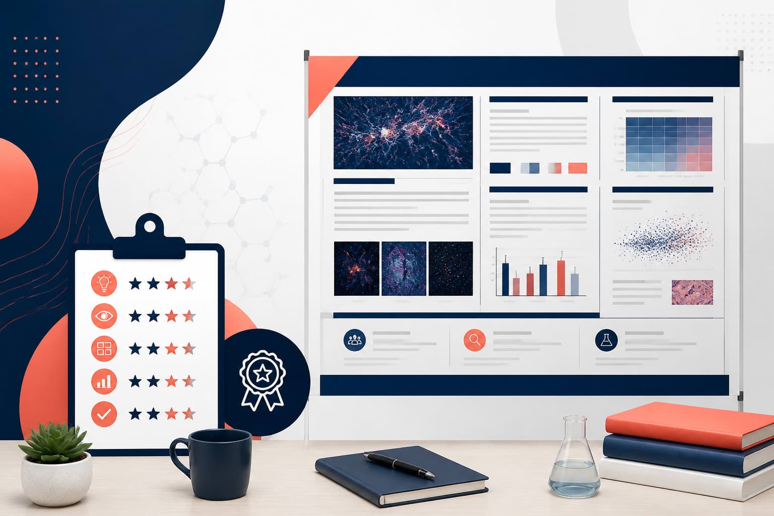
Grid-based templates divide content into distinct, equally-weighted modules. Each section serves a specific purpose: background, methods, results, conclusions. This systematic approach appeals to viewers who prefer structured information presentation and want to focus on particular aspects of your work.
Modular templates excel when you need to present multiple related findings or when your audience includes people with varying levels of expertise. Viewers can easily navigate to sections most relevant to their interests without getting lost in irrelevant details.
What Makes a Better Poster Template Actually Better
Not all modern templates qualify as genuine improvements over traditional formats. The most effective templates share specific characteristics that enhance both readability and audience engagement.
White Space as Communication Tool
Effective templates treat white space as an active design element, not wasted real estate. Strategic use of empty areas helps viewers process information without feeling overwhelmed. Research in cognitive psychology shows that cluttered designs increase mental effort and reduce comprehension, especially in noisy conference environments.
The best templates use white space to create visual breathing room around key points. This doesn't mean less information. It means presenting information in a way that respects how human attention actually works.
Typography That Supports Scanning
Superior templates prioritize typography choices that support quick scanning behavior. This means larger font sizes for key points, sufficient contrast between text and background, and font families optimized for readability at distance. The research on conference poster reading patterns consistently shows that typography choices significantly impact viewer engagement time and comprehension.
Effective templates also use typography hierarchy to signal information importance. Headlines, subheadings, and body text should be clearly distinguishable without relying solely on size differences. Color, weight, and spacing all play crucial roles.
Color Systems That Guide Attention
The most successful templates use color strategically to guide attention and organize information. Rather than decorative color choices, effective templates employ color to create functional distinctions between content types.
For example, a template might use one color for methodology sections, another for results, and a third for conclusions. This creates a visual language that helps viewers navigate quickly to their areas of interest. The key is consistency and restraint rather than rainbow variety.

Template Features That Enhance Audience Flow
Beyond basic readability, the most effective templates consider how conference attendees actually move through poster sessions. Understanding this behavior helps you choose template features that work with natural viewing patterns rather than against them.
Entry Points and Visual Anchors
Successful templates create clear entry points that immediately orient viewers to your work. This might be a compelling image, a surprising statistic, or a clear problem statement positioned prominently. The goal is to provide an obvious starting point that doesn't require viewers to hunt for context.
Visual anchors throughout the template help maintain orientation as viewers scan. These might be section dividers, consistent icon usage, or repeated design elements that create a sense of coherence and progression.
Logical Reading Paths
The most effective templates acknowledge that poster viewing rarely follows traditional left-to-right, top-to-bottom patterns. Instead, they create multiple logical paths through the content, accommodating different viewing preferences and time constraints.
This might mean positioning your key finding prominently in the center, with pathways leading to supporting evidence arranged around it. Or it could involve creating a clear sequential flow that works whether someone reads quickly or studies details carefully.
Common Template Pitfalls to Avoid
Even well-intentioned template choices can backfire if they include problematic elements that hinder rather than help communication.
False Hierarchy
Some templates create visual hierarchy that doesn't match content importance. For instance, methodology sections that dominate the layout while key findings get buried in small text. This mismatch confuses viewers and wastes their limited attention.
Effective templates ensure that visual prominence aligns with actual significance. Your most important findings should receive the most visual weight, regardless of how much space traditional formats typically allocate to different sections.
Decoration Over Function
Templates loaded with unnecessary design elements often distract from content rather than enhancing it. Excessive borders, irrelevant graphics, and decorative fonts might look polished but can reduce comprehension and slow down scanning behavior.
The best templates prioritize functional design elements that actively support communication goals. Every visual choice should serve a purpose in helping viewers understand and engage with your research.
Choosing the Right Template for Your Research
Different research types benefit from different template approaches. Understanding these connections helps you select formats that naturally complement your content rather than fighting against it.
Single-Finding Studies
Research with one clear, significant finding benefits enormously from better poster template approaches that emphasize this discovery. Templates that dedicate substantial space to the main result, with supporting details arranged around it, work exceptionally well for this content type.
Consider template designs that use the center space for your key finding, with methodology, context, and implications positioned in smaller sections around the edges. This creates immediate impact while still providing necessary supporting information.
Multi-Component Research
Studies with multiple related findings require templates that can organize complexity without creating chaos. Modular approaches often work well, with each significant finding receiving its own clearly defined section within an overall cohesive design.
Look for templates that use consistent formatting across sections while maintaining clear separation between different components of your work. This allows viewers to focus on individual findings while understanding their collective significance.

Process or Timeline Studies
Research involving temporal elements, sequential processes, or methodological progression benefits from templates that emphasize narrative flow. These designs guide viewers through your research journey in a logical sequence.
Effective timeline templates use visual elements like arrows, numbering, or progressive layouts to create clear paths through your content. The goal is making complex processes feel intuitive and followable rather than overwhelming.
Implementation and Practical Considerations
Selecting an effective template is only the first step. Successful implementation requires attention to practical details that can make or break your poster's effectiveness.
Size and Scaling Requirements
Conference poster requirements vary significantly, from compact formats to large-scale displays. The best templates scale effectively across different size requirements without losing their essential characteristics or readability.
Before finalizing your template choice, verify that it maintains its visual hierarchy and readability when scaled to your required dimensions. Text should remain legible from typical viewing distances, and visual elements should retain their proportional relationships.
Content Adaptation
Even the most effective template requires thoughtful content adaptation rather than simple text insertion. This means editing your content to match the template's strengths rather than forcing incompatible information into predetermined spaces.
Consider how your research findings align with your chosen template's structure. You might need to reorganize information, combine related points, or emphasize different aspects of your work to maximize the template's effectiveness.
The most successful poster presentations result from genuine collaboration between content and design. Your template should enhance your message, not constrain it. Sometimes this means modifying template elements to better serve your specific communication goals.
Measuring Template Effectiveness
The ultimate test of any poster template is its performance in real conference environments. Effective templates generate more meaningful interactions, longer engagement times, and better comprehension of key findings.
Pay attention to how conference attendees interact with your poster. Do they stop and read, or simply glance and move on? Are they asking questions about details, or do they seem confused about your main point? These behavioral cues reveal whether your template choice is working.
Consider gathering informal feedback from colleagues and conference attendees about clarity and visual appeal. This real-world input often reveals template strengths and weaknesses that aren't apparent during design phases.
The most effective approach often involves iterating based on experience. What works for one research presentation might need adjustment for different audiences or findings. The key is choosing templates that provide a strong foundation while allowing for necessary customization.
Frequently Asked Questions
What makes a poster template better than traditional academic formats?
A better poster template prioritizes clear visual hierarchy, strategic use of white space, and reader-friendly typography over cramming information into rigid academic sections. These templates help viewers quickly understand your main finding rather than struggling through dense text blocks.
Which better poster template style works best for complex research?
Multi-component research benefits from modular grid templates that organize complexity into clear, scannable sections. Each finding gets its own defined space while maintaining overall cohesion. This allows viewers to focus on individual results while understanding their collective significance.
How do I choose between narrative flow and hierarchical poster templates?
Choose narrative templates for process-based research or studies with temporal elements that benefit from sequential presentation. Select hierarchical templates when you have one standout finding that should dominate the presentation with supporting details arranged around it.
Written by
Shobajo AbdulAzeez
Tags
Share this article