How to Make a Colorblind Safe Scientific Poster: A Complete Guide
In This Article
When you present your research at conferences, you want everyone to understand your findings. Yet roughly 8% of men and 0.5% of women experience some form of color vision deficiency. Creating a colorblind safe scientific poster isn't just about being inclusive, it's about making your research more effective and impactful for everyone.
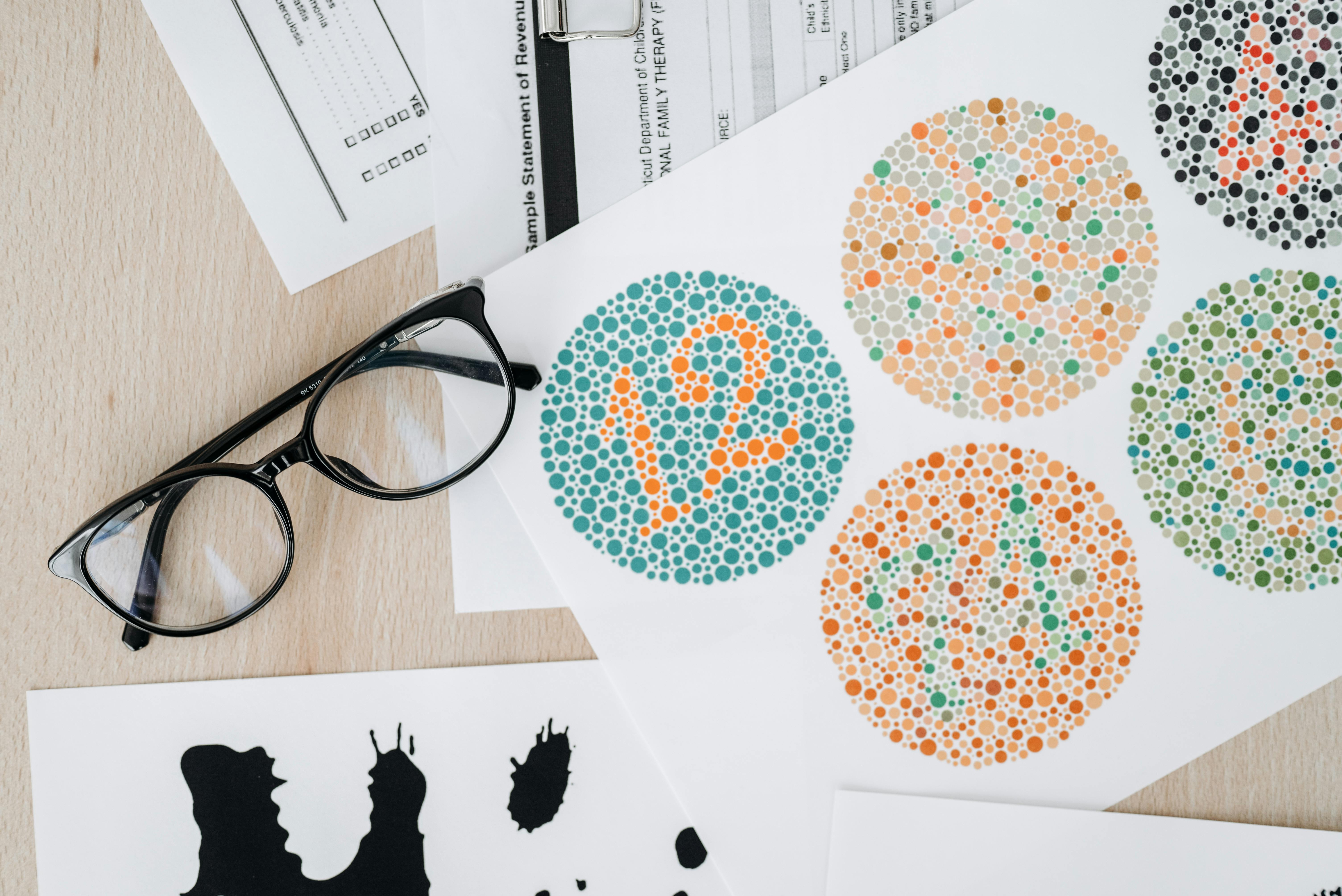
Color vision deficiency affects how people perceive certain color combinations. The most common forms include difficulty distinguishing between red and green, blue and yellow, or in rare cases, seeing no color at all. This means your carefully chosen color scheme might actually hide important information from a significant portion of your audience.

We've seen countless brilliant research presentations fall flat because the audience couldn't distinguish between different data series or experimental conditions. The good news? You can prevent this with a few strategic design choices that make your poster work for everyone.
Understanding Color Vision Deficiency Types
Before diving into solutions, let's understand what you're designing for. The most common type of color blindness affects red-green perception, known as protanomaly or deuteranomaly. People with these conditions struggle to differentiate between reds, greens, and browns. They might see your red data points as brown or your green bars as yellow.
Blue-yellow color blindness, called tritanomaly, is less common but equally important to consider. These individuals have trouble distinguishing blues from greens and yellows from violets. Complete color blindness, or monochromacy, affects very few people but represents the most extreme case where all colors appear as shades of gray.
Research shows that color vision deficiency significantly impacts academic performance when materials aren't designed with accessibility in mind. Your poster design choices directly affect whether your audience can engage with your research.
The key insight here is that what looks perfectly clear to you might be completely indistinguishable to someone with color vision deficiency. This isn't about making your poster look different, it's about making sure the information remains accessible regardless of how someone perceives color.
Essential Contrast Principles for Colorblind Safe Scientific Posters
Contrast becomes your most powerful tool when designing for color accessibility. High contrast between elements ensures that even if colors appear similar, the brightness difference makes information readable. Think of contrast as the backbone of accessible design.
Start with luminance contrast, which measures the difference in perceived brightness between colors. A contrast ratio of at least 4.5:1 between text and background ensures readability for most people with color vision deficiency. For large text and graphics, a minimum 3:1 ratio works, but we recommend aiming higher when possible.
You can test contrast using online tools or by converting your poster to grayscale. If elements become difficult to distinguish in grayscale, they'll likely pose problems for people with color vision deficiency. This simple test reveals problem areas before you finalize your design.
Consider using complementary design elements beyond color. Vary the saturation and brightness of your chosen colors. A light blue paired with dark blue creates more accessible contrast than light blue with light green, even though both combinations might seem equally distinct to someone with typical color vision.
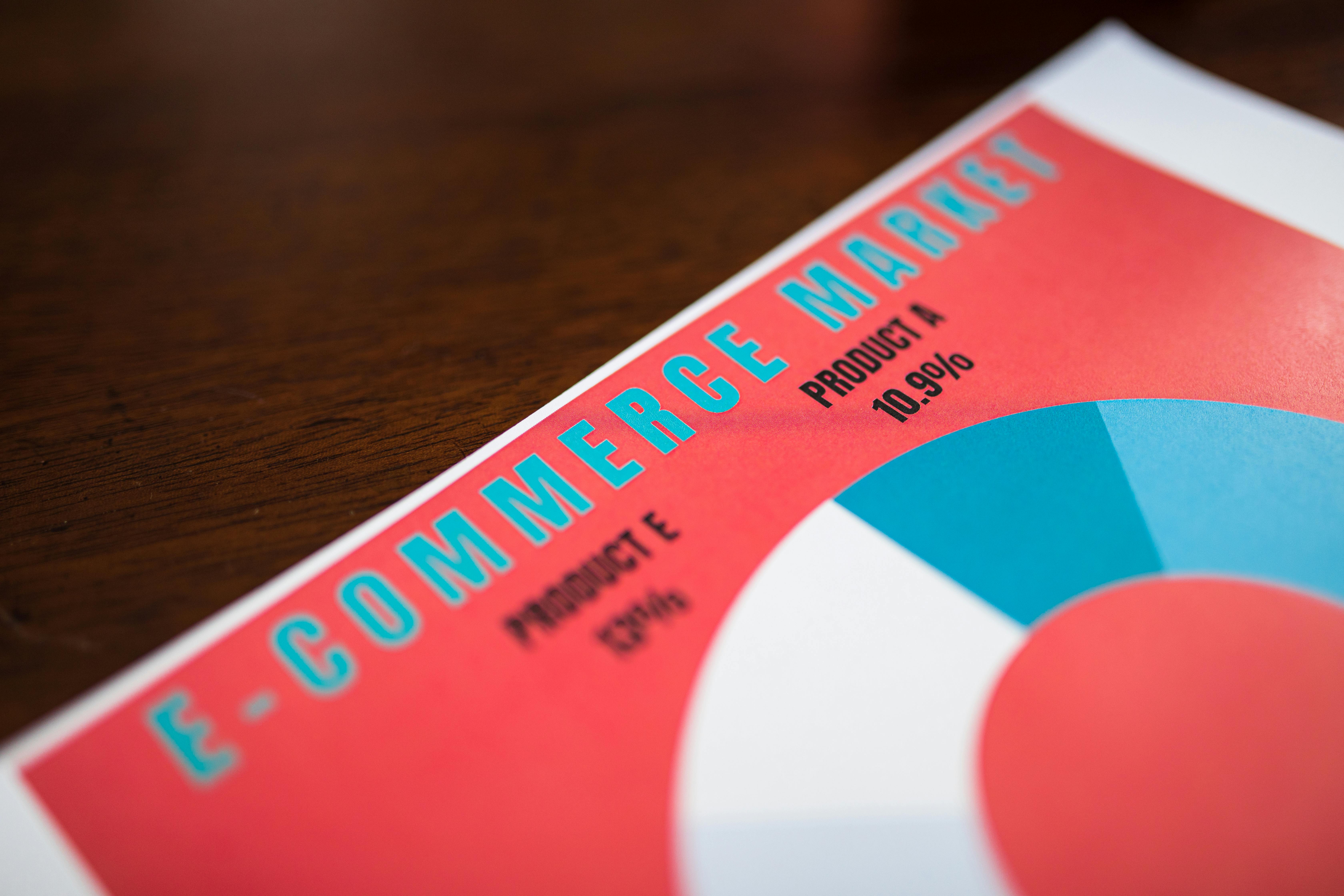
Pattern and texture also enhance contrast. When showing different data series, combine color differences with line styles, dot patterns, or fill textures. This redundancy ensures that information remains accessible through multiple visual channels.
Smart Color Palette Selection
Choosing the right colors from the start prevents accessibility issues later. Certain color combinations work better for people with color vision deficiency, while others should be avoided entirely.
Blue and orange make an excellent pairing because they remain distinct across all types of color vision deficiency. Similarly, purple and yellow, or blue and red combinations typically work well. These color pairs maintain sufficient contrast and distinctiveness even when perceived differently.
Avoid red-green combinations entirely, especially pure red with pure green. These colors often appear identical to people with the most common forms of color blindness. Pink and light green pose similar problems. Brown and red combinations also fail because they can appear as the same muddy color.
When you need more than two colors, consider using a scientifically developed palette like ColorBrewer or Viridis. These palettes undergo testing for color vision deficiency and maintain accessibility across different types of color perception. The Viridis palette, originally developed for scientific visualization, works particularly well for heat maps and continuous data.
Monochromatic schemes using different shades of the same color can work effectively when you ensure sufficient contrast between shades. However, be cautious with subtle gradations that might not translate well for people with color vision deficiency.
Software tools like Coblis or Color Oracle simulate how your poster appears to people with different types of color vision deficiency. Test your color choices early in the design process rather than trying to fix problems later.
Effective Labeling and Text Strategies
Even with perfect color choices, your poster needs clear labeling to be truly accessible. Color should never be the only way to convey important information. Every colored element needs additional identification through text, symbols, or patterns.
Direct labeling works best for simple graphics. Instead of relying on a legend that requires viewers to match colors, place labels directly on or next to each element. For bar charts, put the category name directly on each bar. For line graphs, label each line at its end point rather than forcing viewers to trace back to a color-coded legend.
When you must use legends, make them as clear as possible. Use descriptive text rather than just color swatches. Add symbols or patterns alongside colors. Position legends close to the relevant graphics rather than in distant corners where viewers might lose track of the connection.
Font choices matter for accessibility too. Use high contrast between text and background colors. Black text on white backgrounds provides maximum readability. If you need colored text, ensure it meets contrast requirements against its background.

Consider text size carefully. Conference posters are viewed from various distances, and people with color vision deficiency might need to get closer to distinguish between elements. Larger text ensures readability even when viewers need to approach your poster more closely.
Testing Your Colorblind Safe Scientific Poster Design
Testing your poster design before printing prevents costly mistakes and ensures your message reaches everyone. Multiple testing methods exist, each offering different insights into how your poster performs for people with color vision deficiency.
Digital simulation tools provide quick feedback during the design process. Websites like Coblis allow you to upload your poster image and see how it appears with different types of color vision deficiency. This immediate feedback helps you catch problems while they're still easy to fix.
The grayscale test remains one of the most reliable methods. Convert your poster to grayscale and check whether all information remains clear and distinguishable. If elements blend together or become unclear in grayscale, they'll likely cause problems for people with color vision deficiency.
Print testing proves invaluable because computer screens and printed materials can display colors differently. Print a small version of your poster and ask colleagues to review it. Better yet, if you know someone with color vision deficiency, ask for their direct feedback.
Online accessibility checkers can evaluate contrast ratios automatically. These tools provide specific measurements and recommendations for improving your design. While they can't catch every potential issue, they offer objective data about your color choices.
You can create with Graffiy to streamline this testing process, as the platform includes built-in accessibility features and color palette recommendations specifically designed for scientific communication.
Implementation Best Practices
Successfully implementing these accessibility principles requires planning and attention to detail throughout your design process. Start thinking about color accessibility from your first sketch rather than trying to retrofit accessibility into a completed design.
Establish your color palette before creating any graphics. Choose your two or three main colors based on accessibility principles, then stick to them throughout your poster. Consistency in color use helps viewers navigate your poster more easily and reduces cognitive load.
Layer information thoughtfully. Use color as enhancement rather than the primary way to convey information. Start with high-contrast shapes, patterns, or text, then add color to improve visual appeal and comprehension for those who can perceive it fully.
Consider your audience and venue when making design decisions. Academic conferences often have mixed lighting conditions that can affect color perception. Bright overhead lights might wash out subtle color differences, while dimmer lighting can make low-contrast elements harder to see.
Document your color choices and their rationale. When working with collaborators or when you need to create follow-up materials, having a record of your accessible color decisions ensures consistency across all your research communications.
Plan for different output formats. Your poster might be viewed digitally, printed on different materials, or reproduced in black and white for publications. Design choices that work across all these formats provide maximum flexibility and accessibility.
Common Mistakes to Avoid
Even well-intentioned researchers make predictable mistakes when creating accessible posters. Learning to recognize these common pitfalls helps you avoid them in your own work.
The biggest mistake is relying solely on color to distinguish between important elements. We've seen countless heat maps where adjacent colors appear identical to people with color vision deficiency, making the data completely inaccessible. Always provide alternative ways to distinguish between different data categories.
Insufficient contrast between text and backgrounds creates another frequent problem. Light gray text on white backgrounds or dark blue text on black backgrounds might look sophisticated but fails basic readability tests. When in doubt, increase contrast rather than reducing it.
Using too many similar colors overwhelms viewers and increases the chance that some colors will appear identical to people with color vision deficiency. Limit your palette to three or four distinct colors rather than trying to use every color in the rainbow.
Ignoring the testing phase leads to last-minute discoveries of accessibility problems. By the time you're ready to print for a conference, it's too late to make major design changes. Build testing into your timeline from the beginning.
Assuming that accessibility means sacrificing visual appeal represents a false choice. Well-designed accessible posters often look more professional and polished than their inaccessible counterparts because they rely on strong design principles rather than color gimmicks.
Tools and Resources for Creating Accessible Posters
The right tools can simplify the process of creating accessible scientific posters. Modern design software includes features specifically designed to support accessibility, while specialized tools help you test and refine your color choices.
Color palette generators like Coolors.co and Adobe Color include accessibility checking features. These tools let you build palettes while simultaneously checking contrast ratios and color vision deficiency compatibility. Starting with an accessible palette prevents problems downstream.
Accessibility checkers like WebAIM's contrast checker provide specific measurements and recommendations. Input your foreground and background colors to get precise contrast ratios and pass/fail ratings based on accessibility standards.
Professional design software increasingly includes accessibility features. Adobe Creative Suite, for example, includes color blindness simulation and contrast checking tools. Canva offers colorblind-safe palette options and accessibility feedback during the design process.
Scientific visualization libraries like matplotlib and ggplot2 include colorblind-safe palettes as default options. If you create your graphs programmatically, switching to these palettes requires minimal code changes while dramatically improving accessibility.
Documentation and style guides from organizations like the National Eye Institute provide detailed recommendations for accessible design in scientific contexts. These resources offer evidence-based guidance tailored specifically for research communication.
Remember that creating accessible designs benefits everyone, not just people with color vision deficiency. High contrast improves readability in poor lighting conditions. Clear labeling reduces confusion for all viewers. Simple, well-organized color schemes appear more professional and easier to navigate.
Frequently Asked Questions
What makes a colorblind safe scientific poster different from a regular poster?
A colorblind safe scientific poster uses high contrast, avoids problematic color combinations like red-green, and includes multiple ways to distinguish information beyond just color. It ensures that people with color vision deficiency can access all the information presented.
Which colors should I avoid when designing scientific posters?
Avoid red-green combinations, pink with light green, and brown with red, as these appear similar or identical to people with common forms of color blindness. Instead, use blue-orange, purple-yellow, or blue-red combinations that remain distinct.
How can I test if my poster is accessible to colorblind viewers?
Use online simulation tools like Coblis to see how your poster appears with different types of color vision deficiency. Convert your poster to grayscale to check contrast, and use accessibility checkers to measure contrast ratios between elements.
Written by
Shobajo AbdulAzeez
Tags
Share this article