
How to Create an Engineering Conference Poster That Is Easy to Follow
In This Article
Start with the job of the poster
An engineering conference poster is not a paper pasted onto a board. It is a guided conversation starter for people who may give you 30 seconds, three minutes, or a full technical discussion. Your first task is to make the poster easy to enter. Your second task is to make the important details available when someone wants them.
Engineering posters are especially tricky because they often need to show a system, a method, measured results, constraints, and practical implications. If you give every element equal weight, visitors see a wall of effort instead of a clear argument. So we need to decide what the poster is asking people to understand.

A strong poster usually answers four questions in order: What problem did you address? What did you build, model, or test? What did the evidence show? Why does that matter for engineering practice or future research? Keep those questions visible while designing. They will protect you from clutter.
Plan your engineering conference poster around one claim
Before opening design software, write one claim in plain language. This is not the full abstract. It is the message you want a qualified attendee to remember after walking away. For example: “A compliant gripper reduced peak contact force while maintaining positioning accuracy.” That sentence gives you a backbone for the whole poster.
Once you have the claim, sort your material into three groups: required, supportive, and optional. Required content proves the claim. Supportive content helps people trust the work. Optional content belongs in a QR code, handout, preprint, or conversation. This sorting step is where many posters get better immediately.
Use the claim to choose the dominant visual. For a mechanical design project, the central element may be a labeled schematic or CAD rendering. For control systems, it may be a block diagram paired with response curves. For materials research, it may be a microstructure image next to performance data. The dominant visual should make the claim easier to believe.
If you are working with collaborators, agree on the claim early. Otherwise, every coauthor may try to protect a different piece of technical detail. That is understandable, but it leads to a crowded engineering conference poster with no clear path. A poster can respect the complexity of the project without displaying every intermediate step.
Choose a layout that tells a left to right story
Most conference attendees scan posters in a predictable pattern. They read the title, look for the largest visual, check the graph or result, then decide whether to stop. Your layout should support that behavior instead of fighting it. The simplest structure is a three column story: context, method, results.
For engineering research, a useful variation is problem, system, evidence, and implications. The system section can be wider or more central if the design itself is the contribution. The evidence section should still be easy to find. A beautiful schematic without performance data can feel like a concept pitch rather than research.
Use a clear reading order. Numbered section headers can help, especially when the poster contains multiple diagrams. Keep the title and takeaway at the top, not buried in the conclusion. Many people will never read the bottom right corner unless the top has already earned their attention.
Avoid making the poster symmetrical just because it looks tidy. Symmetry can be elegant, but it can also hide priority. If one result matters most, give it more space. If one schematic explains the whole testbed, make it central. Visual hierarchy is not decoration. It is a promise about what matters.
Balance schematics, results, and technical detail
Engineering audiences want substance. They also want to understand that substance quickly. The best engineering conference poster balances three layers: a schematic that explains the system, results that support the claim, and technical detail that lets experts judge validity.
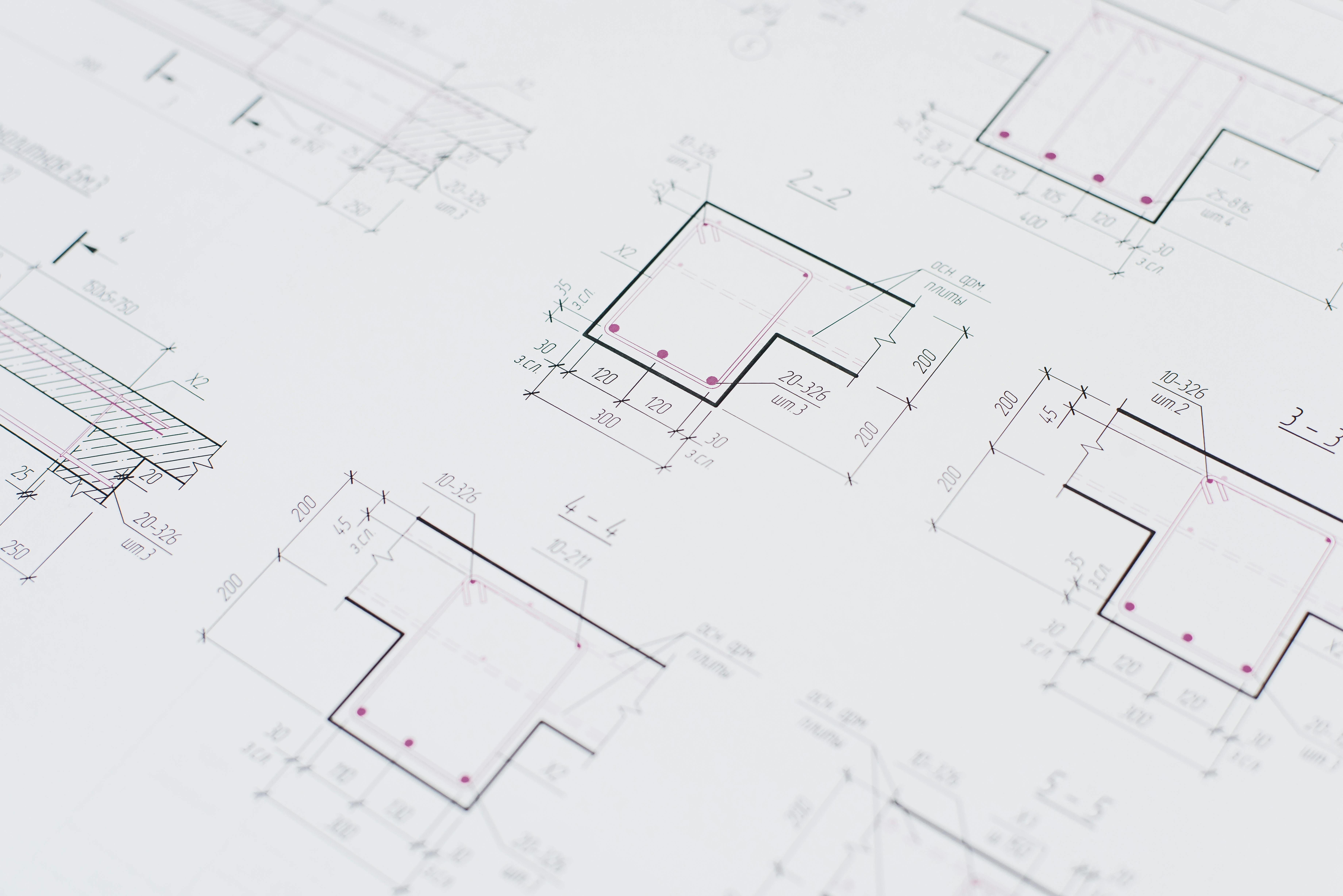
Your schematic should answer “what is connected to what?” It may show components, signal flow, loading conditions, boundary conditions, manufacturing steps, or experimental setup. Label directly on the schematic when possible. Legends force people to bounce their eyes back and forth, which slows comprehension.
Your results should answer “what changed, by how much, and compared with what?” Use graphs that make comparisons obvious. If the key finding is a reduction, show the baseline and the new method side by side. If the key finding is a trend, make the trend line and confidence clear. Do not make people decode five colors to find your main result.
Your technical detail should answer “can I trust this?” Include sample size, sensor type, mesh size, calibration information, operating conditions, error bars, or model assumptions when they matter. But keep the detail close to the evidence it supports. A separate block of dense methods text is rarely the best solution.
| Poster element | Main question it answers | Practical design advice |
|---|---|---|
| Schematic | How does the system work? | Use labels, arrows, and simplified geometry. Remove parts that do not affect interpretation. |
| Results | What did you find? | Show the most important comparison first. Use direct annotations on peaks, slopes, or thresholds. |
| Technical detail | Can the result be trusted? | Include conditions and uncertainty near the relevant figure, not in a distant text block. |
This balance is not always equal by area. A poster about a new sensor may need a large exploded view. A poster about model validation may need more plots. The key is proportion. Give each element enough space to do its job, and no more.
Make figures readable from a real distance
Conference halls are not kind to small labels. People read posters while standing, holding coffee, and trying not to block the aisle. If your graph labels only work on your laptop, they will fail in the room. Print a section at actual size before finalizing, even if you only print it on tiled sheets.
Use fewer plots, not smaller plots. A single annotated graph often beats a panel of six tiny charts. If you need multiple subplots, give each one a short caption that states the point. “Peak stress falls after fillet optimization” is more useful than “FEA results.” Captions should interpret, not merely name.
Be careful with color. Many engineering figures come from MATLAB, Python, CAD, or simulation software with default palettes. Defaults are not always poster friendly. Use high contrast, avoid red and green as the only distinction, and label lines directly when possible. The Web Content Accessibility Guidelines from W3C offer useful principles for readable contrast and accessible visual design at W3C accessibility guidance.
For axis labels, include units every time. This sounds basic, but missing units are common on rushed posters. Engineering readers will notice. If values are normalized, state the reference clearly. If a result depends on a specific load, temperature, voltage, frequency, or material grade, put that condition near the figure.
Use callouts sparingly. A callout should direct attention to a meaningful feature, such as failure onset, a resonance peak, a tolerance limit, or a design requirement. Too many callouts become confetti. Pick the two or three points that help the viewer understand your claim.
Write less text, but make it more useful
A poster with less text is not automatically clearer. The goal is useful text. Replace long background paragraphs with short context statements. Replace method prose with labeled diagrams. Replace generic conclusions with specific takeaways. Every sentence should help a visitor understand the problem, the engineering choice, or the evidence.
Use bullets for scannable points, but do not turn the whole poster into bullet soup. A good pattern is one short paragraph for context, followed by two or three bullets for constraints or contributions. Keep each bullet under two lines. If a bullet needs four clauses, it probably belongs in a paper.
Here is a practical text budget for a standard poster:
- Title: one specific sentence fragment, ideally under 15 words.
- Context: 40 to 70 words explaining the engineering problem and gap.
- Method: 80 to 130 words, supported by a schematic.
- Results: 80 to 150 words, mostly in captions and callouts.
- Takeaway: 30 to 60 words that state what changed and why it matters.
Notice that the results text is not the longest section. The graph carries much of the weight. Your words should help people read the evidence correctly. For example, “Prototype B reduced RMS vibration by 18 percent under the 40 Hz sweep, with no measurable increase in steady state power draw” is more useful than “Prototype B performed better.”
Also, avoid unexplained acronyms in headers. Your immediate subfield may know them, but conferences mix specialties. Define essential abbreviations once. If an acronym appears only once, write it out instead. Clarity is not dumbing down your work. It is removing friction.
Design the title and takeaway for quick scanning
Your title is the first filter. “Improved Thermal Management for High Power Inverters” is okay, but it is broad. “Microchannel Cold Plate Cuts Inverter Hot Spot Temperature by 22 Percent” is stronger because it includes the system, intervention, and outcome. Specific titles attract the right technical conversations.
Under the title, add a one sentence takeaway. This sentence should be visible from a few steps away. Think of it as your spoken opening line. It should not repeat the title exactly. It should explain the practical meaning of the result.
Example takeaway: A topology optimized bracket met the stiffness target with 31 percent less mass, while keeping the first natural frequency above the operating band.
A takeaway like this gives visitors a reason to inspect the details. It also helps non specialists follow the contribution. If someone only reads the title and takeaway, they should still understand the core value of the work.

Use technical detail as evidence, not decoration
Technical detail is essential in engineering, but it should earn its space. A long list of equations, material properties, solver settings, or machine specifications can look impressive while failing to communicate. Ask what each detail proves. If it does not support interpretation, reliability, or reproducibility, move it elsewhere.
Equations are worth including when they define a key metric or model. Keep them large, isolated, and labeled. Do not paste a derivation unless the derivation is the contribution. For most posters, one governing equation or objective function is enough. Pair it with a plain language note explaining how it was used.
For simulations, show the model boundary conditions visually. A small diagram with constraints and loads is usually better than a paragraph of solver settings. Include mesh independence or validation only if it affects trust in the result. If validation is central, promote it to a results figure rather than hiding it in methods.
For experimental work, show the test setup and measurement chain. Include uncertainty where it matters. A compact note such as “n equals 5 specimens, error bars show one standard deviation” can prevent confusion. If the sample size is limited, be direct. Engineering readers prefer honest constraints over vague confidence.
Build a conversation path into the poster
Your poster should work when you are not standing beside it, but it should also help you present. Arrange content so your spoken explanation follows the visual path. Start with the problem, point to the schematic, move to the strongest result, then finish with the takeaway and next step.
Prepare a short version and a technical version. The short version should take about one minute. The technical version can include assumptions, limitations, and future work. If your poster is organized well, you will not need to apologize while presenting. You can simply point and explain.
Add a QR code only if it has a useful destination. Good destinations include a preprint, code repository, supplemental video, dataset, or lab page. Put a short label beside the code, such as “Scan for validation dataset and CAD files.” A lonely QR code with no promise gets ignored.
If you want a faster way to assemble clean diagrams, consistent labels, and poster ready scientific visuals, you can create with Graffiy. We built Graffiy for researchers who need figures that look polished without spending the whole week nudging boxes around. The design still needs judgment, but better tools reduce the busywork.
Check the poster before you print
Final checks catch problems that are hard to see while editing. First, view the poster at full size if possible. If not, zoom to approximate print size on a large monitor. Stand back. Can you read the title, section headers, axis labels, and takeaway? If not, increase type size and remove content.
Second, ask someone outside your immediate project to explain the poster back to you. Do not lead them. If they miss the main claim, the layout needs work. If they understand the claim but question a result, you may need clearer methods detail or uncertainty information. This feedback is more valuable than another round of color tweaking.
Third, check consistency. Use the same term for the same component throughout. Do not call it a “module” in one figure and an “assembly” in another unless there is a real distinction. Match colors across schematics and plots. If the motor is blue in the schematic, do not make a different component blue in the graph.
Finally, proofread numbers. Engineering posters often contain many values, units, and labels. One wrong unit can undermine confidence fast. Check significant figures, axis ranges, captions, author names, affiliations, funding statements, and contact details. Then export to PDF and inspect the final file, not just the editable version.
A practical template for an easy to follow poster
If you are starting from a blank page, use this structure. Put a specific title at the top, followed by a one sentence takeaway. Use the left column for problem, requirements, and gap. Use the center for the system schematic, experimental setup, or model architecture. Use the right column for the two or three results that prove the claim.
Place methods detail where it helps. For example, put loading conditions beside the finite element model, not in a separate paragraph far away. Put sample size and uncertainty beside the plot, not in tiny text at the bottom. Put assumptions near the equation or model diagram. The reader should not need to hunt.
Reserve the bottom strip for implications, limitations, and next steps. Keep it brief. A limitation is not a failure if it is stated clearly. In fact, a precise limitation often invites better questions from the right people. That is one reason conferences are useful.
The best engineering conference poster does not flatten your research into something simplistic. It organizes the complexity so people can enter at the right level. A visitor should be able to skim the main claim, inspect the evidence, and ask a meaningful question. When your schematics, results, and technical detail each have a clear role, the poster becomes easier to follow and easier to discuss.
Frequently Asked Questions
What should an engineering conference poster include?
An engineering conference poster should include a specific title, a clear problem statement, a schematic or system diagram, key results, essential methods detail, and a concise takeaway. Include technical details that help readers judge validity, such as test conditions, assumptions, uncertainty, or sample size. Avoid filling the poster with every result from the project.
How much technical detail is too much for a poster?
Technical detail is too much when it blocks the reader from seeing the main claim and evidence. Keep details that explain how the system works, how results were measured, or why the result can be trusted. Move extended derivations, extra plots, and full parameter tables to a QR linked supplement or paper.
How do I balance schematics and graphs on an engineering conference poster?
Use the schematic to explain the system and the graphs to prove the claim. If the design or setup is the main contribution, give the schematic more space, but keep the key result visible nearby. Connect them with labels, arrows, and consistent terminology so viewers can move from mechanism to evidence without guessing.
Written by
Shobajo AbdulAzeez
Tags
Share this article