How to Choose the Right Poster Layout for Your Research
In This Article
Selecting the right poster layout can transform your research presentation from a wall of text into a compelling visual story. The poster layout you choose determines how your audience navigates your work, absorbs your findings, and ultimately remembers your contribution to the field.
Most researchers struggle with this decision because they focus on cramming information rather than guiding their audience through a clear narrative. The truth is, your poster layout serves as the roadmap for your research story. When you get it right, viewers can quickly understand your methodology, follow your logic, and grasp your key findings without feeling overwhelmed.

We see three main approaches dominating academic conferences: the traditional column layout, the central-results format, and the increasingly popular better-poster structure. Each has distinct advantages depending on your research type, audience, and presentation goals. Understanding these differences helps you make an informed choice that serves your specific needs.
Understanding Traditional Column Poster Layout
The column layout remains the most common poster structure at academic conferences worldwide. This format divides your poster into two or three vertical columns, typically following a left-to-right reading pattern that mirrors how we consume text in books and articles.
In a two-column setup, you typically place your introduction and methodology in the left column, while results and conclusions occupy the right side. Three-column layouts offer more granular organization: introduction and background in the first column, methods and early results in the middle, and main findings plus conclusions in the final column.
This approach works exceptionally well for research with linear progression. Studies that follow clear chronological steps, experimental designs with distinct phases, or projects with straightforward cause-and-effect relationships benefit from the column structure's logical flow.
The column layout excels when you have substantial text content that needs systematic organization. Literature reviews, qualitative research findings, and complex methodological explanations find natural homes within this structured approach. Viewers familiar with academic papers can easily navigate the familiar format.
However, column layouts can create challenges when your research doesn't follow a linear narrative. Complex studies with multiple interconnected components may feel forced into artificial sequences. Additionally, this format can encourage text-heavy designs that overwhelm viewers during brief conference interactions.
Exploring Central-Results Poster Layout Design
The central-results layout places your main findings at the poster's heart, literally and figuratively. This bold approach recognizes that conference attendees often have limited time and want to quickly grasp your key contributions before deciding whether to engage in detailed discussion.
In this structure, you position your most important figure, graph, or visual result in the center of the poster, making it the focal point that draws immediate attention. Supporting elements like methodology, background information, and secondary findings arrange themselves around this central core.
This layout proves particularly effective for research with striking visual results. Studies producing compelling graphs, dramatic before-and-after images, or clear data visualizations benefit enormously from central placement. The layout immediately communicates the value of your work without requiring extensive text consumption.
Research teams presenting at busy conferences find this approach especially valuable. When hundreds of posters compete for attention, central-results layouts help your work stand out. The format respects viewers' time constraints while ensuring your key message doesn't get lost in peripheral details.
The central-results approach works best when you have one clear, powerful finding that represents your research's core contribution. Studies with multiple equally important results may struggle with this format, as choosing which finding deserves central placement becomes difficult.

Examining the Better-Poster Structure Revolution
Mike Morrison's better-poster format has sparked significant discussion in academic circles since its introduction. This radical departure from traditional layouts challenges fundamental assumptions about how research posters should communicate scientific information.
The better-poster structure consists of three main components: a large, central finding statement in readable font size, a supporting visual that reinforces this message, and a traditional-format section available for detailed examination. This QR code-linked section contains comprehensive methodology, full results, and detailed analysis.
This format acknowledges a crucial reality: most conference interactions with posters last less than two minutes. Rather than cramming everything onto the main display, the better-poster prioritizes immediate communication while making detailed information available for interested viewers.
The approach particularly suits research with clear, impactful findings that can be summarized in a single, powerful statement. Studies addressing urgent practical problems, research with immediate policy implications, or work producing surprising contradictions to established thinking thrive in this format.
Early adopters report increased engagement during poster sessions. The large, readable text draws viewers from greater distances, while the simplified main display reduces cognitive load. Conversations become more focused on implications and applications rather than methodological clarifications.
However, the better-poster format faces resistance in some academic communities. Traditional reviewers may view the approach as oversimplified or inappropriate for complex research. Fields requiring detailed visual presentation of multiple results may find the format too restrictive.
Many researchers successfully adapt better-poster principles without fully adopting the format. They increase font sizes, simplify main messages, and reduce text density while maintaining more traditional organizational structures.
Matching Your Research Type to Layout Choice
Your research methodology and findings should heavily influence your poster layout decision. Different types of studies naturally align with specific structural approaches, and understanding these connections helps you choose the most effective format.
Experimental studies with clear independent and dependent variables often work well with column layouts. The format supports systematic presentation of hypothesis, methodology, results, and conclusions. Readers can follow your logical progression from research question through data analysis to final interpretations.
Observational research, particularly studies with striking visual documentation, may benefit from central-results layouts. Environmental science research, medical case studies, or archaeological findings often produce powerful images that deserve prominent placement. The layout draws attention to these compelling visuals while supporting them with necessary context.
Meta-analyses and systematic reviews frequently suit column approaches due to their methodical nature. These studies require clear presentation of search strategies, inclusion criteria, analytical approaches, and synthesized findings. The systematic organization matches the research methodology.
Intervention studies with dramatic outcomes may find better-poster formats particularly effective. Public health research showing significant behavioral changes, educational studies demonstrating improved learning outcomes, or clinical trials with clear therapeutic benefits can leverage the format's emphasis on impactful messaging.
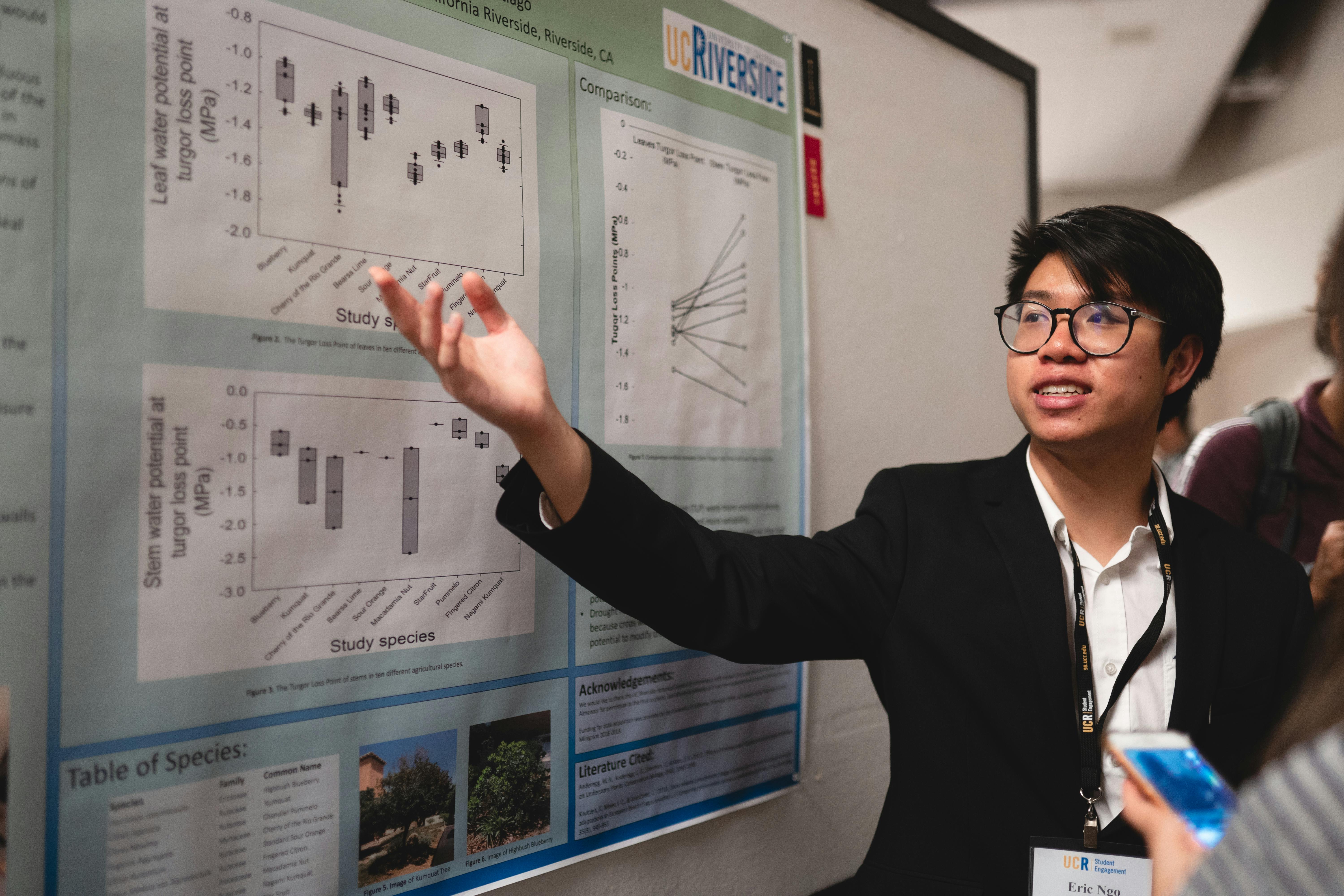
Consider your target audience when making layout decisions. Academic conferences with expert attendees may appreciate detailed column layouts that provide comprehensive information. Industry conferences or public engagement events might respond better to simplified approaches that emphasize practical implications.
The complexity of your findings also matters. Research producing multiple interconnected results may require traditional column organization to maintain clarity. Studies with single, powerful conclusions might benefit from central-results or better-poster approaches that highlight these key findings.
Design Implementation and Practical Considerations
Once you've selected your basic layout approach, implementation details determine your poster's ultimate effectiveness. Typography, color schemes, white space management, and visual hierarchy all contribute to successful communication regardless of your chosen structure.
Font selection becomes crucial in any layout. Sans-serif fonts like Arial or Helvetica typically work better than serif alternatives for poster viewing distances. Your main title should be readable from at least six feet away, while body text needs clarity from arm's length. Better-poster formats may require even larger fonts to achieve their communication goals.
Color choices can reinforce your layout's organizational structure. Column layouts benefit from subtle color coding that helps viewers navigate between sections. Central-results formats might use color to create visual paths leading toward the main finding. Better-poster approaches often employ high contrast combinations to maximize readability.
White space management varies significantly between layout types. Column formats require careful balance to avoid cramped appearance while maintaining information density. Central-results layouts need generous space around the focal element to maintain its prominence. Better-poster formats rely heavily on white space to create the clean, uncluttered appearance that supports quick reading.
Visual hierarchy guides your audience's attention regardless of layout choice. In column formats, consistent heading styles and logical information flow create this hierarchy. Central-results layouts use size, position, and color to establish clear focal points. Better-poster formats achieve hierarchy through dramatic size differences between main messages and supporting elements.
Software tools can facilitate different layout approaches. Traditional design programs like PowerPoint or Adobe Illustrator work well for column and central-results formats. Specialized research poster tools may offer templates optimized for specific layouts. When you create with Graffiy, you have access to AI-powered design assistance that can help optimize your chosen layout for maximum impact.
Print considerations affect all layout types but in different ways. Column layouts require careful attention to text legibility at standard poster sizes. Central-results formats need high-resolution images for their focal elements. Better-poster approaches must ensure their large text remains crisp and readable when printed.

Testing and Refining Your Layout Decision
Before committing to your final poster design, testing your layout choice with representative audience members can provide valuable insights. Different viewers may respond differently to your chosen approach, and early feedback helps identify potential communication barriers.
Informal testing can happen during research group meetings or departmental presentations. Present your poster concept to colleagues and observe their viewing patterns. Do they naturally follow your intended information flow? Can they quickly identify your main findings? Their behavior reveals whether your layout choice supports effective communication.
Time your test viewers as they examine your poster. Column layouts should guide readers through logical progression without confusion. Central-results formats should immediately direct attention to key findings. Better-poster approaches should communicate main messages within the first thirty seconds of viewing.
Pay attention to questions your test audience asks. If they consistently seek clarification about methodology or results placement, your layout may not be organizing information as clearly as intended. Frequent requests for additional detail might indicate that central-results or better-poster approaches aren't providing sufficient context.
Consider conducting A/B testing with different layout approaches if time permits. Create simplified versions of your poster using different structural approaches and gauge audience responses. This direct comparison can reveal which format most effectively serves your specific research communication needs.
Professional poster sessions offer additional testing opportunities. Observe how conference attendees interact with different layout types. Notice which posters attract crowds and generate extended discussions. These observations can inform future layout decisions for your research presentations.
The scientific poster design literature continues evolving as researchers experiment with new approaches and evaluate their effectiveness. Stay current with these developments to inform your layout choices.
Common Layout Mistakes to Avoid
Regardless of which poster layout you choose, certain mistakes can undermine your presentation's effectiveness. Understanding these pitfalls helps you avoid common problems that plague research posters across all formats.
Information overload represents the most frequent layout mistake. Researchers often try to include every detail from their study, creating cluttered displays that overwhelm viewers. Remember that posters serve as conversation starters rather than comprehensive research reports. Your layout should support discussion, not replace it.
Poor visual hierarchy confuses audiences regardless of structural approach. When everything appears equally important, nothing stands out. Use size, color, and positioning to guide viewers through your intended information sequence. Your most important findings should be immediately apparent, while supporting details remain accessible but secondary.
Inconsistent formatting undermines professional appearance and creates cognitive friction for viewers. Establish clear rules for headings, body text, figure captions, and spacing, then apply them consistently throughout your poster. This consistency helps audiences focus on your content rather than decoding your design choices.
Inadequate white space makes posters feel cramped and difficult to navigate. Every layout type requires breathing room to function effectively. Don't fill every available inch with content. Strategic empty space actually improves information absorption and creates more pleasant viewing experiences.
Ignoring viewing distance represents another critical error. Design choices that work on computer screens may fail when viewed from several feet away. Test your poster layout at actual viewing distances to ensure readability and visual impact remain strong.
Finally, misalignment between layout choice and research characteristics can create fundamental communication problems. Don't force complex, multi-faceted research into overly simplified formats, but also don't burden straightforward findings with unnecessarily complex presentations. Your layout should amplify your research's natural communication strengths.
Frequently Asked Questions
What poster layout works best for complex research with multiple findings?
Complex research with multiple interconnected findings typically works best with traditional column layouts. This structure provides systematic organization that helps viewers understand relationships between different components. The sequential flow supports comprehensive information presentation without overwhelming your audience.
How do I choose between central-results and better-poster layout approaches?
Central-results layouts work best when you have compelling visual findings that benefit from prominent display. Better-poster formats suit research with clear, impactful conclusions that can be summarized in powerful statements. Consider your audience's time constraints and your research's visual elements when deciding.
Can I modify traditional poster layout structures for better engagement?
Absolutely. You can adapt any layout by increasing font sizes, reducing text density, and improving visual hierarchy. Many successful posters blend elements from different approaches, such as using column organization with central-results visual emphasis. Focus on serving your audience's needs rather than strict format adherence.
Written by
Shobajo AbdulAzeez
Tags
Share this article