Landscape vs Portrait Poster: Choosing the Right Orientation for Academic Conferences
In This Article
Choosing between a landscape vs portrait poster orientation isn't just about aesthetics. It's a strategic decision that affects how conference attendees interact with your research, how well your content flows, and whether your poster stands out in crowded venue spaces.
Most researchers default to portrait orientation without considering the implications. However, understanding the strengths and limitations of each format can dramatically improve your poster's impact. The orientation you choose affects everything from text readability to audience engagement patterns.
Understanding Poster Orientation Fundamentals
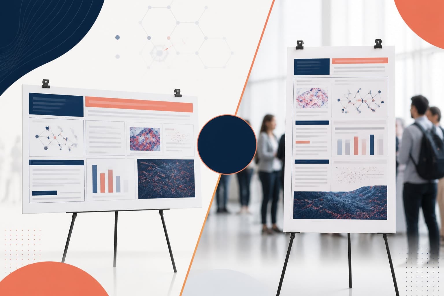
Portrait orientation measures taller than it is wide, typically following ratios like 3:4 or 2:3. This vertical format mimics how we naturally read documents and creates a sense of formality that many academic venues expect. Portrait posters often measure 36 inches wide by 48 inches tall, providing substantial vertical space for content hierarchy.
Landscape orientation stretches wider than it is tall, usually in ratios like 4:3 or 16:9. This horizontal format aligns with how we naturally scan environments and can create more dynamic visual presentations. Common landscape dimensions include 48 inches wide by 36 inches tall, offering expansive horizontal real estate for content layout.
The choice between these orientations fundamentally changes how viewers approach and process your research. Portrait posters encourage top-to-bottom scanning, while landscape formats promote left-to-right exploration. This difference in visual flow directly impacts how effectively you can guide readers through your methodology, results, and conclusions.
Visibility and Viewing Distance Considerations
Conference poster sessions create unique viewing challenges that orientation directly affects. Portrait posters typically perform better when space is limited because they occupy less horizontal real estate. This allows more posters to fit along venue walls and creates defined viewing zones for individual presentations.
However, landscape posters often achieve superior visibility from greater distances. Their horizontal spread naturally draws the eye across the content, making titles and key findings more prominent from afar. This advantage becomes crucial in crowded conference halls where attendees scan multiple posters before deciding which ones deserve closer inspection.
Eye-tracking studies from the Taylor & Francis research on poster design effectiveness reveal that landscape orientations typically generate 23% more initial visual attention than portrait formats. This increased visibility can mean the difference between engaging conference attendees and being overlooked entirely.
Portrait posters excel in intimate viewing scenarios where readers stand directly in front of your presentation. The vertical format naturally guides viewers through sequential content sections, creating a comfortable reading experience similar to browsing a magazine or academic paper.
Content Flow and Information Hierarchy
The landscape vs portrait poster decision dramatically affects how you can organize and present your research findings. Portrait orientation naturally supports traditional academic structures with clear top-to-bottom progression through introduction, methodology, results, and conclusions.
This vertical flow works particularly well for research with linear narratives or step-by-step processes. Medical case studies, experimental protocols, and theoretical frameworks often benefit from portrait orientation because readers expect to follow a logical sequence from problem identification through solution development.
Landscape posters enable more creative content arrangements that can highlight relationships between different research elements. You might place methodology and results side-by-side, allowing viewers to immediately understand the connection between your approaches and outcomes. This horizontal space also accommodates wider charts, graphs, and images that might appear cramped in portrait format.
Consider how your specific research translates to visual presentation. Data-heavy studies with multiple graphs, comparative analyses, or timeline-based findings often work better in landscape orientation. The horizontal space allows for more effective data visualization without forcing viewers to constantly refocus their attention up and down the poster.
Portrait formats excel when your research follows a clear narrative arc or requires detailed text explanations. Literature reviews, theoretical discussions, and qualitative research findings often benefit from the focused, sequential reading experience that portrait orientation provides.
Venue Constraints and Practical Limitations
Conference venues impose real-world constraints that often determine poster orientation choices regardless of your design preferences. Many established academic conferences have standardized poster dimensions and mounting systems that favor either landscape or portrait formats.
Traditional conference spaces with adjustable poster boards or bulletin-style mounting systems typically accommodate portrait orientations more easily. These setups often feature vertical supports every 36 to 48 inches, making portrait posters the obvious choice for proper mounting and stability.
Modern conference centers increasingly feature horizontal display systems, track lighting, and multimedia integration that work better with landscape orientations. These venues may provide wider mounting areas with fewer vertical interruptions, making landscape posters more practical and visually appealing.
Always check conference guidelines before finalizing your poster orientation. Some events specify required dimensions, while others provide mounting hardware that only works with particular orientations. Ignoring these practical constraints can result in mounting difficulties, poor presentation quality, or even rejection from poster sessions.
Transportation considerations also affect orientation choice. Portrait posters often fit more easily in standard poster tubes and vehicle storage spaces. However, landscape posters may be more challenging to transport safely, especially for international conferences requiring air travel.
Audience Interaction and Engagement Patterns
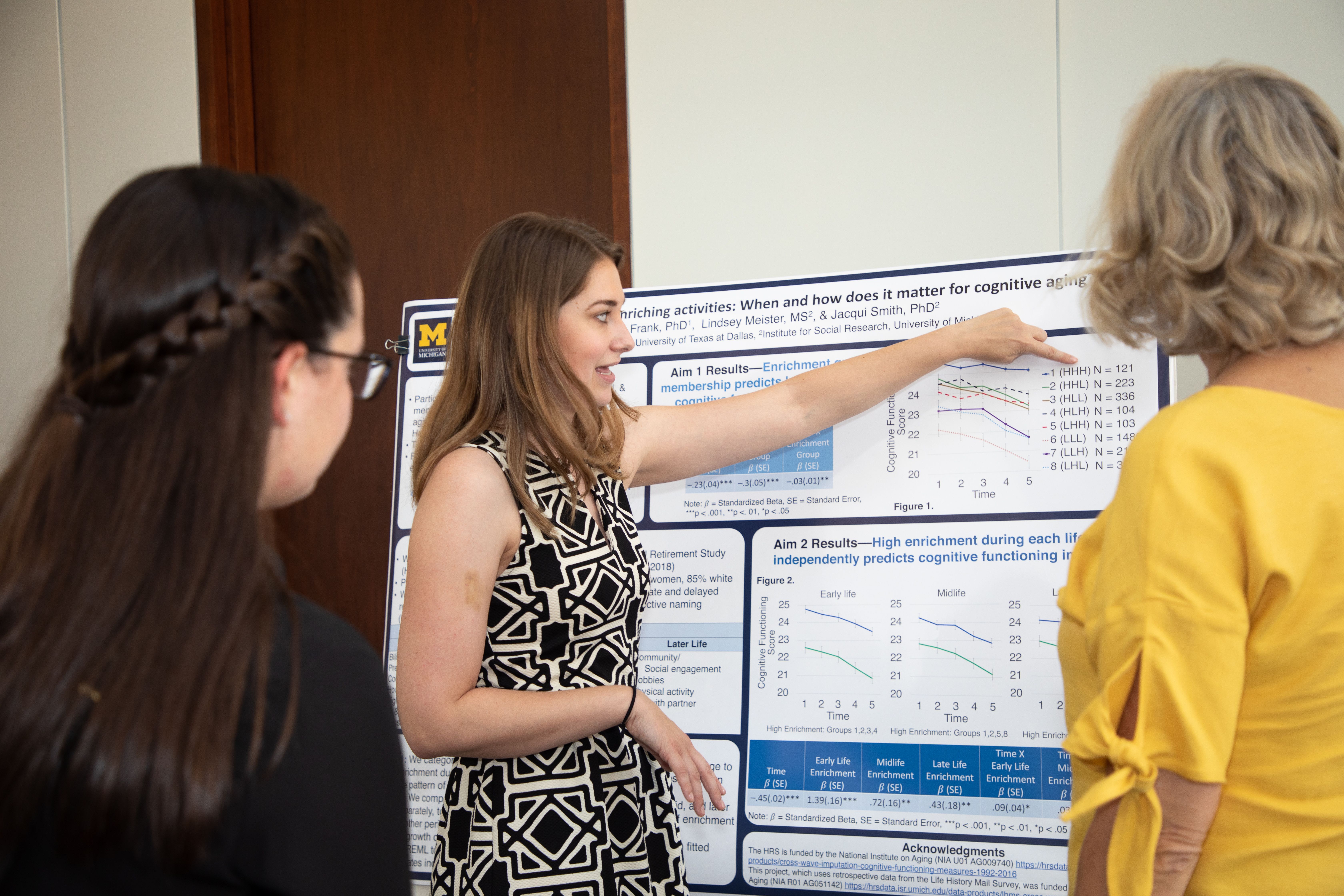
The way conference attendees interact with your research changes significantly based on poster orientation. Portrait posters tend to create more intimate, focused conversations between presenters and individual viewers. The vertical format naturally positions the presenter to one side, creating a comfortable discussion space.
Landscape posters often facilitate group interactions and broader discussions. The horizontal spread allows multiple attendees to view different sections simultaneously, potentially sparking collaborative conversations about your research methods and findings. This can be particularly valuable for interdisciplinary research that appeals to diverse academic audiences.
Presentation dynamics also differ between orientations. Portrait posters typically require presenters to guide viewers through sequential content sections, creating opportunities for detailed explanations and methodological discussions. This format works well for complex research that benefits from structured explanation.
Landscape presentations often allow for more flexible interaction patterns. Attendees might focus on specific sections like results or conclusions while you discuss other aspects of your research. This parallel engagement can be more efficient during busy poster sessions but requires careful content organization to ensure clarity.
Design and Visual Impact Strategies
Creating compelling visual presentations requires different strategies for landscape and portrait orientations. Portrait posters benefit from strong vertical hierarchies with clear section divisions and consistent alignment patterns. The narrow width demands efficient use of horizontal space while the extended height allows for detailed content development.
Typography considerations change dramatically between orientations. Portrait posters can accommodate longer headlines and more detailed section headers because vertical space is abundant. However, text columns must remain narrow to ensure comfortable reading, often limiting your ability to present wide tables or comparative data sets.
Landscape posters offer more flexibility for creative typography and layout experiments. You can use larger, more impactful headlines that span greater widths while still maintaining readable text blocks. The horizontal space also accommodates wider images and graphics that create stronger visual impact from viewing distances.
Color and branding strategies should adapt to orientation choice. Portrait posters often benefit from vertical color bands or gradient patterns that emphasize the height advantage. Landscape formats can use horizontal color transitions or wide background elements that enhance the sense of breadth and openness.
When you create with Graffiy, the platform's AI-powered design tools automatically adapt your content layout based on your chosen orientation, ensuring optimal visual flow and readability regardless of format.

Technical and Printing Considerations
The practical aspects of poster production vary significantly between landscape and portrait orientations. Portrait posters typically use standard paper sizes and printing equipment more efficiently, often resulting in lower production costs and faster turnaround times from commercial printers.
Resolution requirements differ between orientations based on typical viewing distances and content density. Portrait posters may require higher resolution for detailed text sections, while landscape posters might prioritize image quality for visual elements that viewers see from farther distances.
File size and storage considerations become important for digital sharing and backup purposes. Landscape posters with extensive visual content often generate larger file sizes, which can complicate email distribution and cloud storage for collaborative research teams.
Mounting and display hardware varies between orientations, affecting both conference logistics and long-term poster storage. Portrait posters typically use simpler mounting solutions but may require more careful handling to prevent folding or creasing along the extended vertical dimension.
Professional printing services often have preferences or limitations regarding poster orientations. Some commercial printers specialize in particular formats and may offer better quality or pricing for their preferred orientation. Always discuss technical requirements with your printing provider before finalizing design decisions.
Making the Strategic Choice for Your Research
Deciding between landscape and portrait orientation requires careful consideration of your specific research context, venue requirements, and presentation goals. Start by analyzing your content structure to determine whether your research naturally follows a linear narrative or benefits from parallel presentation of multiple elements.
Consider your target audience's viewing patterns and engagement preferences. If your research appeals to attendees who typically scan multiple posters quickly, landscape orientation might provide the visibility advantage you need. For research requiring detailed discussion and explanation, portrait format may facilitate better presenter-audience interactions.
Evaluate the specific conference environment where you'll present. Research the venue layout, mounting systems, and typical poster arrangements to ensure your orientation choice aligns with practical constraints. Some conferences provide detailed guidelines or photos of previous poster sessions that can inform your decision.
Think about your research's visual elements and data presentation needs. Studies with extensive charts, graphs, or comparative data often work better in landscape format, while text-heavy research or linear processes may benefit from portrait orientation's natural reading flow.
Budget and timeline considerations may also influence your choice. If you're working with tight deadlines or limited printing resources, choose the orientation that aligns with readily available services and standard production workflows in your area.
Frequently Asked Questions
Which orientation works better for data-heavy research presentations?
Landscape orientation typically works better for data-heavy presentations because the horizontal space accommodates wider charts, graphs, and comparative tables more effectively. The broader format also allows viewers to see relationships between different data sets without constantly refocusing their attention up and down the poster.
How do I choose between landscape vs portrait poster format for my conference?
Choose based on your research content structure, venue requirements, and audience interaction goals. Portrait works well for linear narratives and detailed discussions, while landscape suits visual content and group interactions. Always check conference guidelines for specific dimension requirements before deciding.
Do landscape posters cost more to print than portrait orientations?
Printing costs vary by provider, but portrait posters often cost less because they align with standard paper sizes and printing equipment. However, the difference is usually minimal for professional poster printing services. Focus on choosing the orientation that best serves your research presentation rather than small cost differences.
Written by
Shobajo AbdulAzeez
Tags
Share this article