
PowerPoint scientific figures: Better Than Most Researchers Think
In This Article
Where PowerPoint scientific figures are genuinely good enough
PowerPoint scientific figures have a bad reputation because many of us have seen blurry screenshots, stretched plots, and crowded conference slides reused as manuscript panels. That does not mean PowerPoint is the problem. It means the file was built without clear figure rules.
For many researchers, PowerPoint is already open all day. You use it for lab meetings, seminar slides, grant diagrams, teaching, and manuscript planning. If your figure is mostly labels, arrows, boxes, simple shapes, microscopy callouts, pathways, or workflow structure, PowerPoint can be good enough. In some cases, it is faster and easier to edit than specialist illustration software.

The key is knowing the boundary. PowerPoint is not ideal for every scientific visual. It is not a statistics package, a plotting engine, or a professional layout system. But when you treat it as a controlled figure assembly tool, not a dumping ground for screenshots, it can produce clean, readable, publication friendly visuals.
This guide is for researchers who already use PowerPoint and want a practical answer. We will look at the figure types where it works, the rules that keep quality high, and the moments when you should stop forcing it and use a different tool or create with Graffiy.
Why researchers underestimate PowerPoint
PowerPoint is easy to blame because it is familiar. Everyone has used it, so everyone has also seen it used badly. Familiar tools tend to look less serious than tools with steeper learning curves, even when the output can be strong.
Another reason is that researchers often confuse slide design with figure design. A slide can tolerate larger text, looser spacing, and more visual drama. A manuscript figure needs controlled scale, consistent typography, clear hierarchy, and export settings that preserve detail. If you build a manuscript figure like a talk slide, it will look amateur.
PowerPoint also hides precision behind a casual interface. Most users drag objects by eye, resize images from corners, and accept default colors. Yet PowerPoint has alignment tools, guides, grouping, shape formatting, precise size fields, and vector export options. Those features are not glamorous, but they matter.
There is also a cultural issue. Some labs treat Illustrator, Inkscape, or BioRender style tools as the only acceptable options for serious figures. Those tools are excellent in the right context. Still, the real standard should be whether the figure communicates accurately, survives export, and meets journal requirements.
For general figure design principles, the classic PLOS Computational Biology article Ten Simple Rules for Better Figures is worth reading. Its advice applies regardless of tool. PowerPoint cannot rescue a poor figure concept, but it can express a strong concept cleanly.
The figure types PowerPoint handles well
PowerPoint scientific figures work best when the visual is assembled from simple parts. Think of PowerPoint as a panel builder and annotation canvas. It is very capable when you need to arrange existing data images, add labels, create explanatory structure, and maintain a consistent look.
Workflow and protocol diagrams
PowerPoint is excellent for stepwise workflows. You can create boxes for sample preparation, arrows for transitions, icons for instruments, and labels for timing. Most protocol diagrams do not need advanced illustration features. They need clean spacing, short labels, and a logical reading path.
Use one direction for flow, usually left to right or top to bottom. Avoid crossing arrows. Keep the number of colors small. If every step has a different color, the reader will search for a meaning that may not exist.
Conceptual mechanisms and pathways
For simplified mechanisms, PowerPoint is often enough. You can build membranes, cells, receptors, proteins, molecular arrows, and compartments from basic shapes. The goal is usually not photorealism. The goal is a simplified explanation that supports your result.
The weakness appears when you need detailed molecular geometry, highly accurate anatomical rendering, or custom vector artwork. For those, dedicated tools are better. But for many graphical abstracts and model figures, PowerPoint can deliver a clear first version and often a final version.
Annotated microscopy and gel panels
PowerPoint works well for placing microscopy images, adding scale bars, labeling regions of interest, and arranging panels. It is also practical for gel or blot assemblies when the image processing has already been done correctly in the proper analysis software.
Be careful here. PowerPoint should not be used to manipulate scientific signal. Do not adjust one lane separately, hide artifacts, stretch images unevenly, or crop in misleading ways. Use PowerPoint for layout and annotation, not data alteration.
Simple summary graphics
PowerPoint can handle summary diagrams for grants, reviews, posters, and teaching. These include disease progression diagrams, experimental timelines, cohort overviews, intervention maps, and study design graphics.
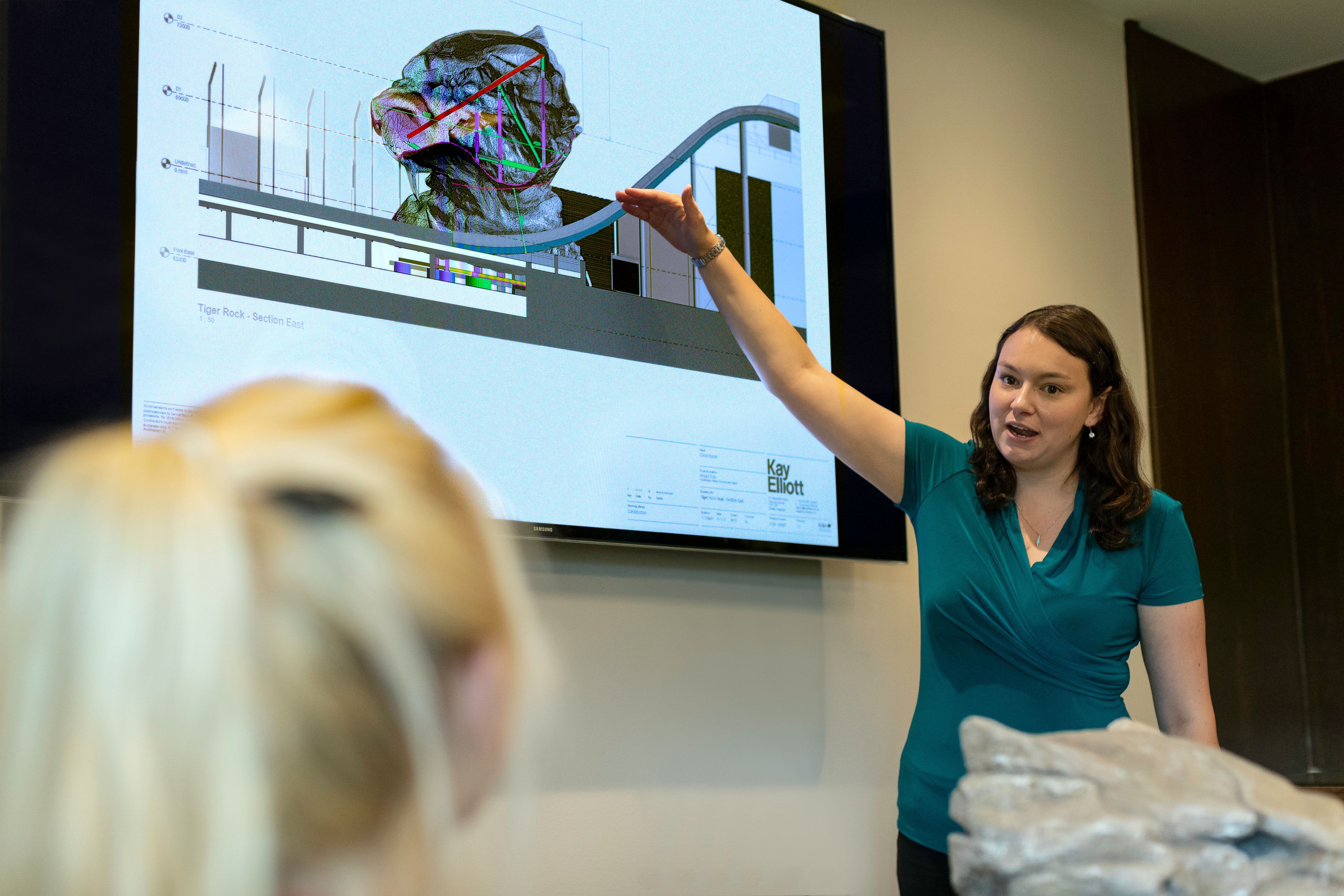
These visuals often fail because the researcher tries to show every detail. PowerPoint gives you enough control to build a strong summary, but you still need editorial discipline. If a detail does not help the reader understand the claim, remove it or move it to a table.
Where PowerPoint scientific figures start to struggle
PowerPoint scientific figures are not the right choice for every job. The most common mistake is using PowerPoint to do work that belongs in data analysis, plotting, or publication layout software. Knowing when to stop saves time and reduces errors.
First, PowerPoint is weak for data plotting. You can make charts inside PowerPoint, but scientific plots usually need traceable analysis, statistical annotation, controlled axes, reproducible styling, and export from the original data environment. R, Python, Prism, MATLAB, or similar tools are better for generating plots. PowerPoint can assemble the final panels after the plots are exported properly.
Second, PowerPoint is not ideal for complex vector illustration. It can create clean shapes, but detailed custom artwork becomes hard to manage. If you are editing many paths, curves, masks, gradients, and layers, you will feel the limits quickly.
Third, PowerPoint can cause export problems when users rely on default settings. Raster images may be compressed. Fonts may shift on another computer. Line weights may look different after PDF conversion. These issues are manageable, but only if you check them before submission.
Fourth, PowerPoint is risky for final journal layout when the journal has strict requirements for figure dimensions, font sizes, color mode, file format, and resolution. Some journals accept PDF, EPS, TIFF, or high resolution PNG. Others have narrow requirements. Always read the instructions before you build the final version.
Finally, PowerPoint can make it too easy to keep adding objects. A figure with fifty labels may look complete to the author and exhausting to the reader. The tool will not tell you when your figure has become cluttered. You need to decide.
A practical quality checklist before you trust PowerPoint
If you want PowerPoint scientific figures to look professional, use a checklist. This is not about making them fancy. It is about preventing the ordinary mistakes that make figures look careless.
- Set the slide size first. Match the intended figure size or at least the same aspect ratio. Do not build on a random widescreen slide and crop later.
- Use consistent fonts. Choose one readable sans serif font and keep label sizes consistent across panels.
- Align everything. Use PowerPoint alignment tools instead of dragging by eye. Tiny misalignments are more visible than you think.
- Group related objects. Group labels, arrows, and shapes once they belong together. This prevents accidental shifts.
- Keep line weights consistent. Arrows, boxes, and connectors should not look like they came from different figures.
- Use color intentionally. If a color indicates condition, pathway, group, or time point, use it consistently.
- Export and inspect. Open the exported file at 100 percent and zoomed in. Check text, images, lines, and symbols.
One simple habit improves almost every figure: turn on guides and align to them. PowerPoint makes rough placement easy, but rough placement is rarely good enough for manuscript figures. Use guides for panel edges, label baselines, and repeated spacing.
Another habit is to create a mini style system. Decide your font, title size, label size, line weight, arrowhead style, and palette before building the figure. Then duplicate objects instead of recreating them from defaults. This keeps the whole figure visually coherent.

How to use PowerPoint as a figure assembly tool
The strongest PowerPoint workflow separates analysis from assembly. Generate the scientific content in the right place, then bring clean outputs into PowerPoint for composition. This reduces the risk of accidental distortion and keeps your figure traceable.
For plots, export from your analysis software using a high resolution raster format or a vector format when possible. Use consistent sizes across plots before importing. If you resize plots wildly inside PowerPoint, axis labels and line weights will no longer match.
For microscopy, export images after proper processing in your imaging software. Keep original files archived. Add scale bars based on calibrated measurements, not visual guesses. In PowerPoint, use cropping only to frame the same type of content consistently across panels.
For diagrams, build with simple shapes and reuse components. If you create a cell membrane, receptor, or organ icon, duplicate it rather than drawing a slightly different version each time. Repetition creates polish.
For multi-panel figures, start with a grid. Place temporary rectangles for each panel area. Align them, label them A, B, C, and D, then insert content into those spaces. This prevents the common problem where panels slowly expand until the figure has no breathing room.
Use PowerPoint notes or a separate text file to record sources. List where each plot, image, or schematic element came from. Future you will be grateful when a reviewer asks for a change six months later.
Export settings and file formats that matter
Export is where many PowerPoint scientific figures lose quality. The figure may look fine on your screen, then turn soft or inconsistent after submission. You need to test the final output, not just the editable slide.
For vector heavy figures, PDF export is often the best first choice. Text, shapes, and lines usually stay crisp. However, always inspect the PDF because fonts, transparency, and image layers can behave differently across systems.
For raster requirements, export to PNG or TIFF at the required resolution. Many journals request 300 dpi for color or grayscale images, and higher for line art. PowerPoint does not always make this obvious, so check the pixel dimensions of your exported file.
Never submit a figure without opening the exported version. Look at small labels, scale bars, symbols, and thin lines. Print it if the final format will be read on paper. A figure that survives this inspection is usually in good shape.
If the exported file fails, do not keep tweaking randomly. Identify the failure. Is it image resolution, font substitution, compressed raster content, or inconsistent sizing? Each problem has a different fix.
When Graffiy or specialist tools are the better choice
PowerPoint is good enough when the figure is clear, accurate, editable, and exportable at the required quality. It is not good enough when the tool starts controlling the science or slowing you down. That is the point where you should switch.
Use a plotting tool when the figure depends on data analysis. Use image analysis software when the figure depends on quantitative image processing. Use vector illustration software when the artwork requires detailed path editing. Use a scientific design platform when you need faster, cleaner figure generation with research aware structure.
Graffiy is built for researchers who want scientific visuals without wrestling with generic design tools. If you are spending hours nudging arrows, rebuilding icons, or translating a rough model into a presentable schematic, it may be faster to create with Graffiy and keep PowerPoint for final slide integration.
This is not an argument against PowerPoint. It is an argument for using each tool where it is strongest. PowerPoint is excellent for assembly, annotation, and quick scientific communication. Graffiy and other specialist tools can help when the visual concept needs more structure, polish, or scientific design support.
A simple decision rule for your next figure
Before opening any tool, ask three questions. Is the figure mostly data, mostly images, or mostly explanation? Does it need precise scientific analysis, precise visual storytelling, or both? Will the final output meet the required format without fragile workarounds?
If the answer is mostly explanation and the elements are simple, PowerPoint is often enough. If the answer is mostly data, generate the panels elsewhere and use PowerPoint only for layout. If the answer is a complex explanatory schematic, consider whether PowerPoint will still be editable after revision three.
Here is a practical rule: use PowerPoint when you can explain the figure structure in one sentence. For example, “a timeline with five stages,” “four microscopy panels with callouts,” or “a pathway model with two branches.” Be cautious when the description becomes “a detailed multi-scale mechanism with many interacting components and custom icons.”
PowerPoint scientific figures are better than most researchers think because many scientific figures are not design masterpieces. They are communication tools. If PowerPoint helps you communicate accurately, clearly, and quickly, it deserves a place in your workflow.
The real goal is not to defend a tool. The goal is to make figures that readers understand without effort. Use PowerPoint when it gets you there. Switch when it does not.
Frequently Asked Questions
Can PowerPoint scientific figures be used in journal submissions?
Yes, PowerPoint scientific figures can be used for journal submissions when they meet the journal's file format, resolution, font, and sizing requirements. The safest workflow is to assemble carefully, export to the requested format, and inspect the final file before submission.
What kinds of scientific figures should I avoid making entirely in PowerPoint?
Avoid using PowerPoint as the main tool for statistical plots, quantitative image processing, or complex vector artwork. Create those elements in the proper analysis or illustration software, then bring clean outputs into PowerPoint for assembly if needed.
How do I stop PowerPoint figures from looking like slides?
Set the final figure size first, use a restrained font system, align objects precisely, and reduce text to only what the reader needs. A manuscript figure should feel quieter and more controlled than a presentation slide.
Written by
Shobajo AbdulAzeez
Tags
Share this article