How to Design a biology graphical abstract for Biology Papers
In This Article
Plan the biology graphical abstract story first
A biology graphical abstract is not a small poster of your whole paper. It is a visual answer to one question: what did you find, and why does it matter biologically? Before choosing icons or colors, write a one sentence message. For example, “Drug X blocks kinase Y, reducing inflammatory signaling in macrophages.” That sentence becomes your design filter. Anything that does not support it should be removed, simplified, or moved to the manuscript figures.
Biology papers often contain many moving parts: pathways, cell types, treatments, time points, phenotypes, and assays. The abstract should not flatten that complexity into decoration. Instead, it should guide the reader through the causal logic of the study. Start with the biological context, then show the intervention or comparison, then end with the key outcome.

A strong biology graphical abstract usually has a simple reading direction. Left to right works well for mechanisms. Top to bottom works well for cascades, differentiation, or tissue level changes. Circular layouts can work for cycles, but they are harder to scan quickly. If your story is not naturally cyclical, resist the temptation to make it a wheel.
Choose the right biological scale
One common mistake is mixing too many scales in one frame. A cell, tissue section, animal model, protein complex, and clinical outcome can all belong to the same study. They do not all need equal space in the biology graphical abstract. Pick the scale where your main finding becomes clearest.
If your paper explains a signaling mechanism, center the pathway inside or near the cell. If your paper compares cell populations, center the cell types and markers. If your paper is about tissue remodeling, the tissue architecture may deserve the largest visual area. The best choice is rarely the prettiest one. It is the choice that helps a reader understand the result fastest.
You can still show multiple scales, but use hierarchy. For example, place a small mouse or organ icon on the left as the model, a large cell in the middle as the mechanism, and a phenotype readout on the right. This tells readers that the study begins in a model, explains a cellular process, and ends with an observable effect.
When possible, label scale changes directly. Use short labels such as “tumor tissue,” “T cell,” “mitochondria,” or “NF kappa B pathway.” Readers should not have to guess whether they are looking at an organelle, a whole cell, or an experimental condition.
Build pathways that read like biology, not spaghetti
Pathways are the backbone of many biology graphical abstract designs. They are also where many designs become unreadable. A pathway with twelve arrows, five feedback loops, and six protein complexes may be accurate, but it will not work as an abstract. Your goal is to show the decisive chain of events, not recreate every edge from a database.
Start by dividing pathway elements into three groups: upstream trigger, central mediator, and downstream effect. The upstream trigger might be ligand binding, mutation, stress, infection, diet, or treatment. The central mediator is the protein, RNA, metabolite, or organelle process that your paper focuses on. The downstream effect is the phenotype, such as apoptosis, proliferation, migration, cytokine release, differentiation, or repair.
Use arrows only where they add meaning. A solid arrow can mean activation, while a blunt line can mean inhibition. Use one visual convention and keep it consistent. If one arrow means “causes,” another means “moves to,” and a third means “increases,” label them. Otherwise, readers will fill in the wrong meaning.
For complex signaling, show modules instead of every molecule. A box labeled “MAPK signaling” may be more useful than stacking RAF, MEK, ERK, and downstream transcription factors, unless one of those proteins is the point of the paper. Your biology graphical abstract should reward the reader with clarity, not test their pathway memory.
If your study includes upregulation and downregulation, use color carefully. Red and blue are familiar, but not universal. Add icons, arrows, or plus and minus symbols so the meaning survives grayscale printing and color vision differences. The PubMed Central archive is a useful reminder that figures must remain understandable across many viewing contexts and formats.
Design cells that are recognizable and purposeful
Cells are powerful visual anchors. They let a reader know the biological system immediately. However, not every cell needs a full set of organelles, membrane texture, granules, and marker labels. Add details only when they serve the story.
For immune cells, shape and context can help. A macrophage may look irregular and phagocytic. A T cell can be smaller and rounder, often interacting with an antigen presenting cell or target cell. For neurons, dendrites and axons carry meaning. For epithelial cells, polarity matters. Use these recognizable features, but keep them clean.
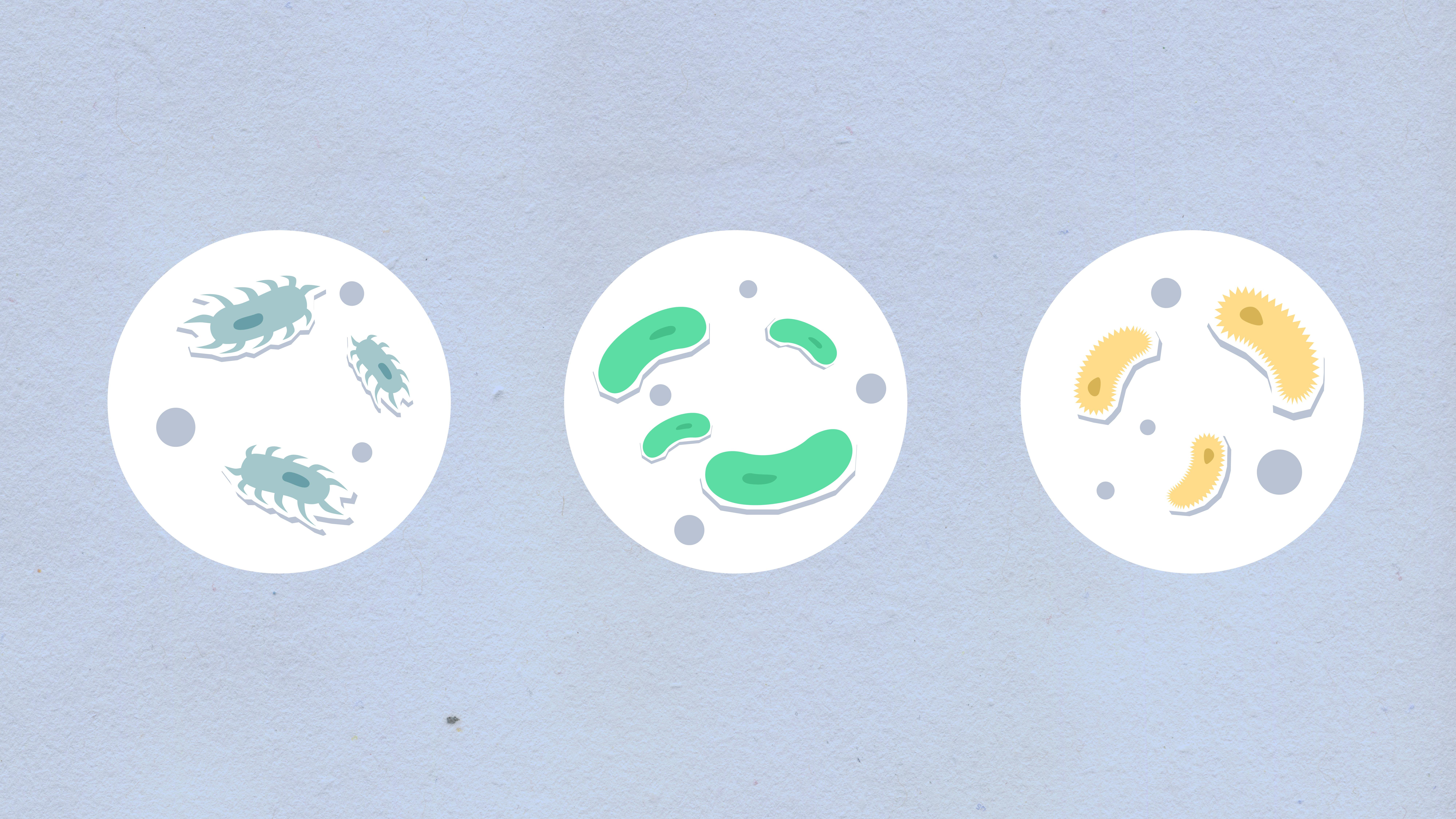
When showing cells, decide whether the viewer is outside the cell, inside the cell, or switching between both. A cutaway cell can show membrane receptors, cytoplasmic signaling, and nuclear transcription in one view. A full outside view is better for migration, adhesion, immune synapse formation, or cell to cell communication. Switching viewpoints too often can make the biology graphical abstract feel unstable.
Markers should be selective. If your story is about CD8 positive T cells killing tumor cells, CD8 and tumor antigen may be enough. If you add CD3, PD1, granzyme B, IFN gamma, and MHC labels, the scene becomes a mini review figure. That can be useful elsewhere, but not here.
Use cell color as an identifier, not a decoration. If macrophages are teal, keep them teal throughout. If cancer cells are purple, do not also use purple for inhibitors or background panels. Consistent color reduces the reading burden, especially when the abstract includes several cell types.
Use icons as scientific shorthand
Icons can make a biology graphical abstract faster to read, but only when they are precise. A syringe, petri dish, DNA helix, antibody, virus, mitochondrion, and microscope all carry familiar meaning. The risk is using icons as filler. Every icon should answer a specific question: What is the model? What is measured? What is changed? What is the outcome?
Icon style should be consistent. Do not mix glossy 3D icons with flat line icons unless there is a strong reason. Mixed styles look accidental and can make the science feel less reliable. For journal figures, clean vector style usually works best because it scales well and stays readable in PDF, slide, and thumbnail formats.
Label icons when ambiguity is possible. A small particle could be a virus, exosome, nanoparticle, or vesicle. A rod shape could be a bacterium, organelle, or drug delivery vehicle. A short label prevents confusion without adding much visual weight.
Inhibitors and treatments deserve special care. A pill icon may be fine for a clinical drug, but a small molecule used in cell culture may be better shown as a labeled compound shape or treatment arrow. For genetic perturbations, use distinct icons for CRISPR knockout, siRNA knockdown, overexpression, and mutation. These details matter to biology researchers.
Graffiy is built for this kind of scientific shorthand. You can create with Graffiy when you need biology aware visuals, editable icons, and a faster route from rough concept to polished graphical abstract.
Make the story flow readable at thumbnail size
Your biology graphical abstract will often be seen first as a small image in a table of contents, search result, social post, or PDF viewer. If it only works at full screen, it is not finished. Test it by zooming out until the text is uncomfortable. The main message should still be visible through the composition.
Readable flow depends on hierarchy. Use size, position, and contrast to show what matters most. The main cell, pathway, or phenotype should be visually dominant. Secondary methods can be smaller. Background context should be subtle. If everything is bold, nothing is bold.
A practical layout is the three act structure. Act one shows the starting condition or biological problem. Act two shows the intervention, mutation, or mechanism. Act three shows the result. This works for many biology papers because it mirrors experimental logic: system, change, outcome.
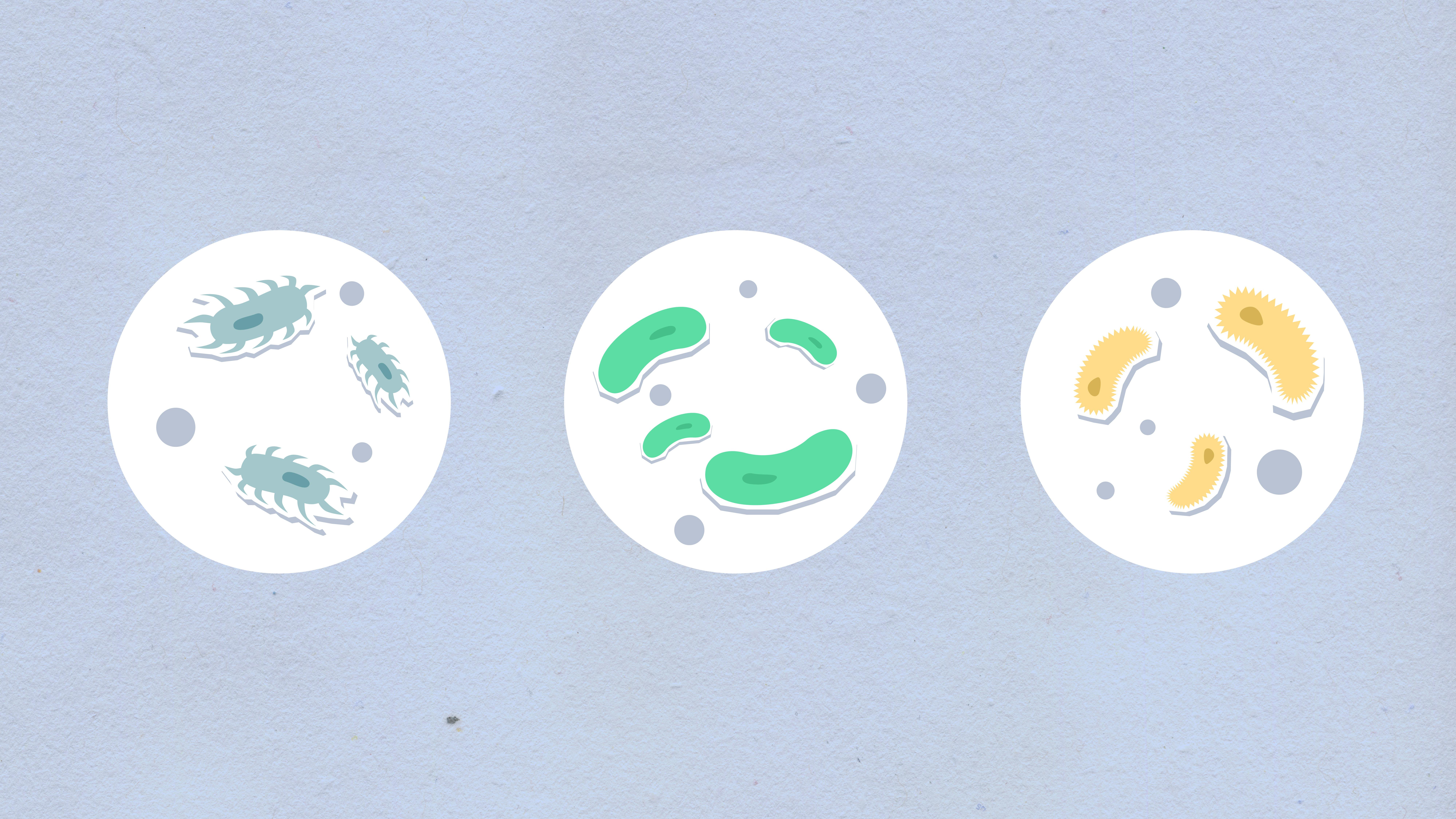
Use white space as a design tool. Dense layouts feel stressful, and they slow down comprehension. White space separates ideas, creates order, and makes labels easier to read. If you feel tempted to reduce font size to fit one more label, remove something instead.
Text should be short and specific. Replace “significant decrease in inflammatory cytokine expression” with “lower cytokines.” Replace “enhanced mitochondrial oxidative phosphorylation” with “higher OXPHOS,” if your audience will understand the abbreviation. Use the same terms as the paper where possible, but do not copy full result sentences into the figure.
Color, contrast, and typography for biology figures
Color should organize information before it beautifies the page. Assign colors by category: cell type, pathway state, experimental group, or outcome. Avoid using color to encode too many variables at once. A biology graphical abstract with six color meanings becomes a puzzle.
Use contrast to separate foreground from background. Dark text on a light background is usually safest. If you use a colored background, keep it pale and avoid putting small text over gradients or busy textures. Journals compress images, and subtle text effects can disappear.
Typography should be simple. Use one typeface or two at most. Make labels large enough to read in a reduced view. Keep capitalization consistent. All caps can work for short protein labels, but long all caps labels become hard to read. Italicize gene names only if that convention matters for your field and the journal allows it in figures.
Protein, gene, and species naming rules can be field specific. If your abstract includes gene symbols, protein names, microbial species, or model organisms, check the manuscript style. A polished design loses trust quickly if the labels ignore basic biological naming conventions.
A practical workflow for your next biology graphical abstract
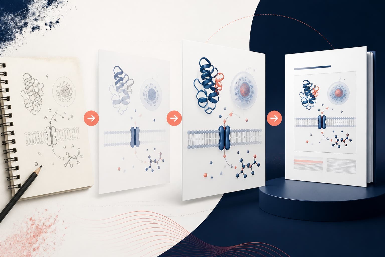
Use a workflow that forces clarity before polishing. First, write the one sentence message. Second, list the visual elements needed to prove that message. Third, sketch the flow with boxes and arrows before adding realistic cells or icons. Fourth, remove anything that does not support the main story.
After the rough layout works, add biological detail. Choose the cell type shapes, pathway modules, treatment icons, and outcome readouts. Add labels last, because labels should support the visual logic, not rescue a confusing layout. If the figure makes no sense without text, the composition needs more work.
Then run a quick review with a colleague outside your immediate project. Ask them to explain what they think happens in the graphic. Do not prompt them. If they miss the main result, the design needs simplification. If they understand the mechanism but miss the experimental system, add context. If they focus on a minor assay, adjust hierarchy.
Finally, check technical requirements. Confirm size, file type, resolution, font embedding, and journal rules. Many journals ask for editable vector files or high resolution raster files. Export a clean version for submission and a second version for talks or social sharing if needed.
Common mistakes to avoid
The first mistake is trying to show the whole paper. A graphical abstract is a selective visual summary, not a complete figure panel collection. It should point readers toward the paper, not replace it.
The second mistake is overusing arrows. Arrows are helpful, but too many arrows create noise. If the direction of flow is already obvious from layout, you may not need an arrow at every step.
The third mistake is using icons without biological context. A DNA icon, cell icon, or drug icon can look polished while saying very little. Tie every icon to a label, pathway, treatment, or outcome.
The fourth mistake is making the design too symmetrical. Symmetry can look tidy, but biology stories often need direction and consequence. A readable biology graphical abstract usually has momentum. It moves the reader from cause to mechanism to result.
The fifth mistake is hiding the main finding in a corner. Your key result should be the visual destination. If your paper’s contribution is a new mechanism, make that mechanism central. If it is a therapeutic effect, make the before and after outcome unmistakable.
Pre-submission checklist
- Main message: Can you say the finding in one sentence, and does the graphic match it?
- Reading direction: Is the flow clear without verbal explanation?
- Pathway clarity: Are activation, inhibition, and downstream effects visually distinct?
- Cell identity: Are cell types recognizable and consistently colored?
- Icon meaning: Does every icon have a purpose?
- Label economy: Are labels short, readable, and scientifically accurate?
- Thumbnail test: Does the abstract still communicate when zoomed out?
- Journal fit: Does the file meet the journal’s format and size rules?
A biology graphical abstract is a bridge between your results and the reader’s attention. It should not oversell, oversimplify, or bury the mechanism under decorative detail. When you focus on pathways, cells, icons, and readable story flow, the design becomes more than a nice image. It becomes a clear scientific argument in visual form.
Frequently Asked Questions
What should a biology graphical abstract include?
A biology graphical abstract should include the biological system, the key mechanism or pathway, and the main outcome. It should focus on the central finding rather than every method or result. Cells, pathway arrows, treatment icons, and phenotype readouts are often enough when they are arranged in a clear flow.
How many pathways should I show in a graphical abstract for a biology paper?
Usually, show one main pathway or one simplified pathway module. If your study compares two pathways, make the contrast visually obvious and avoid adding every intermediate molecule. A graphical abstract should clarify the mechanism, not reproduce a full pathway database.
Should I use realistic cells or simple cell icons?
Simple cell icons are usually better for fast reading, especially in a small journal thumbnail. Add realistic detail only when it carries biological meaning, such as polarity, synapse formation, neurites, or phagocytosis. Consistency matters more than visual complexity.
Written by
Shobajo AbdulAzeez
Tags
Share this article