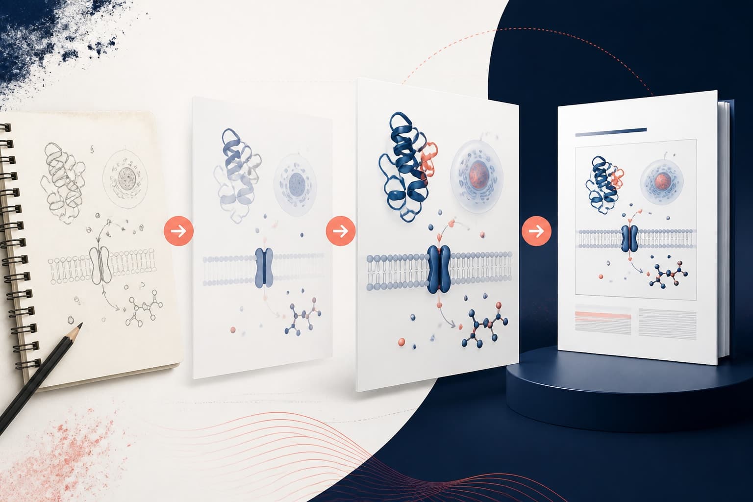
5 Common Graphical Abstract Mistakes and How to Fix Them
In This Article
Your graphical abstract is often the first impression reviewers and readers have of your research. Yet many researchers unknowingly commit graphical abstract mistakes that weaken their submissions and reduce their chances of acceptance. These visual summaries require a different approach than traditional figures or presentations, and the stakes are high when you're competing for space in prestigious journals.

After reviewing thousands of scientific visualizations, we've identified five critical errors that appear repeatedly in submissions. The good news? Each mistake has a straightforward fix that can dramatically improve your abstract's impact. Let's examine these common pitfalls and transform them into opportunities for clearer communication.
Mistake 1: Cramming Too Much Information Into Limited Space
The most frequent error researchers make is treating their graphical abstract like a compressed version of their entire paper. You have roughly 600x400 pixels to work with, yet many abstracts attempt to include every methodology step, result, and conclusion from a multi-page study.
This approach creates visual chaos. Text becomes unreadable when shrunk to fit journal specifications. Complex diagrams lose their clarity when compressed. Readers give up before they understand your core message because there's simply too much competing for their attention.
The Fix: Focus on One Key Message
Successful graphical abstracts communicate exactly one main concept. Ask yourself: what's the single most important takeaway from your research? Build your entire abstract around that central idea.
For example, instead of showing your complete experimental setup, sample preparation, analysis methods, statistical tests, and conclusions, focus solely on the key finding or mechanism you discovered. If your research revealed that protein X binds to receptor Y in a novel way, show that interaction clearly rather than the entire research pipeline that led to the discovery.
Think of your graphical abstract as a movie trailer, not a documentary. You want to intrigue viewers and convey the essence of your work without overwhelming them with details they can find in the full paper.
Mistake 2: Using Dense Text Instead of Visual Elements
Many researchers default to text-heavy designs because they're comfortable with written communication. They create what essentially amounts to a bulleted list with decorative borders, missing the entire point of visual communication.
Text-heavy abstracts fail because readers scan graphical abstracts quickly, often spending less than 10 seconds evaluating them. Dense paragraphs and lengthy labels force readers to slow down and read carefully, which defeats the purpose of visual summary.
The Fix: Replace Words with Icons, Symbols, and Diagrams
Transform text into visual elements whenever possible. Instead of writing "increased cell proliferation," show cells dividing with simple illustrations. Rather than stating "temperature increased," use a thermometer icon with an upward arrow.
Consider these replacements: molecular structures instead of chemical names, flowcharts instead of process descriptions, bar graphs instead of numerical comparisons, and pictograms instead of category labels. Research published in Nature Methods shows that visual elements are processed 60,000 times faster than text, making your message more accessible to time-pressed reviewers.
Keep essential text brief and large enough to read at thumbnail size. Use bold, sans-serif fonts and limit yourself to two or three key phrases maximum.

Common Graphical Abstract Mistakes in Color and Contrast
Color choices can make or break your graphical abstract's effectiveness. We regularly see abstracts that use colors poorly, creating accessibility issues and reducing visual impact. The most common color-related errors include using too many colors, choosing colors that don't reproduce well in print, and ignoring colorblind accessibility.
Overly complex color schemes distract from your message. When every element uses a different color, nothing stands out as important. Similarly, colors that look vibrant on your screen may appear muddy or indistinguishable when printed in journal formats.
The Fix: Develop a Strategic Color Palette
Limit yourself to three or four colors maximum, including black and white. Choose colors that serve specific purposes: one color for highlighting key elements, another for supporting information, and neutral colors for background elements.
Ensure your colors work for colorblind readers by avoiding red-green combinations and testing your design with colorblind simulation tools. Colors should have sufficient contrast to remain distinguishable when printed in grayscale, as many journals still use black-and-white printing for some content.
Consider using color psychology strategically. Warm colors (reds, oranges) draw attention to important results, while cool colors (blues, greens) work well for background processes or supporting information.
Mistake 3: Ignoring Visual Hierarchy and Flow
Poor visual organization confuses readers about where to look first and how information connects. Many graphical abstracts present elements randomly without considering how the human eye naturally scans visual information.
Without clear visual hierarchy, readers may focus on minor details while missing your main message. They might read elements in the wrong order, creating confusion about your research process or findings.
The Fix: Create Clear Visual Pathways
Design your abstract with intentional visual flow. Most readers scan from left to right and top to bottom, so place your most important information accordingly. Use size, color, and positioning to guide the reader's eye through your content logically.
Establish hierarchy through visual weight. Make your key finding the largest, most prominent element. Use consistent spacing and alignment to create professional appearance and improve readability. Connect related elements with arrows, lines, or consistent styling to show relationships clearly.
Consider the storytelling arc: setup, methodology, key finding, and implication. Arrange elements to tell this story visually, even if someone never reads the accompanying paper.

Mistake 4: Creating Overly Complex Diagrams
Complexity often masquerades as thoroughness in academic settings. Researchers frequently create intricate diagrams that showcase their deep understanding of complex systems, but these detailed illustrations rarely work well in graphical abstracts.
Complex diagrams with multiple pathways, numerous variables, and detailed molecular interactions become incomprehensible when reduced to journal size requirements. What looks impressive at full size becomes a meaningless tangle of lines and shapes when compressed.
The Fix: Embrace Strategic Simplification
Simplify ruthlessly while maintaining scientific accuracy. Remove non-essential details that don't directly support your main message. Use clean, geometric shapes instead of highly detailed illustrations. Focus on the core mechanism or relationship rather than every possible variable or pathway.
For molecular interactions, show key binding sites rather than complete protein structures. For biological processes, illustrate the main steps rather than every intermediate reaction. For data relationships, highlight the strongest trends rather than all variables measured.
Remember that simplification doesn't mean dumbing down your science. It means distilling your research to its most essential and impactful elements. You can create with Graffiy to help streamline this process and ensure your simplified designs maintain professional quality.
Mistake 5: Neglecting Technical Specifications and Quality
Technical execution problems plague many otherwise well-designed graphical abstracts. Common issues include insufficient resolution, inappropriate file formats, incorrect dimensions, and poor image compression that degrades visual quality.
These technical mistakes can lead to automatic rejection before reviewers even evaluate your content. Journals have specific requirements for good reason: abstracts must reproduce clearly across different media and maintain quality when resized.
The Fix: Master Technical Requirements
Always check journal specifications before creating your abstract. Most journals require specific dimensions (typically 600x400 pixels), minimum resolution (usually 300 DPI for print), and particular file formats (commonly TIFF, PNG, or high-quality JPEG).
Create your abstract at the required dimensions rather than designing large and shrinking down. This approach ensures text remains readable and details stay clear at the intended size. Use vector graphics when possible for elements like text and simple shapes, as they scale without quality loss.
Save multiple versions: a high-resolution version for submission and a web-optimized version for sharing on social media or presentations. Test your abstract at different sizes to ensure it maintains impact and readability across various contexts.
Quality Control: Testing Your Graphical Abstract
Before submitting your graphical abstract, conduct thorough quality testing. Many researchers skip this crucial step and discover problems only after submission deadlines have passed.
Start with the "glance test": show your abstract to someone unfamiliar with your research for exactly five seconds, then ask them to explain what they saw. If they can't identify your main message or general research area, your abstract needs revision.
Test technical aspects rigorously. Print your abstract at the size it will appear in the journal. View it on different devices and screen types. Check that all text remains readable and important details stay visible when displayed as a thumbnail.
Consider accessibility throughout your testing. Verify that color choices work for colorblind viewers and that contrast levels meet accessibility standards. Ensure your abstract communicates effectively even without color, as some readers may encounter black-and-white versions.
Learning from Successful Examples
Study graphical abstracts from leading papers in your field, but don't copy their designs directly. Instead, analyze why certain approaches work well. Notice how successful abstracts balance simplicity with scientific accuracy, use white space effectively, and guide readers through complex information clearly.
Pay attention to how top-tier journals present graphical abstracts in their publications. Observe which designs catch your attention most quickly and why certain visual strategies prove more effective than others.
Build a collection of exemplary graphical abstracts from various disciplines. This reference library will help you recognize effective design patterns and inspire creative solutions for your own research presentations.
Remember that effective graphical abstracts require both scientific expertise and design thinking. The most successful researchers develop visual communication skills alongside their research abilities, treating graphical abstracts as essential tools for scholarly impact rather than afterthoughts in the submission process.
Frequently Asked Questions
What are the most critical graphical abstract mistakes to avoid?
The most critical graphical abstract mistakes include cramming too much information into limited space, using dense text instead of visual elements, and ignoring proper visual hierarchy. These errors make your abstract difficult to understand quickly and reduce its impact on reviewers and readers.
How can I test if my graphical abstract is effective?
Use the "glance test" by showing your abstract to someone unfamiliar with your research for exactly five seconds, then asking them to explain the main message. Also test technical aspects by printing at journal size and viewing on different devices to ensure readability.
What technical specifications should I follow for graphical abstracts?
Check your target journal's specific requirements, but most require 600x400 pixel dimensions, 300 DPI resolution, and TIFF, PNG, or high-quality JPEG formats. Create your abstract at the required dimensions rather than designing large and shrinking down to maintain clarity.
Written by
Shobajo AbdulAzeez
Tags
Share this article