How to Make a Graphical Abstract PowerPoint: A Complete Tutorial
In This Article
Creating a graphical abstract PowerPoint presentation might seem daunting, but with the right approach, you can transform complex research into visually compelling stories. Whether you're preparing for a conference presentation or designing supplementary materials for your publication, PowerPoint offers surprisingly robust tools for scientific visualization.
Most researchers already have PowerPoint installed and know the basics. The challenge lies in using these familiar tools strategically to communicate scientific concepts clearly. We'll walk through a practical workflow that transforms your initial sketches into polished, professional graphical abstracts.

Planning Your Graphical Abstract PowerPoint Layout
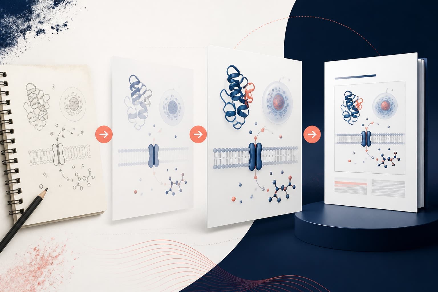
Before opening PowerPoint, spend time sketching your concept on paper. This preliminary step saves hours of digital rearranging later. Your sketch should identify the main story elements: the problem, methodology, key findings, and implications.
Think of your graphical abstract as a visual elevator pitch. You have seconds to capture attention and minutes to convey your research significance. Start by listing the three most important takeaways from your work, then consider how visual metaphors might represent these concepts.
PowerPoint's strength lies in its layered approach to design. Unlike static image editors, you can easily modify individual elements, adjust colors, and experiment with layouts. This flexibility becomes crucial when refining your scientific narrative.
Consider your target audience during planning. Conference attendees scanning posters need different visual cues than journal readers examining supplementary figures. Academic conferences often favor clean, high-contrast designs that remain legible from several feet away.
Setting Up Your PowerPoint Workspace for Scientific Design
Start with a blank presentation and immediately adjust your slide dimensions. Go to Design > Slide Size > Custom Slide Size. For most graphical abstracts, a 16:9 aspect ratio works well, but check specific journal requirements if you're creating supplementary materials.
Enable the grid and guides under View > Show. These alignment tools prevent the amateur look that comes from eyeballing element placement. Set up your color palette early by creating a custom theme. Scientific figures benefit from consistent color usage throughout.
Import any existing figures, data charts, or images you plan to incorporate. PowerPoint handles various file formats, but vector graphics (SVG, EMF) scale better than raster images (JPG, PNG) when resizing elements.
Create a dedicated folder structure on your computer for this project. Save frequently as you work, and consider using PowerPoint's AutoSave feature if you have cloud storage enabled. Nothing derails creative momentum like losing hours of work to a software crash.

Building Your Visual Narrative Step by Step
Begin with your background. Solid colors work better than gradients for scientific presentations. White or very light gray backgrounds ensure maximum contrast with text and figures. Avoid busy patterns that compete with your content for attention.
Add your title first, positioning it prominently at the top. Use sans-serif fonts like Arial or Calibri for better readability. Keep titles concise but descriptive. Your graphical abstract title should immediately convey the research focus.
Now comes the creative challenge: translating your research process into visual elements. PowerPoint's Insert menu provides access to shapes, icons, and SmartArt graphics. Use these tools to create flowcharts, process diagrams, and conceptual illustrations.
For molecular structures, chemical reactions, or biological processes, combine basic shapes to build custom diagrams. PowerPoint's grouping function lets you treat multiple elements as single objects, making complex diagrams easier to move and resize.
Color coding helps viewers navigate complex information quickly. Establish a consistent system where specific colors represent particular concepts, stages, or categories throughout your presentation. Research shows that consistent color usage significantly improves comprehension in scientific figures.
Creating Effective Graphical Abstract PowerPoint Elements
PowerPoint's shape tools can create surprisingly sophisticated scientific illustrations. The basic circle becomes a cell, atom, or data point. Rectangles transform into experimental apparatus, data tables, or process steps. Arrows indicate flow, causation, or temporal sequences.
Layer transparency adds depth to your designs. Right-click any shape and select Format Shape to access transparency controls. This technique works particularly well for showing overlapping processes or highlighting specific components within larger systems.
Text boxes should complement, not overwhelm, your visual elements. Use bullet points sparingly and keep individual text blocks short. Consider using callout shapes to label important features without disrupting the overall flow.
Smart use of PowerPoint's alignment tools creates professional-looking layouts. Select multiple objects and use the Arrange menu to distribute elements evenly or align them precisely. These small details separate amateur designs from polished presentations.

Incorporating Data and Results Effectively
Your graphical abstract should highlight key findings without overwhelming viewers with raw data. PowerPoint's chart tools can create simplified versions of your main results. Focus on trends and patterns rather than precise numerical values.
Screenshots from statistical software often look unprofessional in presentations. Instead, recreate important graphs using PowerPoint's chart function. This approach gives you complete control over colors, fonts, and styling to match your overall design theme.
Consider using infographic-style elements to represent quantitative results. PowerPoint's icon library includes symbols for increases, decreases, and comparisons. These visual shortcuts help viewers grasp your findings quickly.
For before-and-after comparisons, use side-by-side layouts with clear visual separation. This arrangement works particularly well for showing treatment effects, methodological improvements, or temporal changes in your research system.
Polishing and Professional Finishing Touches
Review your design with fresh eyes after completing the initial layout. Print a black-and-white version to ensure your visual hierarchy works without color. Important elements should remain prominent even in grayscale.
Check text readability by viewing your slide in presentation mode. If you need to squint to read labels or captions, increase font sizes. Academic audiences often view presentations from considerable distances.
PowerPoint's Design Ideas feature can suggest layout improvements, though use it cautiously with scientific content. The AI sometimes misinterprets technical elements, but it might spark ideas for better visual organization.
Consistency matters more than flashy effects. Stick to your established color palette, maintain uniform spacing between elements, and use the same font family throughout. These details create visual coherence that enhances comprehension.

Export Options and Quality Considerations
PowerPoint offers multiple export formats, each with specific advantages. For print materials, export as high-resolution PDF to preserve crisp lines and text. The Save As dialog includes PDF options where you can specify resolution and quality settings.
For digital presentations, consider exporting individual slides as PNG images. This format works well for embedding in websites, email attachments, or social media posts. Choose resolution settings based on your intended use: 150 DPI for web, 300 DPI for print.
Test your exported files on different devices and platforms. Colors sometimes shift between PowerPoint's display and final output. PDF exports generally maintain color accuracy better than image formats.
Keep your original PowerPoint file organized with descriptive filenames and version numbers. You'll often need to make revisions based on feedback or adapt your design for different presentation contexts.
Advanced Techniques for Complex Research Visualization
PowerPoint's animation features can enhance understanding when used judiciously. Simple entrance effects can reveal information sequentially, helping audiences follow complex processes step by step. Avoid overly dramatic animations that distract from scientific content.
For multi-step processes, consider creating multiple slides that build upon each other. This approach works particularly well for conference presentations where you can control pacing and emphasis.
PowerPoint supports embedding other Office documents, including Excel charts and Word tables. This integration maintains data connections, allowing updates in source documents to automatically reflect in your presentation.
Master slides and slide layouts become valuable when creating multiple related presentations. Set up custom layouts with your preferred formatting, then apply them consistently across different projects.
Troubleshooting Common Design Challenges
Font compatibility issues plague many presentations when moving between computers. Stick to system fonts like Arial, Times New Roman, or Calibri to ensure consistent appearance across platforms. If you must use specialty fonts, embed them in your PowerPoint file through the Save Options menu.
Image resolution problems typically arise from using low-quality source images. PowerPoint cannot improve image quality, only degrade it. Start with the highest resolution images available, particularly for microscopy, photographs, or detailed diagrams.
Color reproduction varies between monitors and projectors. Test your presentation on the actual equipment you'll use when possible. Avoid subtle color distinctions that might disappear under different display conditions.
File size becomes problematic with image-heavy presentations. PowerPoint's Compress Pictures feature reduces file sizes while maintaining acceptable quality for most academic purposes. Access this tool through the Format tab when an image is selected.
When you're ready to take your graphical abstracts to the next level with AI-powered design assistance, create with Graffiy for access to specialized scientific design tools and templates built specifically for researchers.
Creating compelling graphical abstracts in PowerPoint requires patience and attention to detail, but the results justify the effort. Your research deserves clear, professional presentation that engages audiences and communicates your scientific contributions effectively. With these techniques, you can transform PowerPoint from a basic presentation tool into a powerful scientific communication platform.
Frequently Asked Questions
What slide dimensions work best for graphical abstract PowerPoint presentations?
Use 16:9 aspect ratio for most applications, as it works well for both digital displays and print materials. For journal submissions, check specific requirements as some prefer square formats or custom dimensions. Always verify requirements before starting your design.
How can I ensure my graphical abstract PowerPoint design looks professional?
Focus on consistency in fonts, colors, and spacing throughout your presentation. Use PowerPoint's alignment tools to position elements precisely, and stick to a limited color palette. Avoid cluttered layouts and ensure text remains readable when projected or printed.
What export format should I use for sharing my graphical abstract?
Export as PDF for print materials and formal submissions, as it preserves formatting and resolution. Use PNG format for digital sharing, social media, or web embedding. Always test your exported files on different devices to ensure they display correctly.
Written by
Shobajo AbdulAzeez
Tags
Share this article