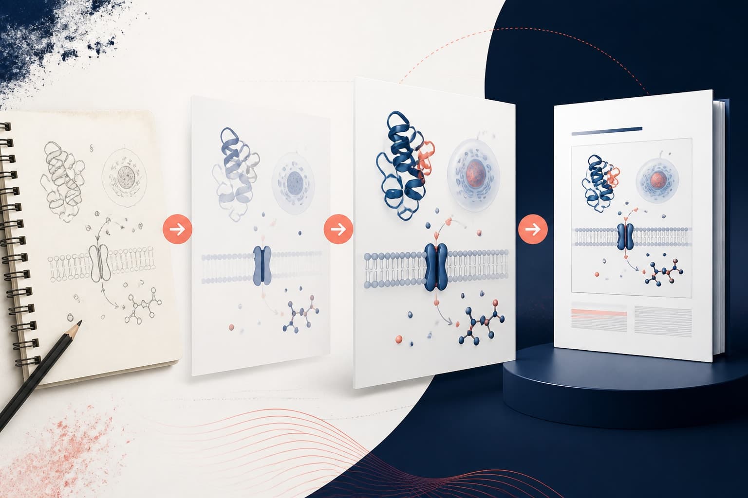
Graphical Abstract vs Visual Abstract: What Researchers Should Know
In This Article
When you submit your research paper or prepare a conference presentation, you'll likely encounter requests for either a graphical abstract or a visual abstract. The graphical abstract vs visual abstract confusion is real, and choosing the wrong format can hurt your paper's visibility and impact. These terms sound similar but represent distinct approaches to visual science communication.
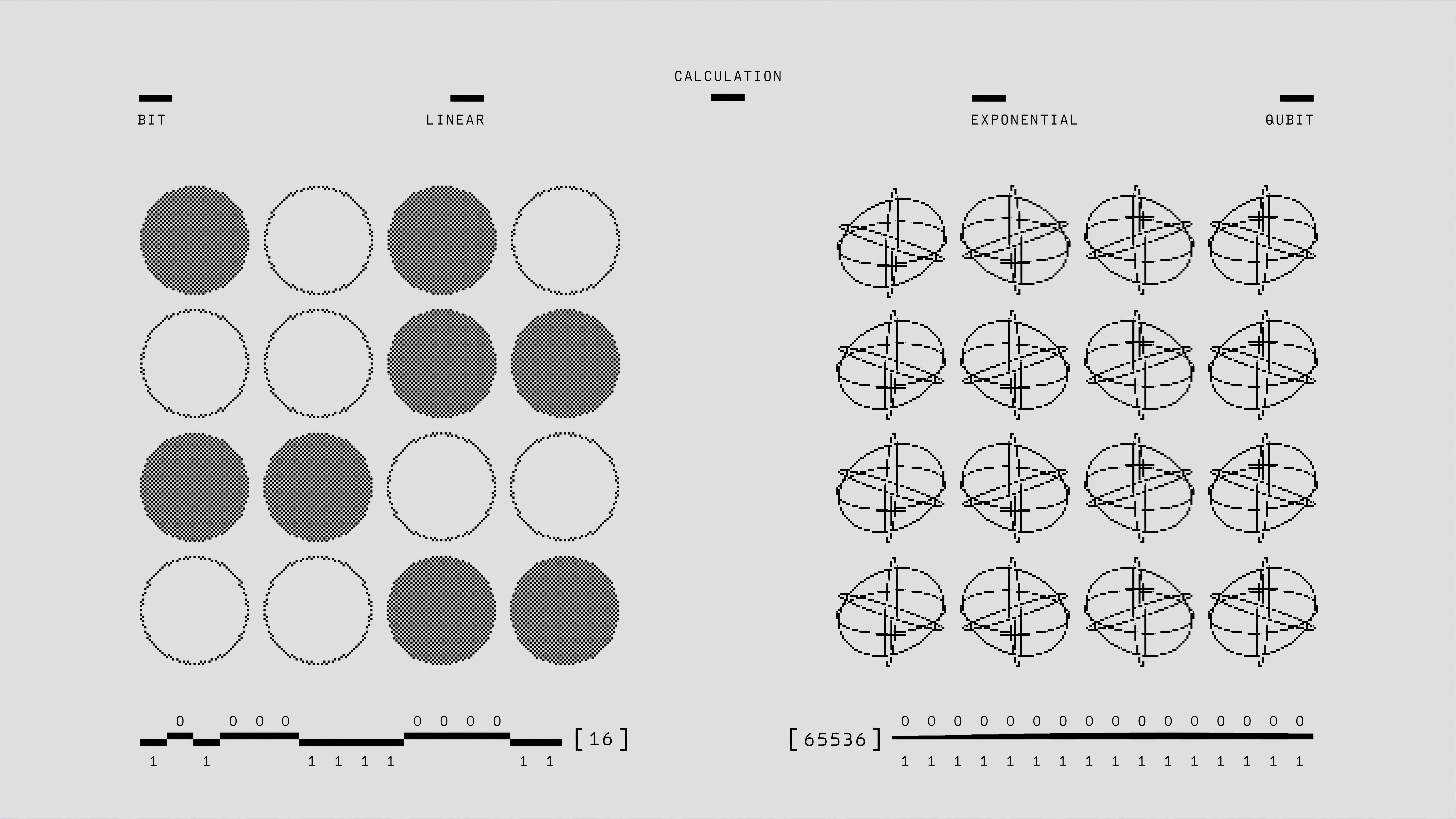
Both formats aim to make complex research accessible through visual storytelling. However, they serve different purposes, follow different design conventions, and reach different audiences. Understanding these differences helps you create more effective scientific visuals that actually get your work noticed.
What Makes a Graphical Abstract Different
A graphical abstract is a single-panel visual summary that captures your paper's key finding or main concept. Think of it as a sophisticated scientific diagram that tells your story at a glance. Most major journals, including Cell Press publications, require graphical abstracts alongside submitted manuscripts.
These visuals typically feature scientific diagrams and molecular structures, process flows showing experimental methodology, data visualizations highlighting key results, schematic representations of biological or chemical processes, and technical illustrations using standard scientific symbols.
The format emphasizes scientific accuracy over aesthetic appeal. Your graphical abstract should demonstrate clear understanding of your research domain while remaining comprehensible to scientists outside your specific field. Publishers often display these prominently on journal websites and in search results.
Size restrictions are strict. Most journals require dimensions around 1200x600 pixels, with file sizes under 5MB. The single-panel constraint forces you to distill complex research into one coherent visual narrative. This limitation actually strengthens the final product by eliminating unnecessary details.
Design software preferences lean toward professional tools. Many researchers use Adobe Illustrator, CorelDRAW, or specialized scientific illustration programs. The goal is creating publication-ready graphics that maintain clarity when scaled down for thumbnails or enlarged for presentations.
Understanding Visual Abstracts in Modern Research
Visual abstracts take a more flexible, infographic-inspired approach to research communication. These multi-panel visuals can include text blocks, icons, charts, photographs, and illustrations arranged in various layouts. Social media platforms and online science communication favor this format.
Key characteristics include multiple panels or sections telling a story, combination of text and visual elements, infographic-style design with icons and illustrations, color schemes optimized for digital sharing, and layouts designed for social media dimensions.
Visual abstracts prioritize accessibility and engagement over strict scientific convention. They often include background context, methodology explanations, and implications that wouldn't fit in traditional graphical abstracts. The format allows more creative freedom in presenting complex information.

Size flexibility is a major advantage. You can create visual abstracts for Twitter posts, Instagram squares, LinkedIn articles, or conference posters. This adaptability makes them powerful tools for science outreach and public engagement.
Design tools range from simple platforms like Canva to professional software. Many researchers appreciate template-based solutions that speed up creation while maintaining visual consistency. The emphasis shifts from technical precision to clear communication and visual appeal.
Graphical Abstract vs Visual Abstract: Key Differences
The graphical abstract vs visual abstract distinction becomes clearer when you examine their core purposes and constraints. These formats serve overlapping but distinct roles in scientific communication.
Graphical abstracts target scientific peers and journal readers. They assume domain knowledge and use technical terminology without extensive explanation. The primary goal is conveying research significance to other researchers who might cite or build upon your work.
Visual abstracts cast a wider net. They aim to engage both scientific and non-scientific audiences, including students, policymakers, journalists, and curious members of the public. The communication approach emphasizes broader implications and real-world applications.
Journal requirements dictate graphical abstract specifications. You'll work within strict dimension limits, file size restrictions, and content guidelines. Most journals prohibit advertising, author photos, or institutional logos in graphical abstracts.
Visual abstracts enjoy greater format freedom. You can experiment with different aspect ratios, include multiple pages or panels, and incorporate diverse visual elements. This flexibility supports more creative storytelling approaches.
Graphical abstracts follow established scientific illustration conventions. They prioritize accuracy, clarity, and professional appearance over trendy design elements. The aesthetic should feel consistent with peer-reviewed scientific literature.
Visual abstracts embrace modern design trends and social media aesthetics. Bold colors, trendy fonts, and eye-catching layouts are not just acceptable but often preferred. The goal is stopping scroll-happy audiences and encouraging engagement.
Space limitations force graphical abstracts to focus on one key message or finding. You might show your main experimental result, proposed mechanism, or novel methodology, but rarely all three in detail.
Visual abstracts can include multiple key points, background information, methodology summaries, and future implications. This comprehensive approach helps viewers understand both what you discovered and why it matters.
When to Choose Each Format
Your research context, target audience, and distribution goals determine whether graphical abstracts or visual abstracts serve you better. Sometimes you'll need both formats for different purposes.
Choose graphical abstracts when submitting to journals requiring this specific format, targeting academic conferences with technical audiences, presenting highly specialized research with complex mechanisms, working in fields with established visual conventions like chemistry or molecular biology, or emphasizing methodological innovations or technical achievements.
For example, if you've discovered a novel protein folding mechanism, a graphical abstract showing the structural changes with proper scientific notation will resonate with peer reviewers and potential collaborators. The technical accuracy demonstrates your expertise while the visual clarity aids understanding.
Choose visual abstracts when sharing research on social media platforms, engaging non-specialist audiences at public events, applying for funding from agencies emphasizing broader impacts, communicating interdisciplinary research crossing multiple fields, or highlighting societal implications or applications.
Consider climate change research that combines atmospheric chemistry with economic modeling. A visual abstract can effectively communicate both the scientific findings and policy implications to diverse stakeholders, while a traditional graphical abstract might overwhelm non-specialists with technical details.
Design Best Practices for Both Formats
Regardless of format choice, certain design principles improve the effectiveness of your scientific visuals. These guidelines help ensure your abstracts communicate clearly and professionally.
Start with a clear narrative structure. Whether creating graphical or visual abstracts, identify your core message before beginning design work. What single insight do you want viewers to remember after seeing your visual?
Maintain visual hierarchy through strategic use of size, color, and positioning. Your most important elements should dominate the composition, while supporting details remain visible but secondary. This hierarchy guides viewer attention through your story.
Choose colors purposefully. High contrast improves readability, while consistent color schemes create professional appearances. Avoid color combinations that create accessibility barriers for colorblind viewers.
Typography matters more than many researchers realize. Select fonts that remain legible when scaled down for thumbnails or printed in grayscale. Sans-serif fonts typically work better than serif options for scientific visuals.
Embrace white space as a design element. Overcrowded graphical abstracts lose impact and become difficult to parse quickly. Strategic spacing between elements improves comprehension.
Use consistent visual styles throughout your abstract. If you represent one protein as a ribbon diagram, maintain that convention for related proteins. This consistency helps viewers build mental models of your system.
Test readability at thumbnail size. Journal websites often display graphical abstracts as small preview images. Essential text and key visual elements must remain clear even when significantly reduced.
Optimize visual abstracts for your intended platform. Instagram squares, Twitter headers, and LinkedIn posts have different optimal dimensions and viewing contexts. Design with your primary sharing destination in mind.
Include clear calls to action when appropriate. Visual abstracts often serve as entry points to longer content, so guide viewers toward your full paper, presentation, or related resources.
Consider animation possibilities. While static images work well, subtle animations can enhance engagement on platforms supporting video content. Keep animations simple and purposeful rather than distracting.
Tools and Resources for Creation
The right tools streamline visual abstract creation while ensuring professional results. Your choice depends on design experience, budget constraints, and specific requirements.
Adobe Illustrator remains the gold standard for graphical abstracts in many research fields. Its vector-based approach ensures scalability without quality loss, while extensive scientific symbol libraries speed up creation. The learning curve is steep but worthwhile for researchers creating multiple visuals.
CorelDRAW offers similar capabilities with potentially more intuitive interfaces for some users. Both programs excel at precise scientific illustrations requiring technical accuracy.
Canva has revolutionized visual abstract creation for researchers lacking design experience. Pre-built templates, drag-and-drop functionality, and extensive icon libraries make professional-looking visuals achievable without extensive training.
BioRender specializes in scientific illustrations and offers templates specifically for research communication. The platform includes thousands of scientifically accurate icons and symbols, making it particularly valuable for life sciences research.
When you create with Graffiy, you access AI-powered design assistance that understands scientific content and suggests appropriate visual elements. This technology bridges the gap between design expertise and scientific accuracy.
GIMP provides basic image editing capabilities for researchers with zero budget. While less polished than commercial alternatives, it handles simple graphical abstract creation adequately.
Inkscape offers vector graphics capabilities similar to Illustrator without licensing costs. The interface requires learning but provides professional results once mastered.

Making the Right Choice for Your Research
Successfully navigating the graphical abstract vs visual abstract decision requires considering multiple factors simultaneously. Your research field, career stage, target audience, and communication goals all influence the optimal approach.
Early-career researchers benefit from mastering both formats. Graphical abstracts demonstrate technical competence to academic peers, while visual abstracts showcase communication skills increasingly valued by funding agencies and institutions emphasizing public engagement.
Established researchers might delegate visual creation while maintaining creative control. Understanding format differences ensures you can provide clear direction to designers or research assistants creating visuals on your behalf.
Consider creating multiple versions of key visuals. A detailed graphical abstract for journal submission can be simplified into a visual abstract for social media sharing. This approach maximizes your content's reach across different platforms and audiences.
Frequently Asked Questions
Can I use the same image for both graphical and visual abstracts?
Generally no, because graphical abstracts and visual abstracts serve different purposes and audiences. A graphical abstract designed for journal submission typically won't work effectively as a social media visual abstract. You'll likely need to create separate versions optimized for each format's specific requirements and viewing context.
What's the difference between graphical abstract vs visual abstract in terms of journal requirements?
Journals typically require graphical abstracts with strict formatting guidelines including specific dimensions, file sizes, and content restrictions. Visual abstracts aren't usually required by journals but are more commonly used for social media and public science communication. Always check individual journal guidelines as requirements vary significantly between publications.
How long should I spend creating a graphical or visual abstract?
Plan to spend 4-8 hours creating your first graphical abstract, including conceptualization, design, and revisions. Visual abstracts may take slightly less time if using templates, but complex custom designs require similar time investments. The time decreases significantly as you develop templates and workflows for future abstracts.
Written by
Shobajo AbdulAzeez
Tags
Share this article