How to Design a chemistry graphical abstract for Chemistry Papers
In This Article
Why a chemistry graphical abstract matters
A chemistry graphical abstract is not decoration. It is the shortest visual explanation of your paper, built to help a busy chemist understand your main discovery in seconds. If it works, the reader sees the system, the transformation, the evidence, and the takeaway without hunting through the full manuscript.
That does not mean cramming the whole project into one panel. Good chemistry design is selective. You choose the chemistry that carries the story, then remove everything that slows comprehension. The result should feel like a well edited scheme, not a poster squeezed into a thumbnail.

Journal readers often meet your paper through search results, table of contents pages, social posts, or recommendation emails. In those places, your image competes with dozens of other visual signals. A clear chemistry graphical abstract gives your work a better chance of being understood, saved, and cited.
Before you draw, check the journal instructions. Some publishers provide exact size, font, color, and content rules. You should also follow standard chemical representation conventions, including names, symbols, and stereochemical clarity. For formal terminology, the IUPAC nomenclature resources are a useful reference.
Start with the claim, not the artwork
The strongest design process starts with one sentence. Write the central claim of your paper in plain language. For example: “We developed a nickel catalyzed cross coupling that tolerates alcohols and produces arylated heterocycles in high yield.” That sentence tells you what the graphic must show.
Now reduce it further. What must a reader remember after three seconds? Maybe it is the catalyst, the substrate class, the unusual functional group tolerance, or the mechanistic insight. Your chemistry graphical abstract should be built around that memory.
A common mistake is to begin by copying the most beautiful scheme from the manuscript. That scheme may be accurate, but it may not be communicative. Manuscript schemes are made for complete reporting. Graphical abstracts are made for selection, hierarchy, and quick recognition.
Try this practical test. Cover every element except one. If the remaining element does not support the claim, delete it. Then repeat the process. This can feel harsh, especially after months of synthesis, purification, and characterization. Still, the abstract is not a reward for labor. It is a guide for readers.
For chemistry papers, your claim usually belongs to one of five story types: new reaction, improved selectivity, mechanistic discovery, material performance, or analytical method. Each type needs a different visual structure. A new reaction needs a clean input to output scheme. A mechanism needs an energetic or stepwise pathway. A material paper needs structure plus function.
Build the core chemistry graphical abstract structure
A useful chemistry graphical abstract usually has three zones: context, transformation, and outcome. Context tells the reader what system you studied. Transformation shows the reaction, mechanism, assembly, or measurement. Outcome shows why it matters, using one or two visual facts.
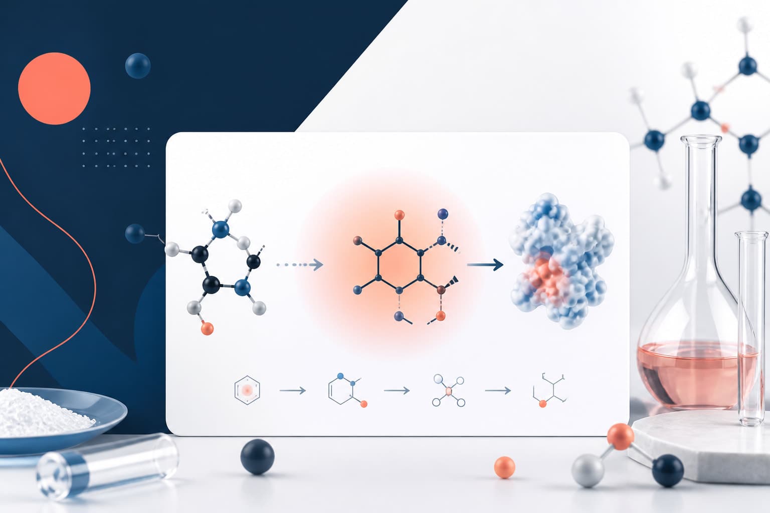
For a synthetic chemistry paper, the structure might be left to right. Put representative substrates on the left, key conditions or catalyst in the center, and the product family on the right. Add one small callout for yield range, selectivity, scope, or green chemistry benefit.
For a mechanistic study, avoid a crowded catalytic cycle unless the cycle itself is the discovery. Instead, show the step that changes interpretation. Use a highlighted intermediate, a rate determining step, an isotope effect, a radical clock, or a computational energy comparison. The reader should know what you learned, not only what you measured.
For materials chemistry, the structure often works from bottom to top or left to right. Show molecular building blocks, then assembly into the material, then the property or application. If you include a device, sensor, battery, membrane, or catalyst support, keep it schematic. Realistic rendering can help, but only when it improves recognition.
For analytical chemistry, the reader needs sample, method, signal, and result. A tiny workflow can work well: sample in, chemistry or separation step, detector response, key performance metric. Do not include full calibration curves unless the curve is the central visual evidence.
Use arrows carefully. In chemistry, arrows carry meaning. A reaction arrow, equilibrium arrow, resonance arrow, electron pushing arrow, and process arrow are not interchangeable. If you use a broad process arrow for a workflow, keep it visually distinct from a mechanistic arrow.
Schemes: make the reaction readable at thumbnail size
Chemists are good at reading schemes, but even expert readers struggle with tiny, overloaded structures. Your scheme should be chemically credible and visually calm. Start with the minimum number of atoms and labels needed to define the transformation.
If your full paper reports many substrates, choose one representative substrate pair or use R group notation. R groups are efficient, but they can become vague. Define them only where they matter. If the story is broad heteroaryl tolerance, show a few small heteroaryl icons instead of a long table of substituents.
Keep reaction conditions short. In the graphical abstract, “Ni cat., base, mild conditions” may work better than a full list of ligand, solvent, temperature, time, atmosphere, and equivalents. If the exact ligand is the main novelty, show it clearly. Otherwise, conditions should support the story, not dominate it.
Use consistent structure styling. Bond length, line weight, font, and charge placement should match across the entire graphic. Mixed styles make the work look assembled from screenshots. Redrawing key structures is usually worth the time.
Color should identify meaning, not decorate the page. Highlight the newly formed bond in one color. Use another color only if you need to mark a catalyst, reactive site, or functional group class. Too many colors create noise and can confuse readers with color vision differences.
Stereochemistry deserves special care. If stereochemical outcome is part of the claim, show wedge and dash bonds clearly, and include ee, dr, or stereoretention information near the product. Do not hide the strongest result in small text under the arrow.
Finally, leave whitespace around the scheme. White space is not wasted area. It helps readers parse reactants, arrows, products, and labels as separate ideas. A crowded chemistry graphical abstract often fails because the reader cannot decide where to look first.
Mechanisms: show the step that explains the result
Mechanistic chemistry can be tempting to overdraw. A full catalytic cycle may look impressive, but it often becomes a ring of tiny arrows and unreadable intermediates. If the graphical abstract is meant to communicate mechanism, choose the step that changes understanding.
Ask what your paper proves or proposes. Did you identify an off cycle resting state? Did you show radical versus polar reactivity? Did computation reveal a lower energy pathway? Did spectroscopy capture an intermediate? That is the visual anchor.
Electron pushing arrows are valuable when they explain selectivity or bond formation. Use them only where they are readable. A single curved arrow pair can teach more than a complete mechanism drawn at postage stamp size.
Energy diagrams can work well, especially for selectivity or competing pathways. Keep them simple. Show two curves, label the key transition states, and mark the energy difference if it matters. Avoid dumping computational values across every point.
If your mechanism depends on evidence, pair the proposed step with one compact proof. For example, show a radical trap adduct, kinetic isotope effect value, isotope labeling outcome, or operando spectral change. This gives the mechanism credibility without reproducing the results section.
Use uncertainty honestly. If the mechanism is proposed, label it as proposed. If there are competing pathways, show them as alternatives rather than pretending certainty. Readers appreciate precision, and reviewers notice when a graphic overclaims.
Compact visual storytelling for chemical research
Compact visual storytelling means arranging chemical information so the reader experiences a sequence. The sequence can be left to right, top to bottom, center outward, or problem to solution. What matters is that the path is obvious.
Start with a visual hierarchy. The most important element should be largest, highest contrast, or centrally placed. Supporting elements should be smaller. Captions inside the graphic should be brief, ideally two to five words. Use labels such as “mild C H activation,” “selective oxidation,” or “fluorescent turn on” rather than long phrases.
Avoid putting the paper title inside the graphic. The title already appears near the abstract in most journal layouts. Use that space for chemistry. Likewise, avoid author names, affiliations, decorative lab glassware, and generic DNA helices unless they are truly part of the story.
Use contrast to guide attention. Black structures on a light background remain the safest choice for many chemistry abstracts. If you use a dark background, make sure atom labels, charges, arrows, and small text remain legible after compression.
Think about shape language. A reaction scheme is linear. A catalytic cycle is circular. A material assembly may be layered. A sensor workflow may be sequential. Matching the layout to the chemistry reduces the amount of explanation needed.
One strong visual metaphor can help, but keep it secondary. A shield can suggest stability, a funnel can suggest selectivity, and a light beam can suggest photochemistry. However, metaphors should not replace chemical evidence. Your audience is made of chemists. They want the chemistry first.
Design details that improve clarity
Typography matters more than many researchers expect. Use one clean sans serif font for labels and a consistent chemical structure style for formulas. Keep the smallest text large enough to read in the journal table of contents. If you must zoom in to read it on your screen, it is too small.
Align elements. Reactants, arrows, labels, and outcome panels should sit on an invisible grid. Alignment makes complex chemistry feel organized. Misalignment makes the reader work harder, even when the science is sound.
Use callouts with restraint. A callout should point to something meaningful: active site, new bond, stereocenter, intermediate, binding pocket, or product feature. If every part has a callout, no part feels important.
Use icons only when they are specific. A generic flask icon does not add much to a synthetic scheme. A photoreactor icon, glovebox symbol, electrochemical cell, or flow reactor can add useful context when the apparatus is part of the contribution.
For colors, define a small palette before you begin. A practical chemistry palette might use black for structures, blue for catalysts, red for newly formed bonds, green for sustainability or biological readout, and gray for background context. Use the same meaning throughout.
Export quality is part of design. Use vector formats when possible, and follow the journal file requirements. Raster images should have enough resolution for print and online use. Blurry atom labels can make an otherwise excellent chemistry graphical abstract look unfinished.
A practical workflow from draft to final
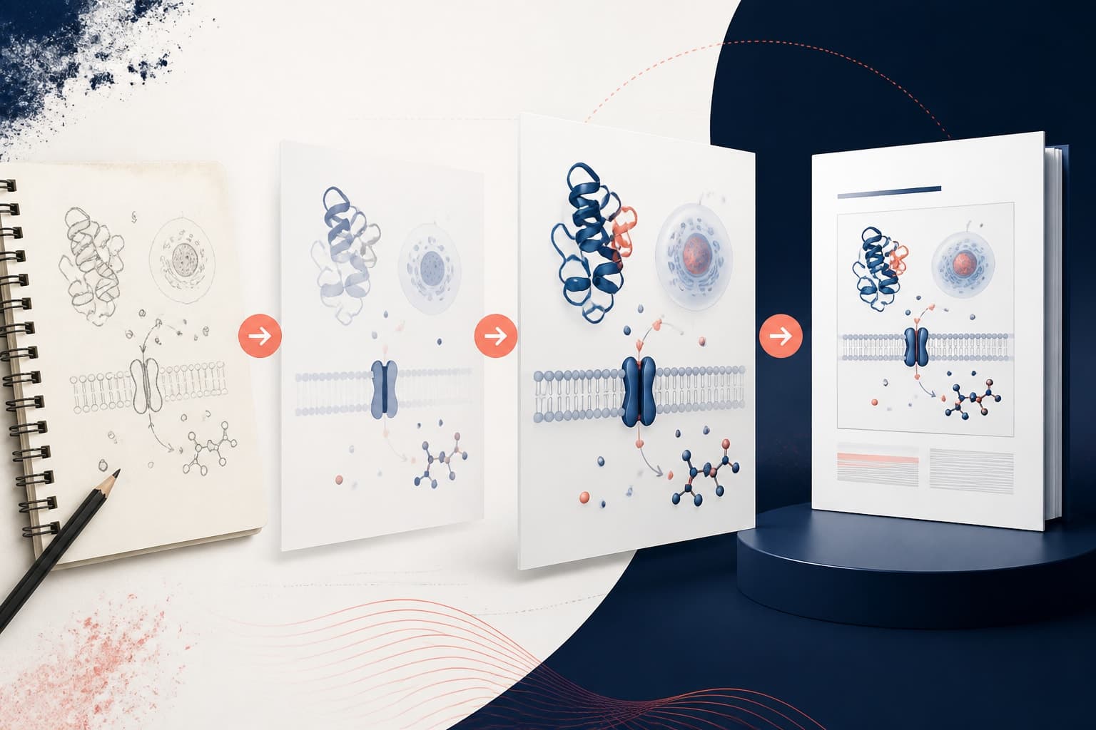
Begin with a rough sketch on paper or a whiteboard. Do not start with perfect structures. First decide the reading direction, main visual anchor, and supporting result. Then build the graphic in layers.
Layer one is the chemistry. Draw the core scheme, mechanism, or material structure. Layer two is the evidence or outcome. Add the key metric, product class, selectivity result, or functional readout. Layer three is visual guidance, including labels, colors, arrows, and callouts.
After the first draft, shrink it to thumbnail size. This is the most useful test. If the main message disappears, the design is too detailed. Remove secondary labels, simplify structures, or increase the size of the central transformation.
Next, show it to someone close to your field but outside the project. Ask them what the paper is about after five seconds. Do not explain first. Their answer will reveal whether the visual story is working.
If you want to move faster, you can create with Graffiy and use AI assisted scientific design to turn your scheme, mechanism, or research summary into a polished visual direction. We still recommend reviewing every chemical structure carefully. AI can speed layout, but chemical accuracy remains your responsibility.
Before submission, check journal specifications, spelling, stereochemistry, charges, atom labels, abbreviations, and image dimensions. Also check whether the graphic still works in grayscale. Many readers print papers, view them on low quality screens, or scan them quickly on mobile devices.
Common mistakes to avoid
The first mistake is trying to show the whole paper. A graphical abstract is not a miniature manuscript. It should represent the central message, not every control, substrate, and instrument.
The second mistake is making structures too small. Chemistry readers can forgive a simple graphic, but not an unreadable one. If the bond changes, functional groups, or stereochemical features cannot be seen, the graphic is failing its main job.
The third mistake is weak hierarchy. When every element has equal size and color, the reader has no entry point. Choose one hero element. It could be the product, catalyst, mechanism step, material architecture, or analytical signal.
The fourth mistake is decorative complexity. Gradients, shadows, 3D glassware, random particles, and dramatic backgrounds can make the image look busy. Use visual effects only when they clarify scale, phase, structure, or function.
The fifth mistake is overclaiming. If the abstract implies perfect generality, confirmed mechanism, or broad biological relevance beyond the data, reviewers may push back. A trustworthy chemistry graphical abstract is persuasive because it is clear and accurate.
Final checklist before you submit
- Central claim: The image communicates one main scientific message.
- Readable chemistry: Structures, charges, stereochemistry, and arrows remain clear at small size.
- Scheme logic: Reactants, conditions, products, and outcomes follow an obvious direction.
- Mechanistic focus: Any mechanism highlights the key explanatory step, not unnecessary detail.
- Compact evidence: One or two metrics support the claim without clutter.
- Consistent style: Fonts, bond weights, colors, and labels match across the graphic.
- Journal fit: Dimensions, file type, resolution, and content rules match the author guidelines.
- Ethical accuracy: The image does not exaggerate scope, certainty, or application.
A strong chemistry graphical abstract is a careful act of editing. You are not making the science smaller. You are making the main idea easier to enter. When schemes, mechanisms, and outcomes are arranged with discipline, your paper becomes more discoverable and more memorable.
The best test is simple. Can another chemist understand what you made, how it works, and why it matters before reading the abstract text? If yes, your visual story is doing its job.
Frequently Asked Questions
What should a chemistry graphical abstract include?
A chemistry graphical abstract should include the central chemical system, the key transformation or mechanism, and one compact outcome that explains why the work matters. For most chemistry papers, that means a simplified scheme, a highlighted bond change or intermediate, and a short label for yield, selectivity, function, or application.
Should I show a full mechanism in my graphical abstract?
Usually, no. Show the mechanistic step that explains your main result, such as a key intermediate, rate determining transition state, radical pathway, or selectivity deciding event. A full catalytic cycle is useful only when the complete cycle is the core discovery and remains readable at small size.
How much text is too much in a chemistry graphical abstract?
Use only the text needed to guide interpretation. Short labels of two to five words usually work better than full sentences. If the reader must read several lines before understanding the graphic, simplify the layout and let the chemistry carry more of the story.
Written by
Shobajo AbdulAzeez
Tags
Share this article