
How to Design a medical graphical abstract for Medical Research
In This Article
Why a medical graphical abstract matters
A medical graphical abstract is not decoration. It is a compact visual summary of your study, built to help clinicians, reviewers, editors, and readers grasp the main message quickly. In medical research, that usually means showing the population, intervention or exposure, comparator, outcome, and key finding without forcing the viewer to decode a crowded figure.
The best visual abstracts do not try to replace the paper. They create a clear entry point. A clinician scrolling through a journal table of contents may decide whether to read your article after seeing one figure. A conference attendee may remember your result because the visual structure was simple. A patient advocacy group may share your finding if it feels understandable and accurate.

For clinical and medical researchers, the stakes are higher than in many other fields. A misleading arrow, unclear denominator, or overconfident icon can change how readers interpret your findings. So your design has to respect the evidence. Good design helps your data look more honest, not more dramatic.
This guide walks through the practical decisions behind a strong medical graphical abstract: what to include, how to show outcomes, which icons to use, and how to meet journal expectations. If you want a faster way to produce polished scientific visuals, you can also create with Graffiy and build from research focused design components.
Start with the message before the layout
Before opening a design tool, write one sentence that answers this question: what should a reader remember after five seconds? If you cannot express the message in one sentence, the visual abstract will likely become cluttered. This is especially common in clinical studies with multiple endpoints, subgroup analyses, and adjusted models.
Use a short working statement such as: In adults with atrial fibrillation, treatment A reduced stroke risk compared with treatment B, with no significant increase in major bleeding. That sentence gives you the core design ingredients. You have a population, comparison, primary outcome, safety outcome, and direction of effect.
Next, identify the type of study. Randomized trial, cohort study, case control study, diagnostic accuracy study, systematic review, and translational study all need different visual logic. A randomized trial often works well as a flow from eligible patients to randomization, treatment arms, and outcomes. A cohort study may need exposure groups and follow up. A diagnostic study may need index test, reference standard, sensitivity, and specificity.
It helps to define what you will not show. You do not need every secondary endpoint. You do not need every statistical adjustment. You do not need the full eligibility criteria. A medical graphical abstract should reduce the article to the most useful visual claim, while the manuscript carries the full detail.
Practical rule: if a design element does not help explain the research question, population, comparison, outcome, or conclusion, remove it.
Build the structure of a medical graphical abstract
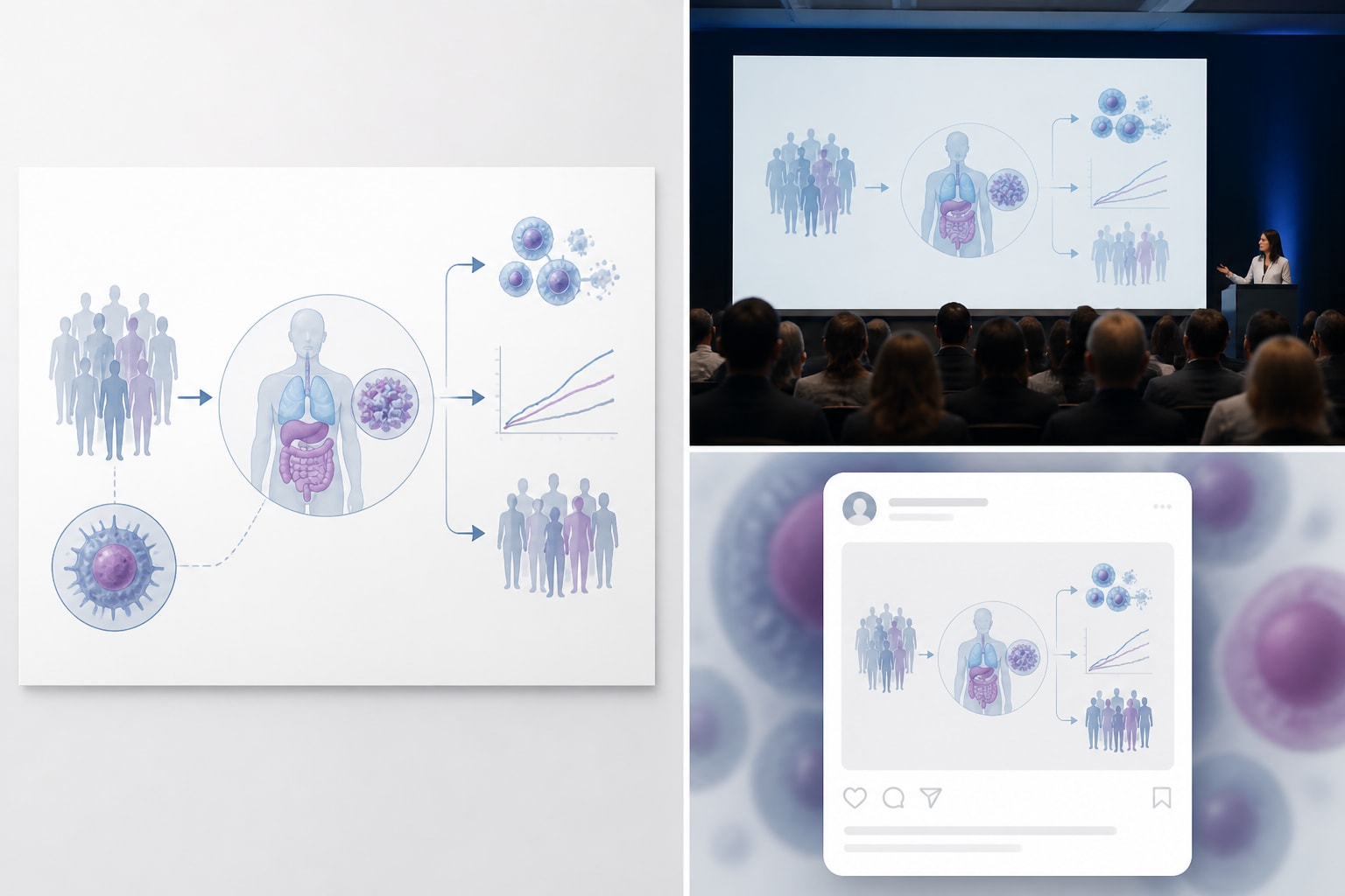
A reliable structure keeps your visual abstract from becoming a poster. Most medical graphical abstracts can use a three part framework: context, study design, and key result. You can arrange these from left to right, top to bottom, or in a central hub with supporting panels. Left to right is usually easiest for journal readers because it matches the way many people scan clinical evidence.
Start with a title strip or short header. Use plain language, not the full article title. For example, write, “Drug A reduced recurrent hospitalization in heart failure,” instead of a 26 word title with acronyms and statistical terms. Keep the title honest. If the study is observational, do not imply causality.
The first panel should introduce the clinical question. Show the patient group or disease area with one clear icon or illustration. Add essential eligibility details only if they change interpretation, such as “adults with stage 3 chronic kidney disease” or “newly diagnosed type 2 diabetes.” Avoid tiny text blocks filled with inclusion and exclusion criteria.
The middle panel should show design and comparison. For trials, include randomization and treatment arms. For cohorts, show exposed and unexposed groups. For diagnostic studies, show test flow. For systematic reviews, show the number of included studies and participants. This is where your visual abstract earns trust because it reveals how the evidence was generated.
The final panel should show outcomes. This is the reader’s payoff. Highlight one primary endpoint and, when appropriate, one safety or secondary endpoint. Use numbers, direction, and uncertainty carefully. If your result is not significant, say that clearly. A strong medical graphical abstract can show a null result just as well as a positive one.

Show outcomes without confusing the reader
Outcomes are often where graphical abstracts fail. Researchers want to include hazard ratios, confidence intervals, absolute risk, p values, subgroup differences, and Kaplan Meier curves. Readers want to know what happened, to whom, and how certain the result is. You need to balance accuracy with speed.
Use absolute numbers when they matter clinically. “12 of 100 patients experienced recurrence” is often easier to understand than “relative risk 0.72.” Relative measures are useful, but they can exaggerate perceived benefit when baseline risk is low. When space allows, include both absolute and relative effects. For example, “Stroke: 2.1 percent vs 3.4 percent, HR 0.62.”
Do not hide denominators. If you show icons for events, make the base population clear. Ten red patient icons mean little unless the viewer knows whether they represent 10 out of 100, 10 out of 1,000, or a symbolic direction. In medical communication, ambiguity can become misinformation.
When showing uncertainty, keep it readable. Confidence intervals can be shown as a small forest style marker if your audience expects it. For broader clinical audiences, a short label may work better: “Estimate favored intervention, confidence interval crossed no effect.” That wording is less elegant, but it is honest.
Be careful with color. Red often suggests harm, danger, or worse outcomes. Green suggests benefit or improvement. Use these associations only when they match the data. If both outcomes are neutral, use balanced colors. Also consider readers with color vision deficiency. Pair color with labels, icons, or patterns so meaning does not depend on color alone.
| Outcome type | Best visual choice | Common mistake |
|---|---|---|
| Binary clinical event | Percent, count, or icon array with denominator | Showing icons without sample size |
| Time to event | Hazard ratio plus absolute event rate | Showing only a p value |
| Continuous measure | Mean change with units | Omitting whether higher is better |
| Safety endpoint | Separate harm panel with neutral wording | Using reassuring color for serious adverse events |
Choose medical icons that clarify, not decorate
Icons are useful because they reduce reading load. They are also risky because they can oversimplify. A stethoscope icon may signal medicine, but it does not explain heart failure, sepsis, or screening. Choose icons that name a concept visually, not icons that merely make the design look clinical.
For population, use patient silhouettes only when they add meaning. If sex, age, pregnancy status, or pediatric status matters, show it carefully and respectfully. Avoid stereotypes. For diseases, use organ icons, cell illustrations, or simple anatomical shapes. A lung icon for chronic obstructive pulmonary disease is clearer than a generic hospital symbol.
For interventions, match the treatment type. Pills, syringes, infusion bags, surgical tools, radiation symbols, behavioral counseling icons, and digital health devices all suggest different care pathways. If your study compares two drugs, avoid using a large dramatic syringe for one arm and a tiny pill for the other unless that distinction is part of the study.
For outcomes, use symbols that align with clinical meaning. A heart rhythm line can show cardiovascular events, a droplet can show bleeding, and a hospital building can show admission. But do not make severe outcomes look playful. Mortality, stroke, cancer progression, and serious adverse events need sober visual treatment.
Keep icon style consistent. Mixing 3D illustrations, line icons, filled icons, and realistic drawings creates visual noise. Use one style family with consistent stroke weight and level of detail. In a medical graphical abstract, consistency reads as credibility.

Design for journal expectations
Journal requirements vary, so check the author guidelines before finalizing your file. Some journals call these visual abstracts, some call them graphical abstracts, and some request a specific size, file format, or font minimum. Others expect a standalone figure that can be shared on social platforms.
Many biomedical journals also care about reporting transparency. Your graphical abstract should not contradict the manuscript, abstract, or trial registration. If the study follows a reporting guideline, your visual summary should reflect the same discipline. The EQUATOR Network is a useful source for reporting guidelines across clinical research designs.
Check whether the journal allows branding, logos, or institutional marks. Many journals prefer no promotional elements. If a funder logo is required, place it in a low emphasis area and make sure it does not compete with the finding. Your aim is scientific clarity, not advertising.
Resolution matters. A beautiful abstract can become unreadable if exported too small. Use vector formats when allowed, such as PDF or SVG. If the journal requests PNG or TIFF, export at the specified resolution. Before submission, view the file at the size it will appear online. If you cannot read the outcome numbers on a laptop screen, simplify.
Accessibility is also part of publication quality. Use sufficient contrast, readable fonts, and labels that do not rely only on color. Avoid placing small white text on pale blue boxes. Use sentence case rather than all caps for longer labels. Readers should not have to zoom in to understand your main result.
Use typography and hierarchy like a reviewer would
Reviewers and editors scan quickly. Your design should guide their eyes in the right order. Start with the main title, then the study design, then the result. Make the most important number visually stronger than supporting details. Do not give equal weight to every label.
Use one or two typefaces at most. A clean sans serif font works well for most medical graphical abstracts. Keep body labels large enough for online viewing. Avoid long italicized phrases, condensed fonts, and decorative type. They may look interesting, but they slow comprehension.
Create hierarchy through size, spacing, and weight. A primary outcome might be bold and larger. Secondary information can be smaller. Group related elements inside light boxes or panels. Use consistent spacing between columns so the figure feels organized.
Be restrained with arrows. Arrows should mean sequence, assignment, flow, or causal direction. If everything has an arrow, nothing feels important. For observational data, avoid arrows that imply treatment caused the outcome unless the study design supports that conclusion. Use neutral connectors when needed.
Short labels beat long labels. “Primary outcome: 18 percent lower recurrence” is easier than “The primary composite endpoint occurred less frequently in the intervention arm.” Save detailed phrasing for the manuscript. The visual abstract is a scanning tool.
Plan for visual abstracts beyond the journal page
A journal submission may be the first use of your graphical abstract, but it is rarely the last. The same visual may appear in a newsletter, conference slide, lab website, press release, teaching deck, or social post. Design with those settings in mind.
Create a master version first, then adapt. The journal version may need strict dimensions. A social version may need larger text and fewer details. A presentation version may benefit from stepwise reveal across slides. Keep the data consistent across formats. Do not let adaptation turn into reinterpretation.
If your audience includes patients or policy groups, reduce jargon further. Replace “MACE” with “major heart events” if space allows. Define abbreviations on first use. Avoid assuming that every reader knows clinical trial shorthand. Even among clinicians, abbreviations differ by specialty.
For multilingual teams, keep text modular. If labels may be translated, leave enough room for longer words. Do not bake text into complex illustrations if you will need regional versions. A well structured medical graphical abstract can travel across audiences without losing scientific control.
A practical workflow for your next design
Start by gathering the essentials: article title, study type, population, sample size, intervention or exposure, comparator, follow up duration, primary outcome, key secondary or safety outcome, and main conclusion. Put these into a plain text brief before designing. This prevents design choices from driving the science.
Sketch three rough layouts. One might be a simple three column flow. Another might place the patient population in the center with comparison arms branching out. A third might use a top row for design and a bottom row for outcomes. Choose the version that makes the main finding easiest to understand.
Then edit. Remove one element at a time and ask whether the meaning suffers. If it does not, keep it out. This is the fastest way to improve a crowded visual abstract. Medical researchers often under edit because every detail feels important. The reader does not need every detail at once.
After the first polished draft, ask two people to review it. One should understand the study. The other should be less familiar with the paper. Ask both to explain the study in their own words after five seconds. If they miss the main conclusion, revise the hierarchy.
Finally, compare the graphical abstract against the manuscript. Numbers, labels, endpoints, and direction of effect must match. Check spelling of drug names, disease terms, units, and statistical values. A small typo in a figure can weaken trust more than a typo in body text because visuals are often shared independently.
Common mistakes to avoid
The first mistake is overloading the canvas. A medical graphical abstract is not a mini manuscript. If you need five panels, eight icons, and four footnotes, the concept is probably too broad. Narrow the message and move supporting detail elsewhere.
The second mistake is using icons as filler. Every icon should have a job. If an icon does not identify a population, method, intervention, outcome, or conclusion, remove it. Decorative medical symbols can make the design look generic.
The third mistake is overstating the finding. This can happen through words, arrows, color, or scale. A small observational association should not be presented like a definitive treatment effect. Use cautious language when the design requires it.
The fourth mistake is ignoring journal specifications until the end. Size, resolution, and format can affect layout. If you design a wide horizontal abstract and the journal requires a square graphic, you may have to rebuild from scratch.
The fifth mistake is treating accessibility as optional. Small labels, low contrast, and color only coding reduce the reach of your work. Clinical research should be understandable to the readers who need it most.
Final checklist for a stronger submission
- Main message: The central finding is clear within five seconds.
- Study design: The viewer can tell whether it is a trial, cohort, review, diagnostic study, or other design.
- Population: The patient group and sample size are visible.
- Comparison: Intervention, exposure, comparator, or control are clearly labeled.
- Outcomes: Primary outcome and essential safety outcome are shown with denominators or units.
- Icons: Visual symbols are consistent, respectful, and clinically meaningful.
- Journal fit: Dimensions, resolution, file type, and style rules match author instructions.
- Accuracy: All numbers and claims match the manuscript.
A good medical graphical abstract is disciplined. It selects one message, supports it with the right visual structure, and leaves out anything that competes with comprehension. That discipline helps your research travel farther while staying accurate.
When you design with outcomes, icons, and journal expectations in mind from the start, the final figure feels less like an afterthought. It becomes a useful research communication tool. That is the standard worth aiming for: clear enough for a quick scan, accurate enough for clinical readers, and polished enough for publication.
Frequently Asked Questions
What is a medical graphical abstract?
A medical graphical abstract is a visual summary of a clinical or biomedical study. It usually shows the patient population, study design, comparison groups, key outcomes, and main conclusion in one compact figure.
How much data should I include in a visual abstract for a clinical study?
Include the data needed to understand the main finding, not every result from the manuscript. Most designs should show the sample size, comparison, primary outcome, and one important secondary or safety outcome if it changes interpretation.
Do journals have specific requirements for graphical abstracts?
Yes, many journals specify dimensions, file type, resolution, font size, and whether text or logos are allowed. Always check the author instructions before final export, because journal rules can affect your layout and level of detail.
Written by
Shobajo AbdulAzeez
Tags
Share this article