Reactome Icon Library for Pathway and Mechanism Figures
In This Article
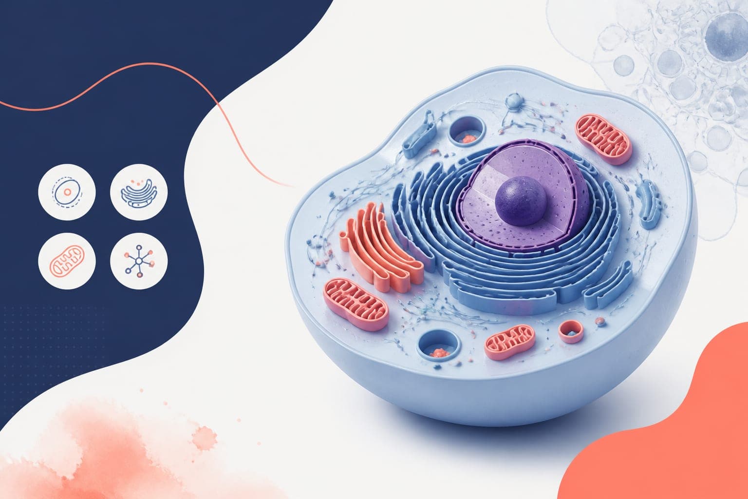
What the Reactome icon library gives you
The Reactome icon library is a practical starting point when you need pathway and mechanism figures that look like molecular biology, not generic clip art. It gives you recognizable visual building blocks for proteins, complexes, cellular locations, small molecules, and pathway events. For researchers, that matters because a figure is not just decoration. It is an argument in visual form.
If you are preparing a manuscript figure, conference poster, graphical abstract, grant schematic, or lecture slide, pathway icons help readers identify the biology faster. They reduce the need for long labels, make relationships easier to scan, and bring consistency to multi-panel figures. Used well, the Reactome icon library can make a dense signaling model feel organized instead of crowded.
This guide is for molecular biology researchers who want better figures without spending a week redrawing every receptor, enzyme, and complex by hand. We will cover what pathway icons are useful for, how to choose them, how to combine them into clear mechanisms, and how to use design tools without losing biological accuracy.
Why pathway icons improve molecular biology figures
Most biological pathways are difficult to explain because they mix several kinds of information. You may need to show molecular identity, cellular location, directionality, regulation, state changes, and experimental findings in one compact panel. Text alone becomes heavy. Simple shapes alone become vague. Icons sit in the useful middle.
A receptor icon immediately tells the reader where the story begins. A kinase, transcription factor, membrane, vesicle, or metabolite icon can carry meaning before the caption is even read. That speed matters in journal browsing, poster sessions, and abstract review. People scan before they study.
The Reactome icon library is especially useful because it is tied to pathway thinking. Reactome is a curated pathway knowledgebase, so its visual language fits the way molecular biologists describe reactions, complexes, and pathway events. You can read more about the resource through Reactome's icon library.
There is also a practical benefit. When every molecule in a figure is drawn in a different style, the reader has to work harder. Consistent icons reduce visual friction. They make your mechanism look intentional, even when the underlying biology is messy.
When to use the Reactome icon library in research communication
The Reactome icon library is useful anywhere you need to explain biological relationships quickly. It is not limited to full pathway diagrams. In fact, the best uses are often compact, focused, and selective. A figure should show the mechanism your reader needs, not every molecule you know.
For manuscript figures, pathway icons can support a results model, a proposed mechanism, or a summary panel. They are helpful when you need to connect experimental conditions to downstream signaling, gene expression, metabolic flux, or phenotypic outcomes. A consistent icon set can also help tie together multiple panels that were generated from different assays.
For posters, icons make your central story easier to understand from several feet away. A visitor should be able to spot the cell type, pathway class, and main perturbation before reading your methods. Use icons to make the top-level structure obvious, then reserve fine detail for labels and legends.
For graphical abstracts, the Reactome icon library can help you avoid the classic problem of trying to show too much with too little space. Icons let you show the receptor, pathway node, nuclear outcome, and disease context in a compact visual chain. That is often enough for the abstract to do its job.
Choose icons based on biological meaning, not decoration
Good pathway figures start with a decision about meaning. Before opening a design tool, write one sentence that states what the figure must communicate. For example: ligand stimulation activates a receptor complex, leading to kinase signaling, transcription factor movement, and inflammatory gene expression. That sentence becomes the structure of your visual hierarchy.
Next, map each concept to an icon category. Use a membrane receptor icon for the surface signal, a protein or complex icon for intermediate nodes, a nucleus or transcription factor icon for gene regulation, and a phenotype or cell state cue for the outcome. The Reactome icon library works best when each icon has a specific job.
A common mistake is using too many icons because they are available. Resist that. Every symbol adds reading effort. If two molecules have the same role in your message, consider grouping them or using a label list. If a molecule is not central to the mechanism, it may belong in the caption or supplement.
Another mistake is treating icons as proof. Icons make a model understandable, but they do not replace evidence. Use figure legends, annotations, and citations to distinguish confirmed interactions from hypotheses. If your pathway includes inferred steps, mark them with a different line style or phrase such as proposed, predicted, or model.
A practical workflow for building pathway figures
A simple workflow prevents most figure problems. Start with the biological claim, then build the figure around that claim. Do not start by arranging icons on a blank canvas and hoping the story appears.
- Define the message. Write one sentence that summarizes the pathway or mechanism.
- List the required entities. Include receptors, ligands, enzymes, complexes, metabolites, compartments, and outputs.
- Choose the minimum icon set. Pull only the icons needed to support the message.
- Sketch the flow. Decide whether the pathway reads left to right, top to bottom, or outside to inside.
- Add experimental context. Mark knockdown, inhibition, mutation, treatment, or disease state only where needed.
- Label carefully. Use gene or protein names consistently, and define abbreviations in the legend.
- Review for ambiguity. Ask whether a colleague could explain the figure after ten seconds.
This workflow is intentionally plain. It keeps attention on the biology. The Reactome icon library should support your pathway logic, not distract from it.
After sketching, check directionality. Arrows should indicate activation, transport, conversion, or information flow, depending on your figure. Do not use arrows as general connectors if they imply causation you have not shown. For inhibition, use blunt-ended lines or clearly labeled negative regulation. For binding, use proximity, brackets, or a complex symbol.
Finally, export in a format that matches the destination. Manuscripts often need high-resolution TIFF, PDF, EPS, or SVG depending on journal instructions. Posters can tolerate larger raster files, but vector export is safer for large printing. Graphical abstracts should be tested at small size because many are viewed as thumbnails.
Design rules that keep mechanism figures readable
Biological accuracy matters, but readability is what gets the figure understood. The best pathway designs are usually restrained. They use fewer colors, cleaner labels, and more spacing than the author initially wants. That restraint is not boring. It is respectful to the reader.
| Design choice | Recommended approach | Why it helps |
|---|---|---|
| Color | Use one neutral base palette plus one or two highlight colors | Prevents the pathway from looking like unrelated parts |
| Labels | Keep labels short and consistent with your field's naming conventions | Improves scanning and reduces caption burden |
| Spacing | Leave visible space between pathway modules | Helps readers separate receptor, cytosol, nucleus, and output |
| Lines | Use distinct styles for activation, inhibition, transport, and uncertainty | Stops readers from misreading relationships |
| Emphasis | Highlight only the experimental finding or key mechanism | Keeps attention on the main claim |
Use color to encode meaning, not to decorate every molecule. For example, blue can mark control pathway components, orange can mark induced activity, and gray can mark background context. If everything is highlighted, nothing is highlighted.
Typography also matters. Use one clean font family and avoid tiny labels. If you must label many genes, consider a compact table beside the schematic rather than squeezing every name into the pathway. Your figure should survive resizing, conference printing, and PDF compression.
How to use icons in figures, posters, and abstracts
Manuscript figures
In manuscripts, the figure must support a specific result or model. Use the Reactome icon library to create summary schematics that connect data panels to biological interpretation. For example, after showing immunoblot, RNA-seq, or imaging data, a final panel can show how the pathway changes under treatment or mutation.
Keep journal production in mind. Avoid hairline strokes, pale colors, and text smaller than the journal's minimum. If a schematic will appear as one panel in a larger figure, simplify it aggressively. Readers should not need to zoom to understand the central mechanism.
Conference posters
For posters, the figure has to work quickly. Place your pathway schematic near the top or center of the poster, where it can serve as a map for the whole story. Use icons for the major biological actors, then use callouts to connect them to experimental panels.
Posters benefit from strong hierarchy. Make the main pathway large, keep secondary molecules smaller, and reserve bright color for the key perturbation or conclusion. The Reactome icon library can help maintain visual consistency across the central model, methods overview, and conclusion box.
Graphical abstracts
Graphical abstracts need even more discipline. They are not miniature review articles. Use one biological setting, one main pathway movement, and one outcome. Icons can make that compact story understandable, but only if the layout is direct.
For abstracts, test the design at thumbnail size. If the cell compartment, main molecule, and biological outcome disappear, simplify. Remove secondary labels, enlarge the central icons, and strengthen contrast. A graphical abstract should invite reading, not explain every control experiment.
Combining Reactome icons with your own data
Pathway icons become more powerful when paired with experimental results. You can use icon-based schematics to explain what the data means, while plots and images show what you measured. This pairing works well for phosphoproteomics, gene expression, perturbation screens, spatial biology, and cell signaling assays.
For example, a pathway figure might show a receptor activating two branches. Next to each branch, you can place a small heatmap, fold-change value, or representative microscopy inset. The icon system provides context, while the data provides evidence.
Be careful with visual equivalence. If one branch is strongly supported and another is speculative, do not draw them with identical weight and confidence. Use line thickness, labels, or annotations to show the difference. A beautiful figure that overstates the evidence can damage trust.
When adapting the Reactome icon library for a specific experiment, keep naming consistent with your data source. If your RNA-seq output uses gene symbols, do not switch to protein names without explanation. If your antibody recognizes a phosphorylated form, label the state clearly. Mechanistic figures are often judged by these details.
Attribution, licensing, and responsible reuse
Before using any scientific icon set in a publication or public communication, check the source terms. Reactome is a respected biological pathway resource, and its content is designed for reuse, but you should still verify the current license and attribution expectations for your exact use. Requirements can change, and journals may ask about permissions.
As a practical habit, keep a note with the icon source, download date, license page, and any modifications you made. This is especially helpful when a manuscript revision comes months later. It also helps collaborators understand which assets are original, adapted, or sourced externally.
Attribution does not have to clutter the figure. Depending on the license and journal style, it can often live in the figure legend, acknowledgments, supplementary methods, or poster footer. The important thing is to be transparent. Scientific visuals should be traceable, just like datasets and code.
If you substantially modify an icon, do not imply that the source endorses your specific biological interpretation. The icon can represent a molecule class or pathway concept, while your model remains your own. That distinction is simple and worth preserving.
How Graffiy helps you build from pathway icons
Once you have chosen your icons and pathway structure, the next challenge is assembly. You need clean alignment, readable labels, consistent colors, and export settings that match publication requirements. This is where a scientific design workflow can save time.
With Graffiy, you can bring together icons, annotations, arrows, compartments, and data callouts in a workspace built for scientific figures. The goal is not to make your biology look trendy. The goal is to make it accurate, clear, and ready for review. If you want a faster way to structure pathway visuals, you can create with Graffiy and refine your figure for manuscripts, posters, or abstracts.
Graffiy is useful when you need to turn a rough pathway sketch into something polished without losing the scientific intent. You can standardize the look of a receptor model, signaling cascade, cellular compartment, or graphical abstract while keeping control over the details that matter to reviewers.
The Reactome icon library provides strong visual ingredients. A thoughtful design process turns those ingredients into a figure that communicates. The combination is powerful because it respects both sides of scientific communication: the biology and the reader.
Final checklist before you export
Before you submit or print, run a short review. First, confirm that every icon has a purpose. Second, check that each arrow means what it appears to mean. Third, make sure your labels match the terminology used in the text, methods, and data panels.
Then test the figure under real viewing conditions. Open the PDF at manuscript size. View the poster from a distance. Shrink the graphical abstract to thumbnail size. If the main mechanism is still clear, you are close.
Finally, ask one colleague outside the immediate project to describe the figure. Their confusion will show you where labels, spacing, or pathway order need work. This quick test is often more useful than another hour of polishing colors.
The Reactome icon library is not a shortcut around scientific judgment. It is a tool for making your judgment visible. Use it selectively, pair it with clear labels and honest evidence, and your pathway figures will be easier to read, easier to trust, and more useful to the people you want to reach.
Frequently Asked Questions
What is the Reactome icon library best used for?
The Reactome icon library is best used for pathway schematics, mechanism figures, posters, graphical abstracts, and teaching visuals. It helps represent biological entities and events with consistent icons that molecular biology readers can recognize quickly.
Can I use pathway icons in a journal figure?
Yes, pathway icons can work well in journal figures when they clarify a result or model. Always check the current license and attribution requirements for the icon source before submission. You should also confirm that your export format and resolution match the journal's figure guidelines.
How many icons should I use in a mechanism figure?
Use the fewest icons needed to explain the biological claim. Too many icons can make a pathway harder to read, especially in posters and graphical abstracts. If a molecule is not central to the message, move it to the caption, supplement, or a grouped label.
Written by
Shobajo AbdulAzeez
Tags
Share this article